Vanu Jam
Packaging Design
Concept:
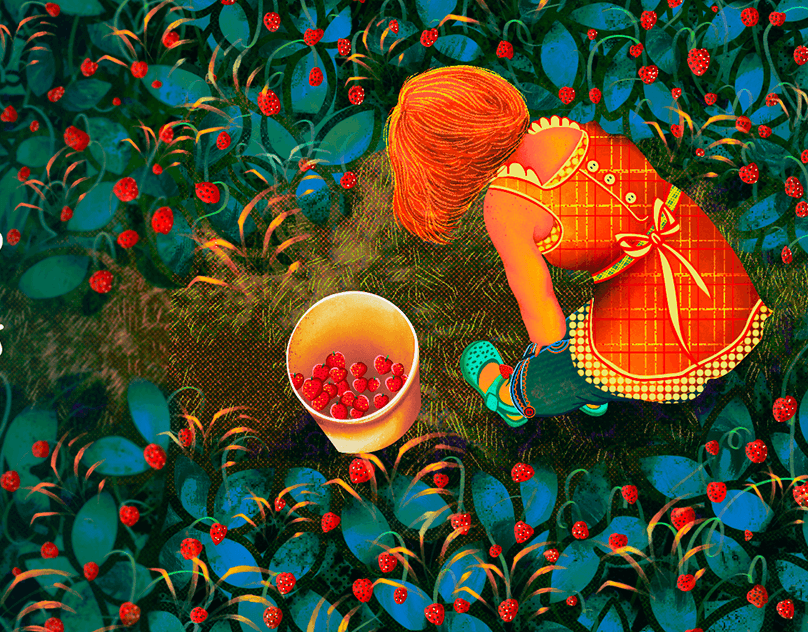
To face this challenge, we immersed ourselves in the colors, shapes and textures of the city of Beira. We developed packaging that honors the tradition and authenticity of Vanu jellies, reflecting the cultural richness of the region in a color palette inspired by the vibrant urban life of the city of Beira. For each flavor on the packaging, we chose to name a neighborhood in the city of Beira. For the strawberry flavor, we chose the 'Munhava' neighborhood; in the taste of Pineapple, we identify with the Ponta-Gea neighborhood; and in the blackberry flavor, we selected the Matacuane neighborhood, further connecting the products to the local community and celebrating its diversity. The result is packaging that not only highlights the exceptional flavors of Vanu jams, but also celebrates the culture and heritage of the city of Beira
To face this challenge, we immersed ourselves in the colors, shapes and textures of the city of Beira. We developed packaging that honors the tradition and authenticity of Vanu jellies, reflecting the cultural richness of the region in a color palette inspired by the vibrant urban life of the city of Beira. For each flavor on the packaging, we chose to name a neighborhood in the city of Beira. For the strawberry flavor, we chose the 'Munhava' neighborhood; in the taste of Pineapple, we identify with the Ponta-Gea neighborhood; and in the blackberry flavor, we selected the Matacuane neighborhood, further connecting the products to the local community and celebrating its diversity. The result is packaging that not only highlights the exceptional flavors of Vanu jams, but also celebrates the culture and heritage of the city of Beira
THE CHALLENGE
In the lush city of Beira, in Mozambique, the Vanu family kept a precious treasure: the exclusive recipe for their fruit jams, passed down with care through the generations. As Vanu's generation delighted in the unparalleled flavor of these jams, the desire to share this wealth with a wider audience grew. However, a monumental challenge loomed before them: how to create packaging that not only captured the unique essence of Vanu jams, but also conveyed the rich history and culture of the city of Beira? Our challenge was to create a label that not only conveyed the entire essence of the city of Beira, but also told the story behind each flavor, delving into local traditions and celebrating the multicultural heritage of this vibrant region.


