Sea of Des is a Unique, organic and simple typographic system. This system is a representation of alphabet letters, based on sound vibrations. This typographic system is inspired by Professor Des Laubscher. We then started with a typographic investigation to learn how to create a typeface while taking cues from the instruments, methods, and subtleties of the industry as well as Des himself. By defining the guidelines for our typeface, which is specifically influenced by the person, we created Sea of Des.

Our typography system was inspired by Prof. Desmond Laubscher, the co-founder of Greenside design center. He is an expert in various design fields, and he specialized in Interior Design. He is worldwide coordinator of design education and a lawmaker and the former president of the International Federation of Interior Architects/Designers (IFI). We were also fortunate enough to have an interview with Des himself to learn more about him and his interests. We decided to take Des’s love for music and the Beatles as our main inspiration for our Typography.

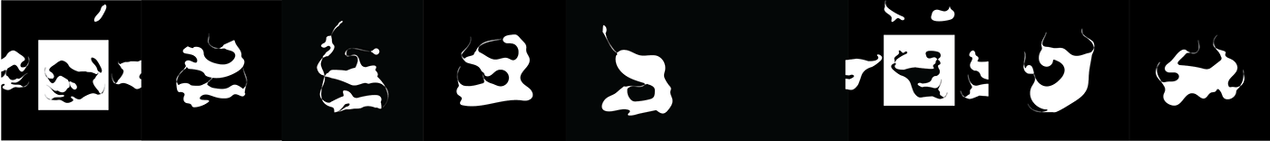
We focused on the vibration of sound and played a list of 26 songs through a speaker
with salt on it, to create interesting and organic shapes. These shapes form the basis of our typography, as we took them into the digital world and added them to a grid.


We then went and traced the various shapes to make a digital version we could work with. We also focused on the system of Notan to create more interesting shapes systems, that became our representation of letters. We also played on the names of some of The Beatles songs and that is where Sea of Des started.

With the use of shapes and a grid, we created a font family. The original organic shapes formed our small letters and then with the expansion of the square we created capital letters. We also went and warped the shapes to create the expansion version of our typeface. These two together form our final font family, titled Sea of Des.

We then went and asked Des to sort the list of songs we used, from his favorite to his least favorite. We then took his favorite songs and sorted the shapes according to the list. We then added the top 5 favorite songs to the vowels as they are the letters that are used the most. We then went further down the list adding the top songs to the letters that are used the most, and the least favorite songs we added to the letters that are least used.


Sea of des font family


Poster, Sea of des , Type-Professional , mockup


Documentary , About our Typeography inspired by Desmond Luabscher .