

About this font
MN Grissee Pro could be the right sans-serif typeface for your project! It has a charming and distinctive character in every shape. This versatile font is suitable for a variety of projects, whether you're going for a classic, grotesque, or heritage design. You have plenty of options to choose from in terms of weight, width, and italics. Plus, it offers excellent readability, making it a great choice for headlines and sub-headlines. Its unique character and range of options make it a standout choice for any project.
MN Grissee Pro could be the right sans-serif typeface for your project! It has a charming and distinctive character in every shape. This versatile font is suitable for a variety of projects, whether you're going for a classic, grotesque, or heritage design. You have plenty of options to choose from in terms of weight, width, and italics. Plus, it offers excellent readability, making it a great choice for headlines and sub-headlines. Its unique character and range of options make it a standout choice for any project.
The Story Behind MN Grissee Pro
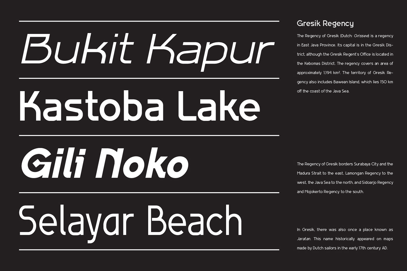
MN Grissee Pro is inspired by the beautiful colonial architecture in the Gresik region of Indonesia. We've taken this influence and turned it into a modern design that appeals to today's market. Instead of using traditional serif fonts, we've chosen Sans Serif as the base for our font.
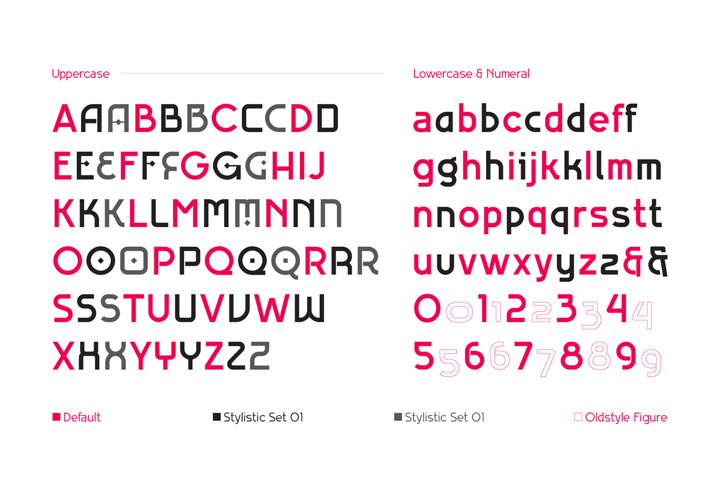
MN Grissee Pro font also inspired by the neo grotesk style and combined with a geometric style. This geometric shape is taken from the characteristics of 4 cultures in the city of Gresik, namely Arabic, Chinese, Javanese and Dutch. The name Grissee is also taken from what Dutch residents called the city of Gresik in the colonial era. These four cultures are displayed in alternates styles on this typeface.
MN Grissee Pro is inspired by the beautiful colonial architecture in the Gresik region of Indonesia. We've taken this influence and turned it into a modern design that appeals to today's market. Instead of using traditional serif fonts, we've chosen Sans Serif as the base for our font.
MN Grissee Pro font also inspired by the neo grotesk style and combined with a geometric style. This geometric shape is taken from the characteristics of 4 cultures in the city of Gresik, namely Arabic, Chinese, Javanese and Dutch. The name Grissee is also taken from what Dutch residents called the city of Gresik in the colonial era. These four cultures are displayed in alternates styles on this typeface.
Ideal for the following project styles
Heritage, Vintage, Classic, European, Grotesk, Experimental, Scandinavian, Industrial, Rustic, Mythology
Heritage, Vintage, Classic, European, Grotesk, Experimental, Scandinavian, Industrial, Rustic, Mythology


Type Design : Fredo Eka Pratama
Creative Director : Bagus Sudrajat
Graphic Design : Danang Mahardika Putra, Ahmad Zahroni Shofi
Case Study : Herodeco, Zedd Kemas
Motion Design : Daniel Eka Wijaya, Fredo Eka Pratama

Don't miss the opportunity to get this font at
|
we also available on


