Cliente: LISA | Serviço: Identidade Visual | Responsável: Innovizion Design | Motion: BeBrands | Ano: 2024
Br
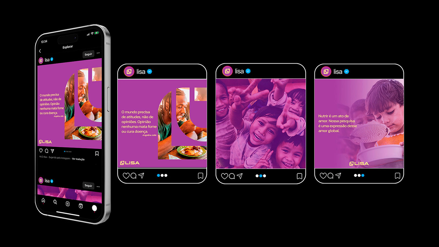
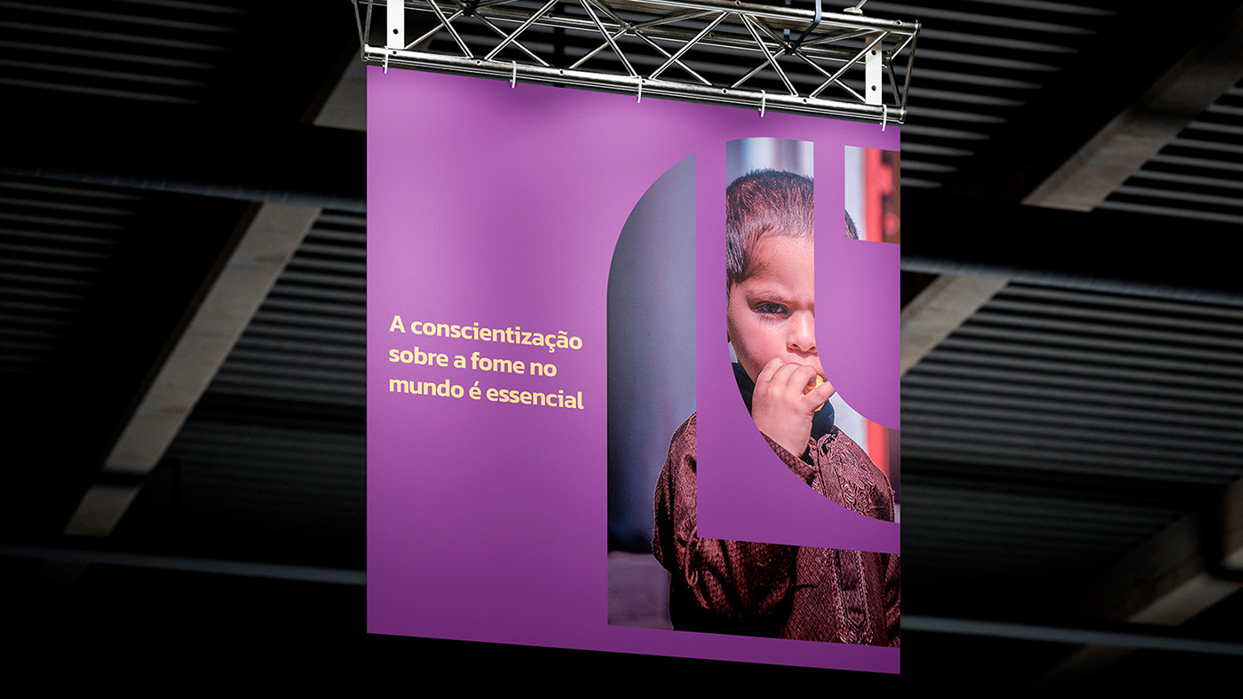
O Laboratório de Inteligência em Segurança Alimentar nasceu com o objetivo de realizar pesquisas relacionadas a fome e segurança alimentar no Brasil.
Um dos seus principais objetivos com os estudos é analisar as iniciativas globais das corporações que promovem ações voltadas à segurança alimentar.
Us
The Food Security Intelligence Laboratory was created with the aim of carrying out research related to hunger and food security in Brazil.
One of its main objectives with the studies is to analyze the global initiatives of corporations that promote actions aimed at food security.
Br
A identidade visual da LISA foi pensada com o intuito trazer unicidade a marca, indo ao oposto das demais marcas do setor da educação que utilizam elementos do segmento em sua construção visual, como capelo, lápis, cérebro, livro, etc.
O símbolo foi desenvolvido tendo como referência uma folha para simbolizar crescimento, vitalidade e renascimento, atributos que se fazem presentes na marca.
Us
LISA's visual identity was designed with the aim of bringing uniqueness to the brand, going against other brands in the education sector that use elements from the segment in their visual construction, such as cap, pencil, brain, book, etc.
The symbol was developed with a leaf as a reference to symbolize growth, vitality and rebirth, attributes that are present in the brand.


Br
A cor roxa predominate foi escolhida para representar calma, respeito e sabedoria, já a cor roxa em tom mais claro surge como cor de apoio nas aplicações da marca e que carrega o mesmo significado.
A cor bege escolhida como cor secundária, enfatiza os atributos de calma, serenidade e confiança que somada as cores principais da marca auxiliam no objetivo de tornar a marca mais amigável ao público que irá vê-la.
Us
The predominant purple color was chosen to represent calmness, respect and wisdom, while the lighter purple color appears as a supporting color in the brand's applications and carries the same meaning.
The beige color chosen as a secondary color emphasizes the attributes of calmness, serenity and confidence that, when added to the brand's main colors, help with the objective of making the brand more friendly to the public that will see it.

Br
A tipografia foi modificada exclusivamente para a marca, tornando-a única e totalmente singular.
A fonte do nome expressa clareza e personalidade, proporcionando acolhimento e credibilidadel. Representa uma marca moderna com atenção em cada detalhe.
Por tratar-se de uma faixa-etária ampla, foi levado em consideração a facilidade de leitura por parte dos usuários, bem como o aspecto de segurança que a composição como um todo transmite sem perder a empatia de um laboratório que preza por ser amigável com o público.
E para dar auxílio a marca em suas aplicações tipográficas, foram escolhidas duas variações da família Kanit que são elas, Kanit Semi Bold para títulos e Kanit Regular para os demais textos.
Us
The typography was modified exclusively for the brand, making it unique and completely unique.
The font of the name expresses clarity and personality, providing welcome and credibility. It represents a modern brand with attention to every detail.
As this is a wide age range, ease of reading for users was taken into account, as well as the safety aspect that the composition as a whole conveys without losing the empathy of a laboratory that values being friendly to the public.
And to help the brand with its typographic applications, two variations of the Kanit family were chosen: Kanit Semi Bold for titles and Kanit Regular for other texts.