Movie Theatre Check-in App
#app design

Context
I completed the design while obtaining the Google UX Design Professional Certificate.
I've chosen a movie theatre check-in app as a prompt via Sharpen, and it took me one month of passionate work to complete the project.
Below, I uncover main steps 🧭 and a few considerations regarding app's further development.
p.s. some steps include extra data, that you can check out on the project's Miro board. You may find the board at the end of this case study.
Respective steps marked with #seemiro🪞.
Challenge & Solution
I wanted to create an app design that would work for a movie theatre of any business model - from a single cinema operator, to a movie theatre network.
I elaborated a brand name, "Movix", and logo for better sense of a final product.*
#seemiro🪞
*the name was added for the sake of the app's presenting purposes solely; this is not a registered trademark and any similarity with names of existing apps or other services is purely coincidental

Ideation
Empathy interviews with users
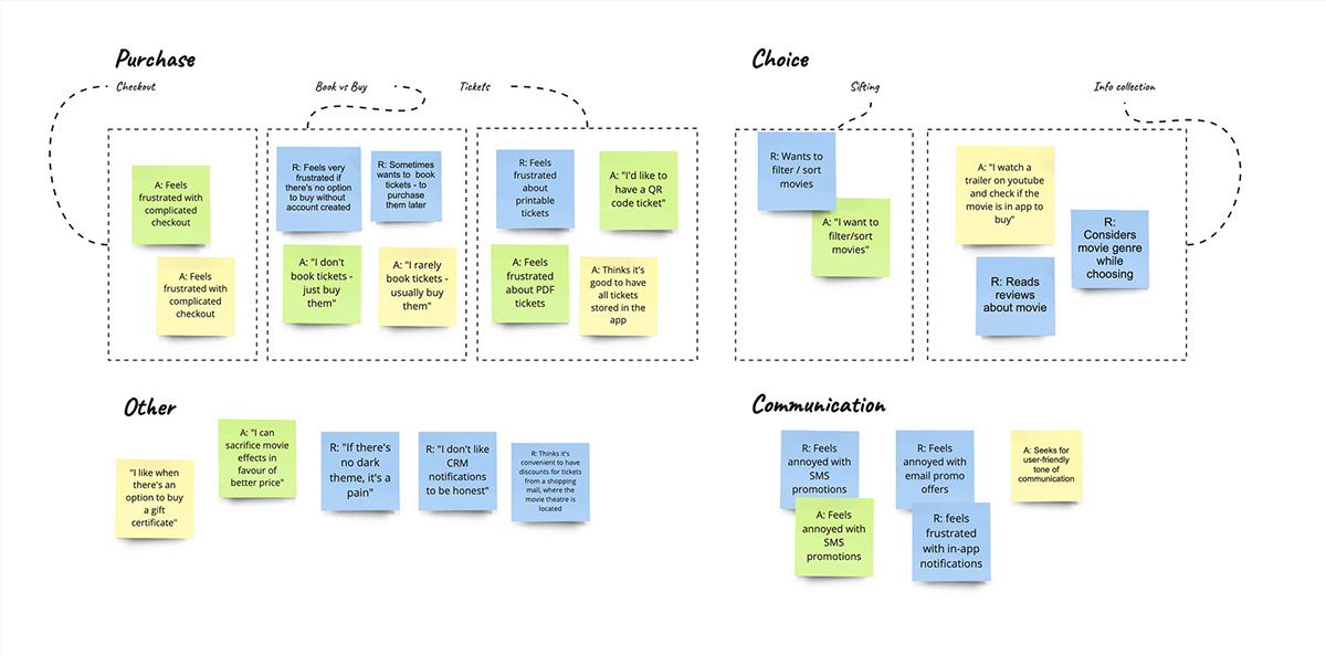
To kickstart the design, I managed to organise three in-person interviews and created an affinity diagram. #seemiro🪞
I was interested in peoples' feelings & thoughts about visiting a movie theatre 🤔 and I wanted to collect wants & pains regarding aspects of the movie theatre app.
Based on users' answers, I identified a few themes to consider further.


User persona
For this project I decided to focus on a single user persona.
The portrait of the app's target user helped me during further considerations about app's features' expediency.

Competitors
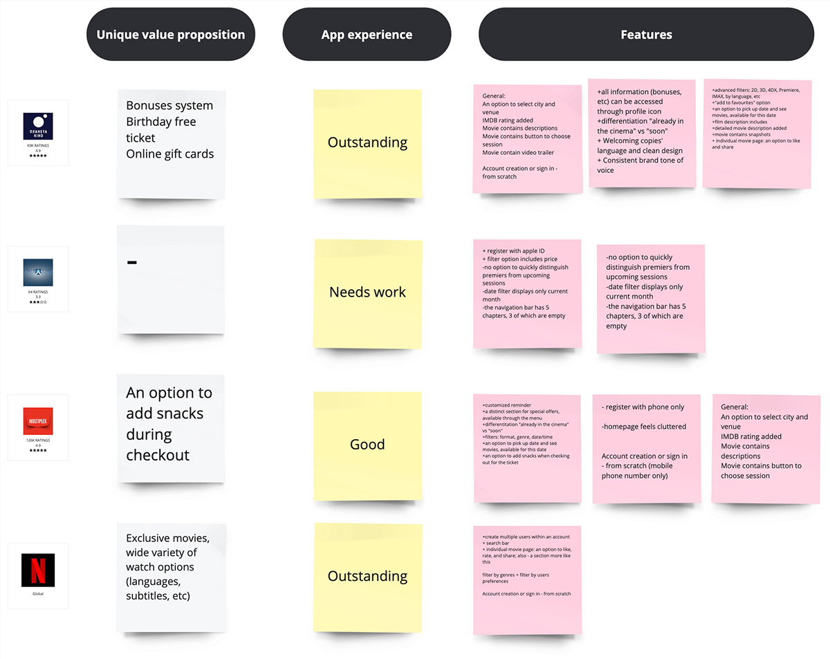
I explored three direct competitors' apps on the Ukrainian market plus Netflix. The goal was to find common attributes, cool handy features, and gaps if any. #seemiro🪞

Brainstorming
With data at hand, I've tackled brainstorming. To evaluate the features' feasibility, I've used a "sifter" questions:
would the feature be expected to be in place by a user?
would it bring UX benefits?
would it differentiate my app from competing ones?
There were a lot of ideas, so I grouped them into 3 packs - with an idea of versions in mind. For this project, I took the MVP's version into work (yellow).


User flow
After completing the ideation phase of my design process, I proceeded with Information Architecture, User Journey, and a User Flow diagram. #seemiro🪞

Paper wireframes
To scope the project, I concentrated on a single part of the user flow (see above 👆) and started design with paper wireframes.
I created up to five alternatives for every screen. Those sketches that seemed most beneficial got their digital representation.


Lo-Fi prototype & Usability tests
It took me several iterations to finalise the low-fidelity prototype.
I agreed on usability testing with four participants, and they provided priceless feedback.
For example, two out of four users said they wanted quick access to their purchased tickets. So, I decided to add the carousel for the closest tickets on the home screen.

Visual
With "vintage" and "quieted" words in mind, I started to seek inspiration from old cinematography aesthetics.
As movies would be top attention in the app, I also wanted to provide enough negative space.
To keep a user's eye on movie posters, headings, and action buttons, I looked for gentle and healing colours.
Moodboard

Palette
These considerations resulted in a muted colours palette, with variations of black and white. The red colour was only used for tiny accents - so as not to cause discomfort for people with visual impairment.

Typography
For typography, I chose Rubik and EB Garamond.
A combination of sans-serif and serif typefaces was aimed to contribute to the visual style yet sustain readability. To bring the app modern and casual look, I used lower case letters for headings and tags.
Mockups


I've created seven high-fidelity app screens.
The process took three iterations with two usability tests. Users' feedback gave ground for improvements.
For example, the "Upcoming tickets" section on home screen happen to be confusing in terms of interaction. So I've manage to re-design it.

Hi-Fi prototype
Please, contact me for a Figma's prototype link on savelieva.yuliia@gmail.com
Further considerations
The project doesn't stop at this point. Below are just a few thoughts regarding next steps in the design:
1. Empathy interviews showed that users had different preferences regarding themes. So, it's worth to add light/dark themes for better accessibility.
2. An important flow to design - an option to purchase tickets without the account created.
3. Depending on business needs, it may be worth to implement personalisation. For example, to display customised offers, discount coupons, and/or loyalty card on the home screen.
Miro Board #seemiro🪞
Table of contents:
1. App Name
Brainstorming notes for app name creation
2. Affinity Diagram & Empathy Maps & User Persona
Notes from in-person interviews + a proto User Persona, compiled based on notes
3. IA & User flow
App's Information Architecture and User Flow chart
4. Competitor Research
Common things, opportunities/UX features, gaps
5. App's features brainstorming
Features to include in app; prioritised by versions - MVP (P0), P1 - 2nd priority, P2 - 3d priority

