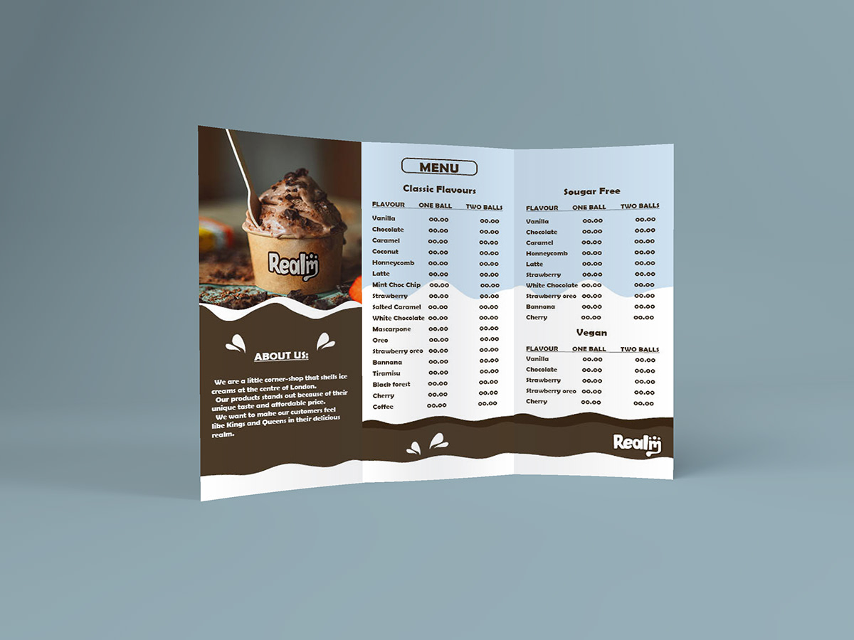
Realm ice-cream (logo and tri-fold brochure)
We are a little corner-shop that shells ice creams at the centre of London.
Our products stands out because of their unique taste and affordable price.
We want to make our customers feel like Kings and Queens in their delicious realm.
Our products stands out because of their unique taste and affordable price.
We want to make our customers feel like Kings and Queens in their delicious realm.

The main idea behind the logo was within the name of the logo to convey the purpose of the business. There is an ice cream inside a and the m ends as melting ice cream that underlines the name and in conjunction with the dots on top shows the sense of a crown.