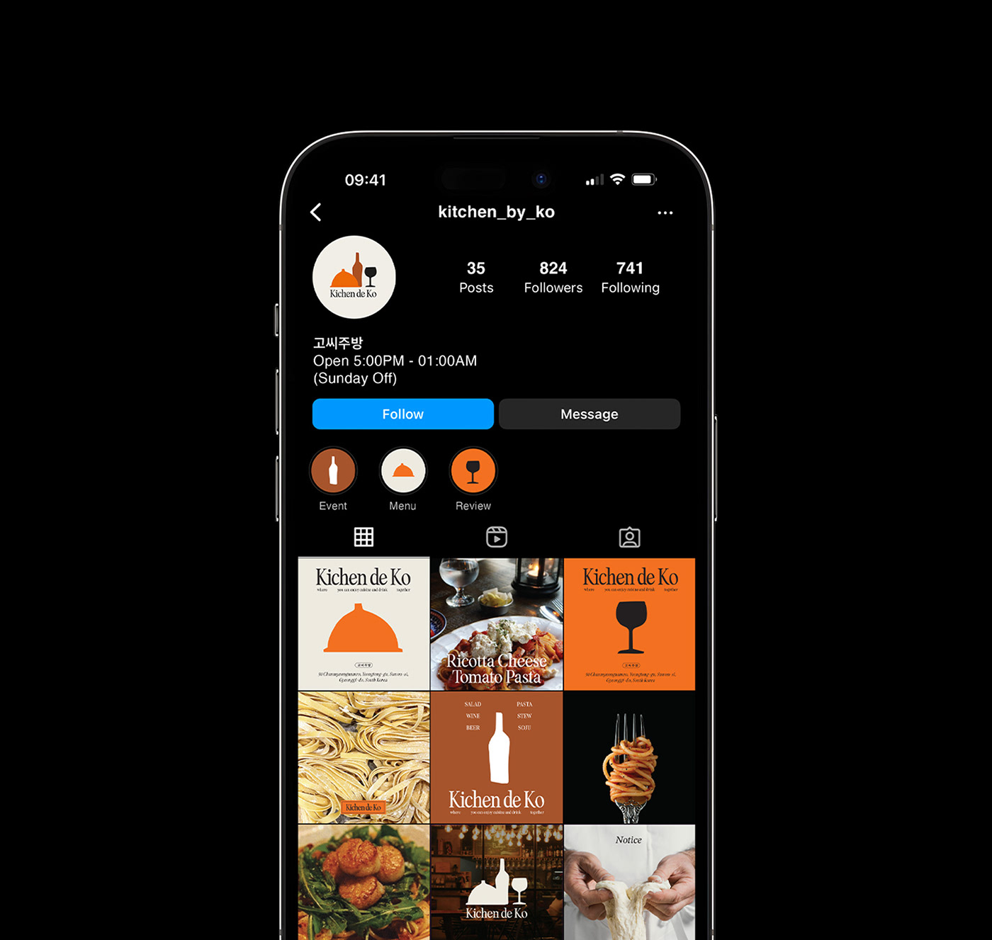
Client : Kichen de ko
Date : Aug 2022
Kichen de Ko is an Italian fusion restaurant located in Korea, specializing in reimagined Korean-style pasta dishes complemented by a diverse wine list. The intentional omission of 't' in the English spelling aligns the pronunciation with the Korean style, while the French preposition 'de' and the Korean surname 'Ko' are combined to infuse European flavors into the restaurant's Korean fusion identity.
The logo artistically overlaps the silhouettes of a food cloche and wine elements to symbolize the joyous experience of food and drink, employing a warm and vibrant orange paired with sophisticated shades of brown and black for a minimalist design.