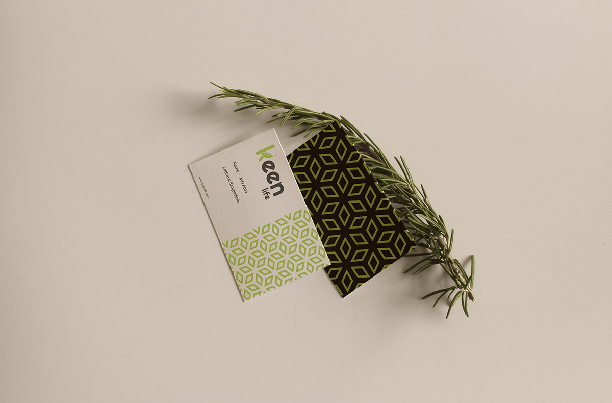
Pattern

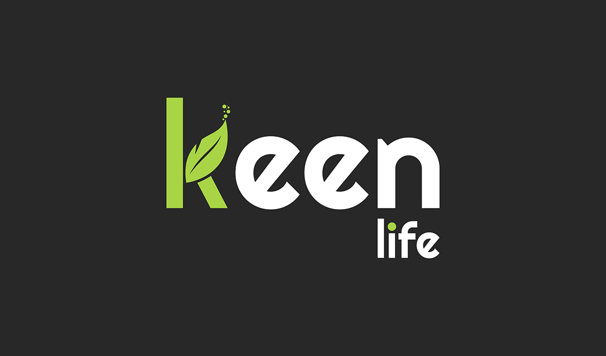
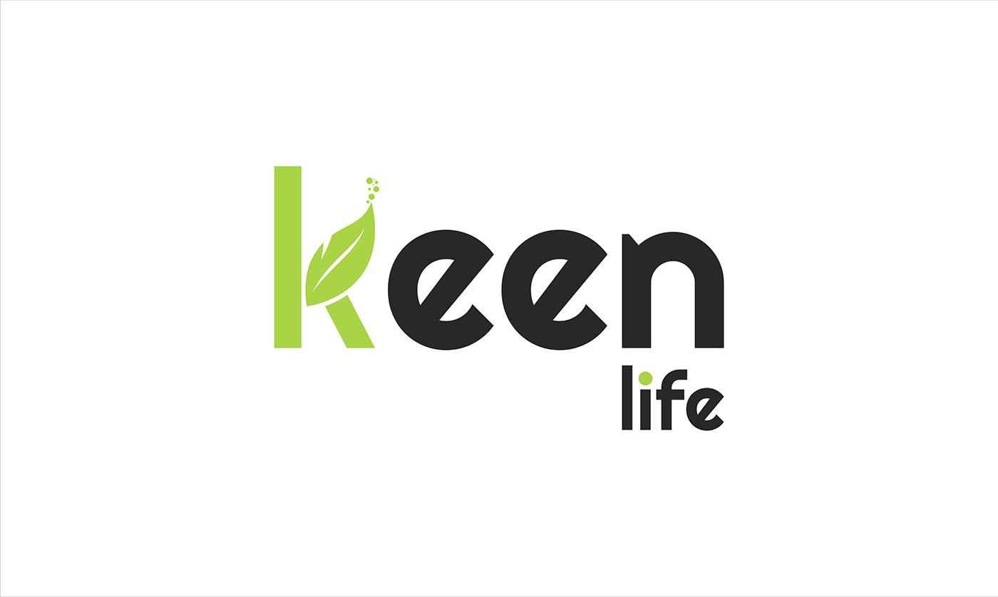
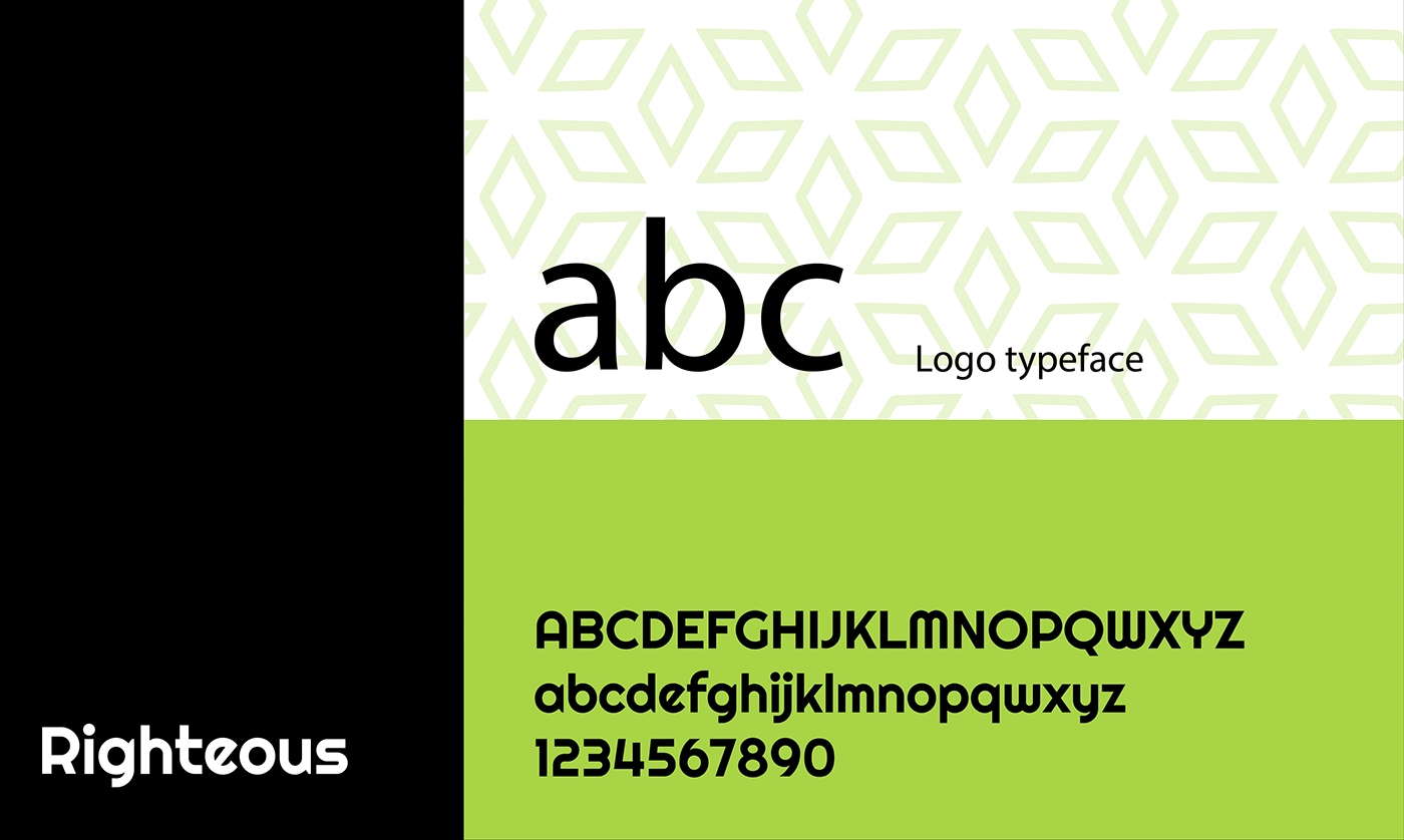
Logo Typeface
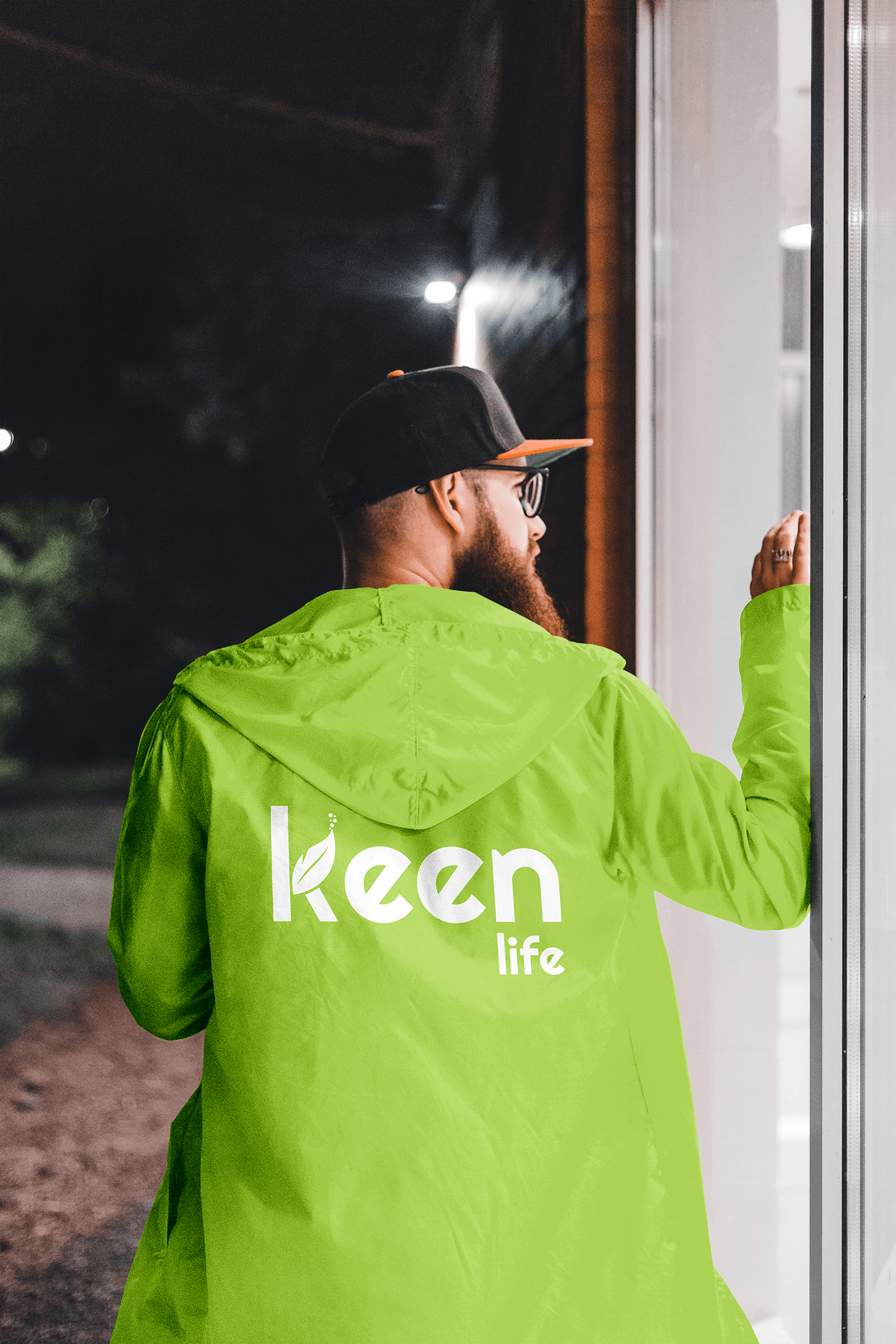
Brand Identity:
Concept:
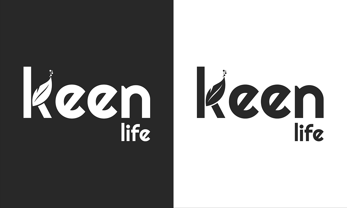
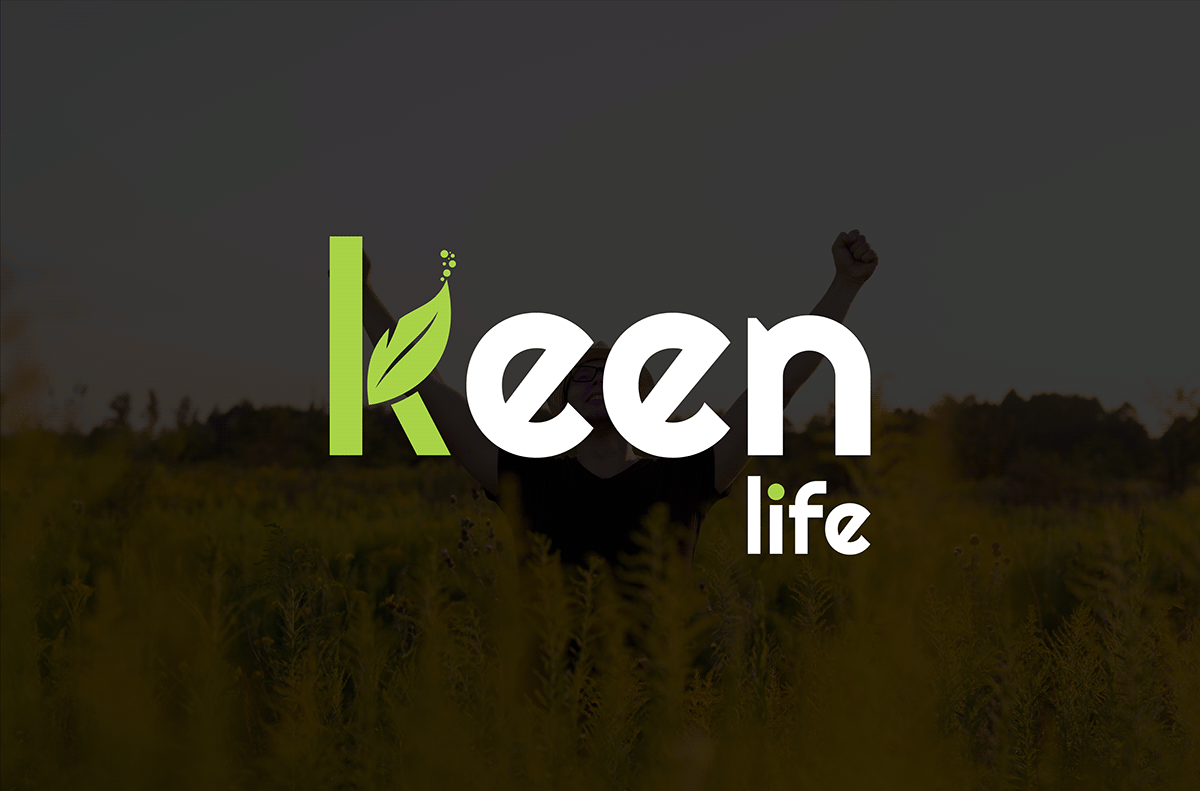
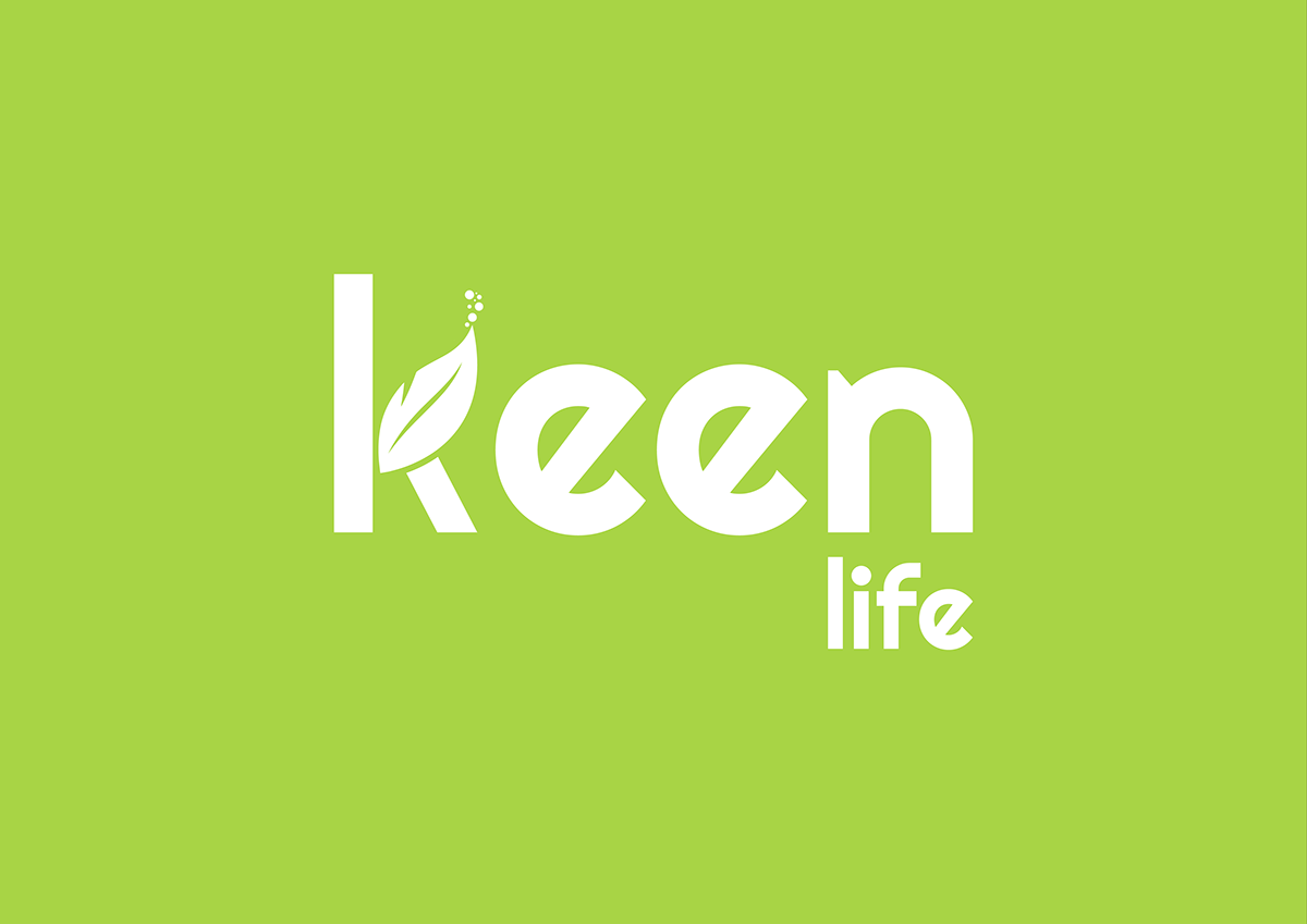
The Keen Life logo seamlessly blends the letters "K" and a leaf to form a cohesive symbol that represents growth, vitality, and a
commitment to health and well-being.
The Keen Life logo seamlessly blends the letters "K" and a leaf to form a cohesive symbol that represents growth, vitality, and a
commitment to health and well-being.
Color Palette:
Primary Color: Green
A refreshing and vibrant green shade signifies health, harmony, and the flourishing nature of a wellness-focused life.
Primary Color: Green
A refreshing and vibrant green shade signifies health, harmony, and the flourishing nature of a wellness-focused life.
Typography:
Font: Quicksand
A modern and clean font that complements the simplicity and sophistication of the logo design.
Font: Quicksand
A modern and clean font that complements the simplicity and sophistication of the logo design.
Logo Design:
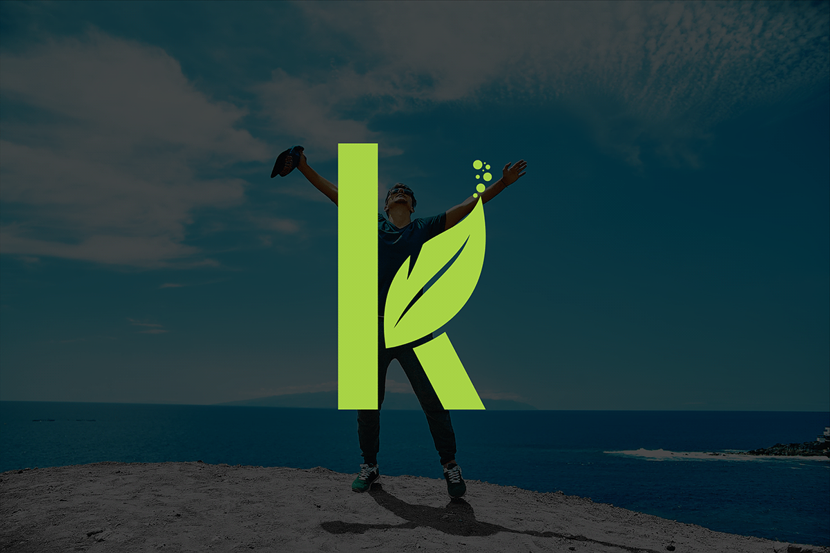
Icon:
A stylized combination of the letter "K" and a delicate leaf, forming a harmonious and visually appealing symbol.
Text:
"Keen Life" in a sleek and legible lowercase font, maintaining a modern and approachable feel.
Icon:
A stylized combination of the letter "K" and a delicate leaf, forming a harmonious and visually appealing symbol.
Text:
"Keen Life" in a sleek and legible lowercase font, maintaining a modern and approachable feel.
Style:
Sleek and Minimalistic:
The logo exudes simplicity, ensuring easy recognition and scalability across various applications.
Balanced Composition:
The combination of the "K" and leaf creates a balanced and cohesive design, reflecting the harmony associated with a healthy lifestyle.
Sleek and Minimalistic:
The logo exudes simplicity, ensuring easy recognition and scalability across various applications.
Balanced Composition:
The combination of the "K" and leaf creates a balanced and cohesive design, reflecting the harmony associated with a healthy lifestyle.