


Typography in Motion
This project intertwines typography and motion, encapsulating our experience at Greenside Design Center through
kinetic typography animations. Inspired by emotive prompts, we designed three captivating animations for
the letters G, D, and C, each creating a narrative that reflects our unique experiences. Collaborating with a partner,
we merged our narratives to create one unified story conveyed through kinetic typography.


G - Rhythmic
Once transitioning from a state of unpredictability, we’ve settled into a rhythmic pace, which brings stability and predictability to our experience. Finding this rhythm stimulates our creativity, allowing it to flow effortlessly like water, it feels like music. We pace ourselves accordingly, finding comfort in structure, which gives us a sense of rhythm.
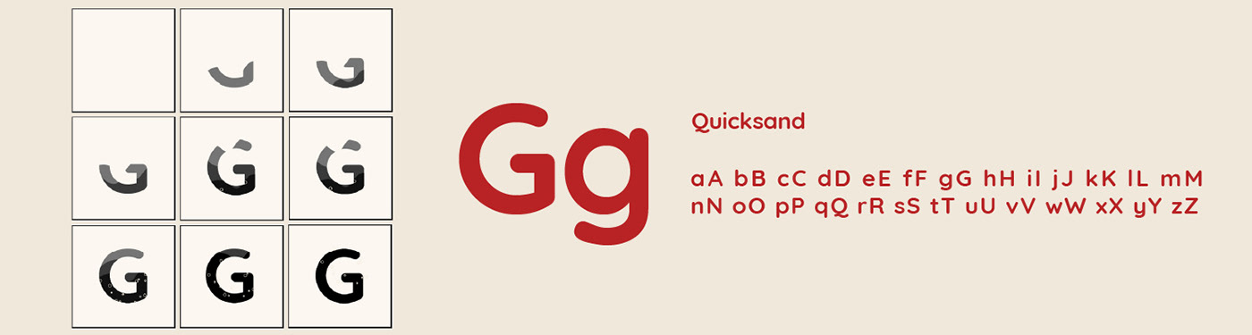
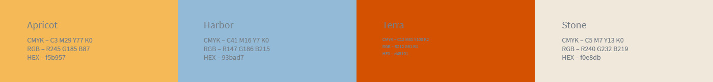
In brainstorming, words like flow, music, pace, structure, and energy guided our vision. We aimed for a design characterised by curves and repetition. We depicted this concept through the letter G for its flowing form, using Quicksand for its balanced proportions and rounded strokes, depicting both structure and fluidity. We opted for an analogous colour palette white evokes a sense of nature. Waves filling the letter represent structure and movement, reflecting both of our interpretations.


D - Bold
We both needed to be bold and brave to study and manage life congruently. Initially daunting, the path to
stability and security required us to embody boldness in different ways. For us, boldness emerges
when there’s stability, security, confidence and authentic self-expression.
stability and security required us to embody boldness in different ways. For us, boldness emerges
when there’s stability, security, confidence and authentic self-expression.
We opted to represent this prompt through the letter “D” due to its inherently bold and angular nature. We chose
the font Futura PT Bold for its thick weight, which evokes a sense of strength and confidence, while its
balanced proportions seamlessly match the inflated bowl of the letter “D” within the animation. The chosen colour
pallet uses analogous and complementary colours, creating a striking contrast. The confident expansion
of each D and vibrant colours capture both of our interpretations of the prompt.


C - Erratic
Reflecting on our experiences at GDC and life in general, unpredictability and irregularity seem to be common
themes. This term encapsulates the busy, unpredictable and occasionally overwhelming nature of our
transition into GDC. Yet amidst the chaos, there exists a playful and dynamic energy that infuses our experiences
with excitement and flexibility.
themes. This term encapsulates the busy, unpredictable and occasionally overwhelming nature of our
transition into GDC. Yet amidst the chaos, there exists a playful and dynamic energy that infuses our experiences
with excitement and flexibility.
The letter C was selected for this prompt due to its rounded and curved forms, lending itself to unpredictable and variable strokes and patterns. We selected the font Responder P Bold, as its organic shapes and curves mimic the irregular movement of a deflating balloon, aligning with our concept. The colour pallet blends vibrant oranges and yellows with a calming blue, visually representing the unpredictable nature of the prompt.


Thank You


