


SPRING WAVE
忠泰樂生活 春季主視覺設計 | NOKE Spring Season Key Visual Design
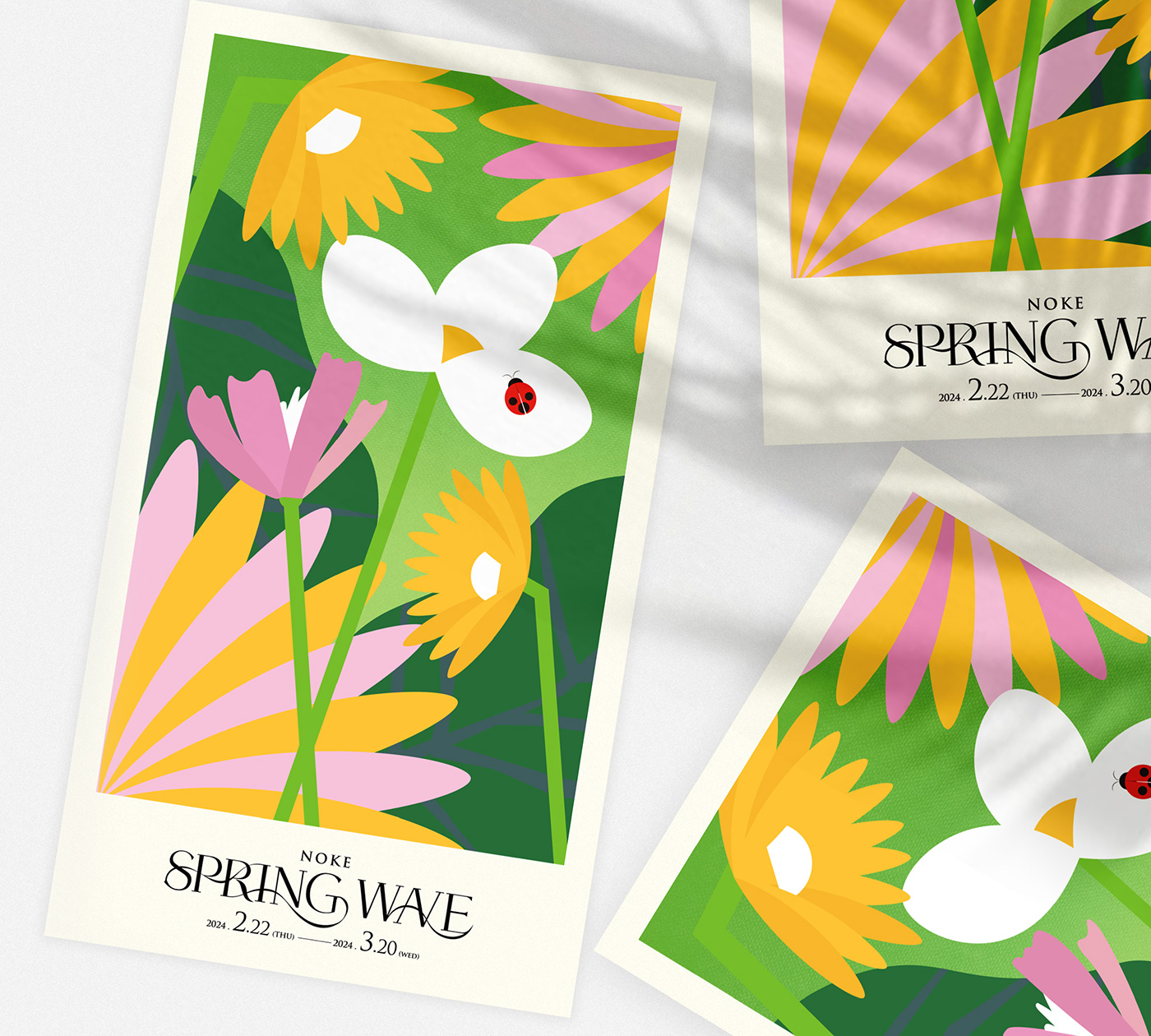
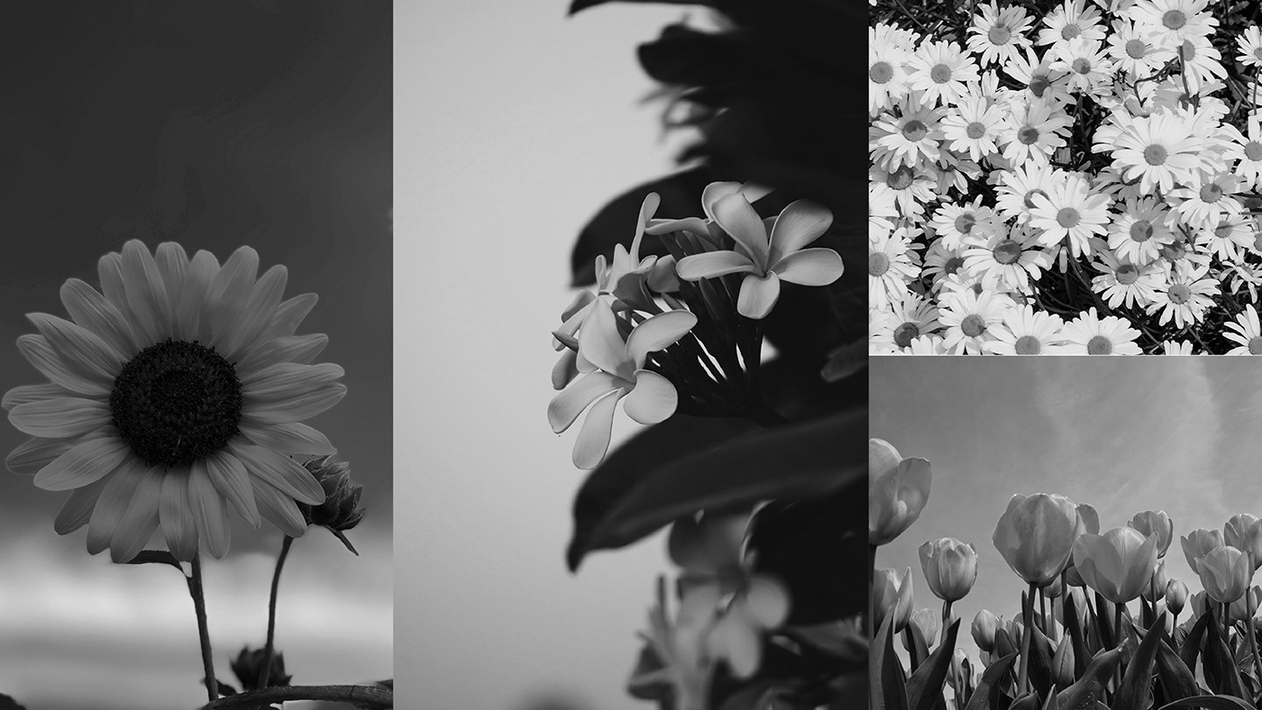
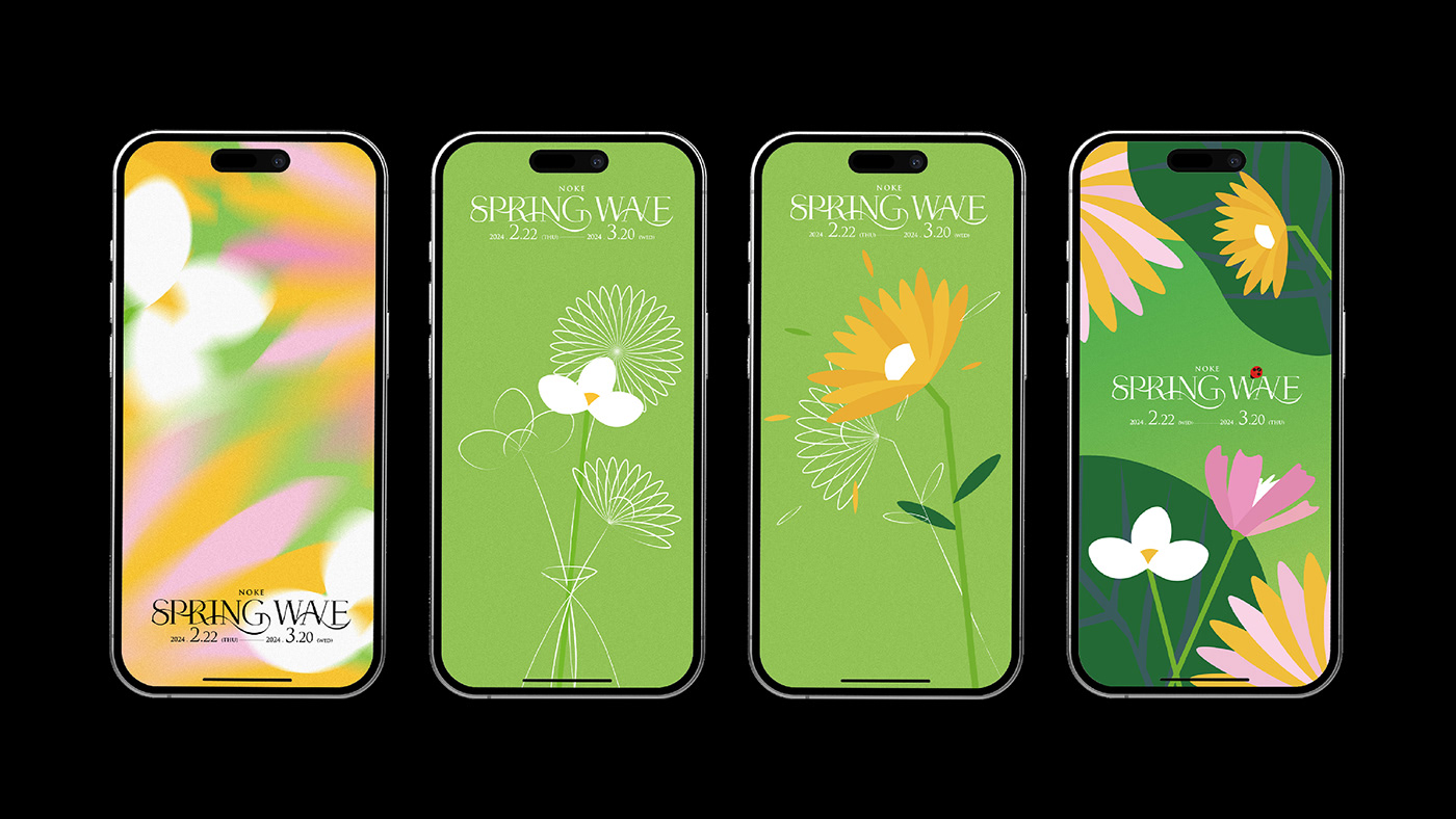
NOKE忠泰樂生活是一間座落於台北大直的新商場,本次春季檔期的主題名稱為“春波搖曳”。 我們以花叢一隅來作為設計發想,透過不同層次的綠色(深色、淺色、漸層、螢光)來堆疊建構出對春天的想像, 選用色系較柔和的花朵作為畫面主體,底部再以熱帶闊葉植物作為襯飾。 我們以扁平化的插畫風格來繪制畫面中的元素,去除過多複雜的線條,藉此來呼應這棟建築本身俐落的線條及其優雅。
The main key visual design for the spring season at NOKE mall, located in Taipei Da-Zhi district, is named "Spring Wave."We drew inspiration from a corner of a flower garden, utilizing various shades of green (dark, light, gradient, fluorescent) to create an imaginative representation of spring. Soft-toned flowers are chosen as the focal point, while tropical foliage adorns the bottom. Utilizing a flat illustration style,
we simplified the elements, remove excessive details, to emphasize the clean lines and elegance of the building itself.
we simplified the elements, remove excessive details, to emphasize the clean lines and elegance of the building itself.


Art Director | 孫守維 Shou-Wei Sun
Visual Design | 孫守維 Shou-Wei Sun / 高宇廷 Yu-Ting Kao / 陳姜芮 Joy Chen
Logotype | 高宇廷 Yu-Ting Kao
Client | NOKE 忠泰樂生活
Date | 2024.01


