
Sister Settings: Logo Concept
For this project, I created a logo for a collaborated event with English Literature students for Anne Arundel Community College.
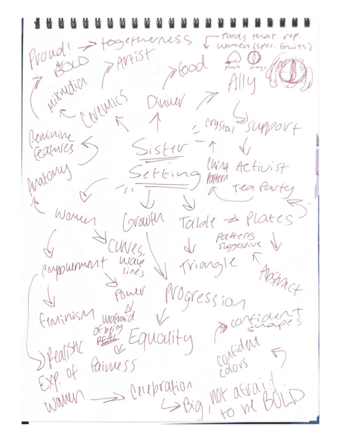
I began with a mood board and mind map for this project; the goal of this exhibit is to celebrate and recognize under-recognized women. I began with the title of the exhibit itself and branched out from there.


I wanted to include the message of Sister Setting through subtle symbolism in my logo. I really liked the idea of using fruit in the logo so I included a couple designs with fruit. I wanted to incorporate beautiful ferns or leaves with the fruit. I was not happy with the shape of the logo itself so I went back and revised my design on the left.
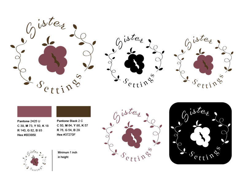
This is my final concept logo for Sister Settings, I am a lot happier with the composition. The shape will flow well on brochures, websites, etc. I selected the typefaces "Gautreaux" and "Meno Banner" because of the elegant and feminine feel which match the energy of this meaningful exhibit.


Working on the color concepts was my favorite part of this project. The color expectations were to match with the ones in the exhibit. I selected colors that would be readable from a distance as it is going to be used for advertisements like posters.

This is my final logo with different color variations. This project involved creating a research file, crafting a brand concept and designs, demonstrating design elements, developing a unique brand mark, applying typography and color solutions effectively, and considering cross-media applicability.

