INTRODUCTION
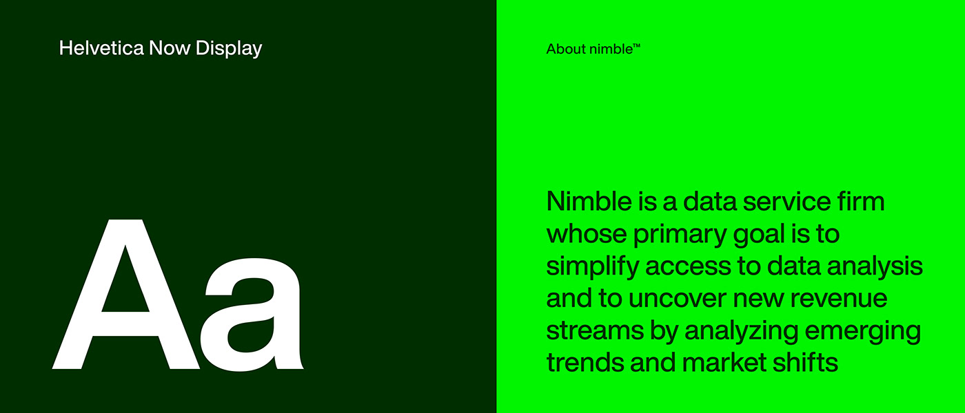
Nimble is a data service firm whose primary goal is to simplify access to data analysis thereby uncovering new revenue streams and real opportunities for Business growth by monitoring trends and market shifts.
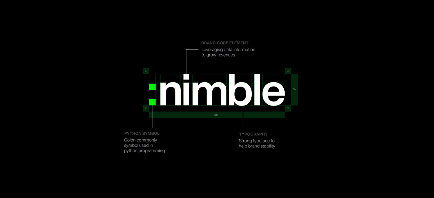
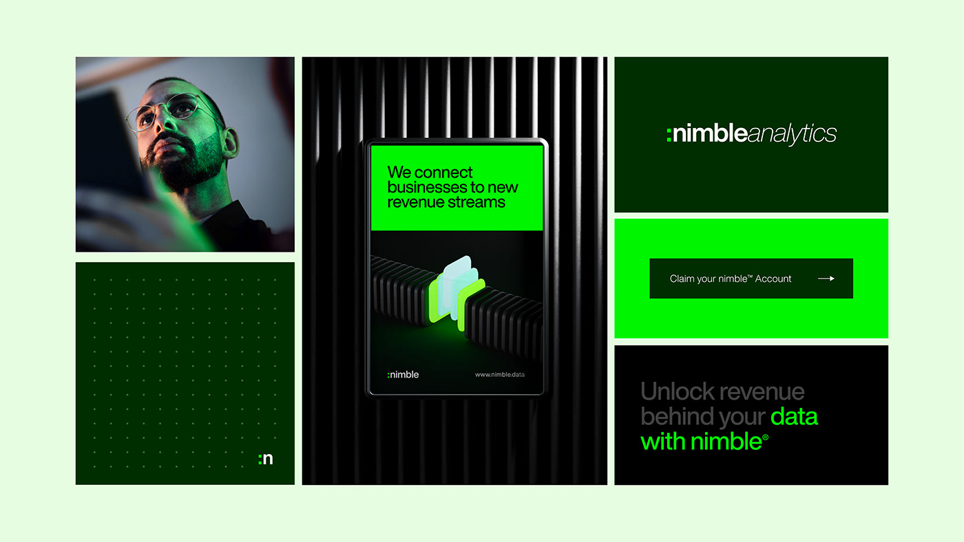
Nimble's brand essence is encapsulated in its wordmark. The simplicity of the typography is intentional, reflecting the brand's commitment to simplifying the complexities of data analysis. The colon sign is a symbol regularly used in python programming which reinforces the holistic data focused approach, Nimble takes in transforming raw data into actionable insights.

COLOR RATIONALE
The choice of a green and dark green palette for Nimble serves multiple purposes, aligning with the brand's values, mission, and the fruitful emotions it seeks to evoke.
The color positioning was chosen to symbolize growth, trust, and innovation considering most data service firm don't occupy this color spectrum. This aligns with the brand's mission to simplify data and ignite new revenue streams.


3d BRAND ASSETS
The integration of 3D assets into Nimble's visual language adds a layer of sophistication. These assets not only symbolize the multi-faceted nature of data but also hint at the depth Nimble goes to provide quality insights. The strategic placement of these assets across branding materials reinforces the brand's commitment to innovative data analysis and generate new revenue streams