

Planning events, even the smallest one, can be stressful.
The last time I wanted to plan a small birthday party for my younger brother, getting a cake vendor alone was a hassle.
Let's not even talk about when my friend was planning her wedding. The frustration she experienced just to secure a venue! Phew!
Thinking about all this recently, I wondered, "What if there was a platform that could make event planning easy and fun? How would it look like? How would it sound like?"
I decided to explore the idea, starting with a brand strategy, then a visual Identity design and some content materials for marketing.
I usually work on fun projects alone but this time around, I assembled some avengers or should I say, I called on other benders... Lol!
I must say, this project tested my team working skills, my project management skills and my patience. Kudos to project managers merhn!
After so much planning and plotting, however, we successfully created a beautiful and goofy brand that I'm sure you'd patronize if it was real.
Now, let's start from where it all began!
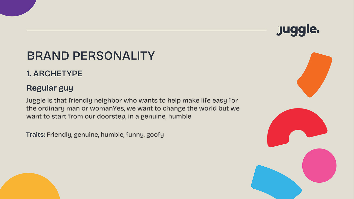
The first question that needed to be answered was, "What at all does Juggle do?"
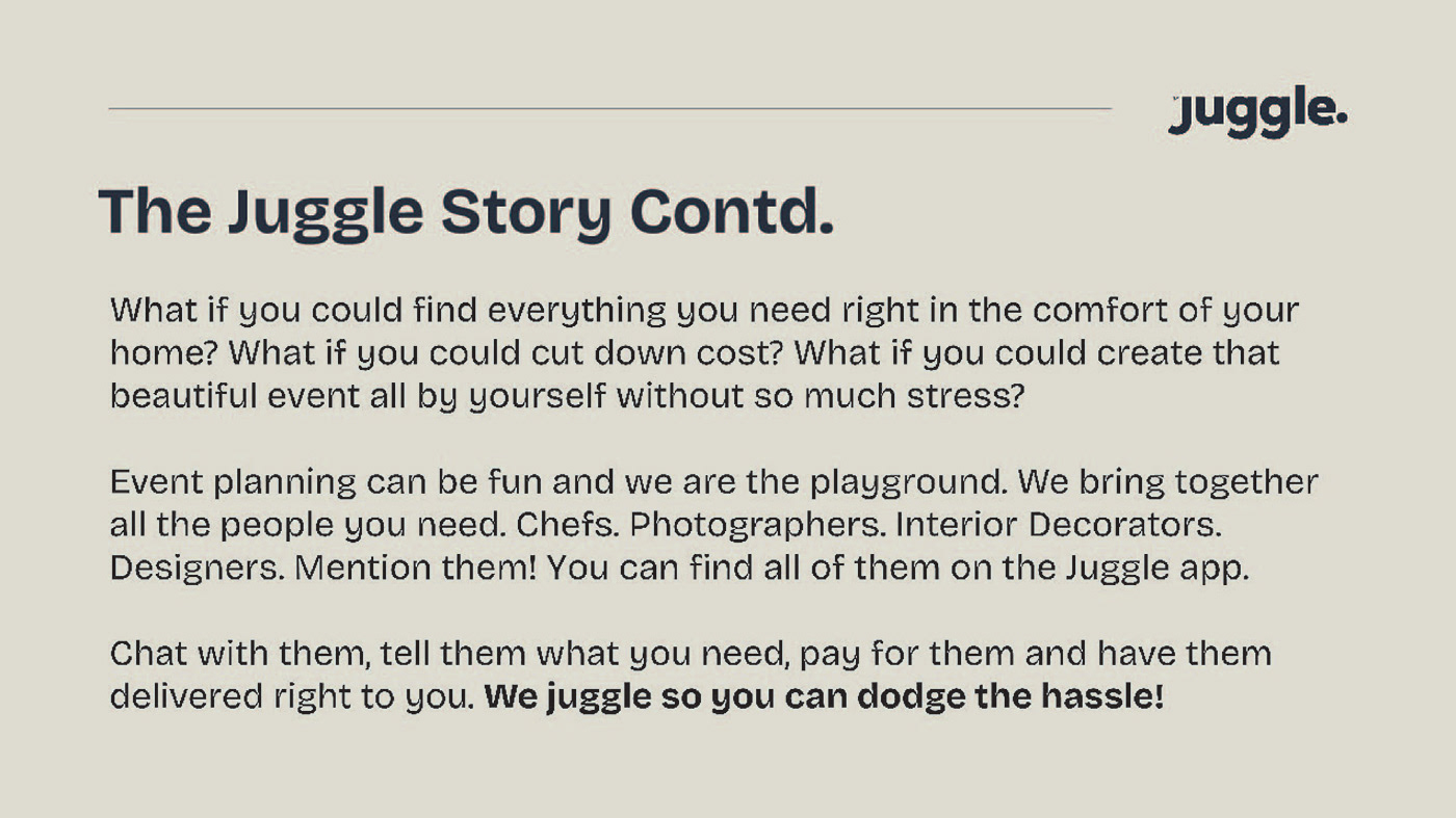
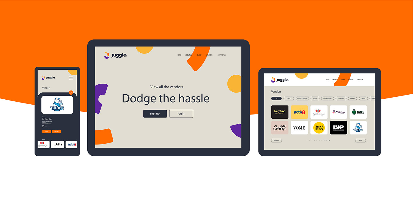
Juggle brings together all the people you need to create a successful event in an easy and fun way. Chefs. Photographers. Interior Decorators. Designers. Mention them!
You can find all of them on the Juggle app. Chat with them, get a 360 view of event centers and other products, pay and have access to all you need.
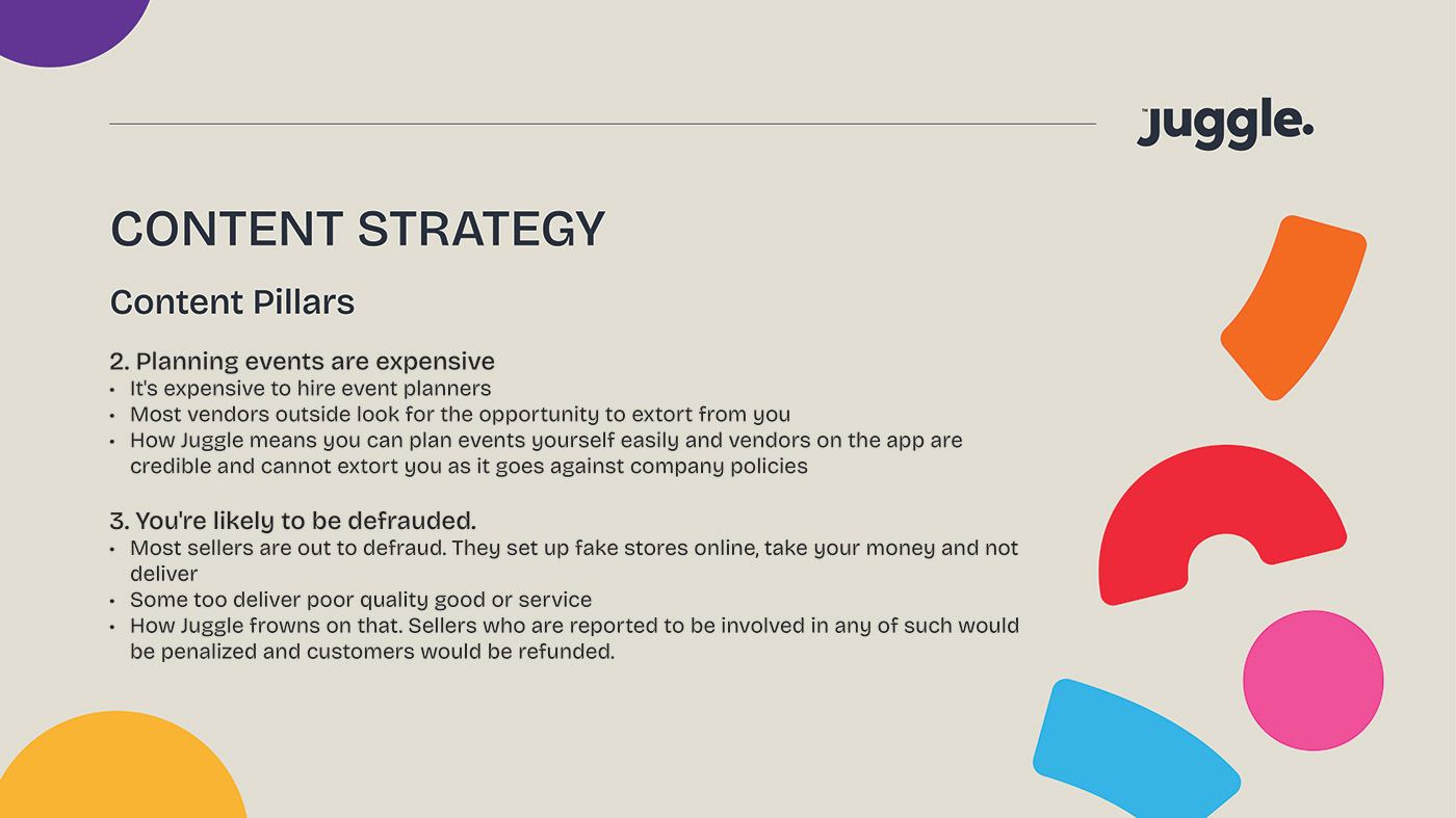
Juggle tackles 3 main issues:
1. The stress that comes with roaming about or asking people if they know any reliable vendors.
2. The frustration that comes with working with unreliable vendors who do not show up on time or perform poorly.
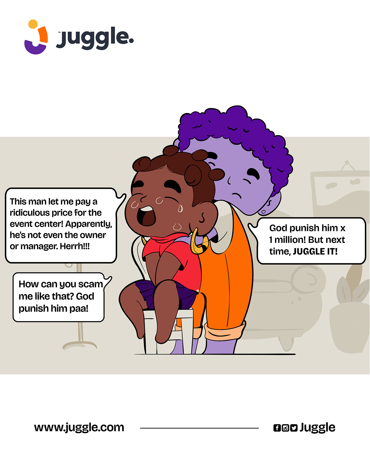
3. Issues of defrauding where people pay for items or services and do not receive it or are tricked into paying the wrong person.
Juggle does thorough background checks to ensure that every vendor on the app is legit.
There's also a review system that makes it easy for customers to leave review or share their complaints and have them addressed with urgency.
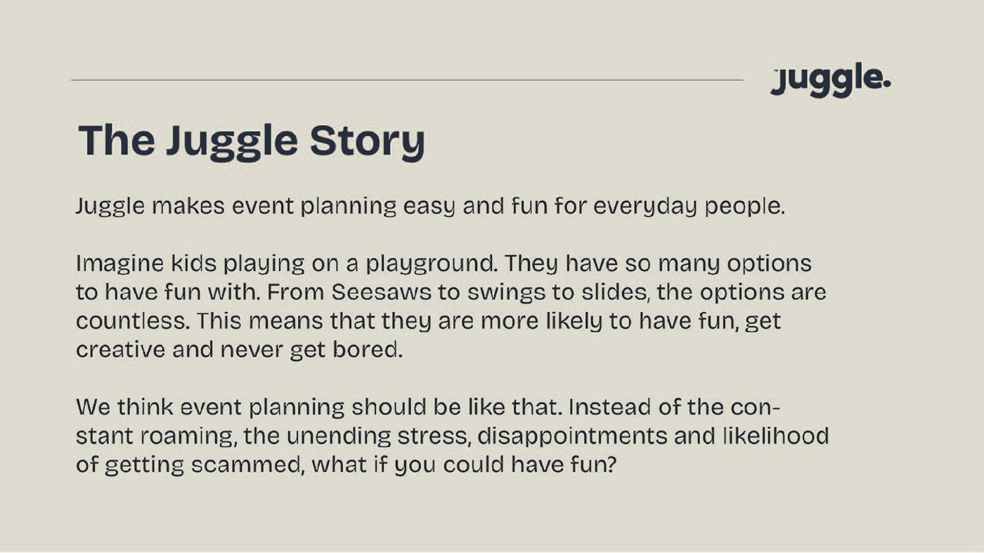
To set the tone for the strategy, I wrote a story to capture the heart of the brand.
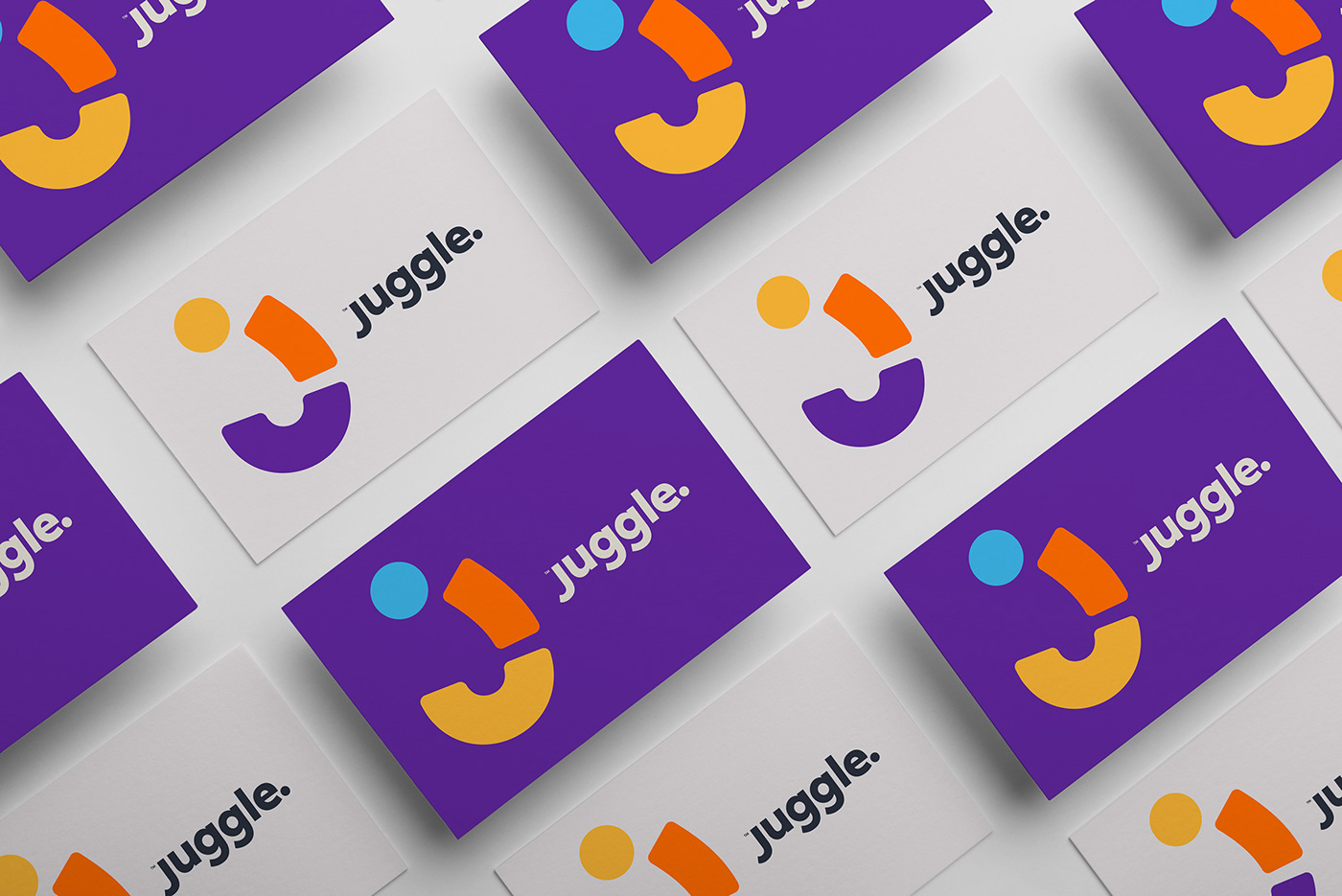
At this point, the brand had been beautifully woven. It was time to translate it into visuals. That's where Mann comes in.
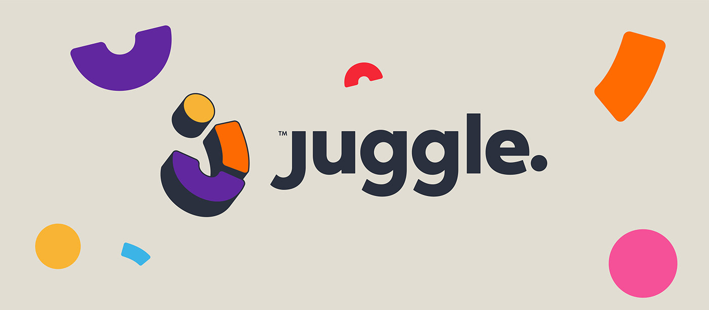
Picture a man juggling several balls. The balls jump high into the sky and falls down only to bounce back up in such a fun way.
That fun was exactly what Mann captured in the logomark. How he did it was spectacular!
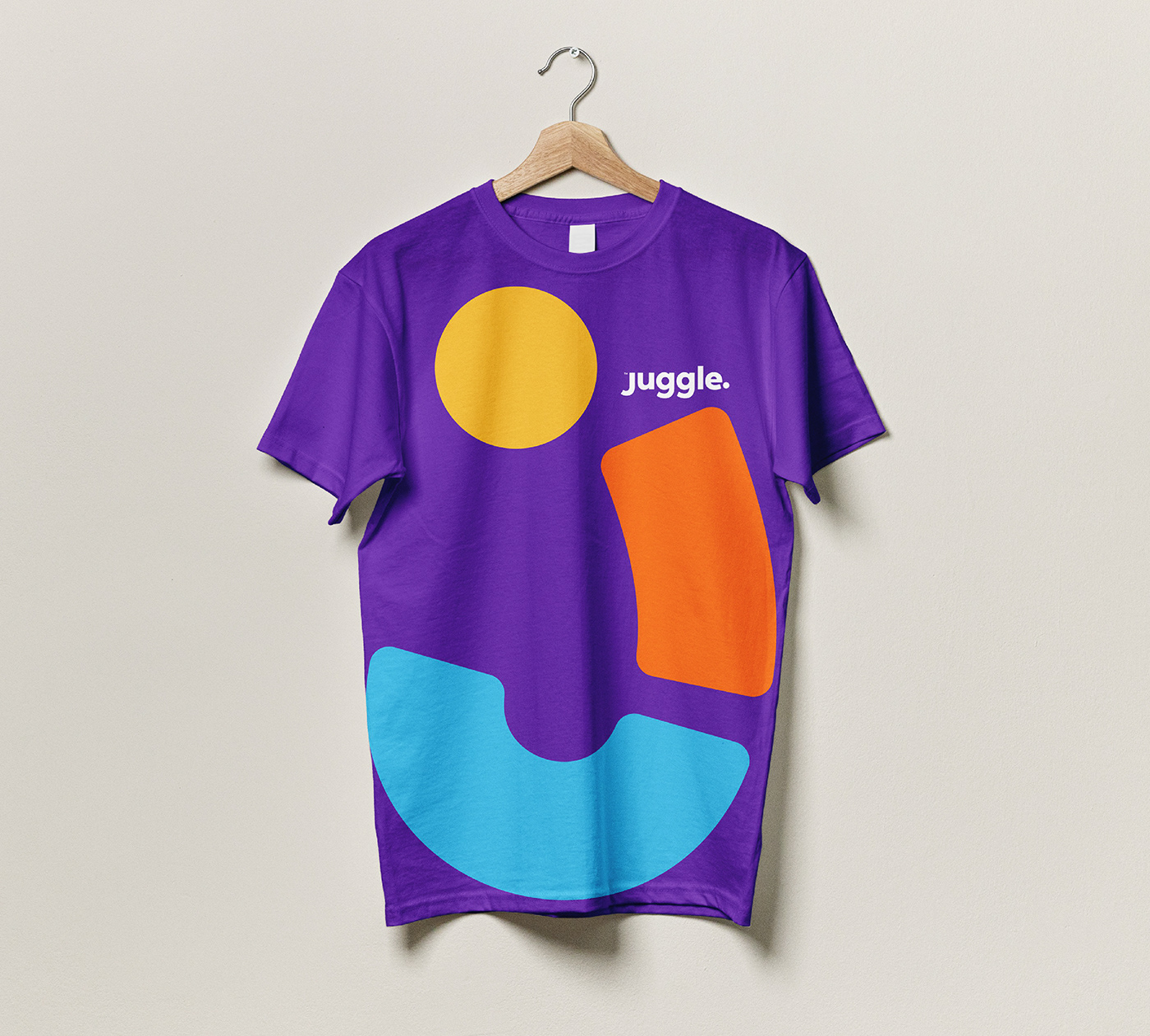
Looking at the logomark, you'd see several shapes stacked together. Mann sought to portray the various services that Juggle provides with these shapes. Also, as you look carefully at that "J", you'd see the shape of a smile at the bottom.
When you juggle shapes, it brings a sense of Joy. In the same way, when you use the various services provided by Juggle for your events, you're left with joy.

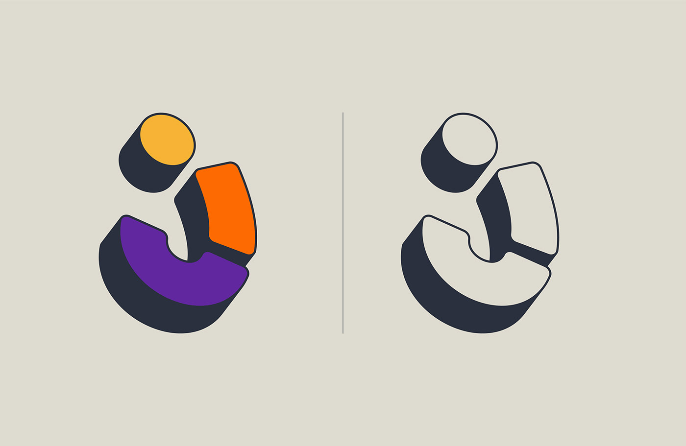
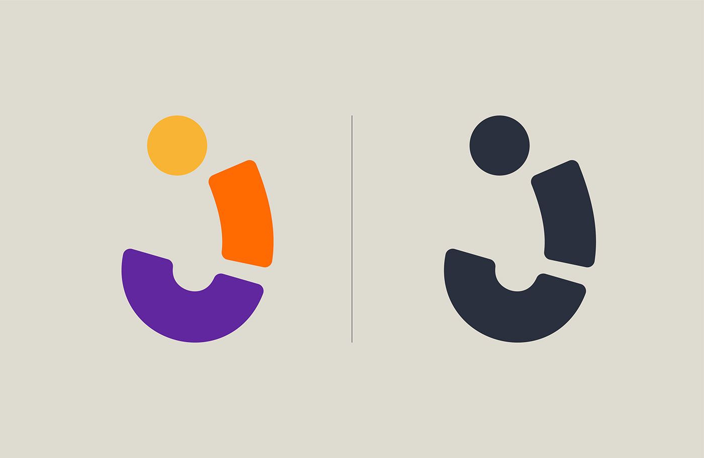
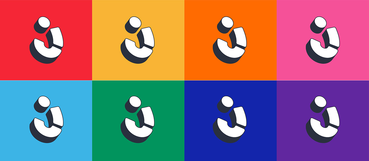
Aside being bold and adaptable, the logomark has this playful feel that makes you want to nudge it and see it bounce.
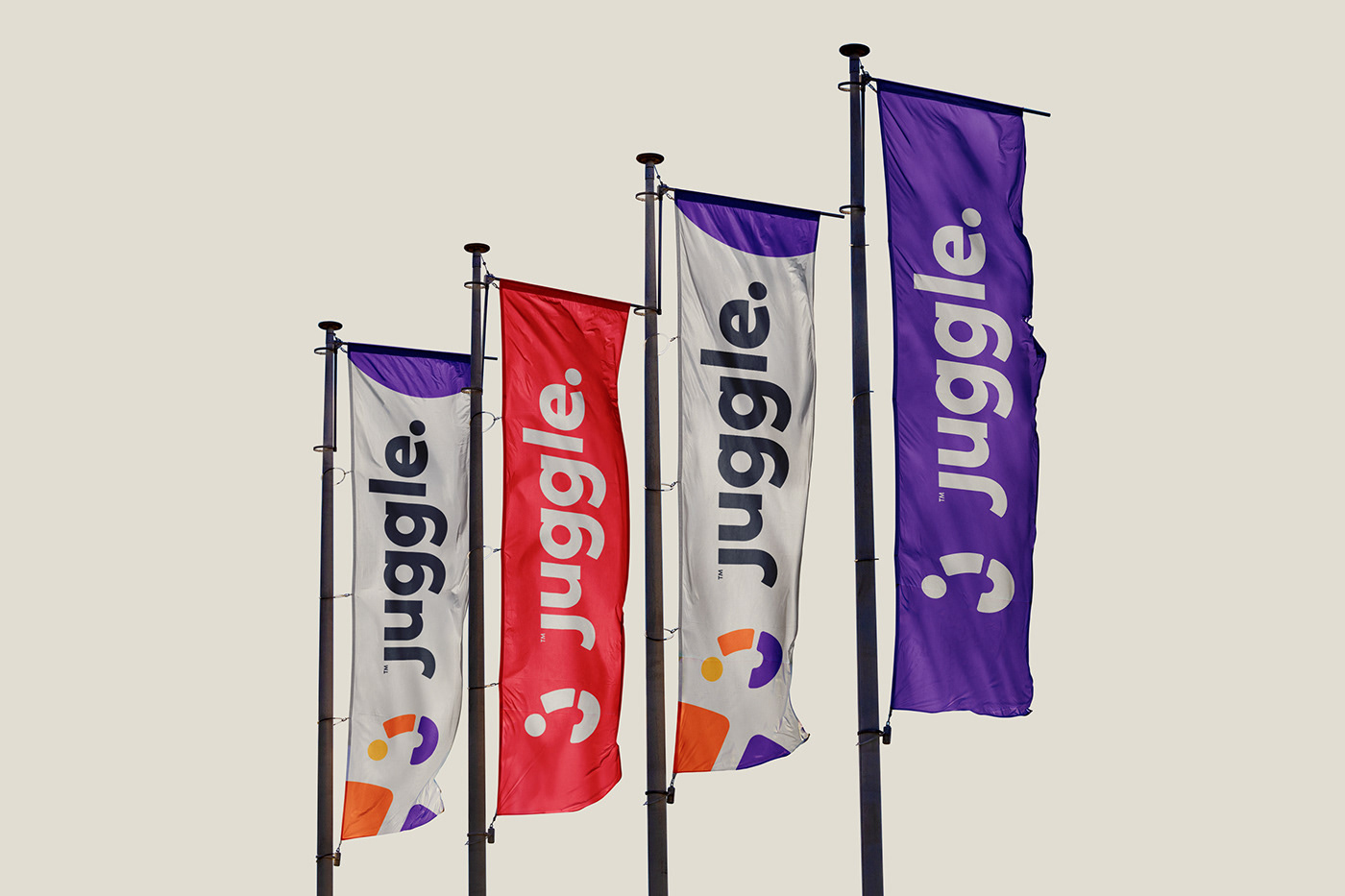
The wordmark was also brilliantly created to complement the logomark. It has that professional and focused look that contrast beautifully with the playful & colourful logomark.
What colours would best capture the friendly, fun yet focused nature of the brand? Mann decided on a myriad of bright colours that could make anyone's heart race in utter excitement.
Not only do they depict fun and creativity, they are colours that appeal to everyday people. Everyone can find their favorite in there.
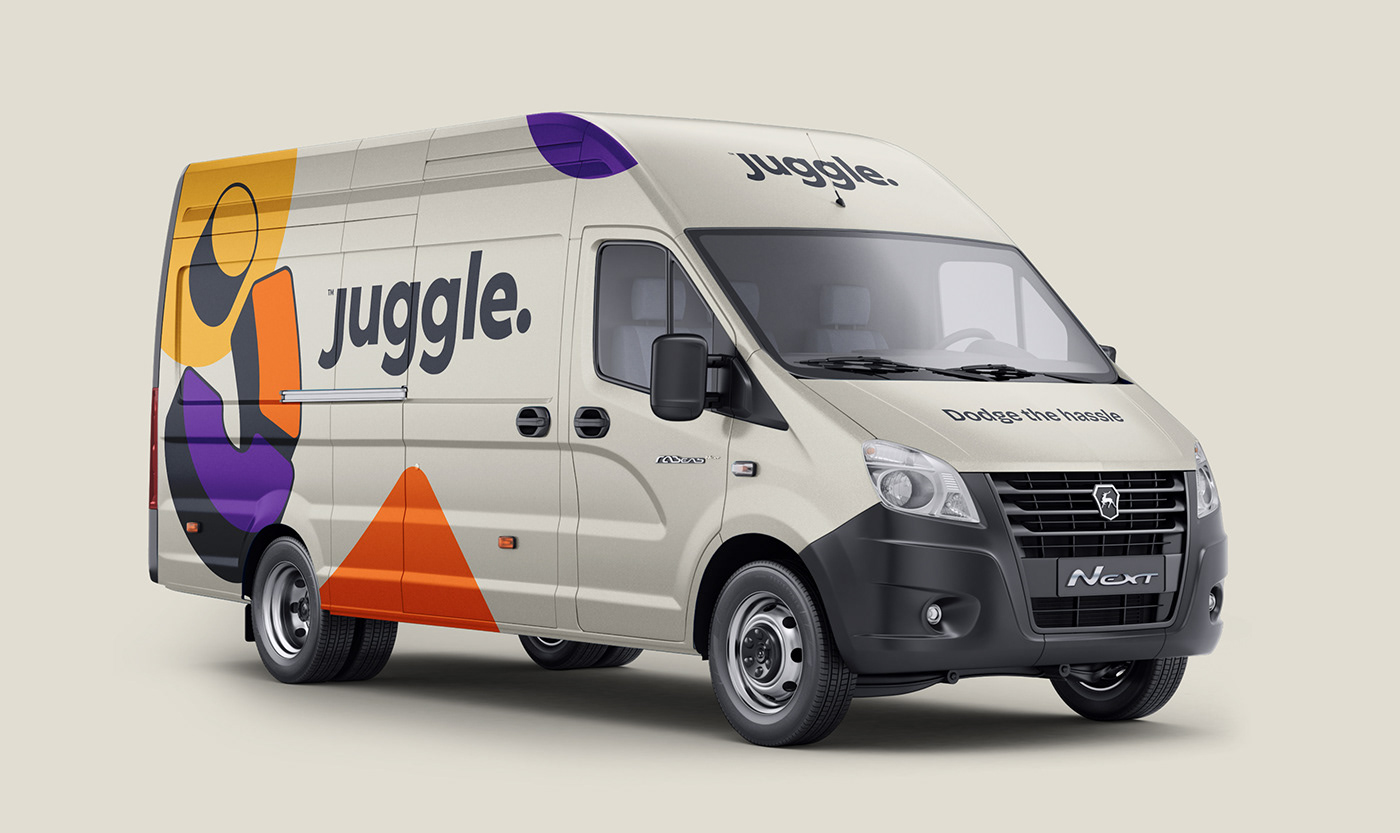
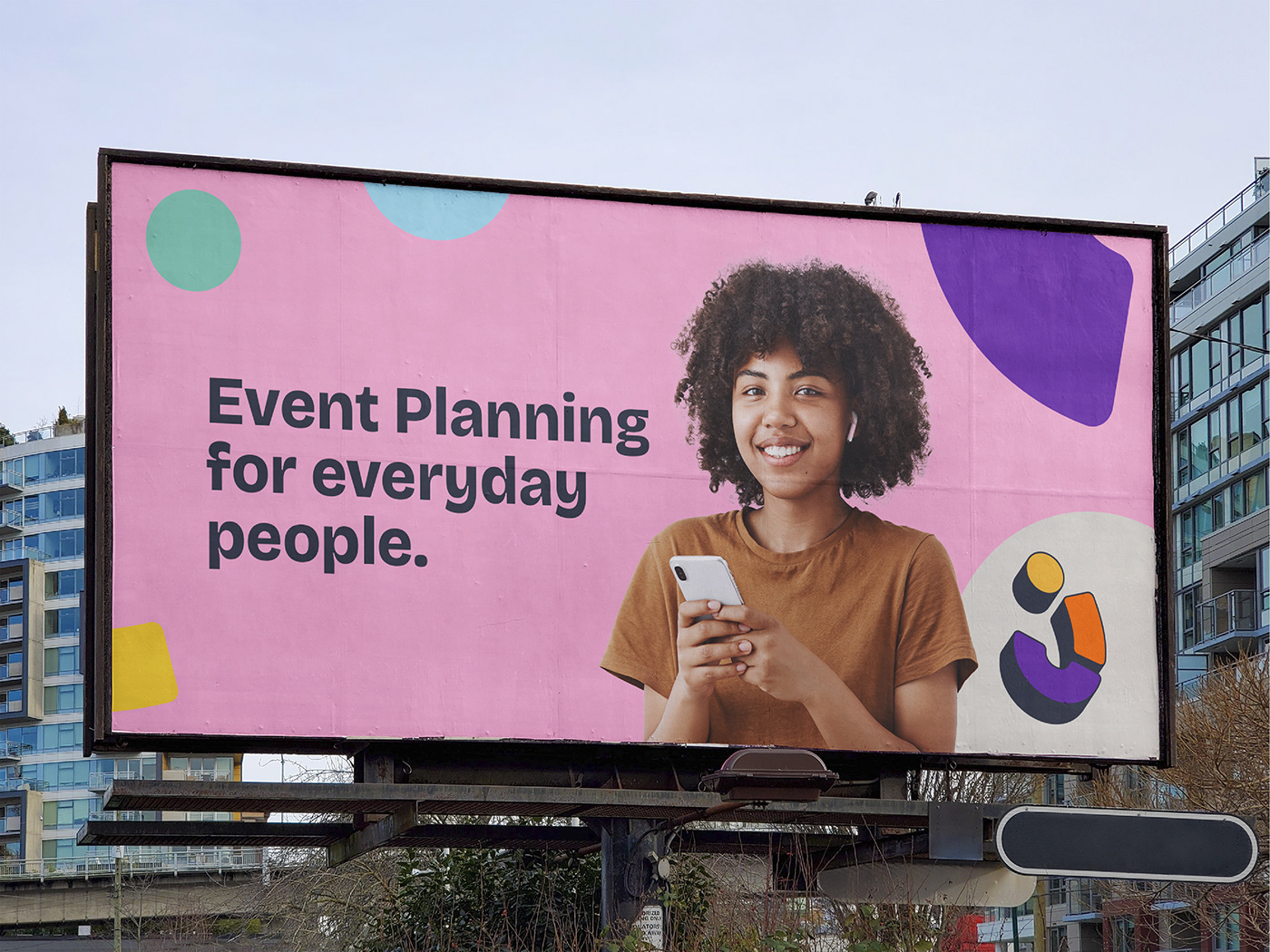
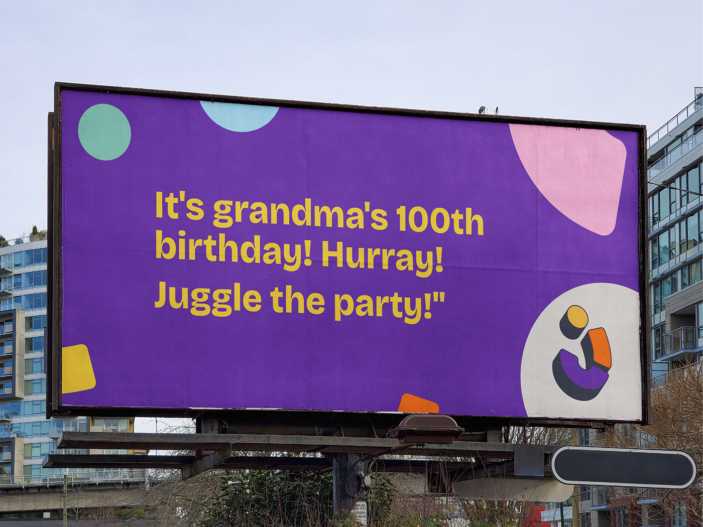
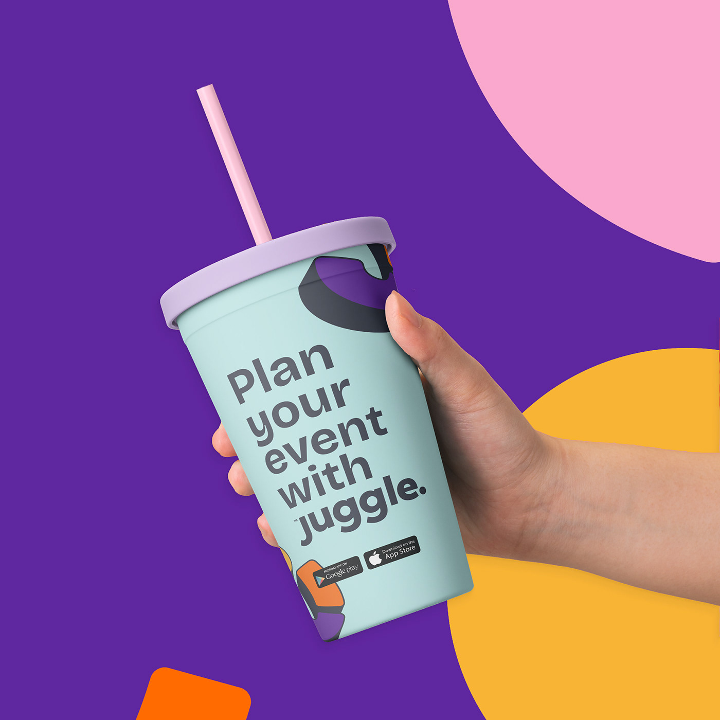
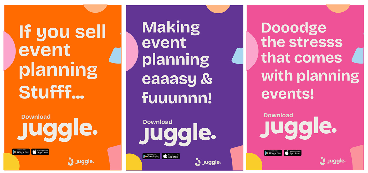
The logo and colors were beautiful but were they functional?
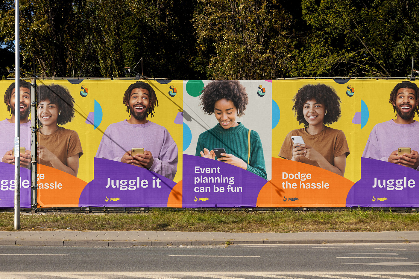
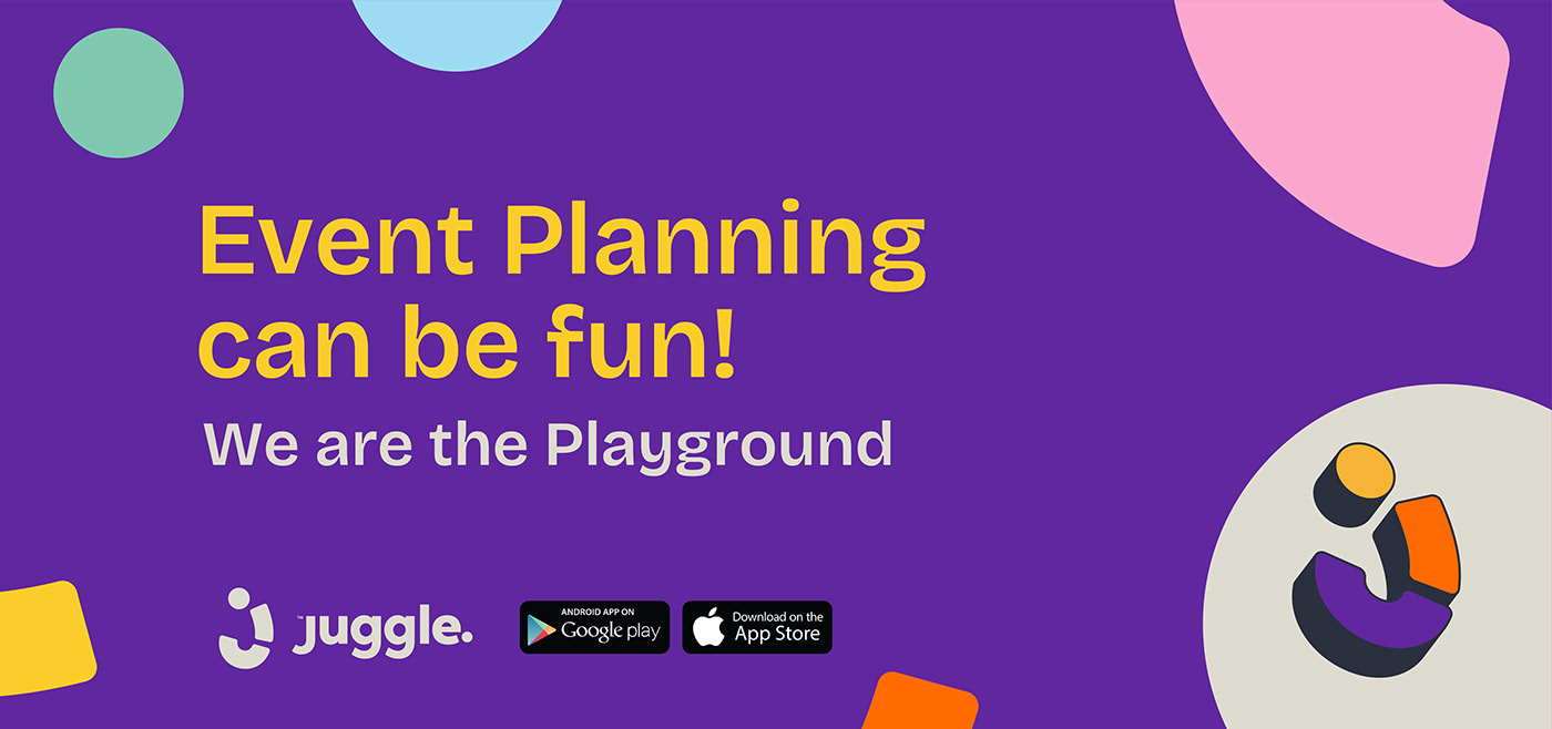
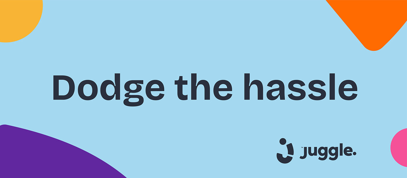
How would they look on mockups? If we wanted to communicate short messages on flyers and billboards, would they look good?
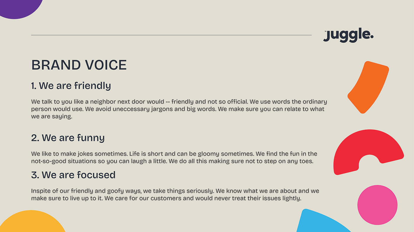
I went to work right away on short messages for the brand. I thought of how we could communicate, in simple terms, what Juggle does - - of course without moving away from the friendly, funny and focused voice.
Mann created some design templates and the result was astounding.


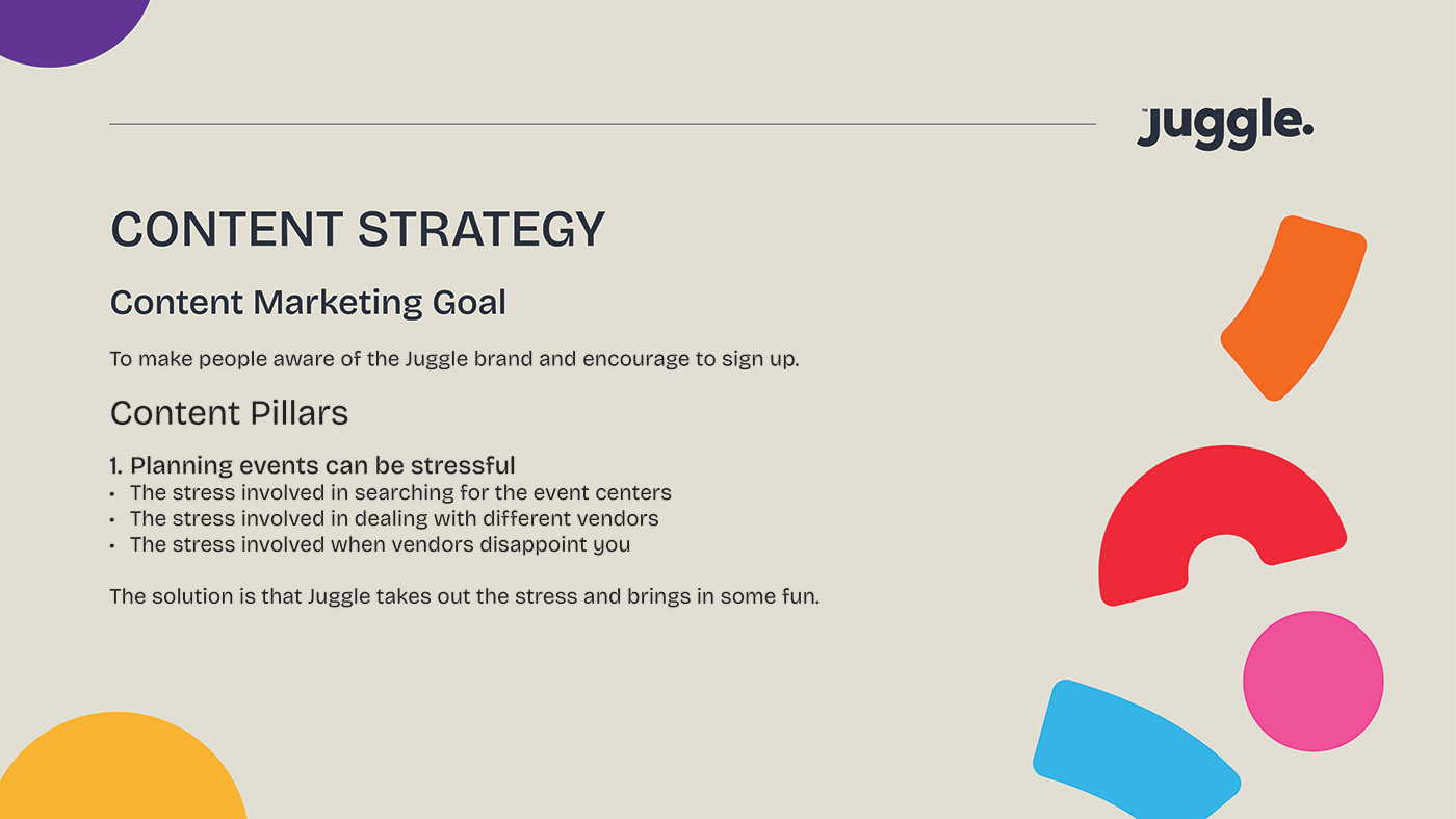
We needed to make Juggle's presence felt on social media.
I set the content marketing goals as well as some content pillars to guide the kind of messages we were going to put out there.
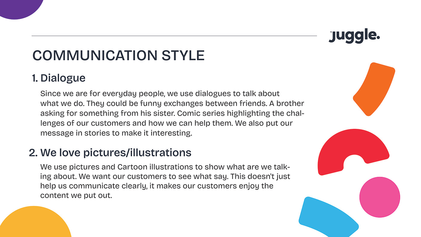
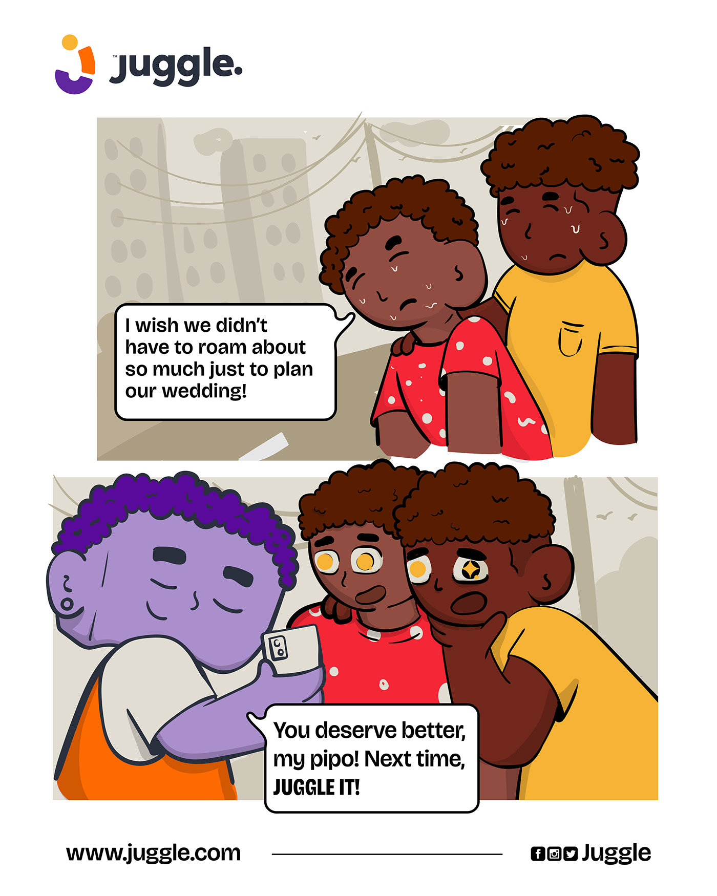
What relatable stories could we tell? The brand message and communication style established during the strategy came in handy here. We are going to employ dialogues and cartoon illustrations to tell relatable stories that would plant Juggle in the minds of target customers.
Once again, I wrote short scripts that captured the heart the brand and would easily win the hearts of Everyday People who see it.
How could we bring these short scripts to life in a creative & fun way?
This is where Neequaye comes in.
His entire approach to the project was nothing short of amazing! He began work on the Juggle Mascot, which we named Jugo.
He also brought 3 of the short scripts to life. The way he illustrated the characters, the expressions on their faces and the way Jugo is seen being involved & dedicated to each customer just gave the brand that natural & relatable feel.
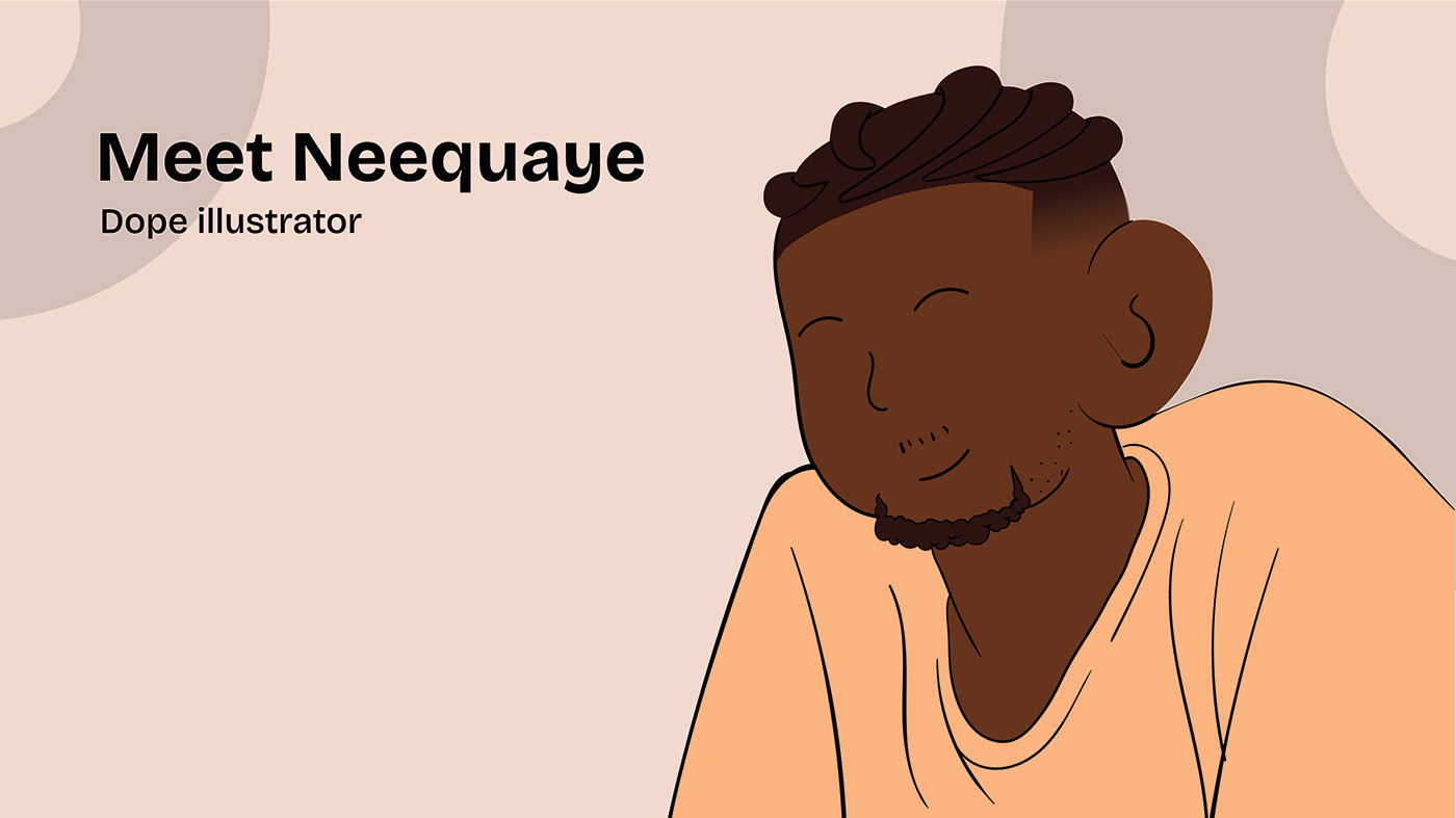


The interesting thing is that the Mascot can be easily animated and used for video content as well.
And of course, these illustrations would be followed by captions detailing how Juggle can help them dodge the frustration, high cost, defrauding and other stressful situations that come with creating simple events.
In all, if Juggle was a realistic brand, will you patronize it? Let us know!
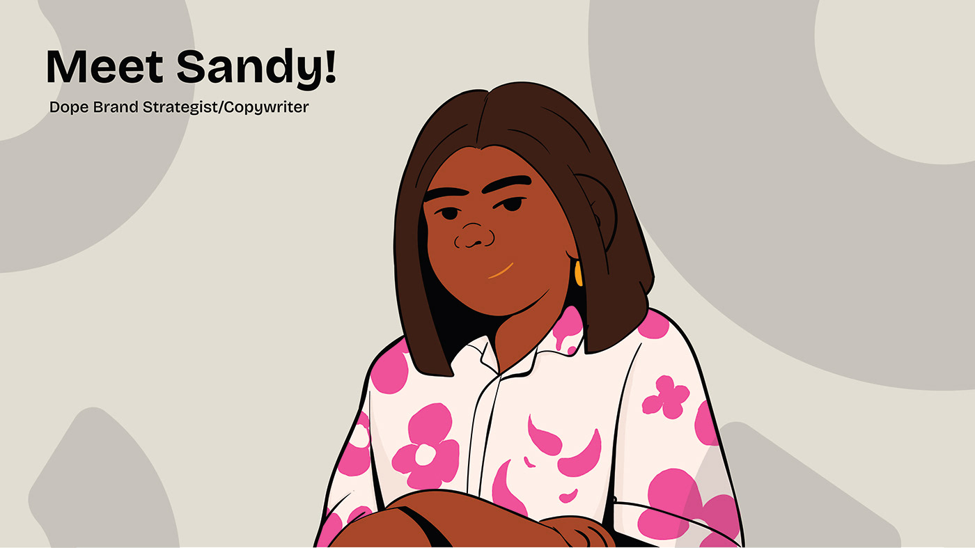
Brand Strategy/Copywriting - Sandy Amponsah
Visual Identity Design - Mann Mihilov
Cartoon Illustrations - Neequaye Kotey


