Brand Background
With the improvement of people's living standards, pets have become an important member of more and more families. The healthy life of pets has become the most concerning topic for pet owners. However, there is a wide variety and uneven quality of pet food on the market, leading to urgent health issues for pets. Lemusen has ushered in a new era of light pet food, providing pets with a sustainable and healthy life.
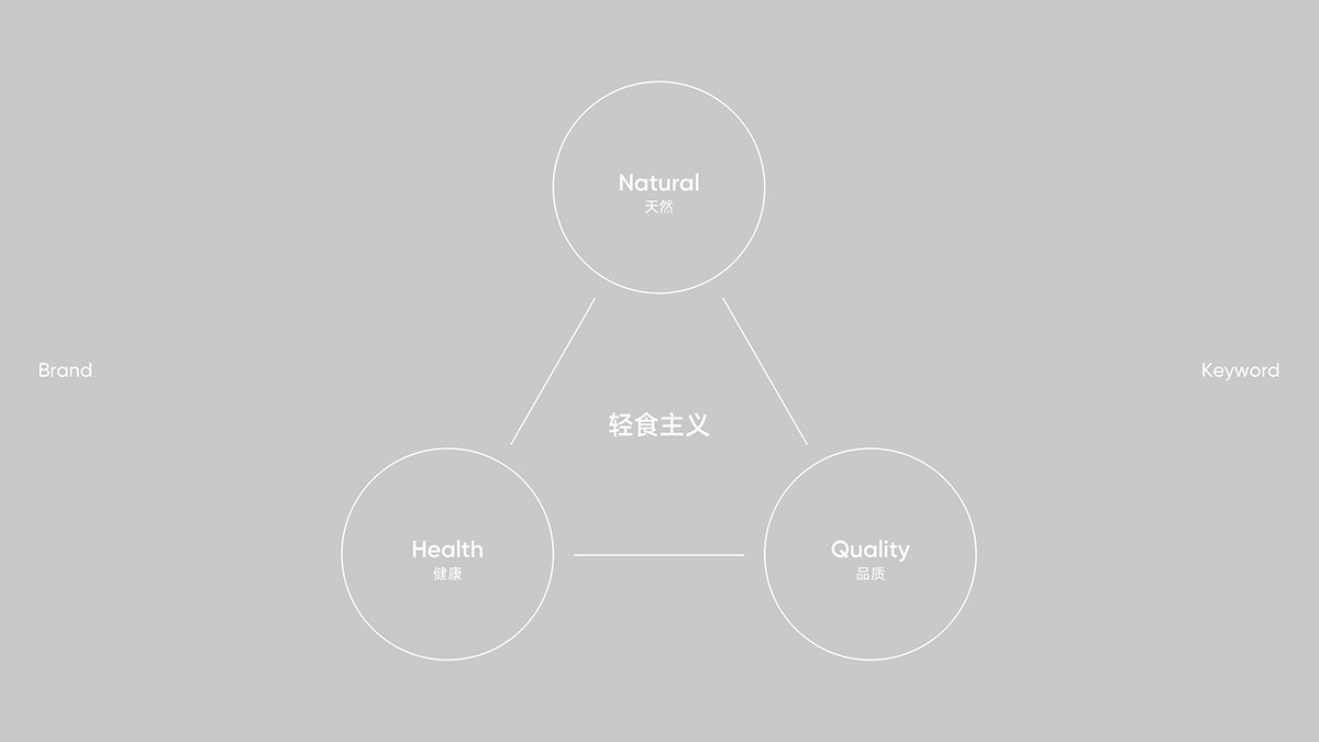
The Lemusen brand emerged in this market context. We are well aware of the care and expectations that pet owners have for their pets, as well as the importance of their healthy growth. Therefore, we are committed to creating a "light food" pet brand that focuses on pet health and emphasizes efficacy and nutrition, providing pet owners with high-quality, natural and healthy pet food choices.
Lemusen adheres to the principles of original ecology and nature, and controls the quality and safety of ingredients from the source. We firmly believe that only low oil, low-fat, naturally pure ingredients can provide pets with healthy and nutritious food. We carefully choose every ingredient, carefully make every food, and ensure that every bite is a care for the health of pets.

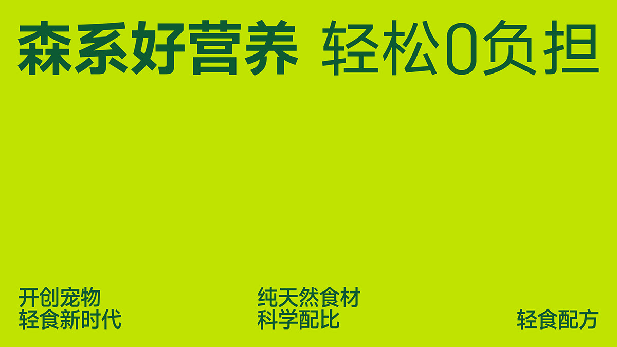
Brand Slogan
Lemusen is a pet food brand deeply rooted in nature, health, and love. Its cultural genes stem from its reverence for the original ecological forest and its persistent pursuit of pet health. The forest, as the cradle of life, nurtures endless vitality and energy. Taking inspiration from it, the forest transforms this natural gift into the purest care for pets.
We excavate the cultural genes of the brand and create a brand slogan that only belongs to Lemusen. "Forest style is nutritious, easy to bear" represents the original ecology, nature, and purity, emphasizing the close connection between the brand and the forest, as well as the forest like vitality and vitality contained in the products. "Good nutrition" is the ultimate pursuit of product quality, ensuring that each product can provide comprehensive and balanced nutrition for pets, and help them grow healthily; "Easy and easy to bear" reflects Lemusen's profound understanding of his attitude towards pet life. It means that pets don't have to worry about any physical burden while enjoying delicious food, making every day full of relaxation and happiness for pets. This is not only a commitment of Lemusen to the health of pets, but also an improvement in the quality of life for pets.
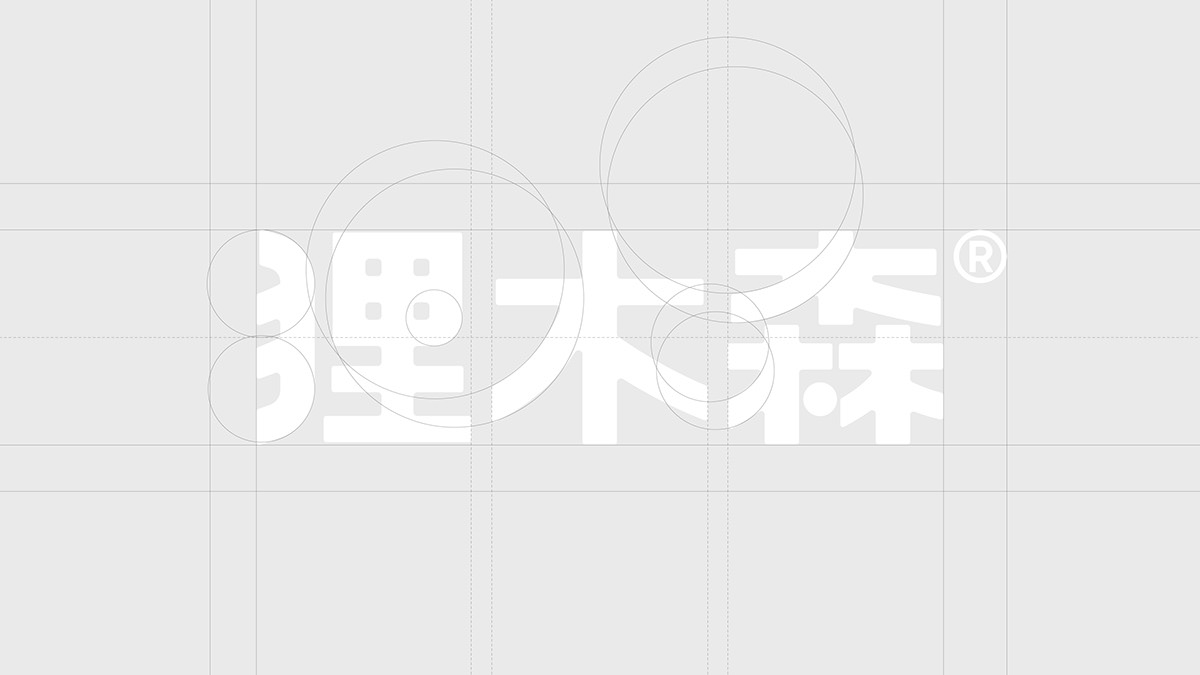

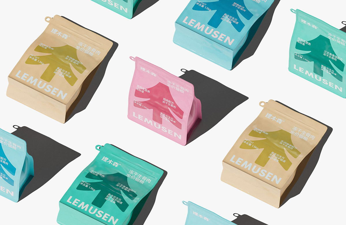
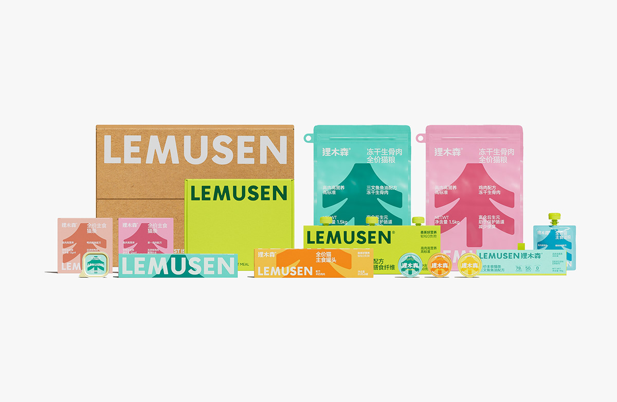
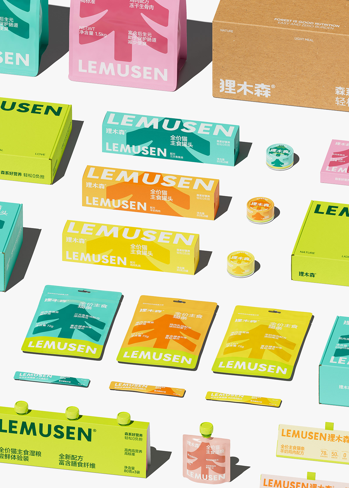
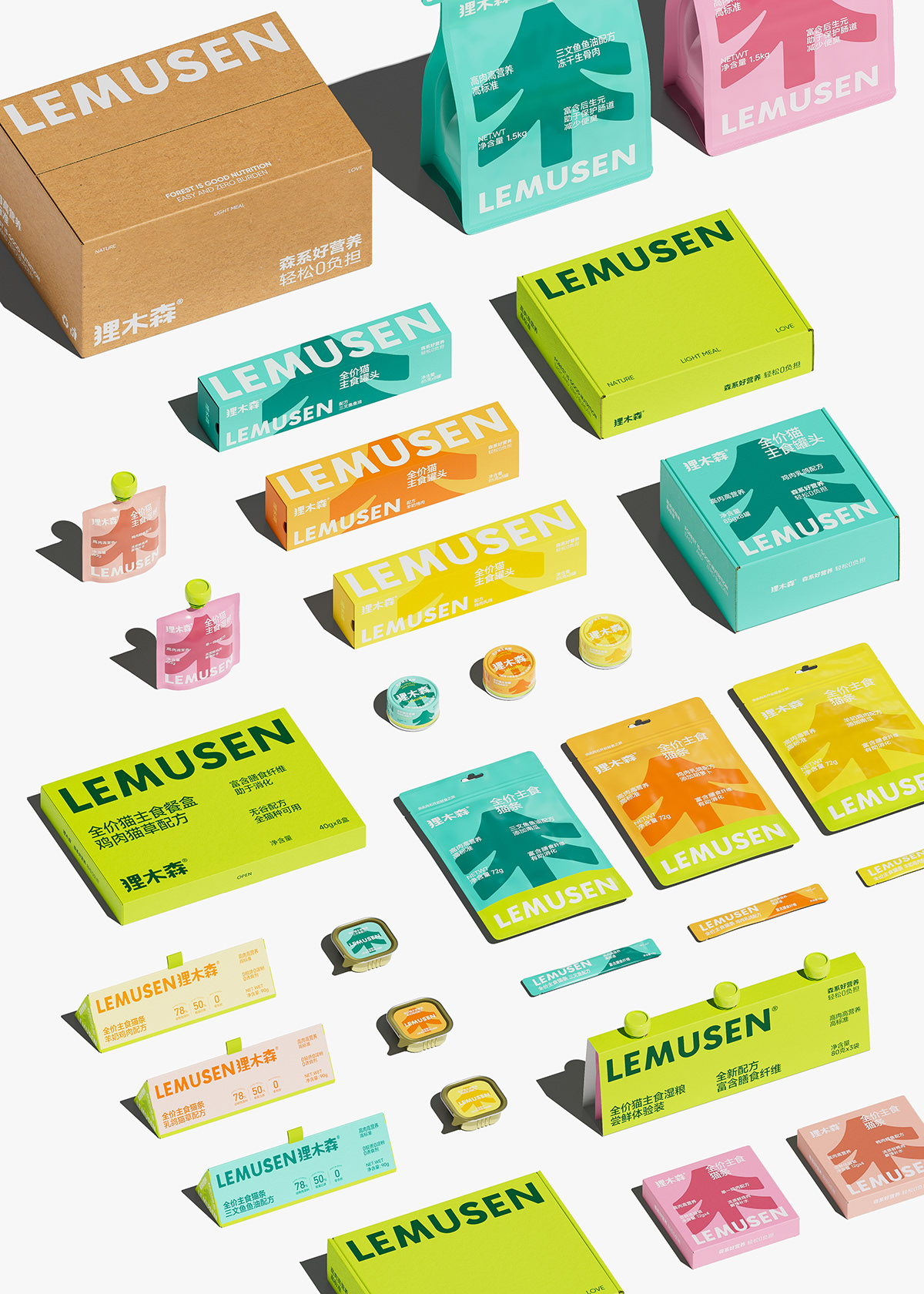
Brand Symbol
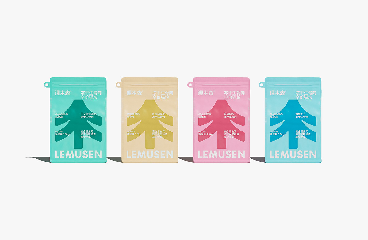
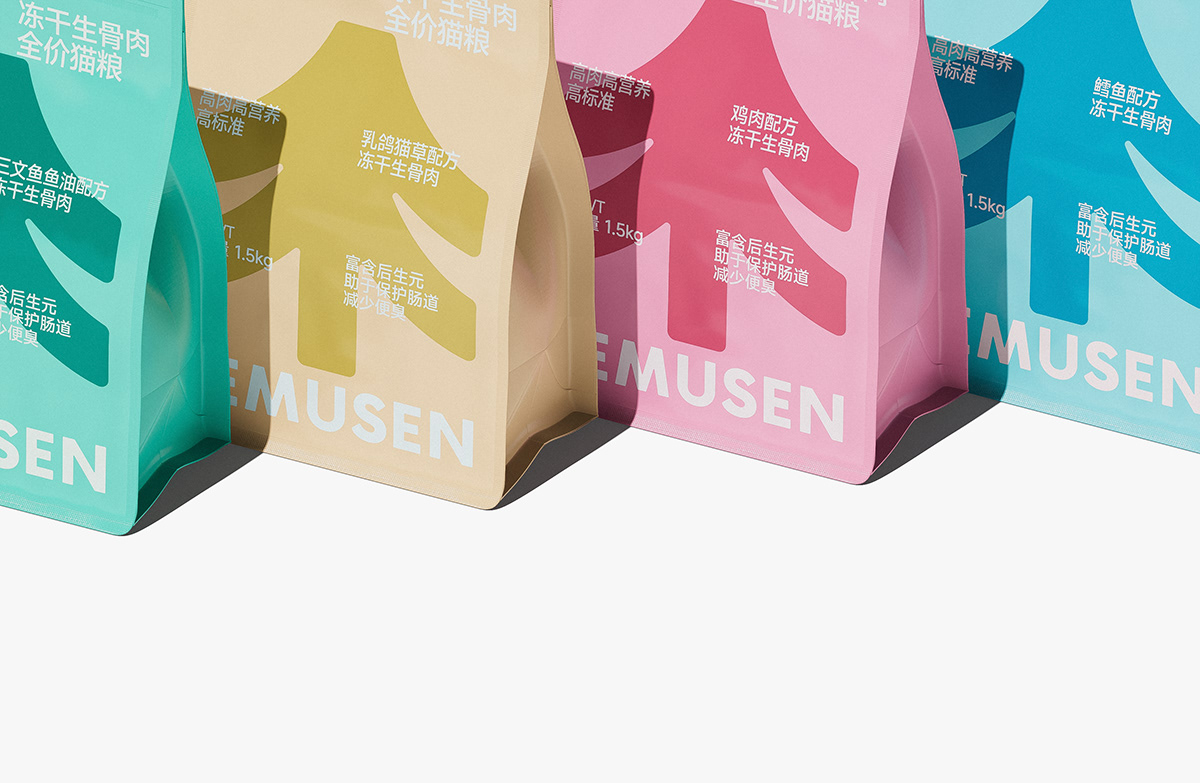
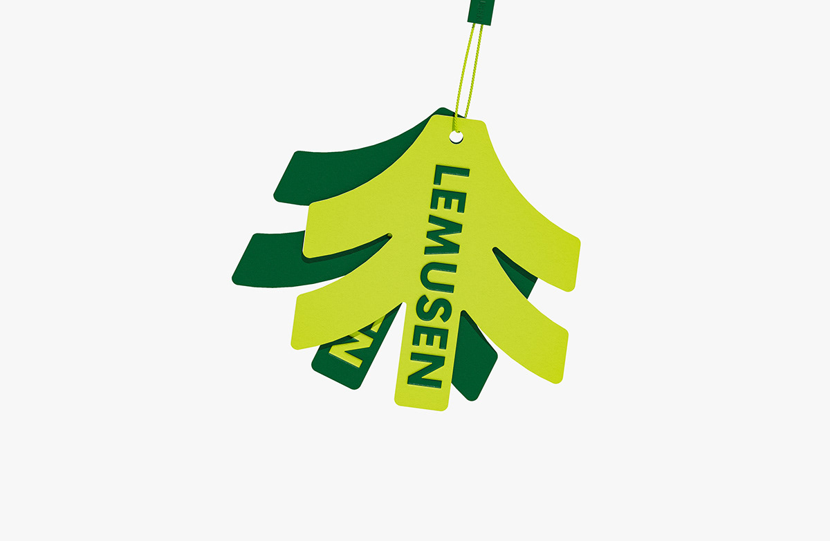
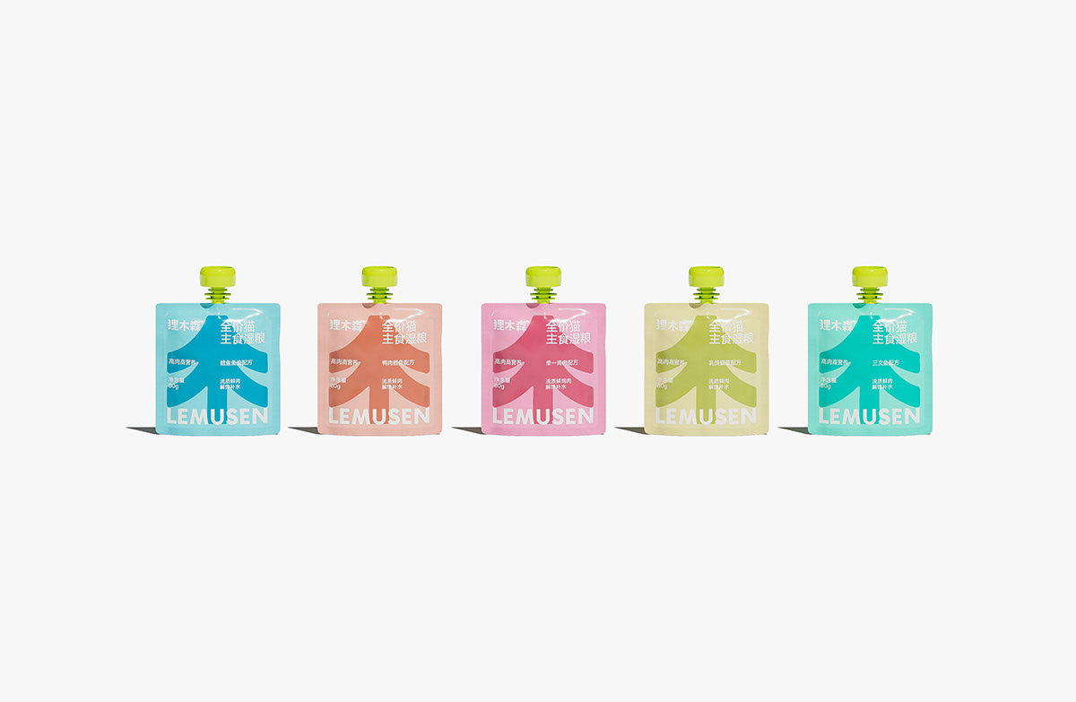
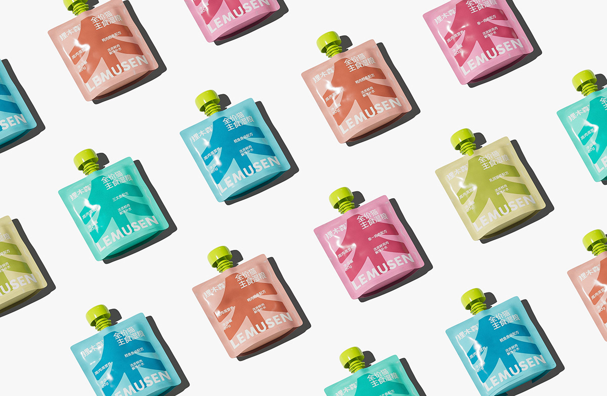
We have extracted a unique and highly recognizable upward arrow symbol based on the brand name "Mu/Sen", while also presenting a tree shape, symbolizing the brand's pursuit of original ecology and natural health, as well as wishes for the healthy growth of pets. Integrate brand symbol language across all product lines, enhance unified brand visual recognition, and reduce communication costs.
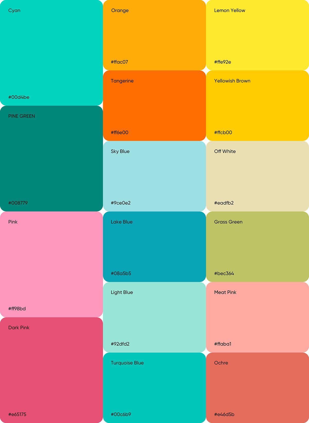
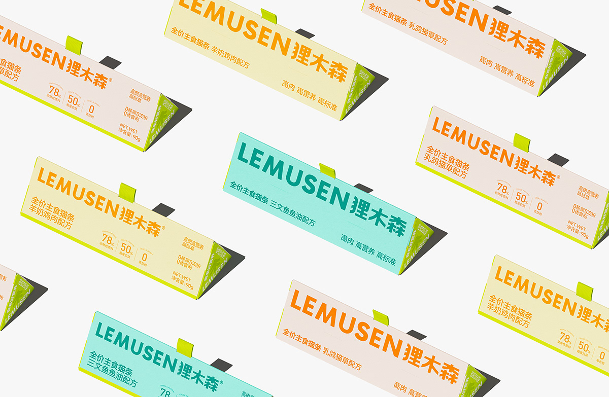
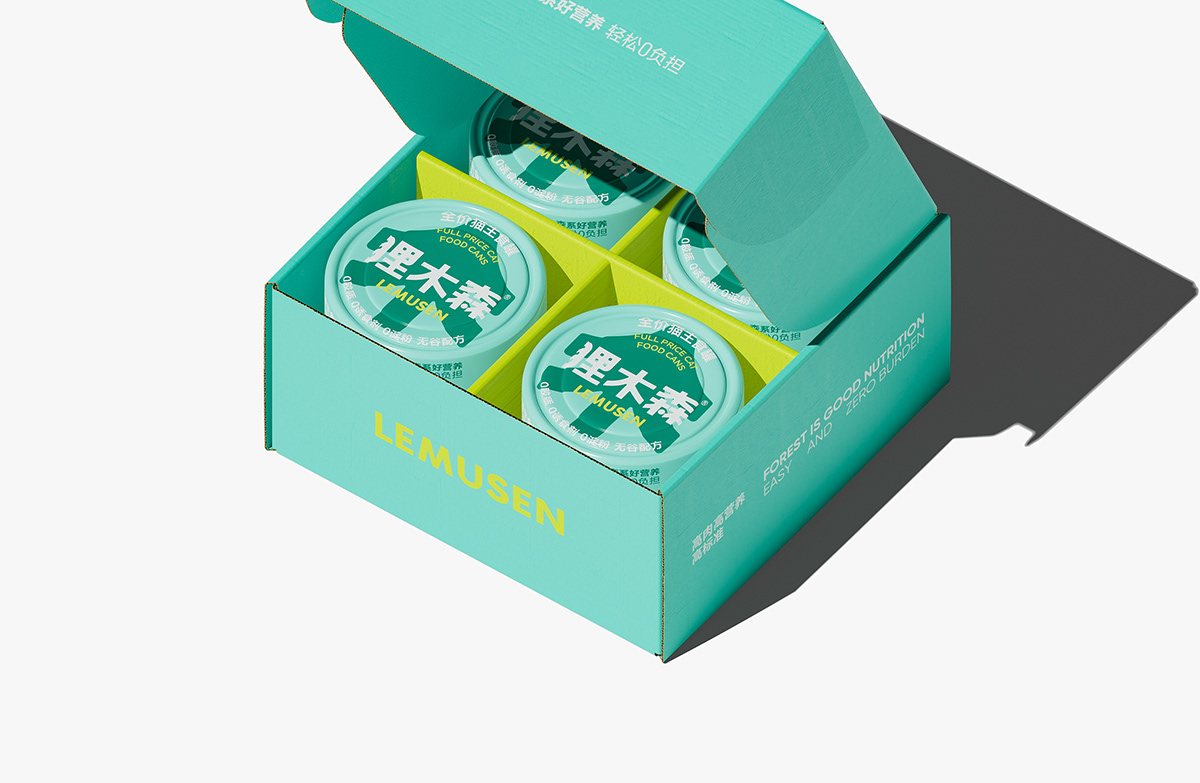
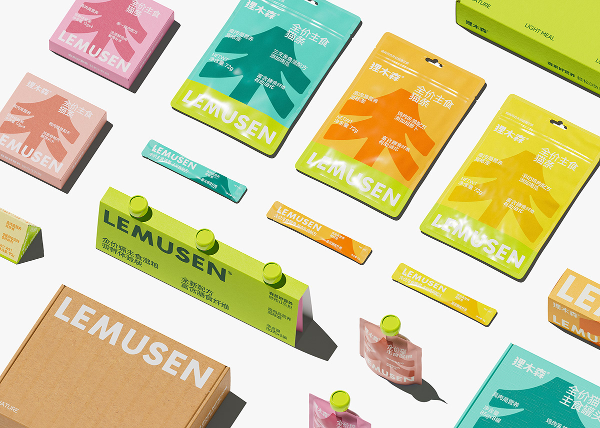
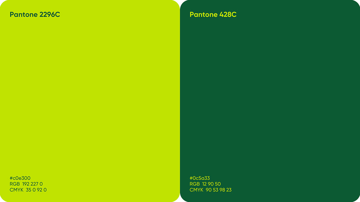
Brand Color Palette
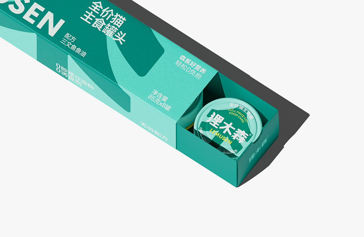
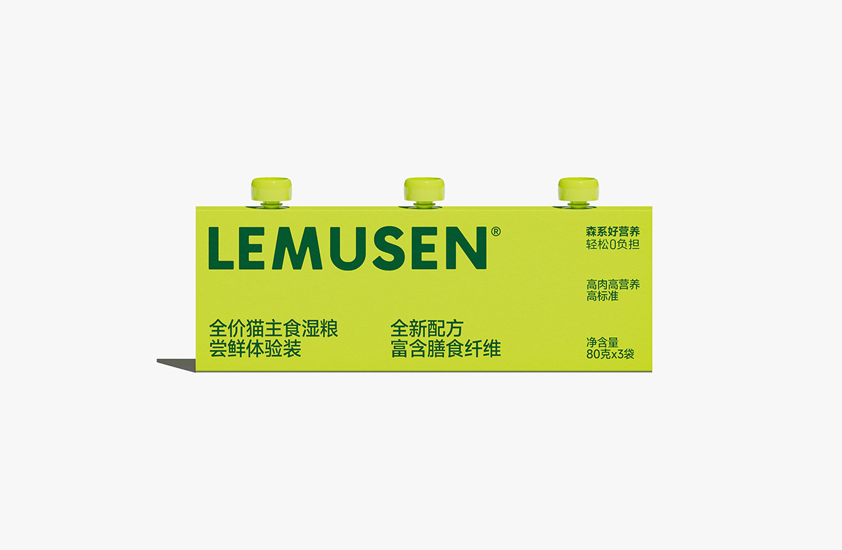
To meet the light food oriented tone advocated by the Lemusen brand, we have carefully selected turquoise and forest green as the brand's main color scheme. Turquoise symbolizes rebirth and vitality, representing the vitality and freshness of nature, which is in line with the brand concept of pursuing original ecology and natural health. Forest green, on the other hand, is more profound and peaceful, representing the richness and depth of the forest, conveying the brand's deep concern for the healthy growth of pets. The combination of two colors makes the brand's visual image more vivid and unique, creating a relaxed and joyful atmosphere, bringing a healthier and better life experience for pet owners and pets.
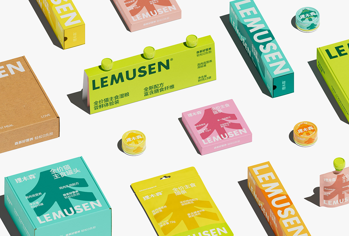
The brand packaging color system combines fresh and energetic color combinations to convey the delicious and healthy attributes of the product, and visually brings consumers a relaxed and joyful atmosphere.
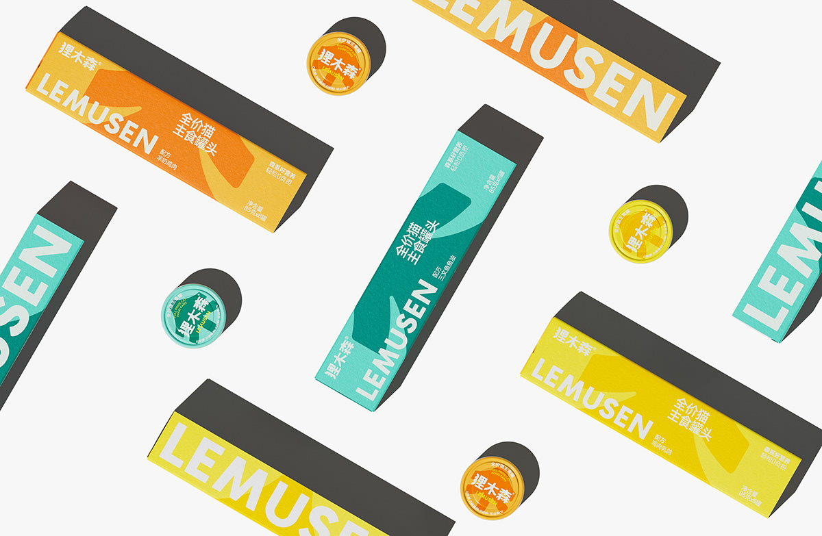
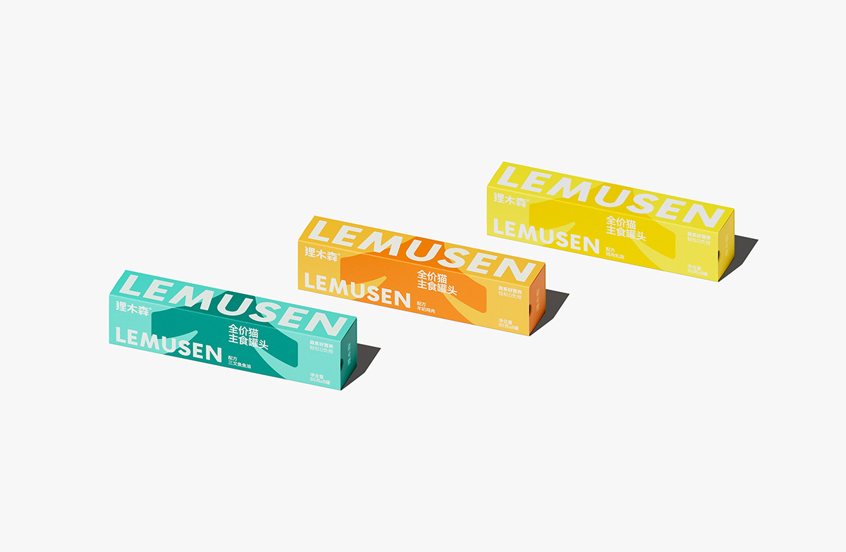
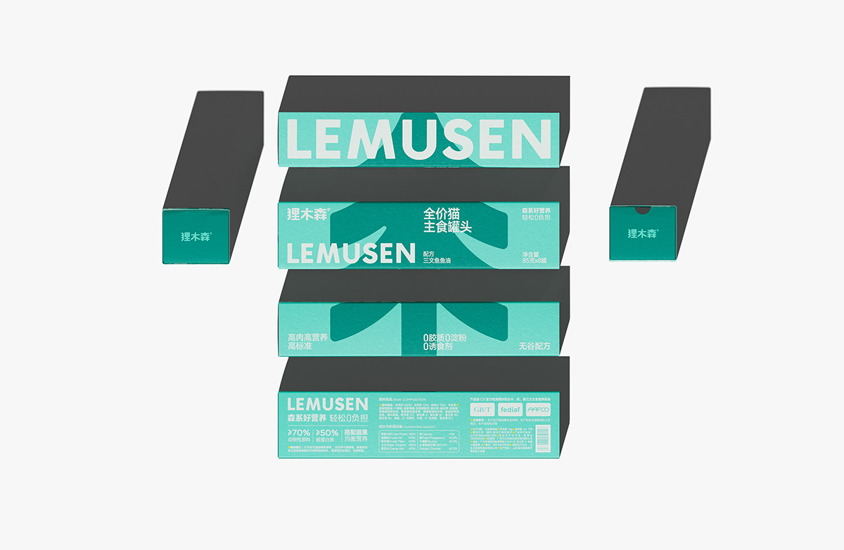

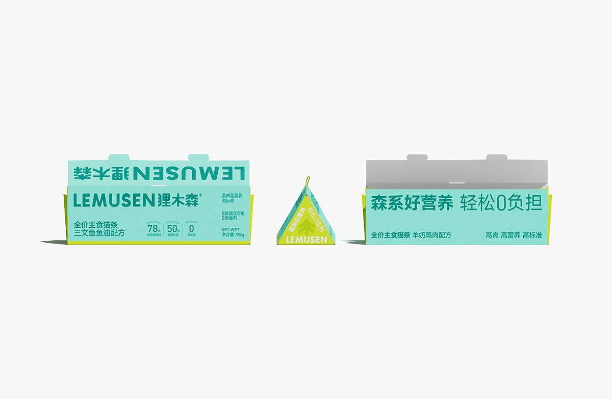
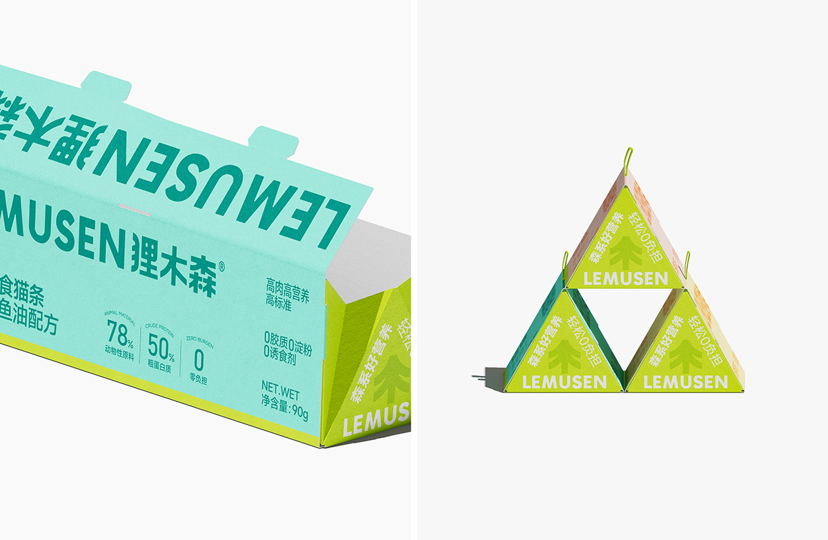
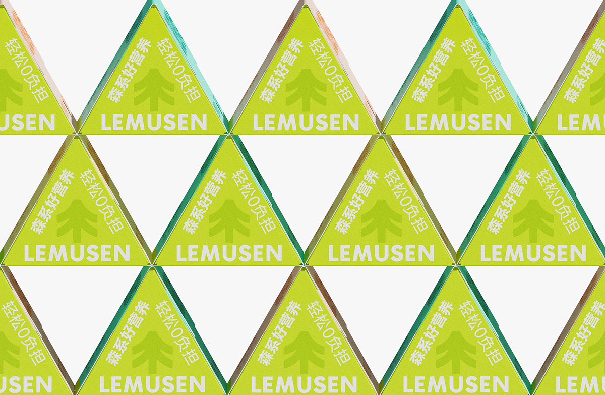
Packaging Structure
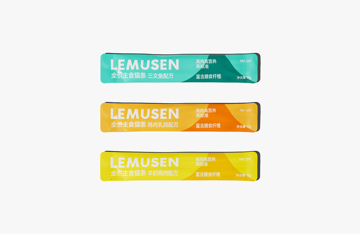
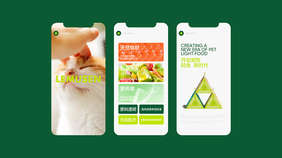
We extract triangle elements from brand symbols and cleverly integrate them into product form, changing the appearance of traditional cat strips and forming a unique brand recognition memory point. At the same time, the triangle is also in line with the brand's advocacy of upward growth and pursuit of natural health.