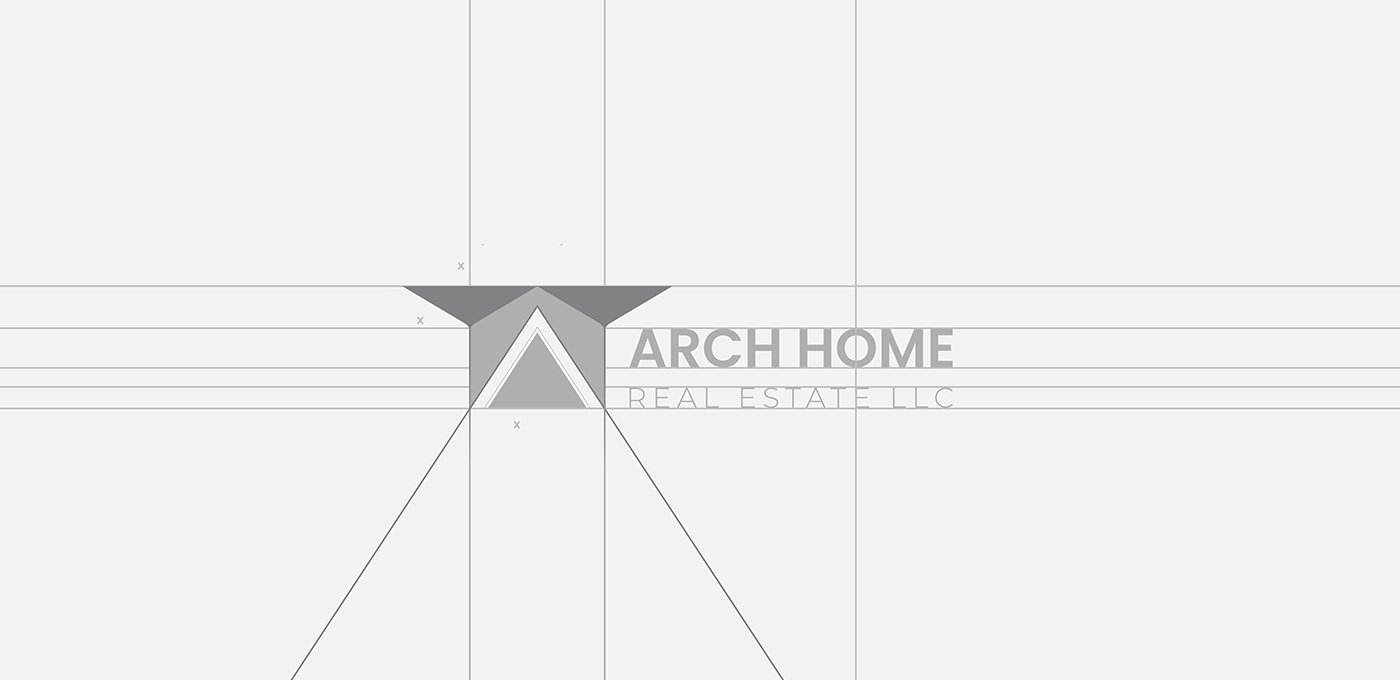
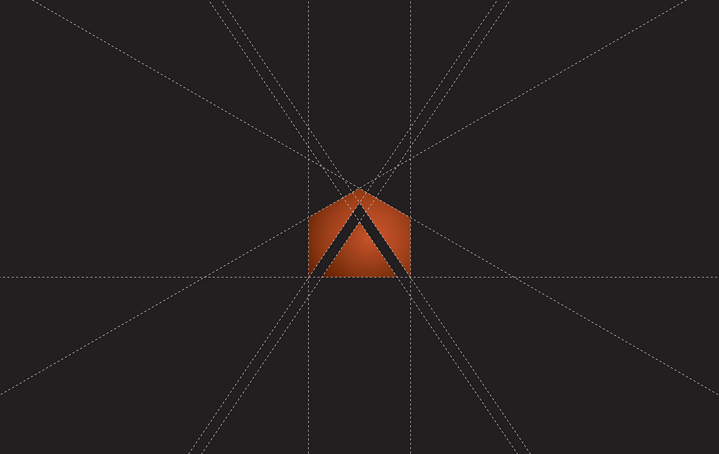
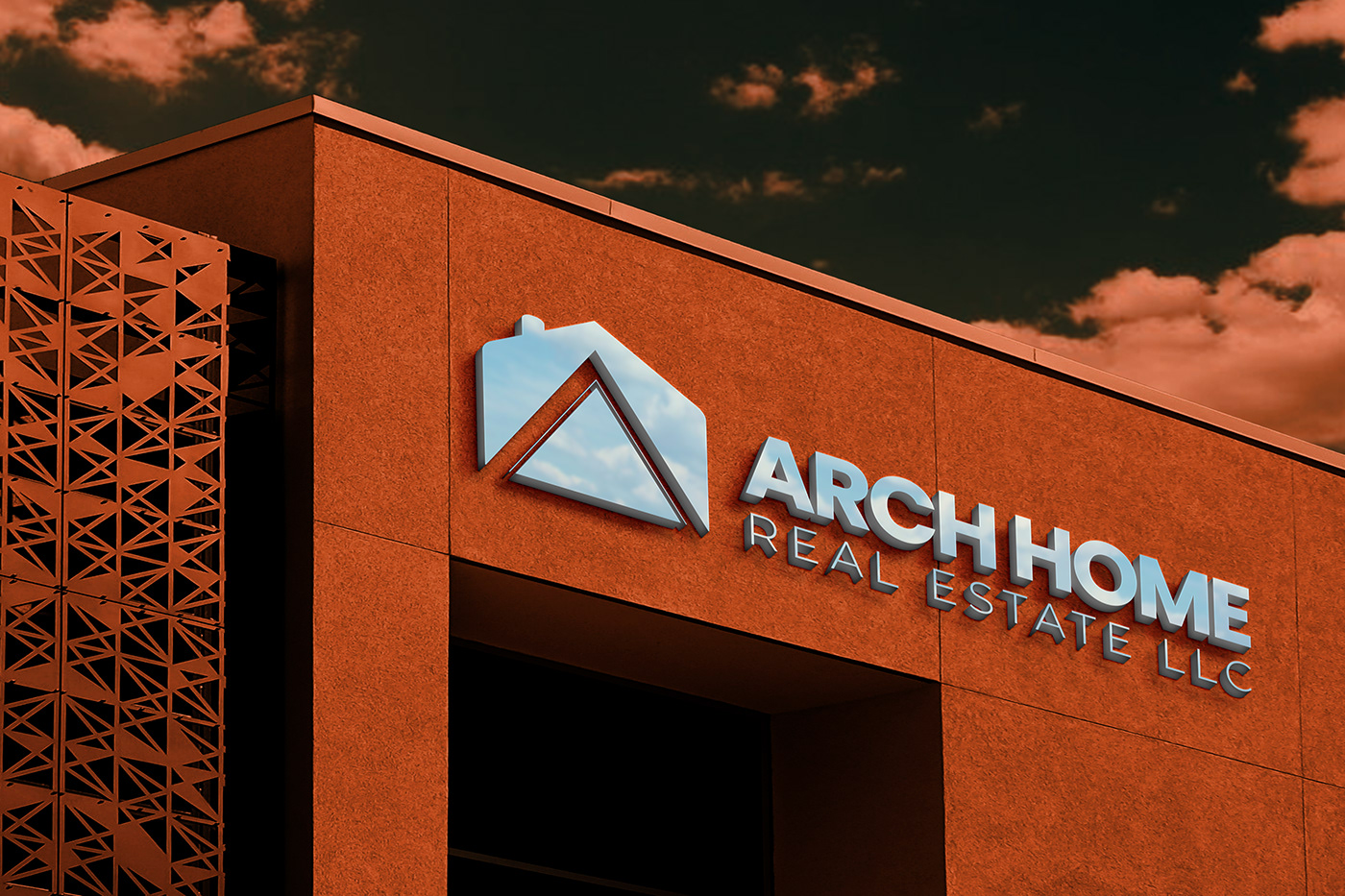
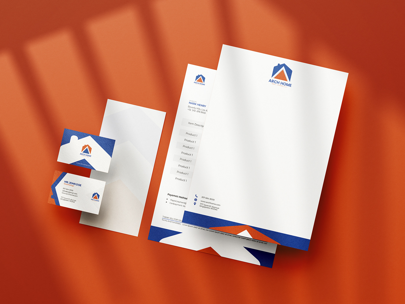
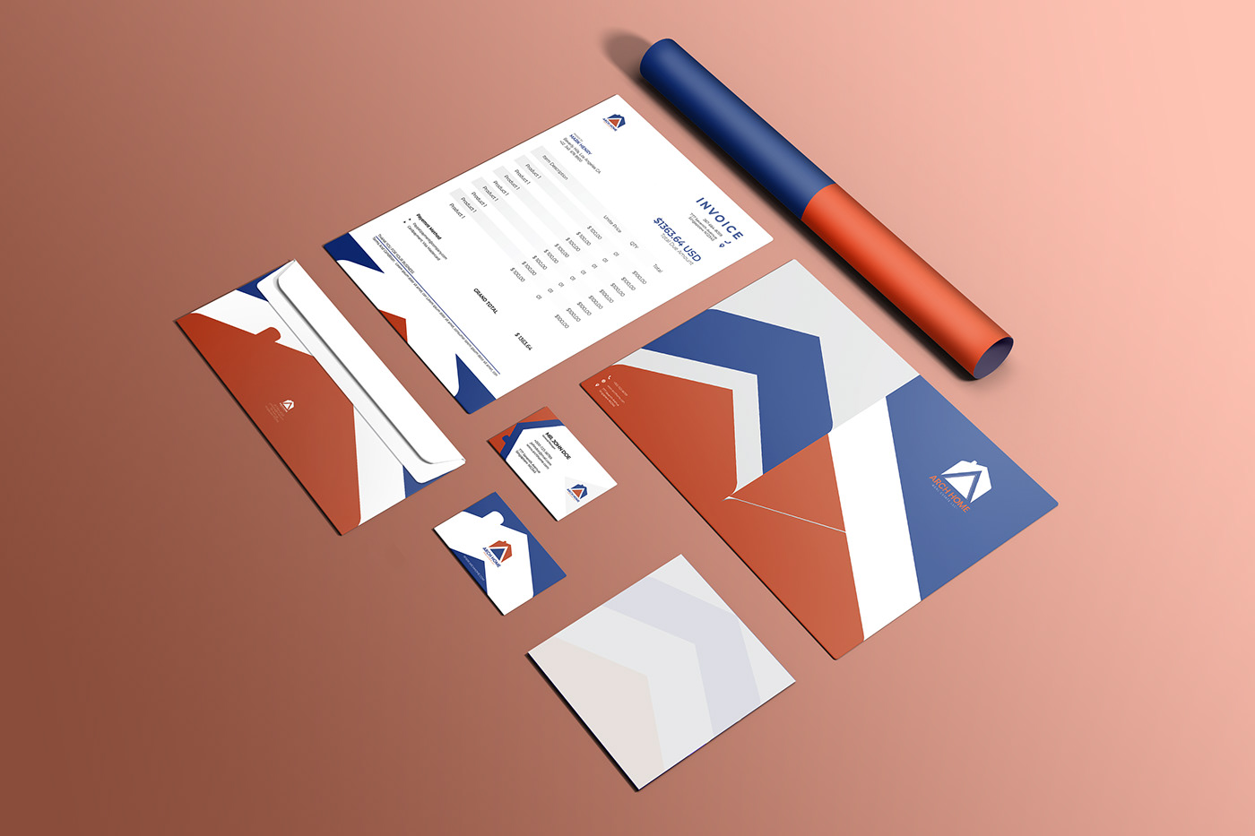
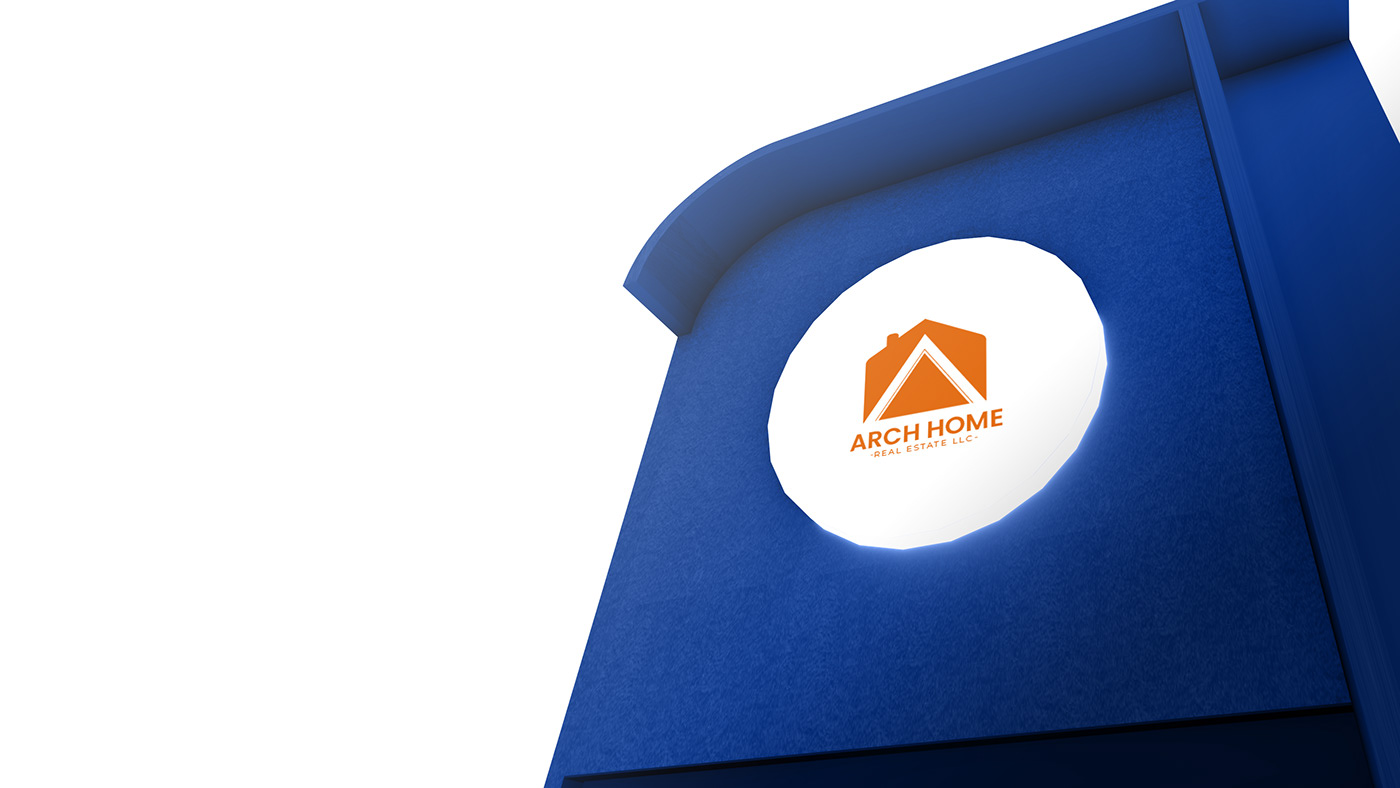
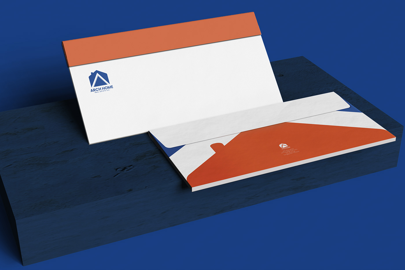
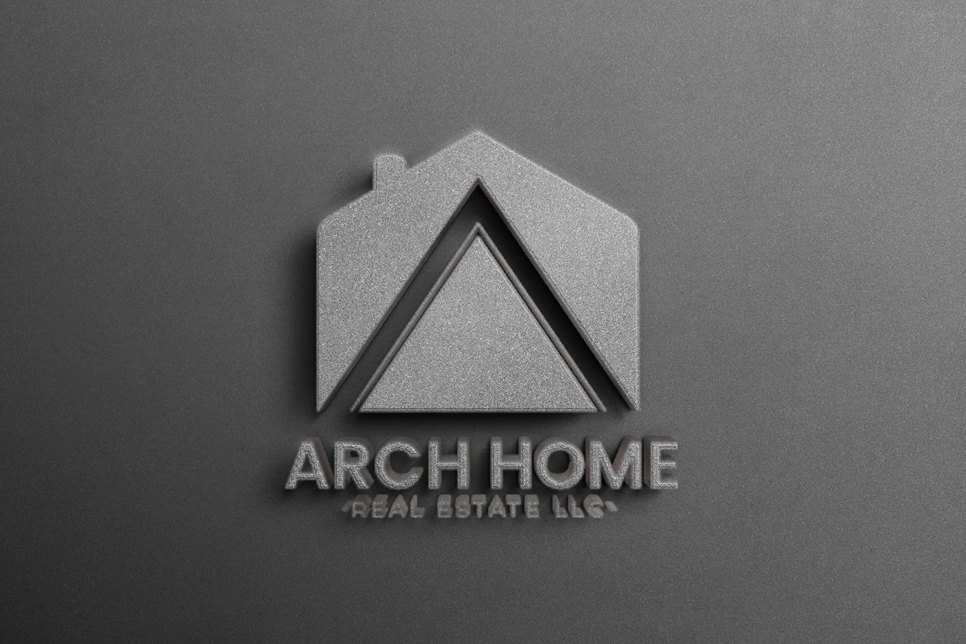
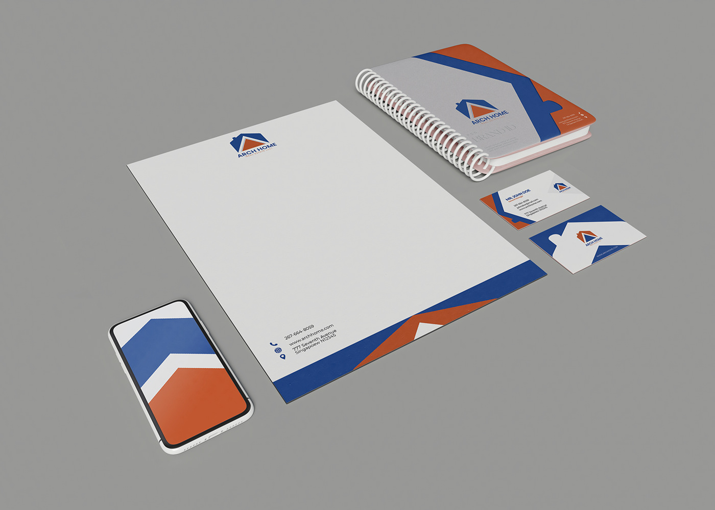
The ARCH HOME logo design showcases the beauty of lines. The lines resembles the letter “A” conveying brand’s initials. The intersection of lines also creates a beautiful home like structure that gives the real estate logo its meaning. Using sans serif fonts for the company name conveys the company’s professional approach toward dealing with customers and other matters.The company used lines to represent home and square shapes to signify building.
The minimalist line serves two purposes — one it showcases the outline of a house and second, it reflects the initial of the real estate business. Make sure that you come up with unique graphic design ideas like these to stand out as a designer.