

[PT/EN]
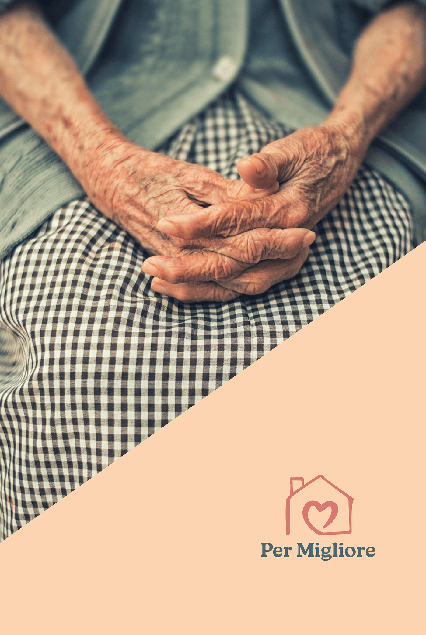
A Per Migliore é uma empresa que oferece serviços personalizados de assistência em saúde, focando na autonomia e nas necessidades específicas de cada paciente e família.
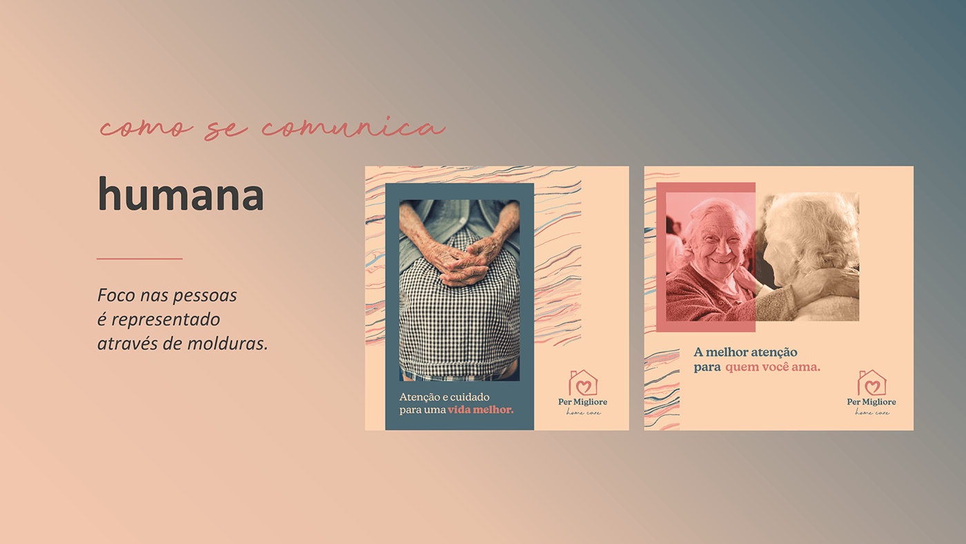
O intuito do projeto foi criar uma identidade visual humana, familiar e acolhedora, que expressasse visualmente todos os valores e objetivos da nova marca.
Per Migliore is a company that offers personalized healthcare services, focusing on the autonomy and the specific needs of each patient and their family.
The project goal was to create a human, familiar and welcoming visual identity that represents all the core values and objectives of the new brand.
A Per Migliore é uma empresa que oferece serviços personalizados de assistência em saúde, focando na autonomia e nas necessidades específicas de cada paciente e família.
O intuito do projeto foi criar uma identidade visual humana, familiar e acolhedora, que expressasse visualmente todos os valores e objetivos da nova marca.
Per Migliore is a company that offers personalized healthcare services, focusing on the autonomy and the specific needs of each patient and their family.
The project goal was to create a human, familiar and welcoming visual identity that represents all the core values and objectives of the new brand.

[EN] Research Brand vision and objectives:
• patient experience • respect their autonomy • safety & freedom • multidisciplinary action • home assistance

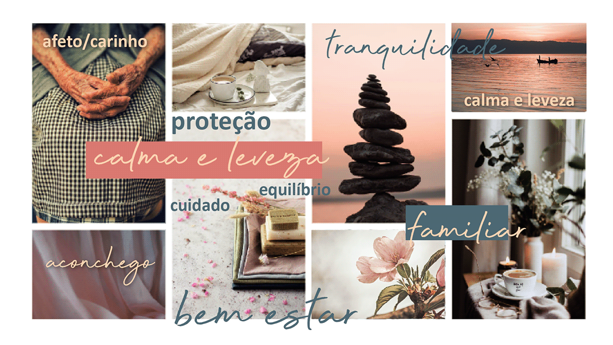
[EN] Strategy Brand attributes
• protection • care • familiar • sensitive • calmness • affection • lightness • trust
[EN] Strategy Brand core values
• autonomy • wellness • humanization • personalization • life quality • safety • assistance • responsibility
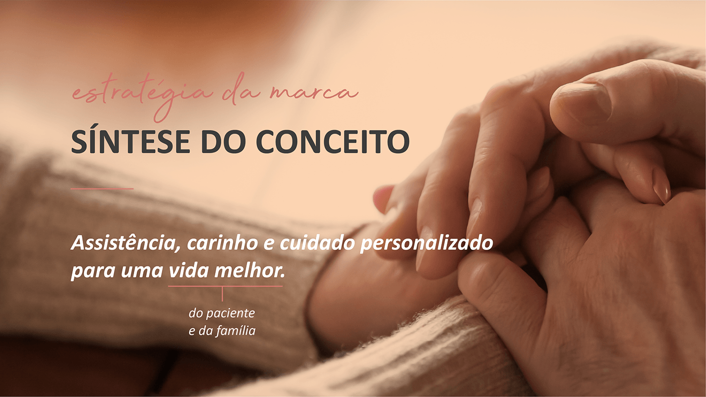
[EN] Strategy Brand concept
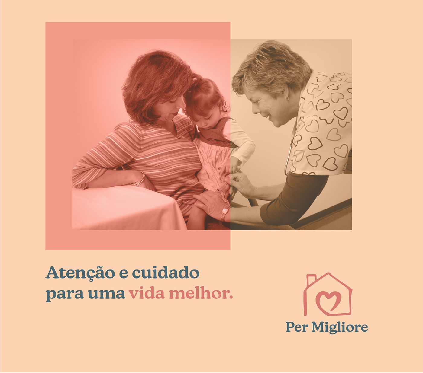
Assistance, kindness and personalized care for a better life — for both the patient and their family.
Assistance, kindness and personalized care for a better life — for both the patient and their family.
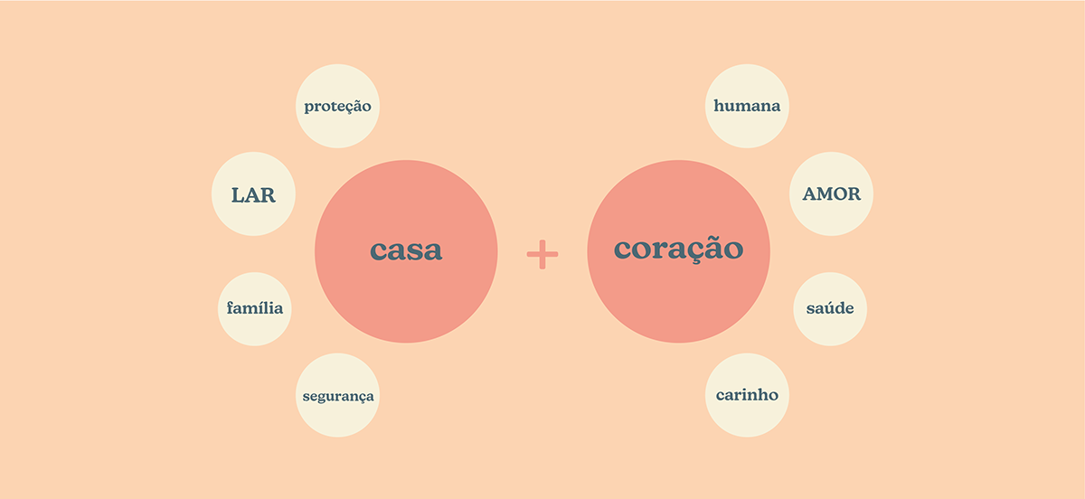
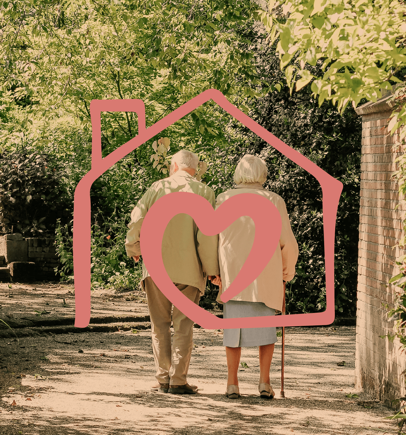
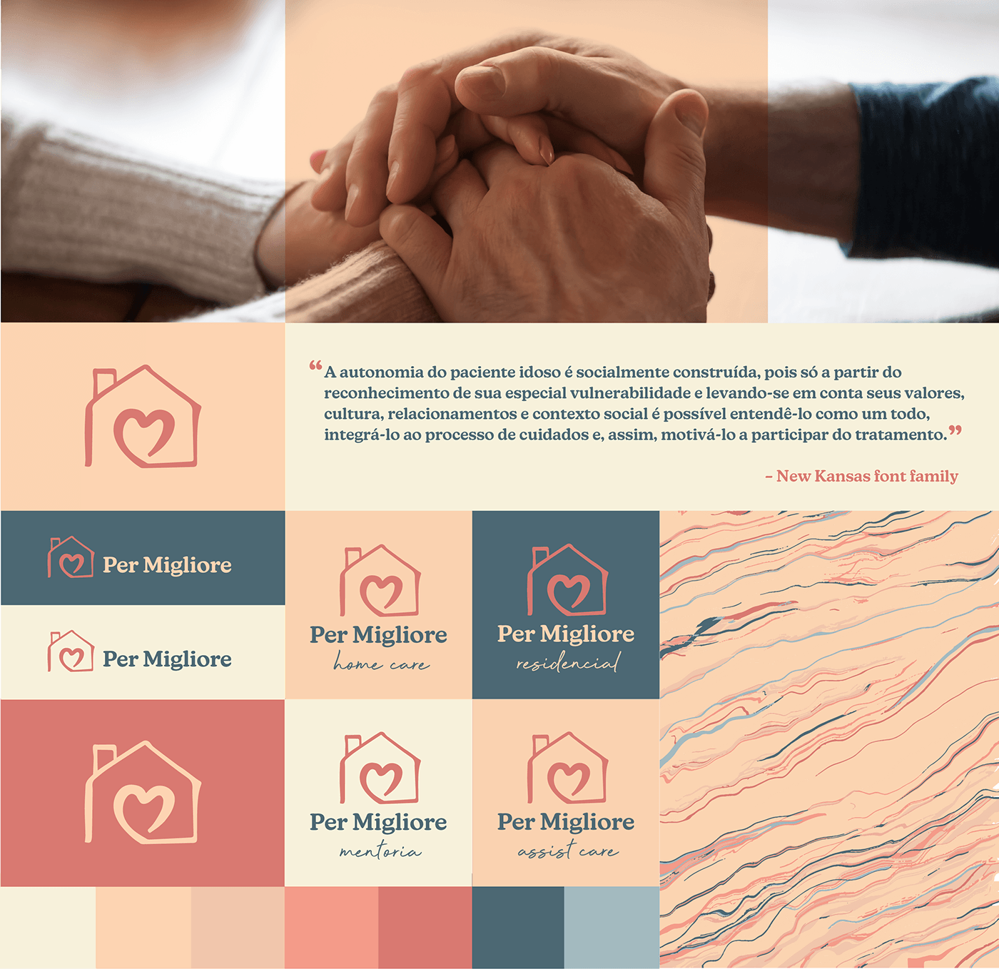
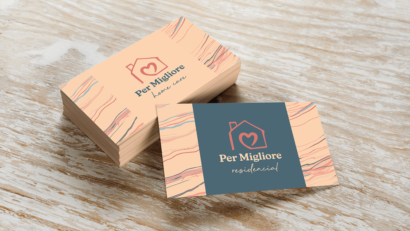
HOUSE + HEART
(protection / home / family / safety) (human / love / health / kindness)
(protection / home / family / safety) (human / love / health / kindness)


[EN] Brand identity
Color Palette
Color Palette
• Inspired by nature. Keywords: warmth, comfort, affection, freedom, calm, balance.
Visual assets
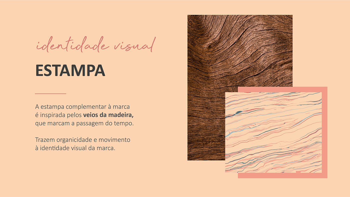
Pattern
Pattern
• Inspired by wood veins that represent time passage, the pattern adds organicity and movement to the brand's visual identity.
___________________
Projeto Design Único
Designer Débora Lima
Gerente de Projeto Giovana Capellato
Fotos Unsplash
Designer Débora Lima
Gerente de Projeto Giovana Capellato
Fotos Unsplash
Cliente Per Migliore
Ano 2022
Ano 2022


