


Naming / Logo design / Honey Label Design
Irini and Anestis have a family honey business in Litochoro. Their approach to our office was about designing
a label for the flower and pine honey they produce. In other words, they needed a label that was attractive
and grabbed the consumer’s attention. Also, it should have a strong design and be able to change graphically,
in its basic elements, so that we can also highlight the following flavors.


The cooperation
Initially, it is worth we mention that a label without a proper logo cannot stand out no matter how beautiful and high-quality the product itself is. For this reason, we jointly decided to take on the logo design as well.
Thus, we succeed in giving a more professional and serious label to the market. But beyond that,
the purpose was to inspire confidence and that would emphasize the quality of the products.
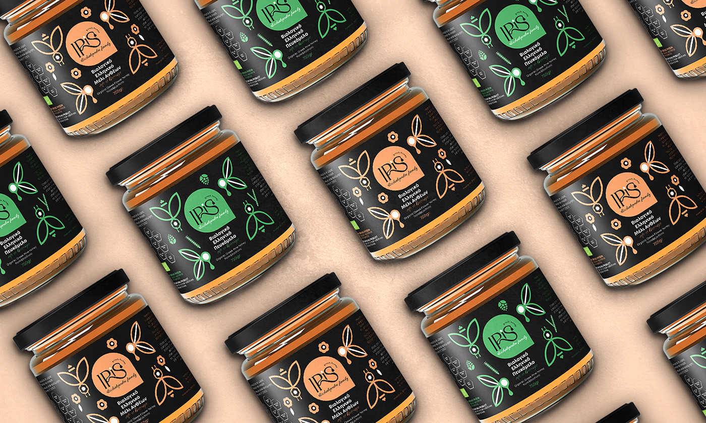
First, for logo design we were inspired by the name of the owner Irene. We emphasized typography with strong curves, which characterizes the way honey flows. In addition, we gave the detail at the end of the word with the drop of honey falling from the last letter “S” to achieve the direct rendering of the message to the consumer.
Then, the concept of label of the honey includes the detail of the logo design, combined with the use of linear abstract bees surrounding the logo.
Drawn a basic label with the original design, adjusted by changing the color of the pine and to some other linear design elements. So they could also use it for the flavor of pine honey.

Don’t be left behind!
Create your corporate identity from scratch or renew it.
Contact us or send us a request & we will respond within 3 hours, maybe less!


