This is my diploma work.
The project owner is Moscow Central Fairgrounds "Expocentre".
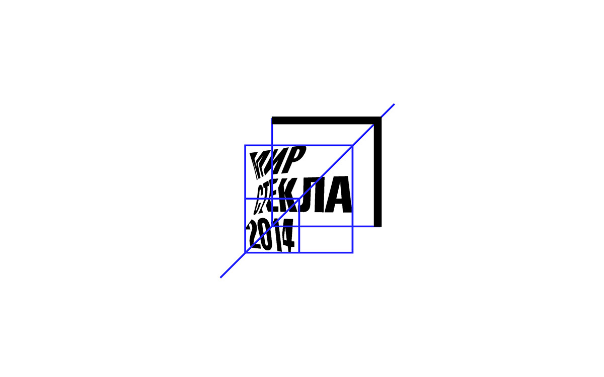
The main goal was to create a brightful stylistical ground but rather plain so that each year a design can
be changed but will be remained noticeable. Another important goal was to lighten the surrounding of the exhibition: to make an easy navigation and to call attention to exhibition events. The logo combines the geometrical cut of glass and shape deformation.
The project owner is Moscow Central Fairgrounds "Expocentre".
The main goal was to create a brightful stylistical ground but rather plain so that each year a design can
be changed but will be remained noticeable. Another important goal was to lighten the surrounding of the exhibition: to make an easy navigation and to call attention to exhibition events. The logo combines the geometrical cut of glass and shape deformation.

A method of crumpled paper and its futher digitazing was chosen to show the distortion truely and this method enables to control the result. Also this way gives an opportunity to make a wide range of logos.


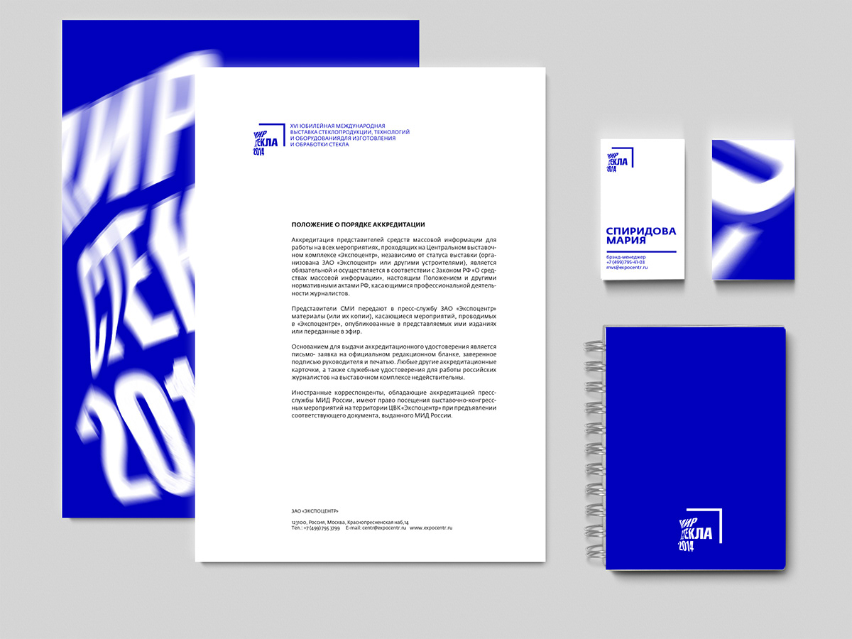


Besides the deformed font in promo banners the raster image of glass roducts is used.
The raster is chosen on the analogy with the way of glass printing.
Blue colour is chosen from RGB system as unlike CMYK it's optical colour mixing. Finally bright blue
colour together with deformed shapes is creating a powerful and laconic style which is perfectrly suited
for the exhibiton.
The raster is chosen on the analogy with the way of glass printing.
Blue colour is chosen from RGB system as unlike CMYK it's optical colour mixing. Finally bright blue
colour together with deformed shapes is creating a powerful and laconic style which is perfectrly suited
for the exhibiton.


