ANGELINA SPIRITS
BRAND IDENTITY & LABEL DESIGN YEAR: 2023
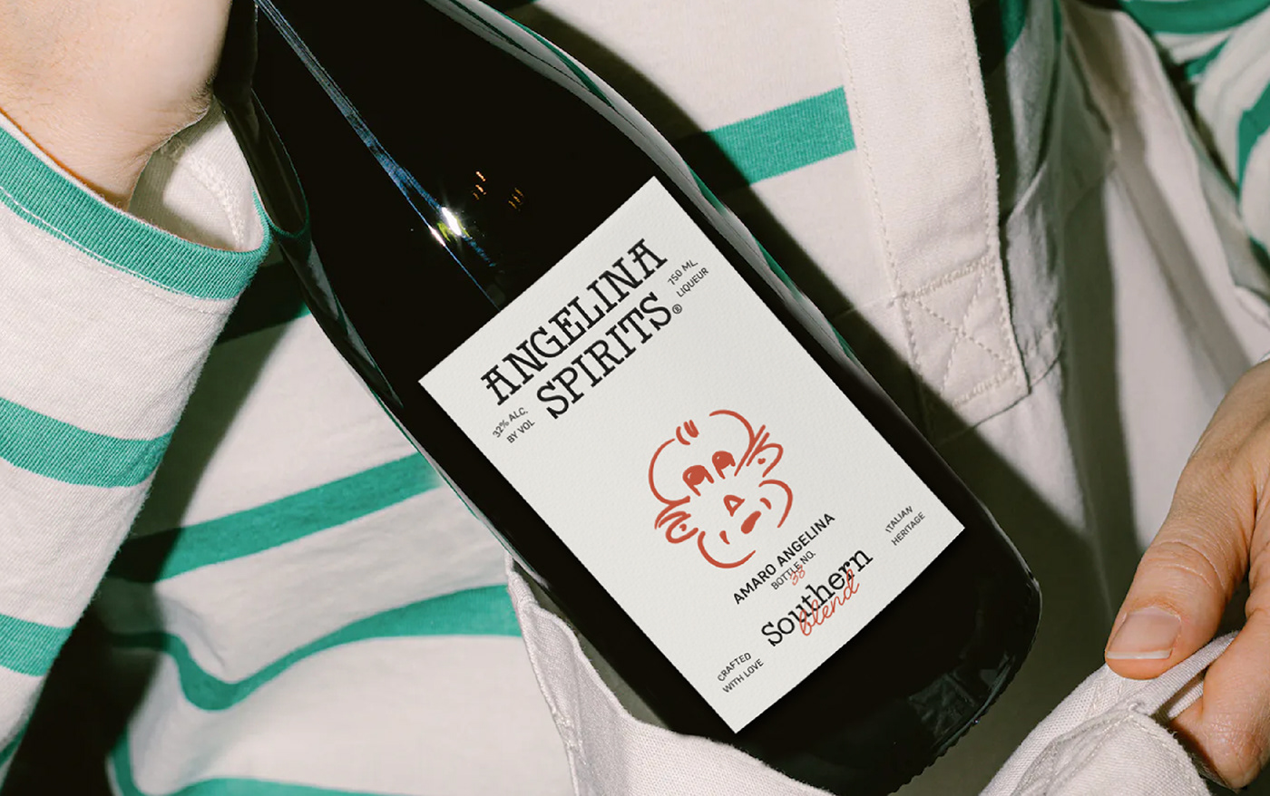
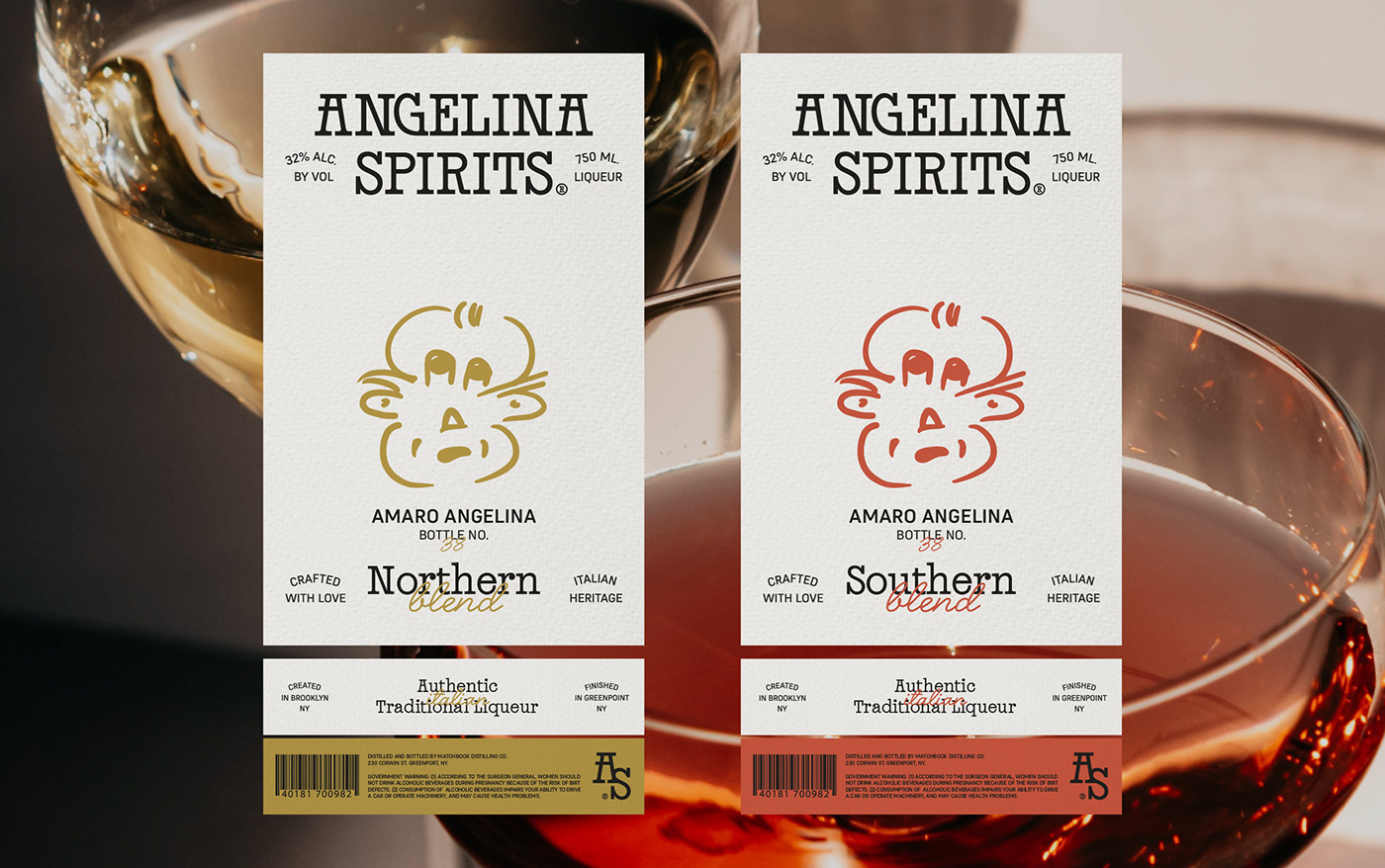
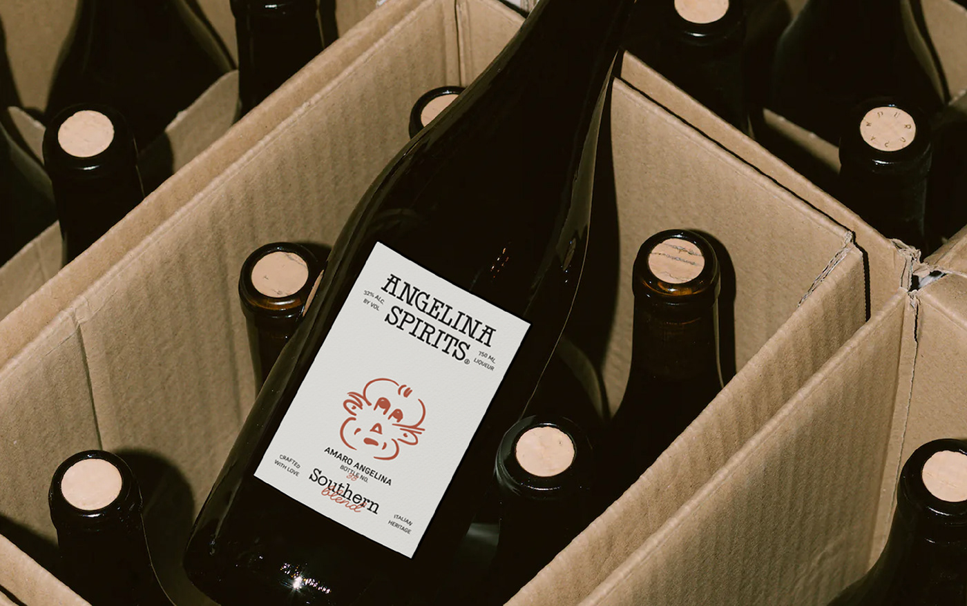
Angelina is a brand that emerges as the perfect excuse to keep a legacy alive. Although Daniel and Sara currently live in Brooklyn, NYC, their grandparents were born and lived in Italy, surrounded by a life full of smells and flavors that date back to the manufacturing of Amaro, a spirits drink that marked the family's life. Now it's grandchildren seek to have a brand full of that italian nostalgia, tradition and family pride for their Nonnos. A small self-portrait illustrated by Nonno himself was the starting point for the design of the identity and its implementation in the brand's packaging. This sketch is very special for the family, since it was a drawing made by the grandfather and that has withstood time. With some tweaks, but maintaining the essence, we decided that it would be the main axis of communication on the packaging and other brand pieces.
The main font, Jazz BT by Bastarda Type, gives the perfect touch to the brand, which operates between a youthful present but with the vitality of Jazz music from the heart of New York, and an emotional heritage of unique recipes originating in Italy. The brand and its packaging seek to give a fresh look at both worlds.