Little Makers Art Studio Branding
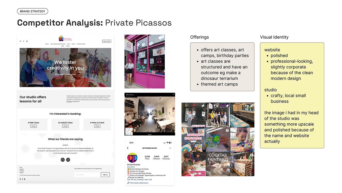
I was approached to design the branding for a children's art studio in Brooklyn, New York. The client wanted an aesthetic that had a crafty feel, was still rough around the edges, colourful and abstract. My first step was to understand her vision for the studio and analyse the competitive landscape, so as to position her brand strategically.


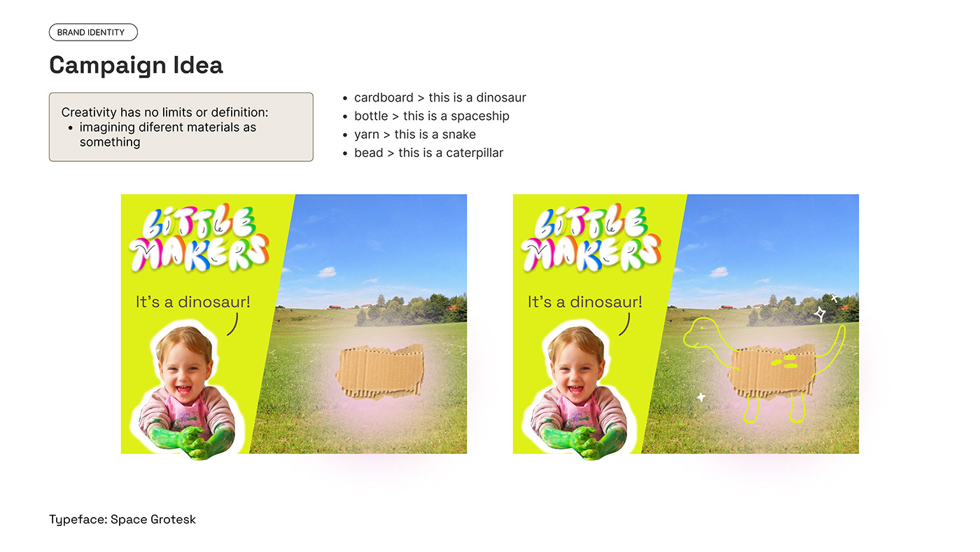
The client preferred the bubble type and doodles of visual direction 2 and really loved the campaign concepts of seeing raw materials through the eyes of a child. With visual direction 2, what could be improved was the neon colours which could give a bit of a dated feel, and looked similar to The Craft Studio. Apart from tweaking the colours, I went ahead to expand on the crafty visual language as well, creating textures and characters from craft materials.
Branding Identity Proposal


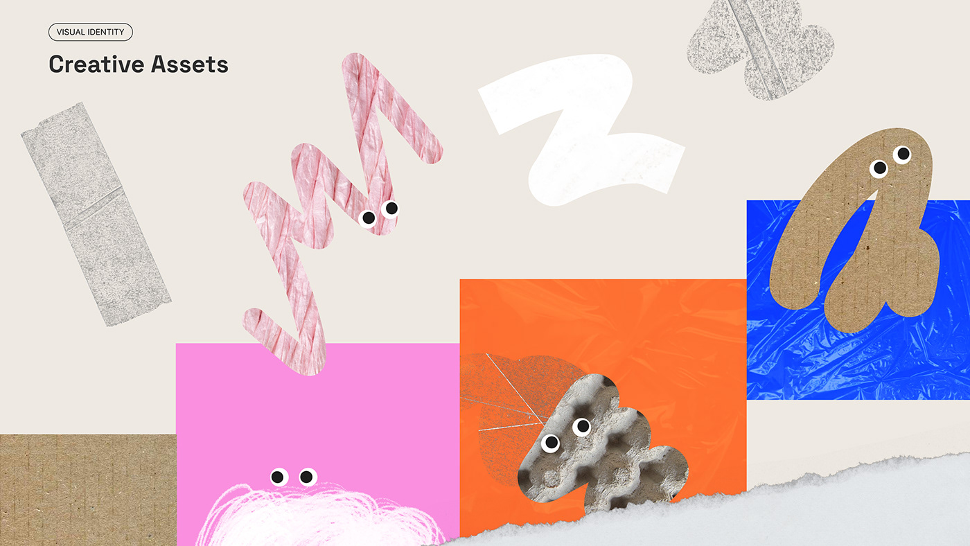
Because the client liked the black and white doodles in the moodboard and mentioned having little characters as part of the branding, I experimented with sketching characters out of procreate paint brushes. I wanted to create a mixed material collage style, combining brush strokes with craft materials to reflect the craft-making process of putting different materials together.
However, overall the characters made from craft materials and googly eyes above tied together as a more cohesive visual identity.