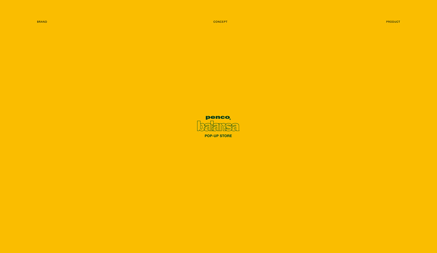
Over view
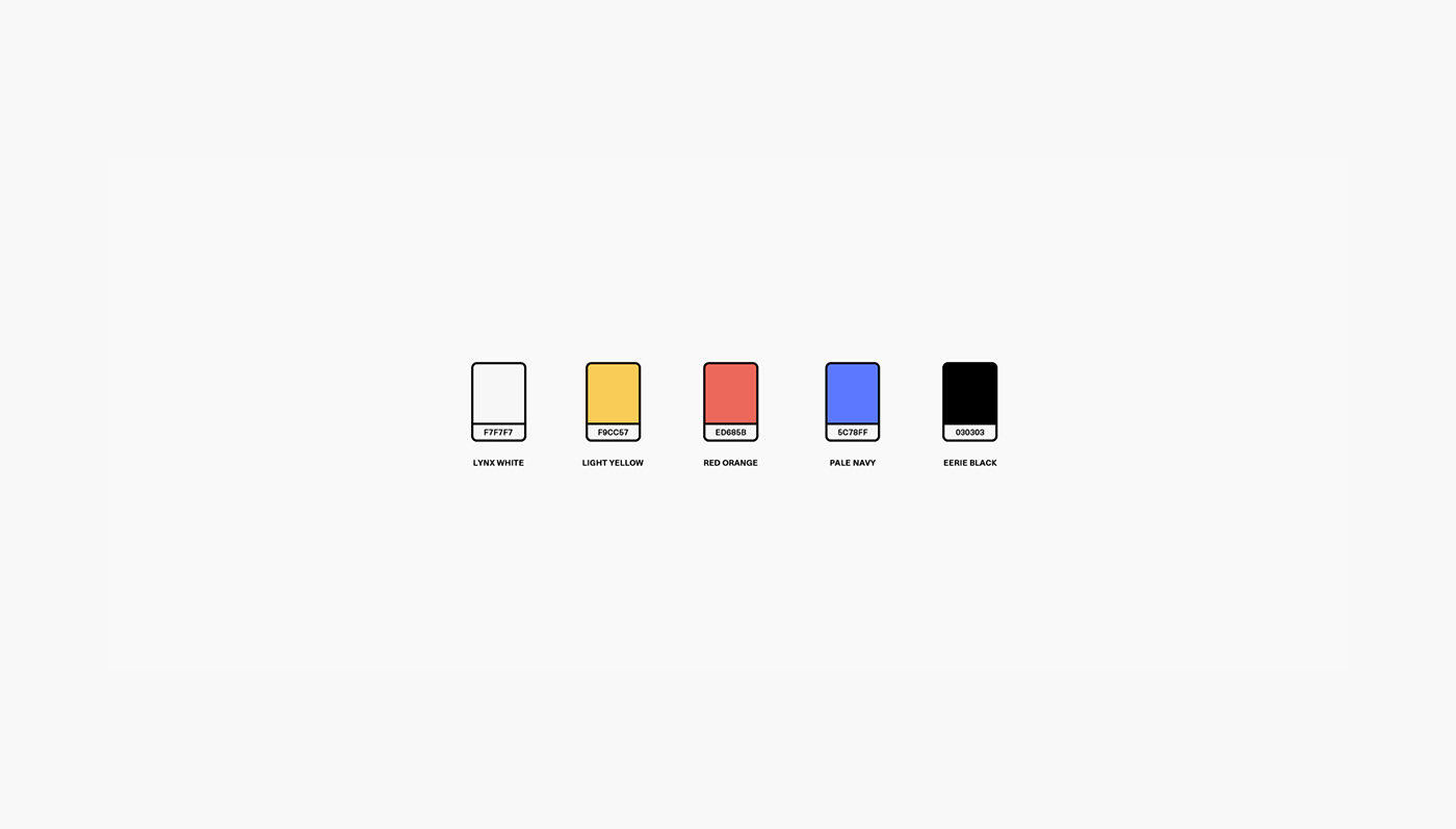
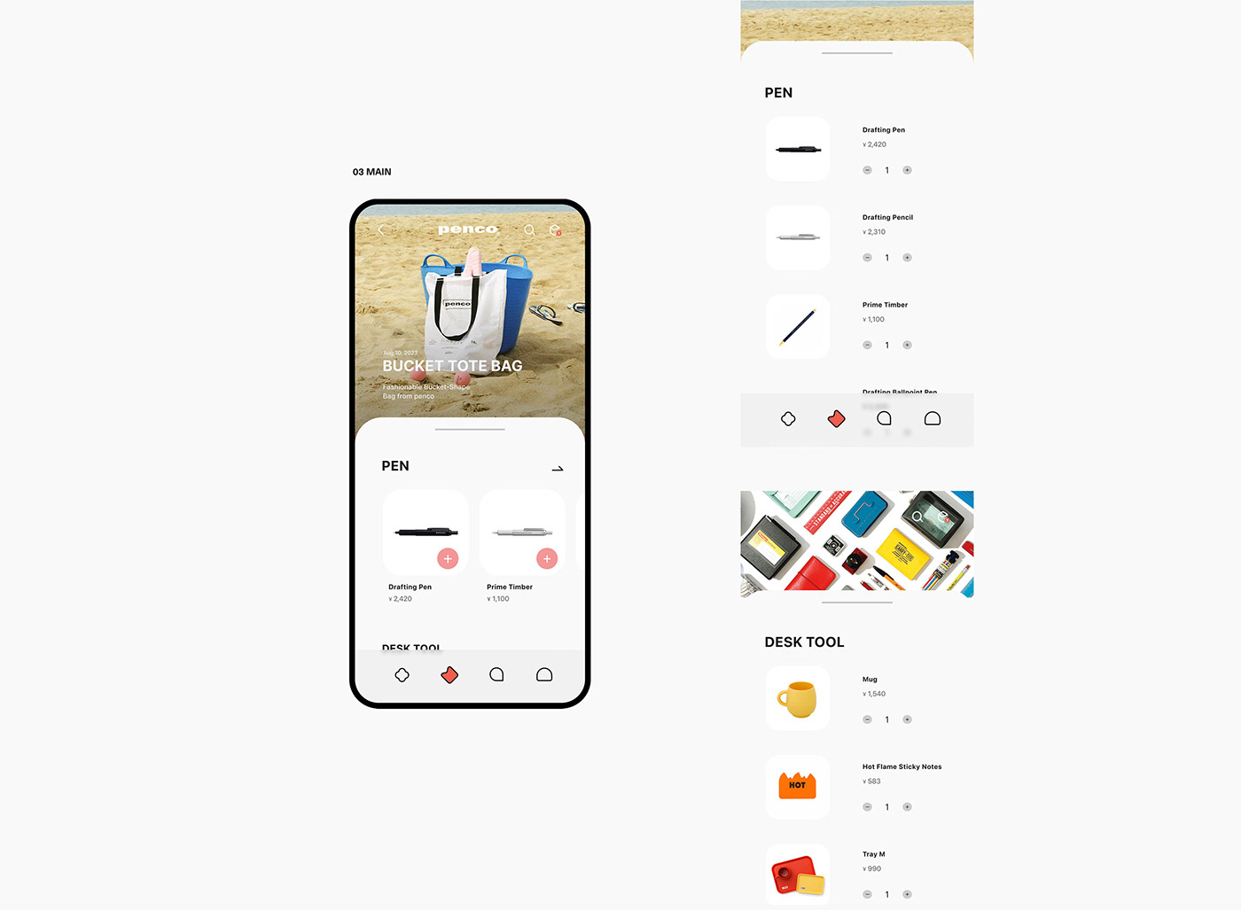
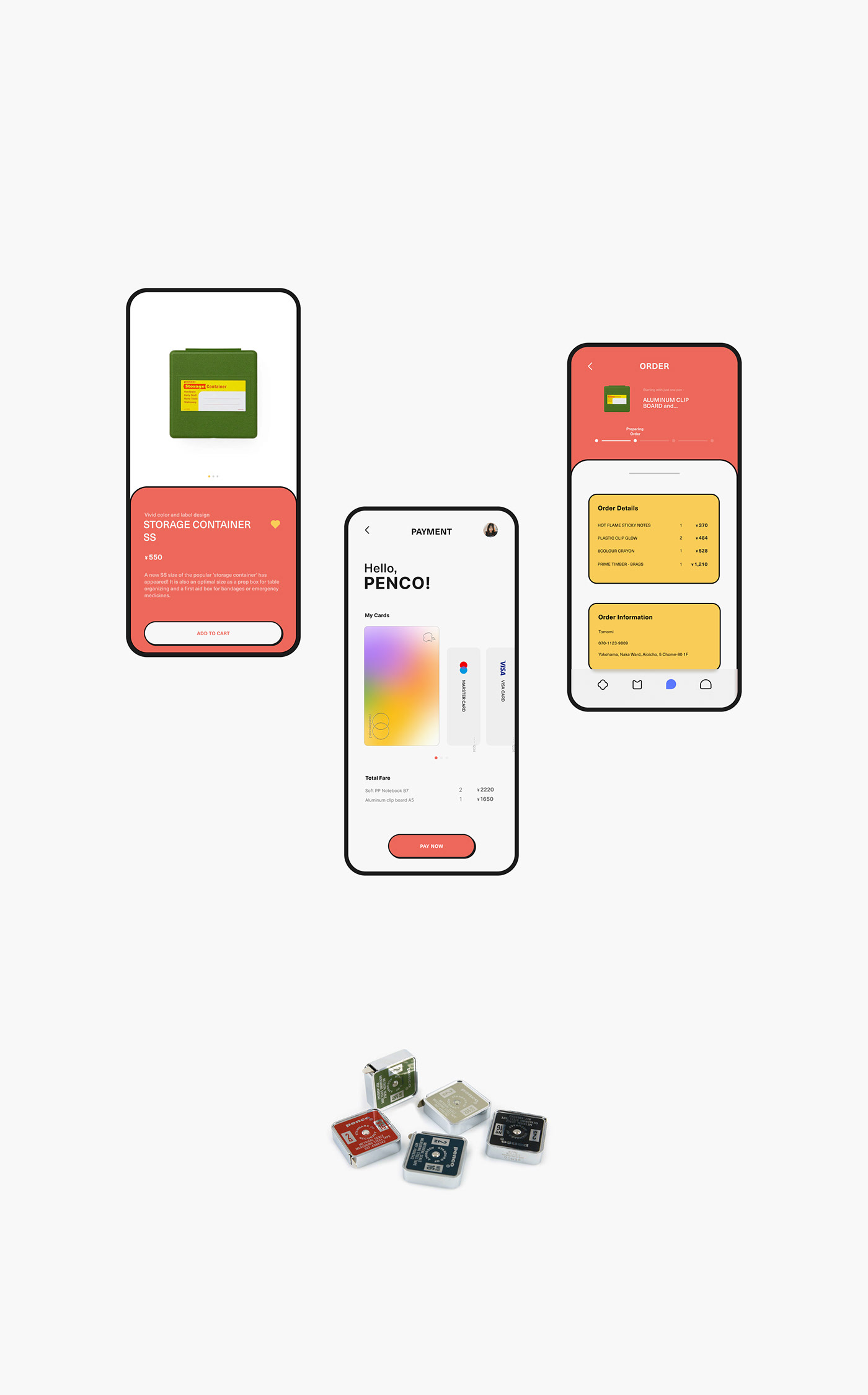
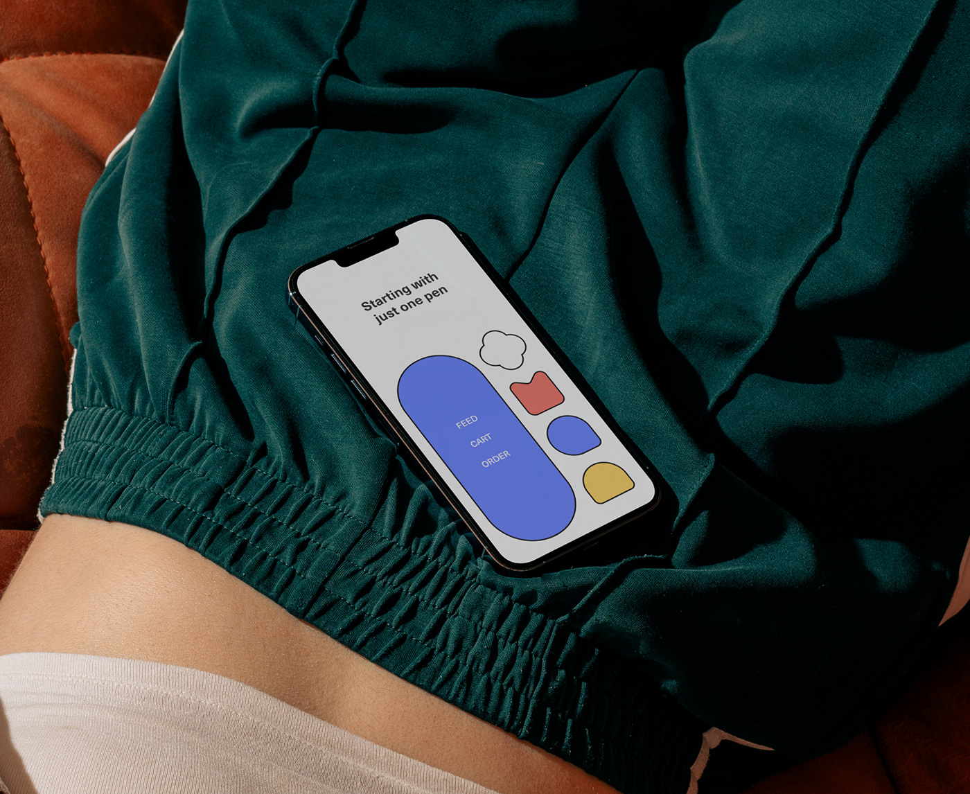
Based on the color palettes incorporated into Penco's products, this project created a cute and unique feeling by using UI elements such as lines and icons. Each color expresses Penco's brand identity and aims to deliver a pleasant visual experience to users through a variety of combinations from soft and quiet tones to colorful and lively colors.
이번 프로젝트는 펜코의 제품에 녹아들어 있는 컬러 팔레트들을 기반으로 하여 컨셉을 잡아 표현하였고 라인, 아이콘 등 UI 요소들을 활용하여 귀엽고 개성적인 느낌을 연출하였습니다. 각각의 컬러는 펜코의 브랜드 정체성을 표현하며, 부드럽고 조용한 톤부터 화려하고 생기 있는 컬러까지 다채로운 조합을 통해 사용자에게 즐거운 시각적 경험을 전달하는 것을 목표로 하여 제작하였습니다.

Core Value
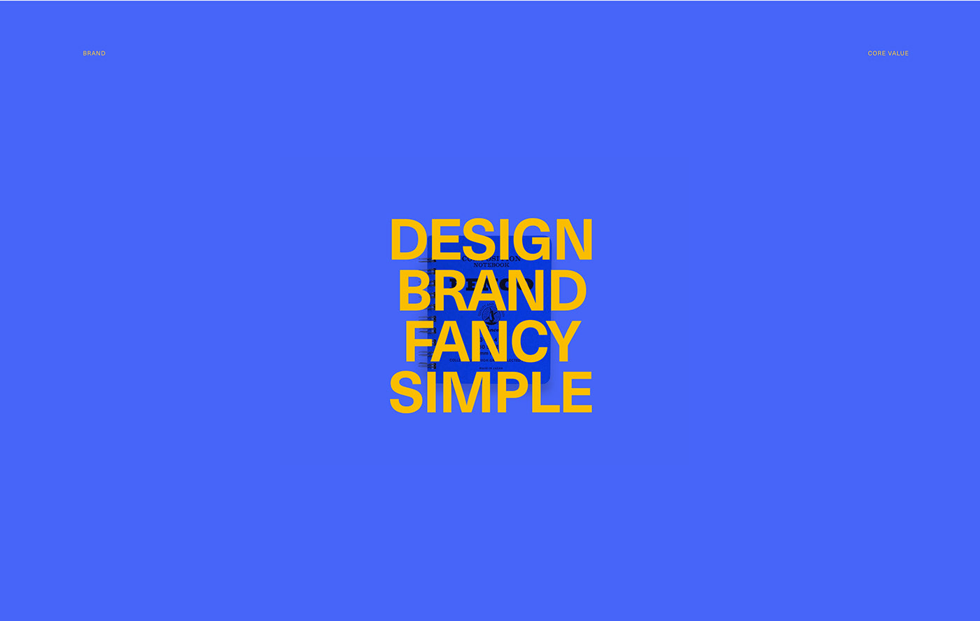
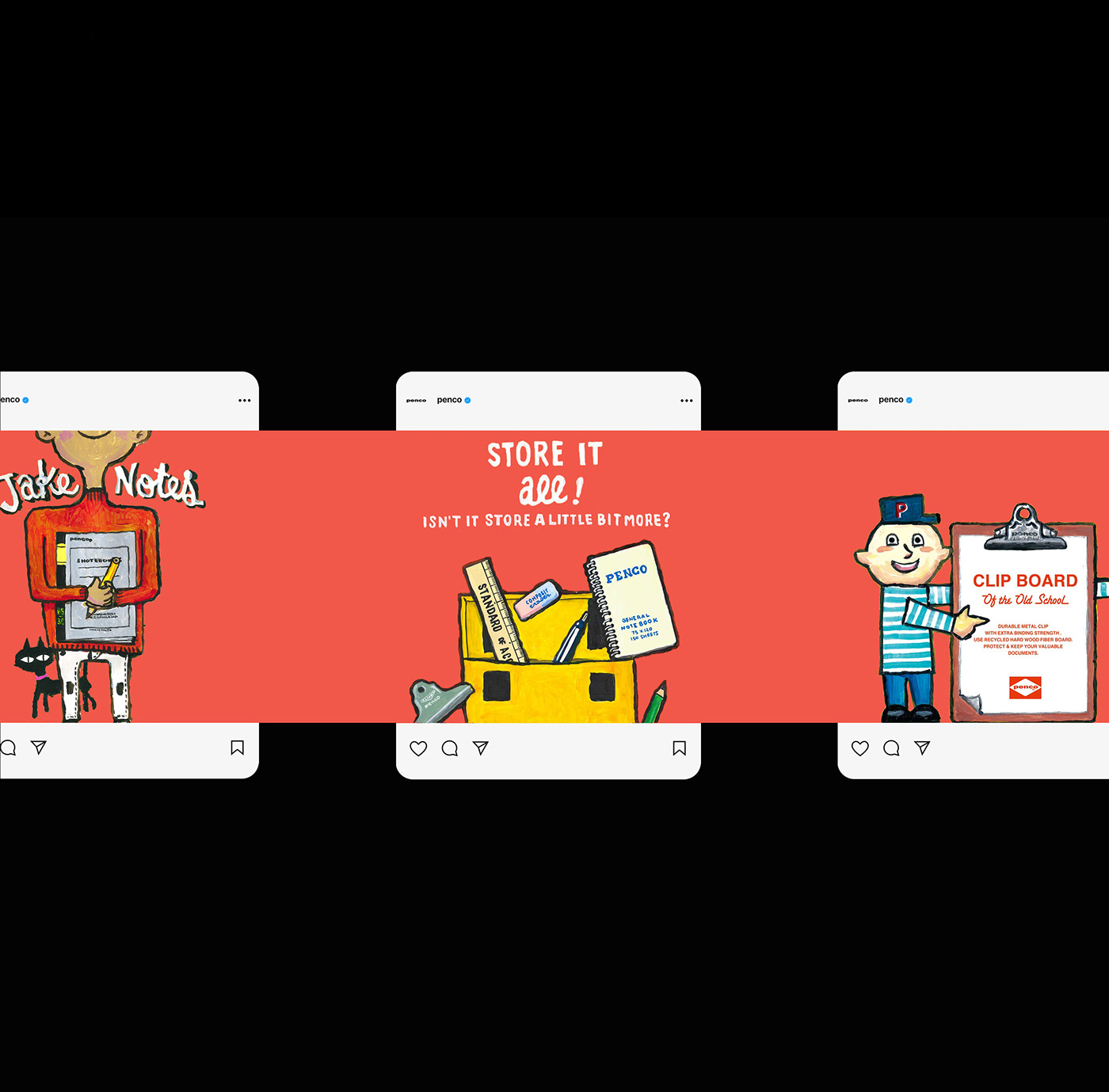
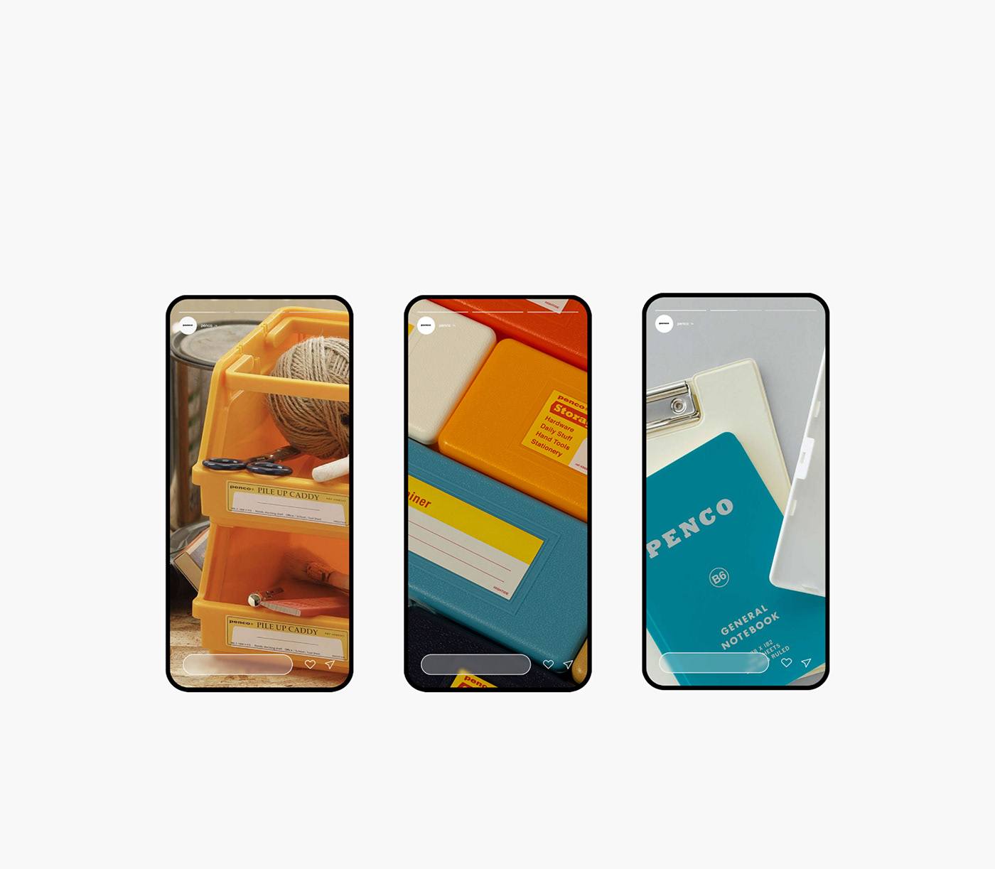
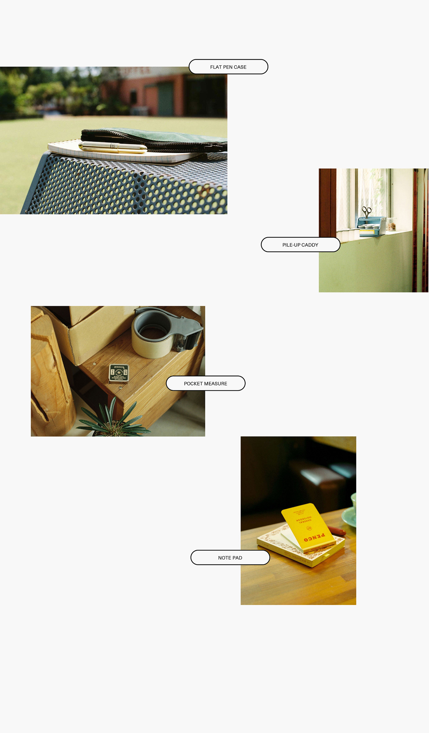
Penco is a daily stationery brand that focuses on design and functionality that originated from a single pen. Penco has analog stationery-like concepts and designs that were found in old bookstores. This project is designed with a focus on showing the identity of penco, so it has Penco's unique bouncy colors and analog elements everywhere.
penco는 단 한 개의 볼펜에서부터 시작된 디자인, 기능성에 중점을 둔 데일리 문구 브랜드입니다. penco에서는 오래된 서점에서 찾아 낸 아날로그 문구 같은 콘셉트와 디자인을 가지고 있습니다. 이번 프로젝트는 penco만의 아이덴티티를 보여 주는 데 중점을 두고 디자인하여, penco 특유의 통통 튀는 색감과 아날로그적인 요소를 곳곳에 배치했습니다.