


When Eggyolk Coffee opened on July 2nd, 2021, no one thought it would have to close its doors just two weeks later as the first wave of the COVID pandemic hit Vietnam—the following two years of social distancing and the subsequent economic recession brought the mood of the whole country and its people down, with the cost-of-living crisis, empty storefronts, slow recovery of tourism and business closure hit a record high.
Eggyolk would almost never have opened its doors again if it wasn't for its founder’s trip to its coffee farm, where the resilient and uplifting attitude of farmers during the difficult time gave the team a new purpose: to get people energised and excited again every morning with a good cup of coffee along with the positivity from those making it.
Eggyolk Coffee enlisted Hands Collective to create the initial visual identity and help bring its newfound purpose to life.

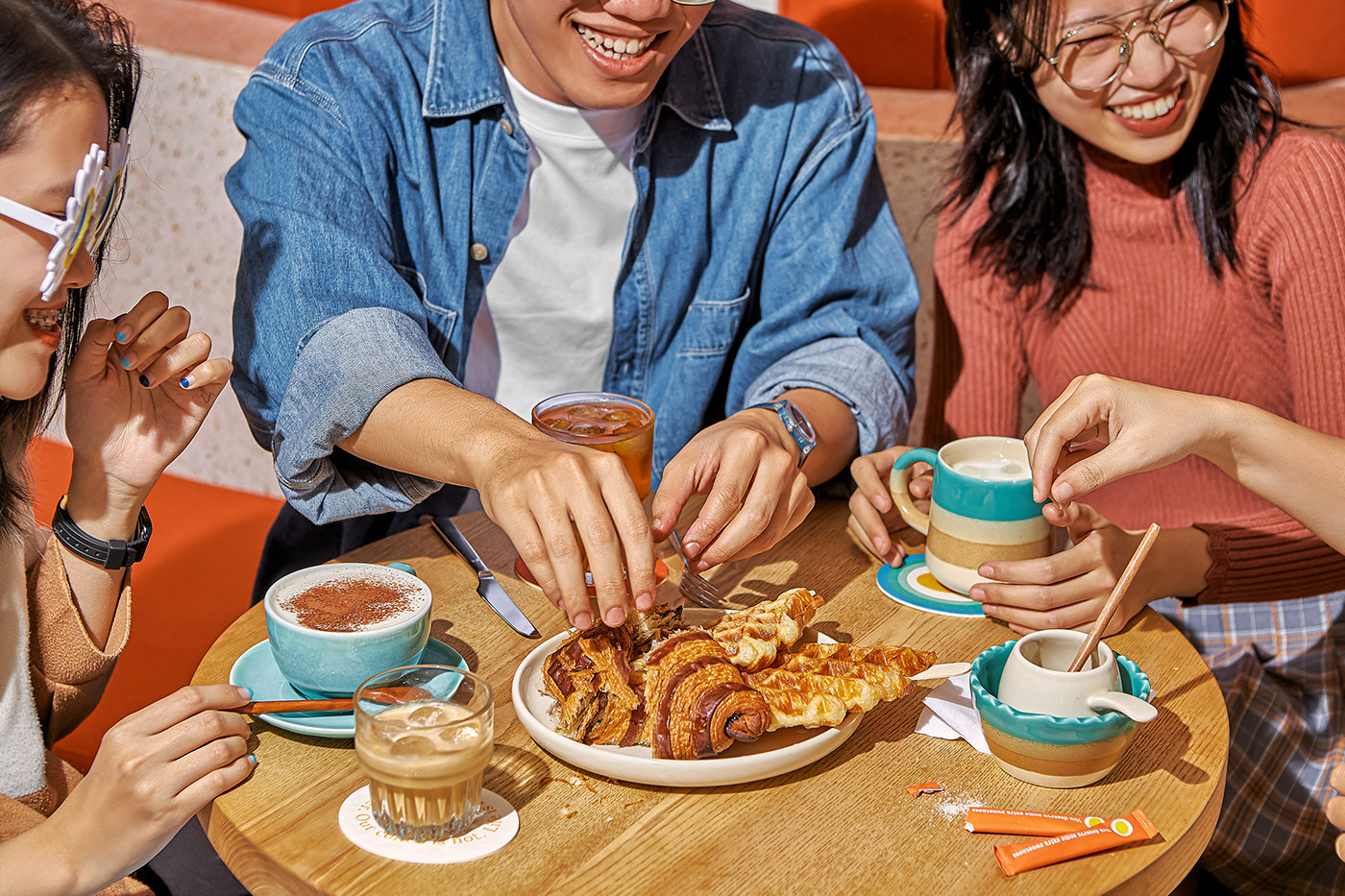
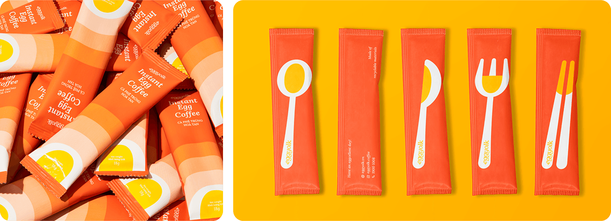
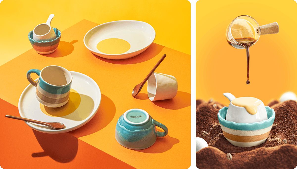
Introducing Egg Coffee - a drink invented during the time of French colonisation of Vietnam when milk was scarce, so whisked egg yolk was used as a replacement. The combination of natural coffee bitterness and the frothy texture of egg yolk makes the drink uniquely rich and bold yet extremely palatable.
This drink embodies some of the greatest of Vietnam, from its incredible coffee beans to the ingenuity and unbreakable spirit of its people during difficult times. The addition of proteins from egg yolks to caffeine gives it an extra kick – a breakfast in a cup that provides energy and nutrients for its people to kickstart the day.
This drink embodies some of the greatest of Vietnam, from its incredible coffee beans to the ingenuity and unbreakable spirit of its people during difficult times. The addition of proteins from egg yolks to caffeine gives it an extra kick – a breakfast in a cup that provides energy and nutrients for its people to kickstart the day.

We resumed the project in the middle of 2022 with deep immersion and research at the farm. We focused on coffee and the people growing it - observing their struggle, sharing their meals, and witnessing their optimistic spirit. We returned with the same positivity about the future and with an inspiration to bring that spirit to the people.


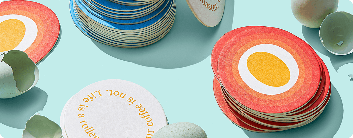

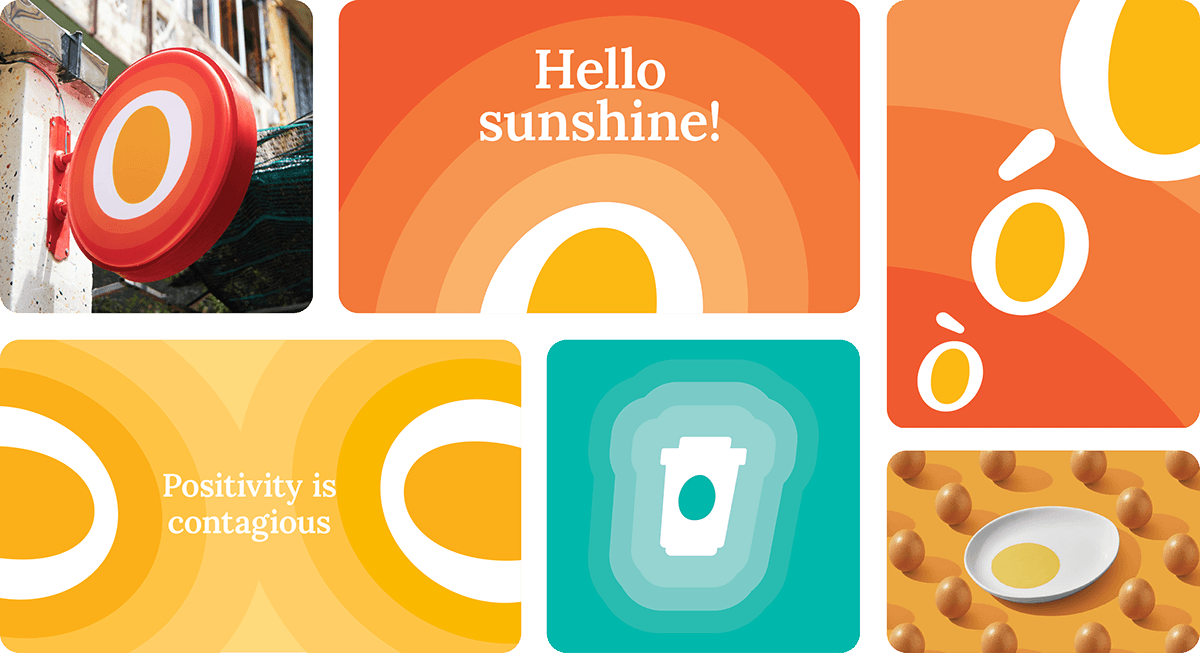
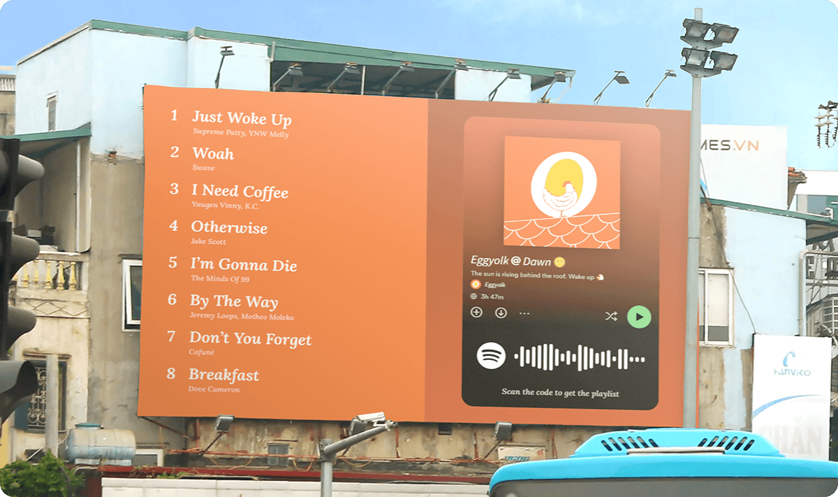
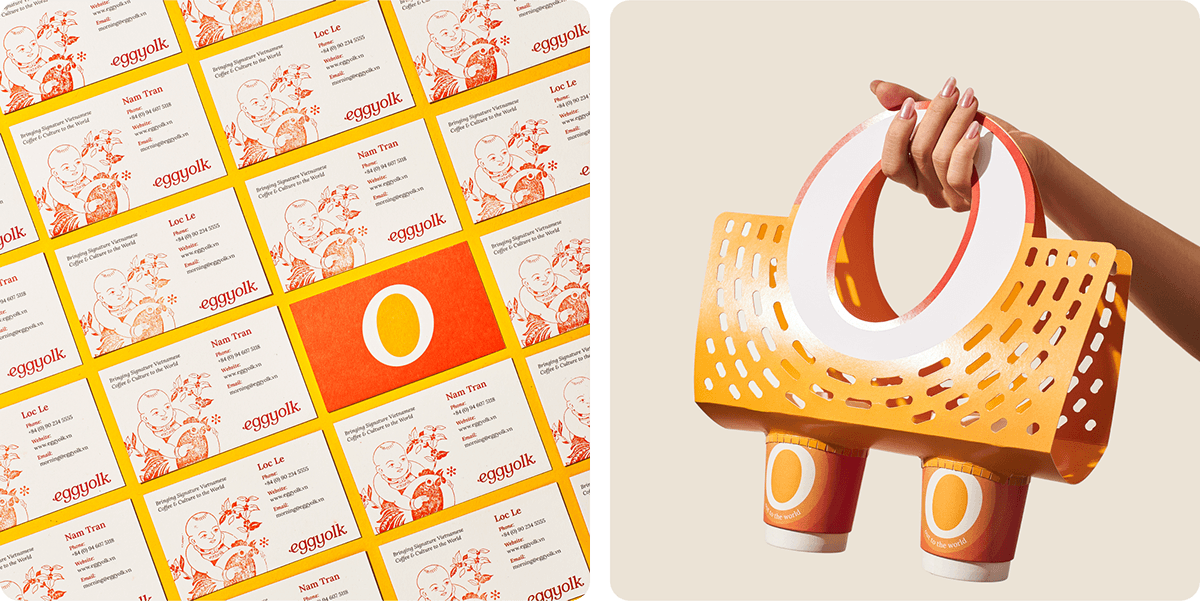
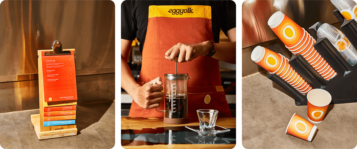
The resulting identity is centered around “the energetic egg,” a fun, abstract symbol inspired by the egg’s cross-section with a huge yolk, slanted 7 degrees to create a familiar yet distinctive look. The egg symbol embodies limitless energy in its dynamic configurations. It can infuse itself with energy by emanating shades of red, orange, and yellow, making it unable to be ignored. A dynamic illustration system is also built into the symbol, allowing it to become a main character or take a supporting role and let people tell their stories. All while maintaining brand presence at all times.
The custom wordmark takes the cue from the logo with a 7-degree slant and contains nearly half a dozen ball terminals, which was challenging to design but resulted in a mark with an energetic flow and rhythm that fit the logomark.

The wordmark inspired typography choice. Lora is a beautiful open-source typeface with subtle flourishes that make it look like calligraphy. It is well-balanced and versatile, available in moderate contrast, and optimal for screen and print. Using a single typeface helps maintain energy flow instead of being broken apart by another sans-serif one. This motif also inspired other graphical elements, such as iconography.
The system is expanded based on two principles. Firstly, there is energy, the functional benefit of coffee consumption. Secondly, there is positivity, which is the emotional benefit of having an excellent cup of coffee. These principles result in a bold colour palette, and key visuals revolve dynamically around the energetic egg symbol.

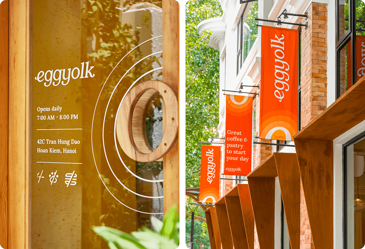
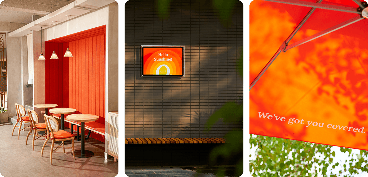
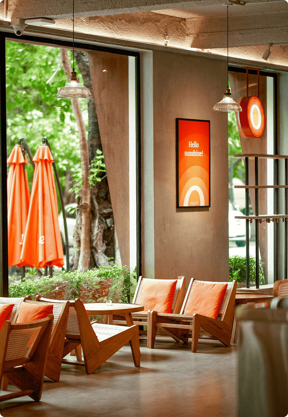
This vibrant visual idiom realised across various digital, printed and architectural applications rendered the identity remarkably versatile, simple and consistent.
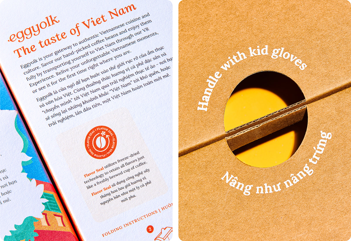
Those principles also shape the brand’s verbal identity, with little messages embedded into the applications, waiting to put a smile on the customers’ faces as they sip their delicious cups of coffee.

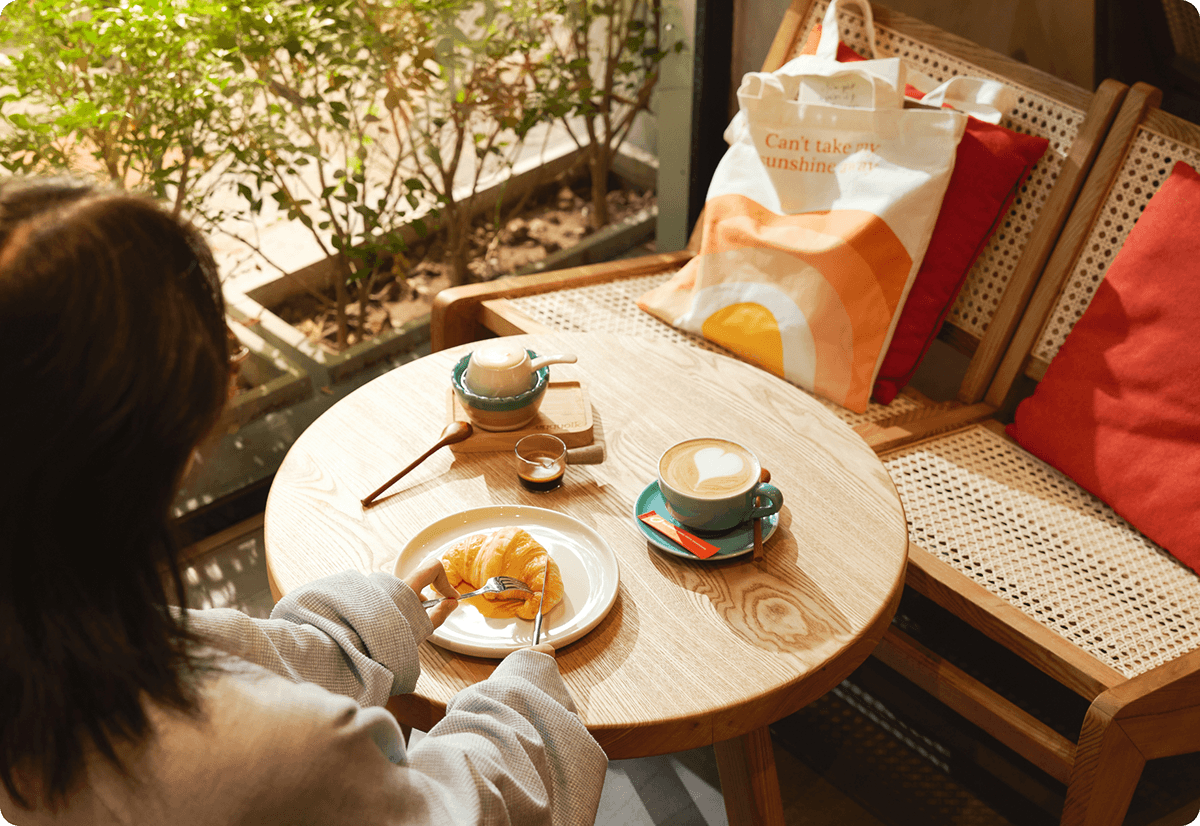
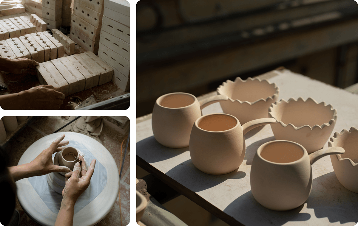
An unique collection of ceramics is also designed and produced in collaboration with artisans at the renowned Bat Trang Ceramic Village, where attention is paid to the materials and techniques to safety, and sustainability.

The website invites visitors to discover Vietnamese coffee culture with unique methods of brewing coffee, ingredients, and ways of consumption. It also provides an interactive process for customers to choose menu items based on their mood and energy level.
Eggyolk's eye-catching visuals and signature egg coffee gained much attention from coffee lovers, food reviewers, tourists and the local press. Its brand identity is also featured in popular branding publications and have won several awards to date.

Strategy Director: Thinh Nguyen
Strategist: Hanh Nguyen, Linh Pham
Designer: Giang Nguyen, Hieu Pham, Phuong Van, Vu Nguyen, Trang Ká
Illustration: Quang Nguyen
Animation: Chau Le
Web Designer & Developer: Linh Pham
Concept & Product Photography: Oni Production
Lifestyle Photography: Cam Lai
Stylist: Ha Nguyen
Producer: Nam Nguyen


