

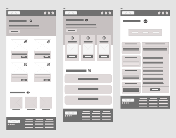
Paper wireframes
After brainstorming and research, we crafted paper wireframes for the Career Aid App, focusing on features for blind users. Designing for visually impaired individuals posed challenges, underscoring the significance of a built-in screen reader for auditory navigation.
Essential features for a successful career coaching website for the blind:
Screen Reader Compatibility: Allows navigation using screen reader software.
Text-to-Speech Functionality: Converts text into audio for accessibility.
High Contrast and Large Text: Enhances readability for users with low vision.
Straightforward Navigation: Facilitates easy movement through the website.
Consistent Layout and Structure: Provides predictability and reduces cognitive load.

Digital wireframes
By leveraging the strengths of the paper wireframes and adapting them to the digital medium, I created digital wireframes that effectively communicated the design vision and user experience for the Career Aid App.

Iteration
By adapting paper wireframes to the digital medium, I ensured the digital versions effectively conveyed the design and user experience for the Career Aid App. Prioritizing user flow and accessibility, I incorporated straightforward navigation and high-contrast visuals. Additionally, I prepared the plans for usability studies by including interactive elements. This ensured optimization for testing before further development.
Mockups
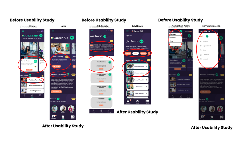
I used the usability error rate metric to identify design pain points during the usability study. Participants encountered navigation challenges due to missing back buttons, and the navigation menu needed a redesign. In response, I added back buttons to the pages that were missing them. Additionally, due to limited space on mobile devices, I replaced trim job search options with horizontal sliding menus and increased the size of menu options to improve visibility. Despite intending to include a zoom-in feature, limitations within the Figma program prevented its implementation. As an alternative, I prioritized readability by enlarging the text size on each page and leveraged screen readers for accessibility.

Paper Wireframes
This approach promotes consistency and continuity by ensuring a uniform platform experience, especially web and mobile layouts. Familiar design elements such as navigation patterns and feature placements build trust and confidence for users, reducing cognitive load and enhancing usability.
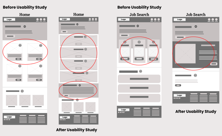
Digital wireframes
I applied complementary design techniques to enhance the Jobs Search page in the digital wireframe. This involved ensuring platform consistency, maximizing space for detailed job listings on web layouts, and prioritizing information with visual hierarchy principles. Through these techniques, I improved the page by providing users with comprehensive information while maintaining usability and consistency.
Iteration
Transitioning to digital wireframes allowed us to refine spacing, content placement, and user flow, followed by a usability study to enhance the designs iteratively. Low-vision participants often expressed frustration with content placement ambiguity. To address this, we simplified design elements. For instance, instead of using a carousel on the homepage for coaching options, we listed each option vertically with minimal wording.

Mockups
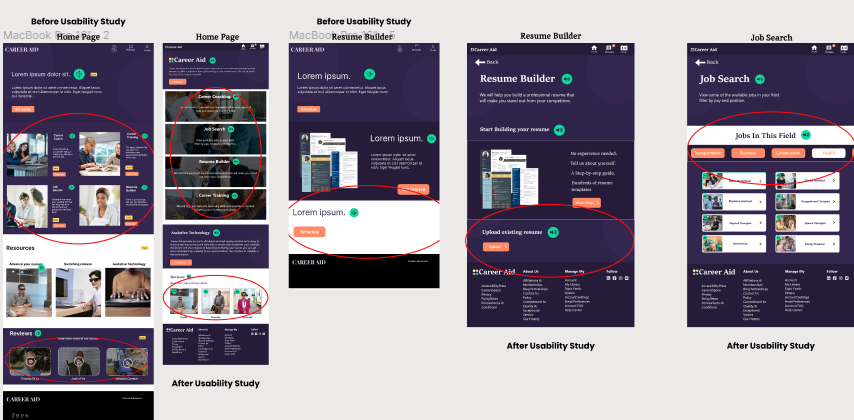
After transforming our digital wireframes into mock-ups, participants emphasized the importance of contrast, especially considering users with vision impairments. To implement context, I leveraged a prototyping feature offered by Adobe XD—voice commands. This unique feature enabled users to accomplish tasks by holding the space bar, enhancing accessibility for web-based users.


