


PT-BR
TOPACI - Decisões Criativas.
Topaci é uma marca de Contabilidade que visa a inovação tecnológica, futurista, mas com um trabalho para pessoas mais maduras. O desafio foi pensar em como criar uma marca futurista sem afastar o público mais velho que precisa ver confiança e segurança numa empresa que vai cuidar de suas finanças que é sempre algo tão sensível. A resposta, foi escolher uma figura antiga, mitológica, de imagem forte, que tem uma dualidade em suas expressões, sendo um animal conhecido por representar a sabedoria e a força. Utilizar um animal lido como antigo com uma perspectiva atual foi uma forma de aproximar esse público. A criação do símbolo é uma pose forte, com as garras do fundo preparadas para agarrar o que for necessário.
EN-US
TOPACI - Creative Decisions.
Topaci is an Accounting brand that aims for technological innovation, a futuristic approach, but with a focus on catering to a more mature audience. The challenge was to think about how to create a futuristic brand without alienating the older demographic that seeks trust and security in a company responsible for handling their finances, a matter that is always so delicate. The solution was to choose an ancient, mythological figure with a strong image, embodying duality in its expressions, as an animal known to represent wisdom and strength. Using an animal associated with antiquity from a modern perspective was a way to connect with this audience. The creation of the symbol portrays a powerful pose, with claws ready to grasp whatever is necessary.
Topaci is an Accounting brand that aims for technological innovation, a futuristic approach, but with a focus on catering to a more mature audience. The challenge was to think about how to create a futuristic brand without alienating the older demographic that seeks trust and security in a company responsible for handling their finances, a matter that is always so delicate. The solution was to choose an ancient, mythological figure with a strong image, embodying duality in its expressions, as an animal known to represent wisdom and strength. Using an animal associated with antiquity from a modern perspective was a way to connect with this audience. The creation of the symbol portrays a powerful pose, with claws ready to grasp whatever is necessary.


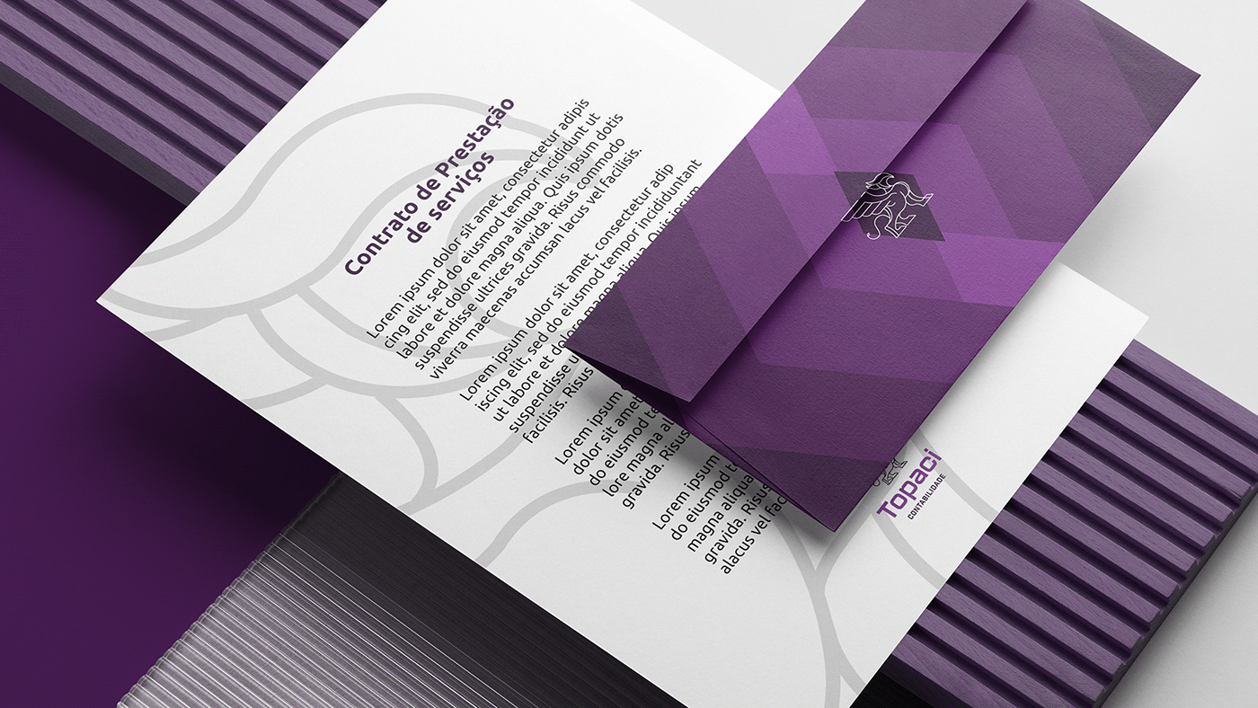
PT-BR Logotipo, Ilustrações e estampa
A construção do grifo, assim como das ilustrações e estampas fora baseada em formas geométricas, o objetivo foi ter um grifo nitidamente forte, robusto, e ainda assim, com ar tecnológico. Já na escolha das estampas, foi visando três pontos: somar, dividir e multiplicar. elas representam essas ações em sua composição. As ilustrações precisavam ter pontos de diversidade, então optei por buscar formas de representar a diversidade na equipe, e etnias sem que necessariamente precisássemos adicionar mais cores ao projeto, levando em consideração a paleta com uma alta variação em uma paleta monocromática.
Abaixo, podem ver rascunhos mais orgânicos, a paleta e uma representação do grid do projeto.
Abaixo, podem ver rascunhos mais orgânicos, a paleta e uma representação do grid do projeto.
EN-US Logotype, illustrations and patterns
The construction of the griffin, as well as the illustrations and pattern, was based on geometric shapes. The goal was to have a distinctly strong and robust griffin while still maintaining a technological feel. In the selection of prints, three points were considered: addition, division, and multiplication. These prints represent these actions in their composition. The illustrations needed to incorporate points of diversity, so I chose to find ways to represent diversity in the team and ethnicities without necessarily adding more colors to the project. This was done by considering a palette with a high variation within a monochromatic range. Below, you can see more organic sketches, the palette, and a representation of the project grid.


Precisa de um orçamento? / Need a project?
Entre em contato aqui!/ Contact us here.
Entre em contato aqui!/ Contact us here.


