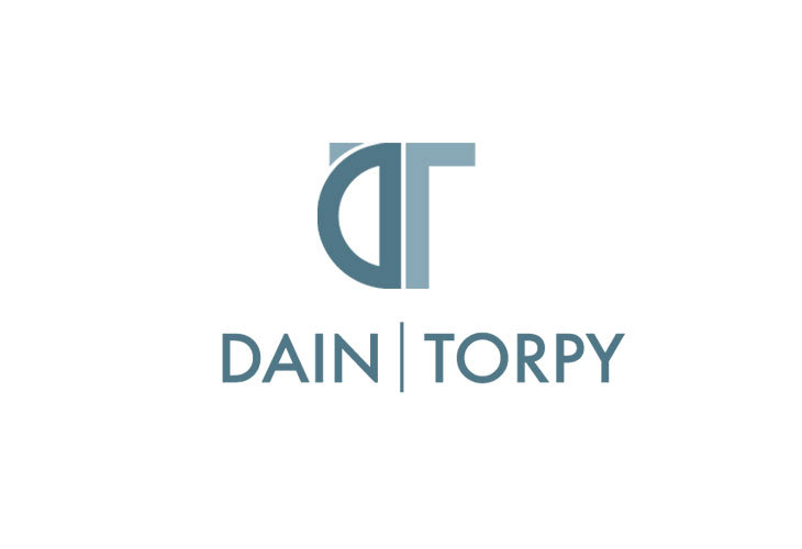
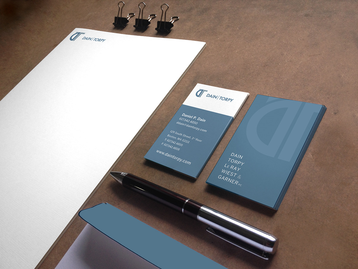

Daniel Dain's previous logo—a circle that included each of five team members' initials—was an easy way to ensure everyone was included in the company branding, but made the company name a mouthful for clients. As lead designer on the project, I was able to suggest a branding system that emphasized the two principle members (and shortened the firm name to aid in brand recognition), but also allowed for inclusion of the whole team where appropriate. The final mark not only reflects the prinicipal's initials, but is made to resemble a protractor and T-square; tools representative of the firm's area of expertise, architectural law.

