

Both target personas work or volunteer in areas that require a variety of printed materials. Brochures, business cards, pamphlets, program books, banners, award engraving, decals. They need all these and more while not breaking their allocated budgets.

Gorilla Graphics stands out not just for its competitive pricing, but also its unique link to Pittsburg State University. By choosing Gorilla Graphics, customers directly contribute to the University's success and its students' education. Gorilla Graphics also employs many students which allows customers to work with aspiring design professionals, gaining fresh perspectives and supporting future generations.

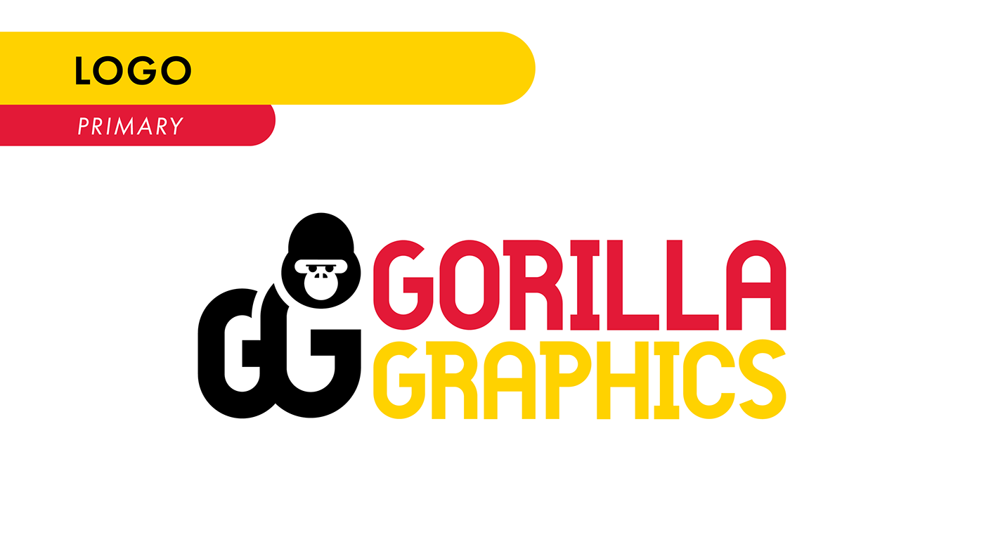
The Gorilla Graphics logo utilizes the two Gs of the name pressed together to form the side profile of a gorilla.


The Gorilla Graphics brand mark was designed to resemble the two icons used by Pittsburg State University while also being able to stand alone. The brand mark uses the same side profile stance as the Champion Gorilla and the heavyset facial features of the iconic Splitface Gorilla.

Gorilla Graphics' official colors echo the iconic Crimson and Gold of Pittsburg State, along with a spectrum of bold secondary colors, symbolizing the energy and vibrancy of their printing services.

To maintain ease of use and consistency, Gorilla Graphics utilizes these Adobe Fonts for all of their branded work.


Each printed material from this project was meant to showcase Gorilla Graphics' capabilities and to specifically promote their Ricoh 5th Color Station.


Starting with black cover paper, the business card leveraged two specialty toners: white and clear. A solid white base was first laid down, followed by machine maintenance to replace the 5th Color Station. Then, The cover sheets went through a second pass using clear toner and standard CMYK inks.


Gorilla Graphics' specialty toner swatches allow clients to visualize the diverse effects achievable with the four 5th Color toners across their extensive paper stock. The back of each swatch contains instructions on proper file prep.


The paper sample book offers clients a tactile experience to help them confidently choose the ideal paper for their project. The included guide highlights key information for informed paper selection.


Designed with the consumer in mind, "Unleash Your Vision" postcards showcase the Fifth Color Station's potential on metallic paper. By reversing the black and white toners, the metallic gold shimmers through designated areas with varying intensities, creating a captivating effect.

A dedicated "White" spot color, composed of 100% magenta, serves as the foundation for controlled metallic effects. Varying tints of this spot color are applied behind designated areas, allowing the metallic paper to shine through with subtle differentiation. To prevent unwanted areas from reflecting the metallic sheen, a multiply effect binds them to the solid "White" layer behind.


