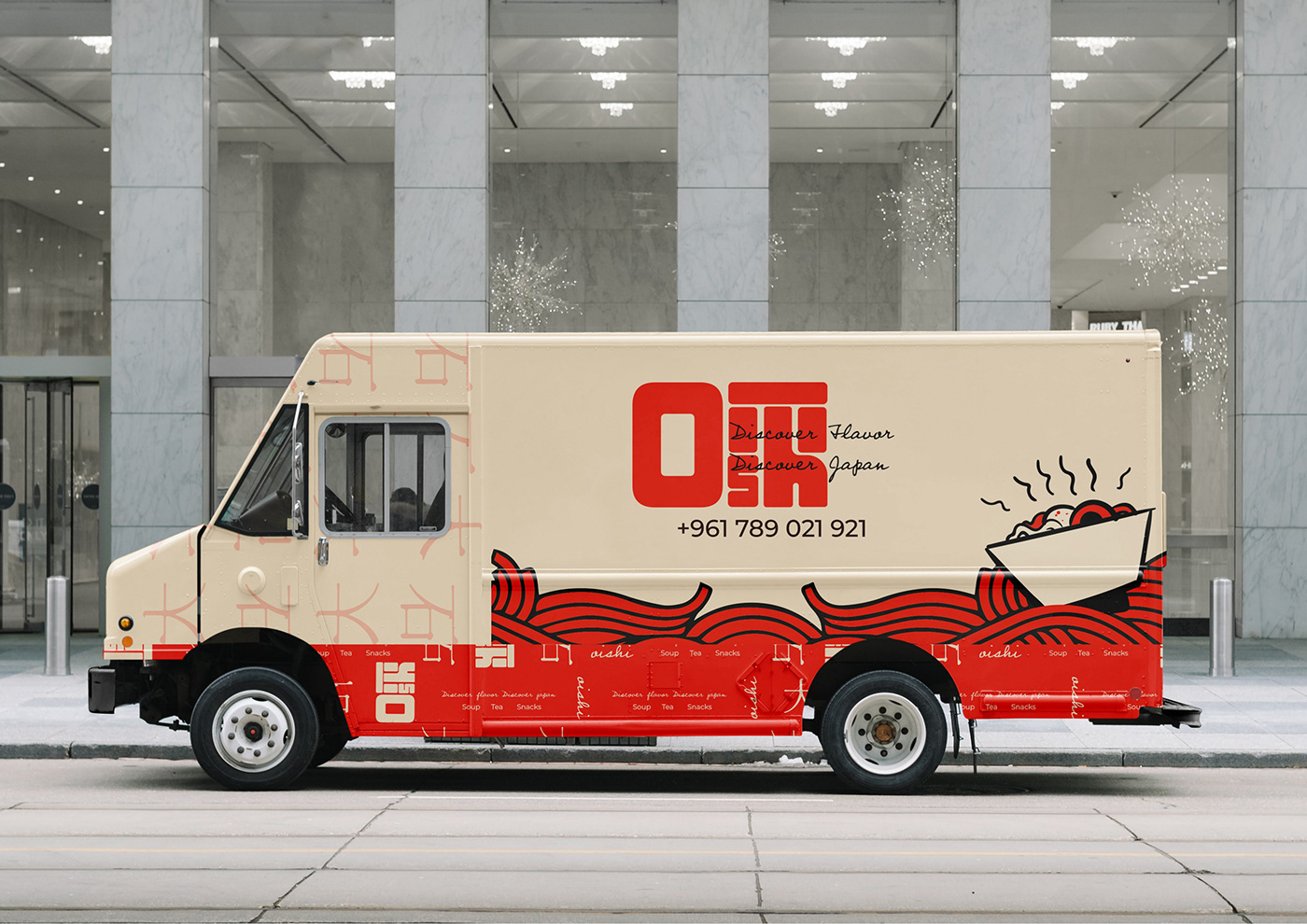
Oishi is a japanese restaurant that mainly serves a variety of soups and broths. The aim was to capture the essence of Tokyo’s lively street food culture and brought it to life in a casual, modern, and fun setting.
The Brand archetype crosses between the Jester and the Explorer capturing Oishi’s brand values of Authenticity, Innovation, Community, Cultural Celebration and Playfulness. Primarily Targeting Food and Culture Enthusiasts, Adventurous eaters, and Locals.

“Oishi” translates to “yummy” in Japanese, capturing the essence of our culinary philosophy. The slogan encapsulates this essence. It goes beyond just taste and delves into the cultural journey the guests embark on.
The logo means to show similarity to traditional japanese writing which is later mirrored in the menu and other items.


The soft, earthy tones of e7d6ba and e1d1b0 symbolizes authenticity evoking a sense of comfort and wellness. The fiery e12508 and deep, rich shades of 070000 and 2d0400 add vibrancy and energy. The fiery accent hue ignites the appetite, while the deeper tones lend depth to our brand. Together, this palette signifies a fusion of old and new, authenticity and innovation, creating an inviting and mouth watering dining experience.