Background: When the QuickBooks website for self-employed customers went live, data was captured and analyzed to established a customer interaction baseline. The team hypothesized that the mobile application would provide a simple way for customers to categorize credit card transactions from the last 24 hours. The mobile version was designed for daily use and was expected to improve the cross-product baseline.
Goal: Categorize transactions in 30 seconds or less each day.
My role: I lead the interaction design of the app. I assisted with the visuals as well.
You will see wireframes, animated keynote concepts, and finished videos for the v1 of the app. The app checks for recent transactions once a day and, if any exist, the user gets a notification. When the app opens, the main decision for the user is the type of each transaction. Was the transaction for personal or business reasons?

One concept was a list in which items could be swiped in either direction. As the item is moved, a label showing business or personal is revealed.
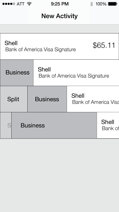
Additional options could be displayed as items approach the edge of the screen.

The card concept focuses on one transaction at a time. Options to categorize transactions could be shown on the bottom of the screen. Since only one card is shown at a time, some sort of progress needs to be displayed.
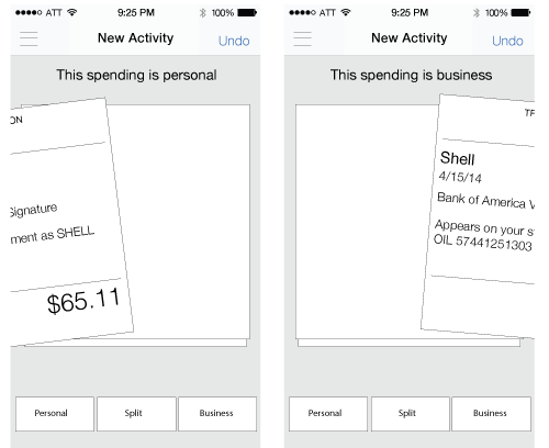
Swipe gestures are a very natural way to make a simple choice. As the card moves, a label on top can also indicate the type of transaction.
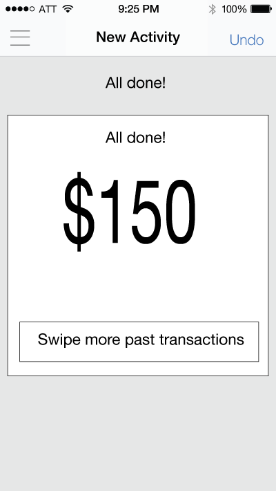
After all of the cards are swiped, show a final state. This could be an opprotunity to show a summary of what the user has just done.
The card style concept was choosen for the final design.
For a given day, a user would most likely have a few transactions (<10). A list view is best for displaying summary information of many items. Cards allow the user to focus on only the information that is needed to make the personal or business choice.

Since the user can only see one card at a time, the UI must give some indication of progress. Here are some concepts that were considered.
A Keynote animation showing possible ways the number representing the cards left could count down.
Labels, in order to show what swiping in a particular direction means, are important. Labels could also animate in some way as the user swipes a card. Above are a couple concepts. In one, the label appears with the type of transaction as the user begins to swipe. In the other, two labels are present and also move with the card.
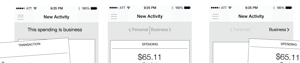
As cards are swiped, the arrow and transaction type label moves. This UI solved the problem of showing what each swiping direction meant, as well as, provided a helpful animation as the cards moved. The circle representing the number of cards left was relocated to the top after internal testing. The position of the thumb for users interfered with the circle.
After looking at current data, more transactions were personal. It was decided that a personal transaction would swipe to the right and business to the left. Swiping right is easier for the thumb of a right handed person. It was dicussed to provide a setting to switch the direction, but this was not included in the first version.

In addition to the personal and business buttons, other actions such as split and skip were consider. One concept was to provide a more button which would open up a menu. This concept was put on hold for the first version of the app and only skip was included. Later versions might add more options.
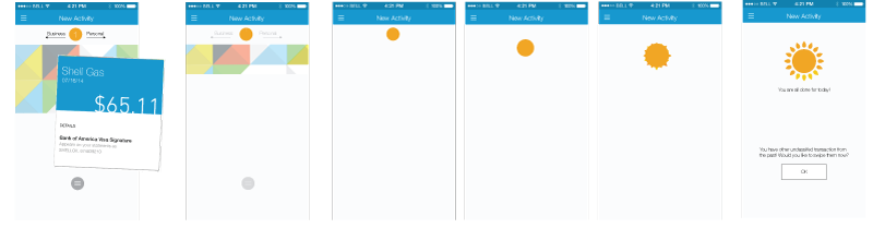
This set of screens shows a concept after the user swipes the last card. Using the number counter circle element, the screen can transform into a sun. The intention is to show sucess and give the user a sense of happiness and accomplishment.
Using Keynote, this movie shows the movement that could be used for accompishing this animation. Timing and exact movements need to be determined.
The first time use for any app is important and this app is no different. In order to show the benefit of the app, the decision was made to provide an interactive tour before signing in. Forcing the user to practice the same actions they would perform in the app has been an effective strategy for past apps I've designed and I think, when done well, it is more effective than coach marks or a carousel of welcome screens.
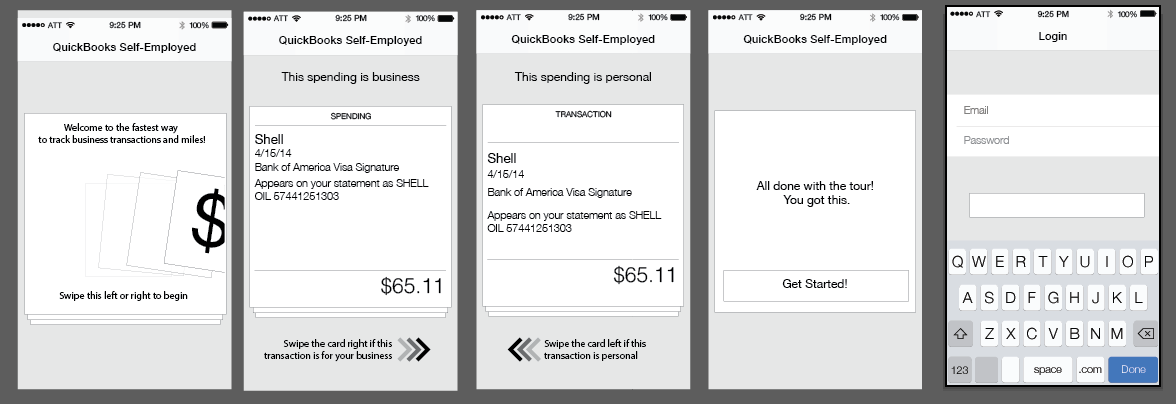
Using the same card UI in the app, a welcome card and example transactions teach the user how to use the app before signing in. A few words of encouragment on the final card provide a sense of accomplishment and encourage the user to login and swipe their real data.
The first time use, as designed in the wireframes, had a couple issues during internal testing. My take away was that users don't read. They didn't see the directions to swipe the cards left or right. In my re-design, I really focused on using less words and more movement and animations in order for the user to understand the interactions.
This is the first time use in the initial production version of the app. Simple commands, animations, and images provide a simple experince that shows the basic interactions before the user signs in.

Whenever you ask for permission for access to the device, it is nice to explain why you are asking and what you need it for. After the user signs in, show them the benefits of daily alerts for new transactions and then ask them to allow Push Notificaitons


