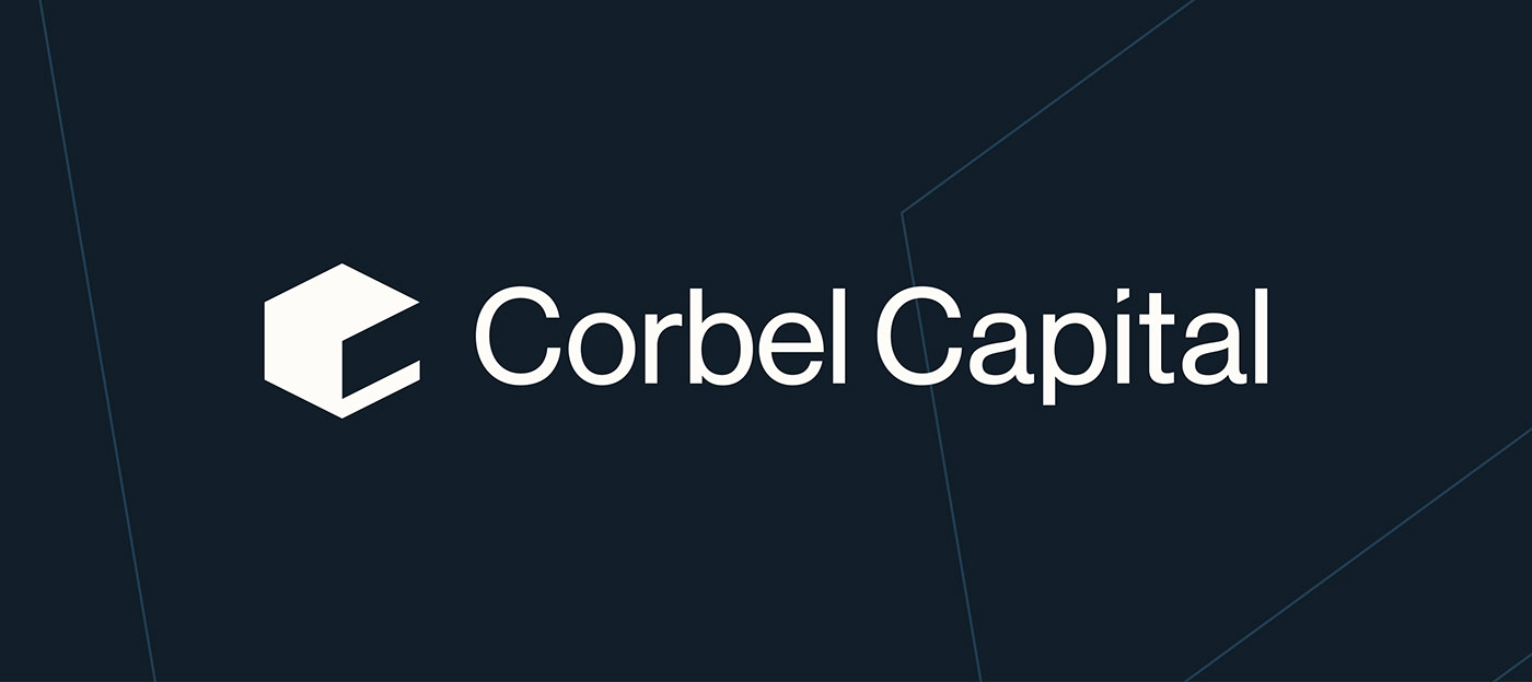
Run by Johnny, Corbel Capital is a boutique corporate financial advisory and consulting business specialising in mergers & acquisitions. Johnny guides people to practically navigate the convoluted and messy world of corporate finance so they can make simple sense of lawyers, accountants, tax and banking to successfully sell their business and life's work. A corbel is a structural piece of stone used in architecture that juts out from a wall to carry a superincumbent weight. Just like Johnny. With massive companies seeking his advice, he acts as a corbel in the M&A process.
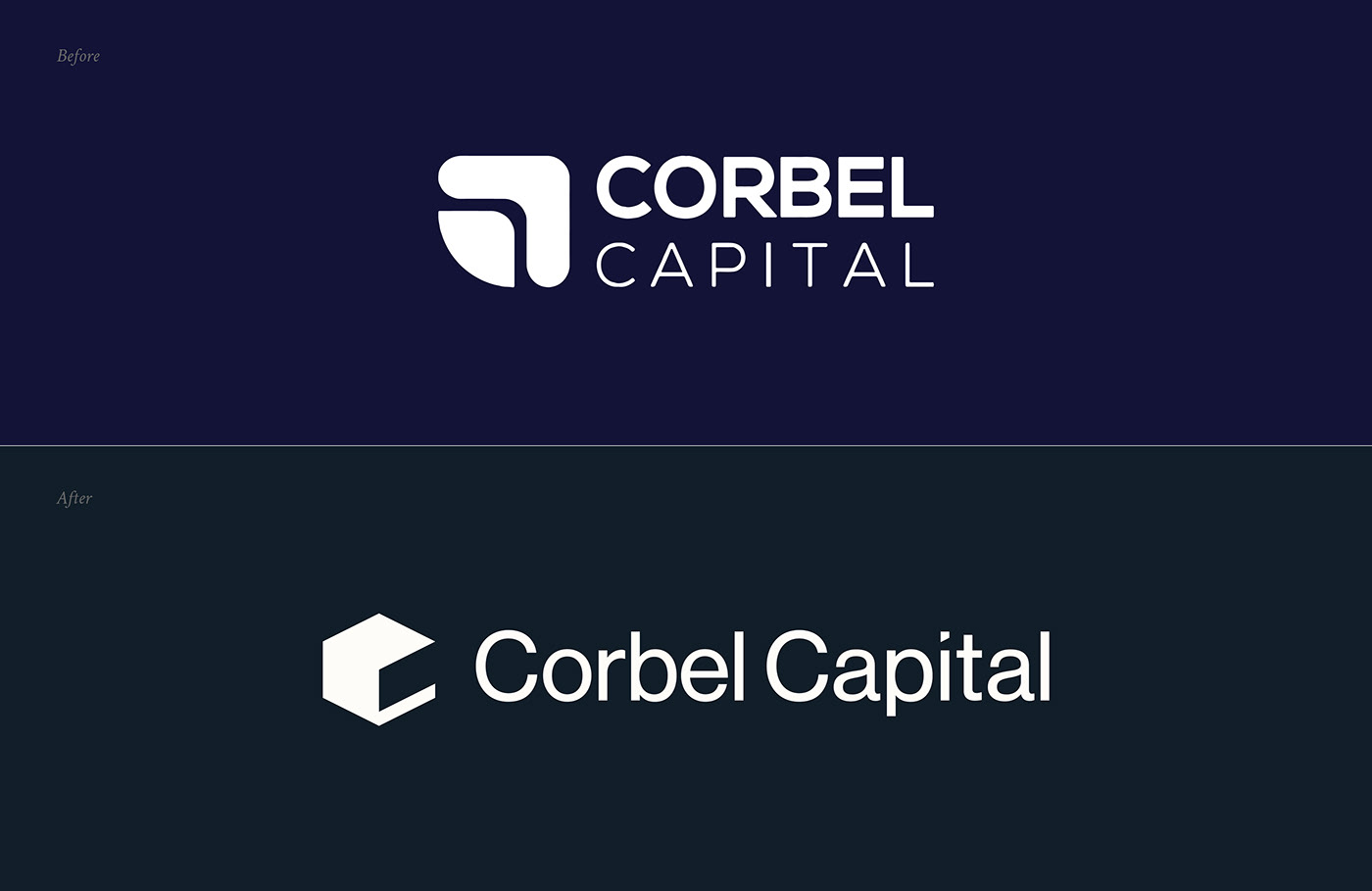
Johnny’s existing logo visualised the concept of a corbel through the use of a right-angled shape and it’s fitted counterpart. Whilst a solid idea, my main issue with the mark was the amount of rounded edges which makes the design feel softer, friendlier and more approachable. Whilst these are certainly not bad traits to imbue in an audience, I feel they shout louder than the feelings of trust, security and precision Johnny wanted his brand to be known for.
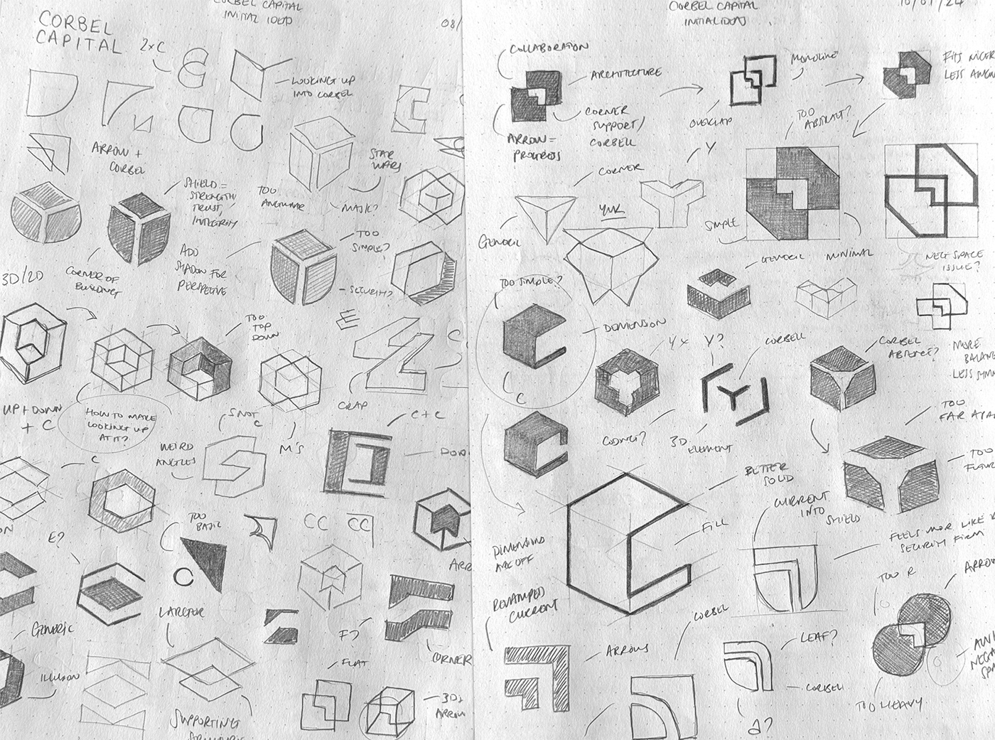
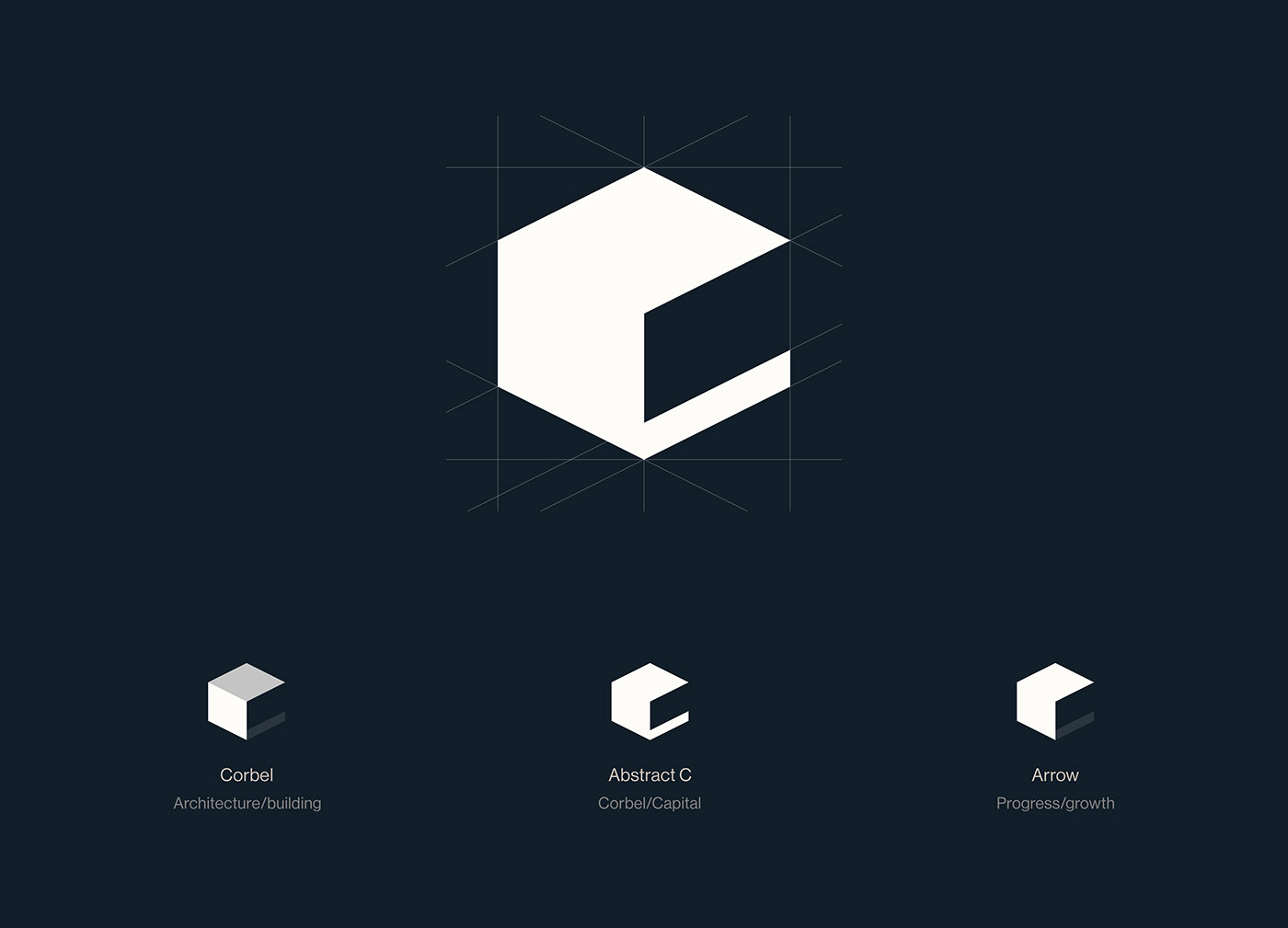
With lots of different avenues to explore after my research stages, I dove head first into ideation. I was really interested in bringing a sense of dimension to the mark. Something akin to an architectural firm to subtly nod to the link between Corbel Capital and architecture. A lot of my early ideas failed at the first hurdle when trying to create the sense of a corbel in the corner of a cube. Without shadows, it was nearly impossible to see it the way I wanted to.
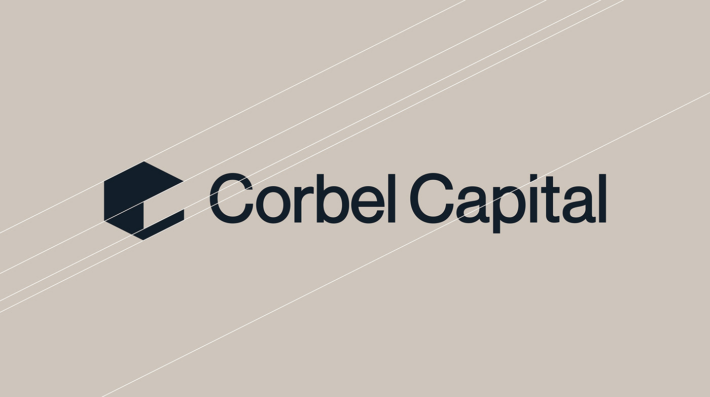
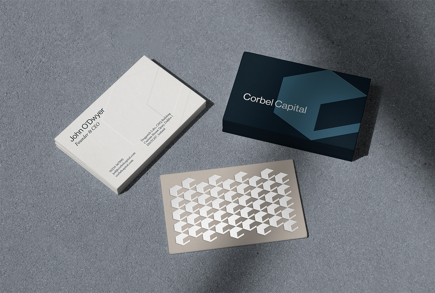
I tweaked my approach to look at what a corbel would look like from another angle. Stripped it back to it’s base elements and then we were cooking! To make such a simple mark more identifiable, I needed to add something else to it. I opted to semi-complete the 3rd side of the cube creating an abstract C letterform. This made the mark much more ownable for Corbel Capital and also allowed for some wicked patterns.
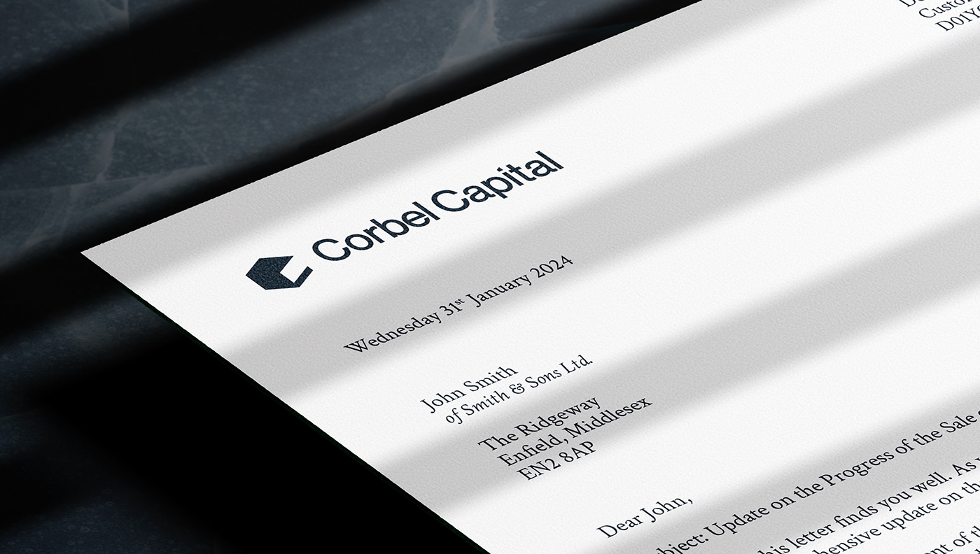
With Johnny being a self-diagnosed design nerd, I knew I could get into the weeds of type selection. Pretty much anything out of Switzerland is bound to be beautiful (Helvetica. I rest my case) and Neue Haas Grotesk is no exception to this rule. Balanced in modernity and sophistication, it brought the perfect tone to the mark and paired perfectly. I made a vey subtle customisation to the dot on the letter ‘i’ by cutting of the bottom right corner with the exact same angle seen in the logomark. This created a lovely harmony between the two.
To contrast Neue Haas Grotesk and to add a sense of prestige and formality to the identity, I opted for Crimson Text for the body copy. When used together, they create a well rounded, trustworthy and modern feel which ticked all the boxes.
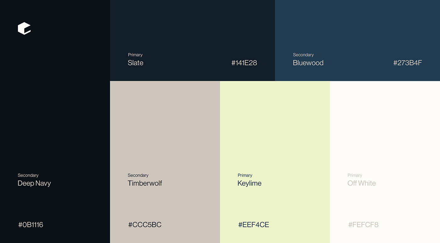
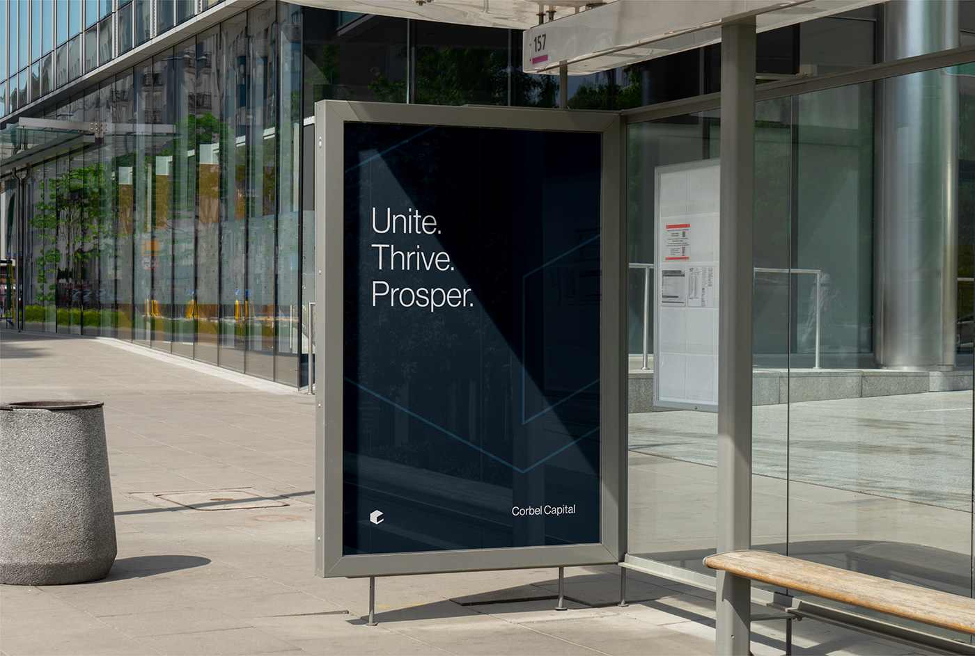
When it came to creating the colour palette, I needed to further evoke those feelings of trust and precision whilst ensuring Corbel Capital stood out from a relatively saturated marketplace. Blue hues grounded the identity in a sense of security and a punch of Keylime rocketed it into the future. Supporting these primary colours are some earthy tones to help warm up the overall palette making it feel less clinical.


Testimonial from Johnny:
"We approached Jack after reviewing a number of agency proposals. We were not disappointed. Jack put heart and soul with extreme thoughtfulness and passion into our new brand identity. He really took the time to understand where we’ve come from, what we were about and where we wanted to go. We are very pleased with the outcome and would highly recommend any brand looking for high quality brand impact to look no further."