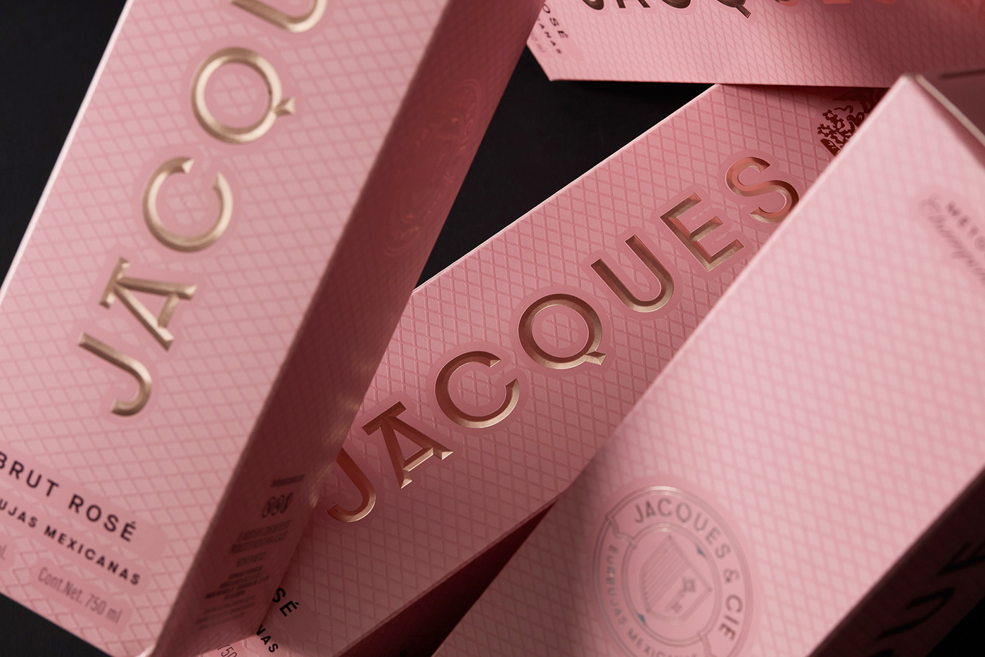
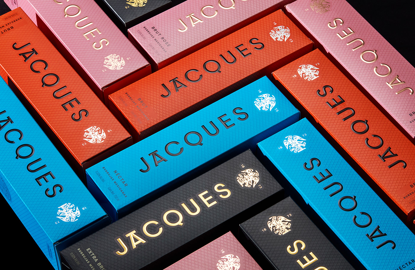
Re-branding for Bodegas Jaques and Cie, the pioneer of Mexican sparkling wines.
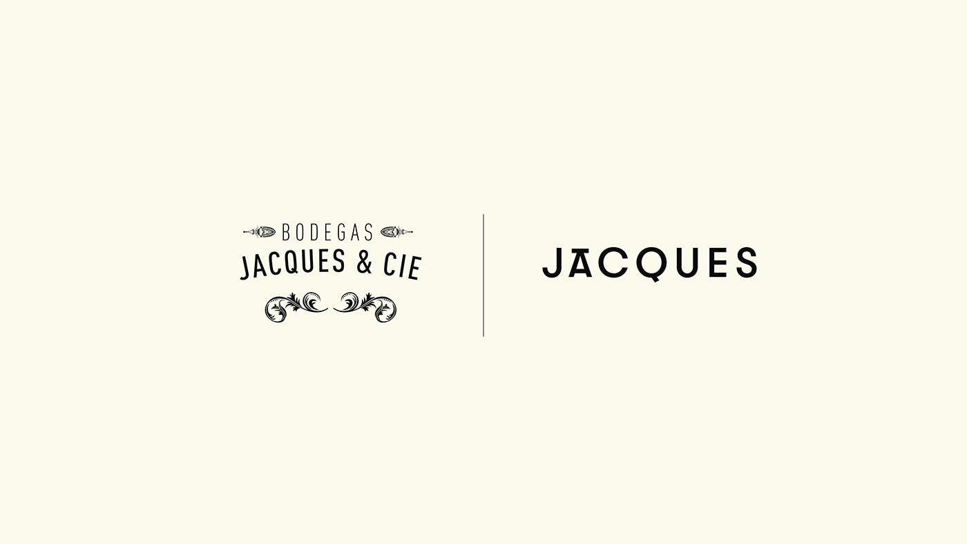
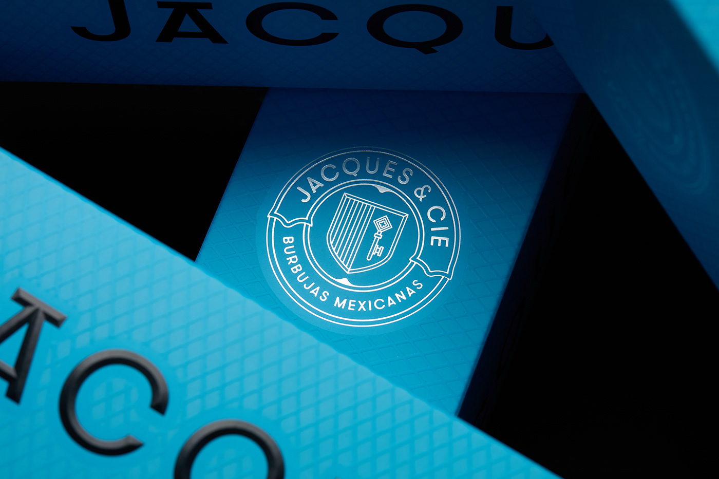
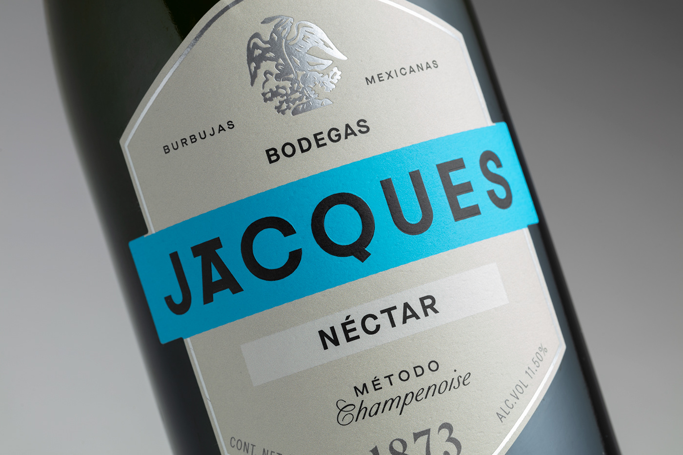
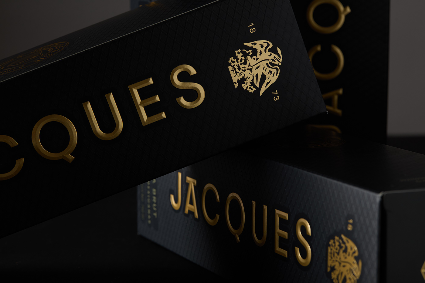
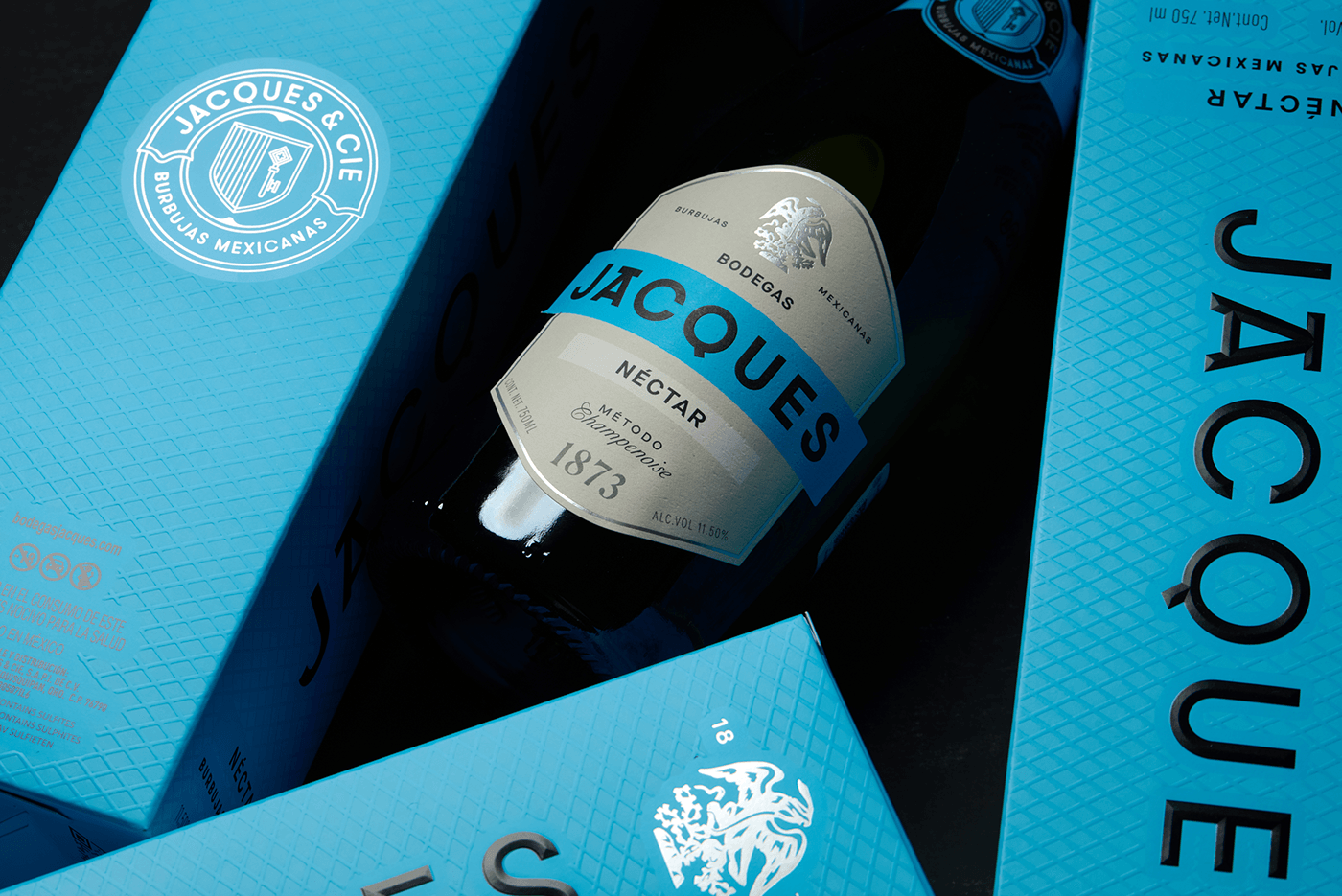
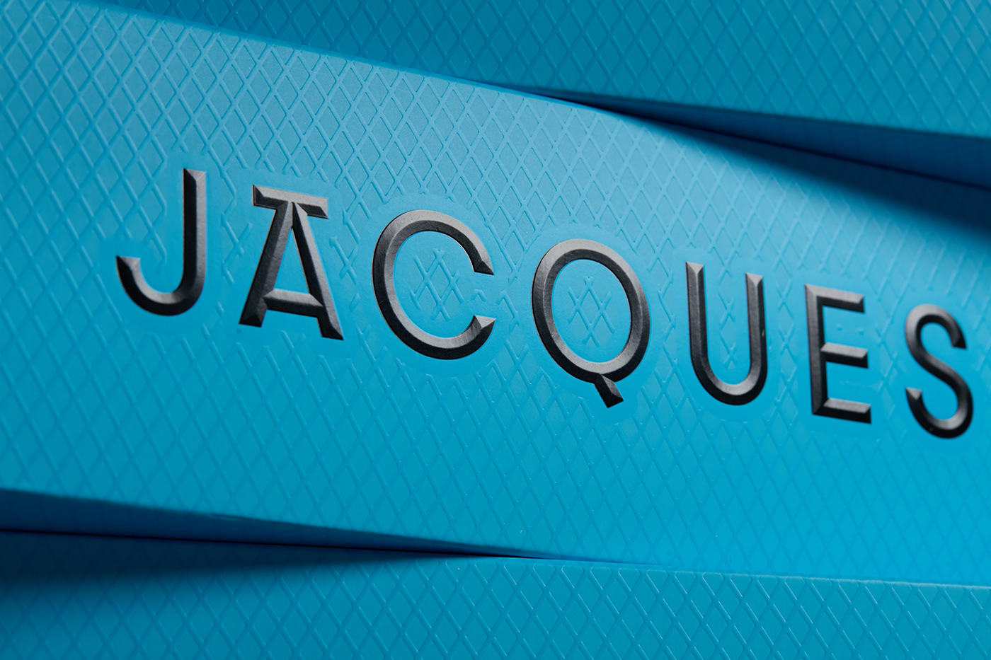
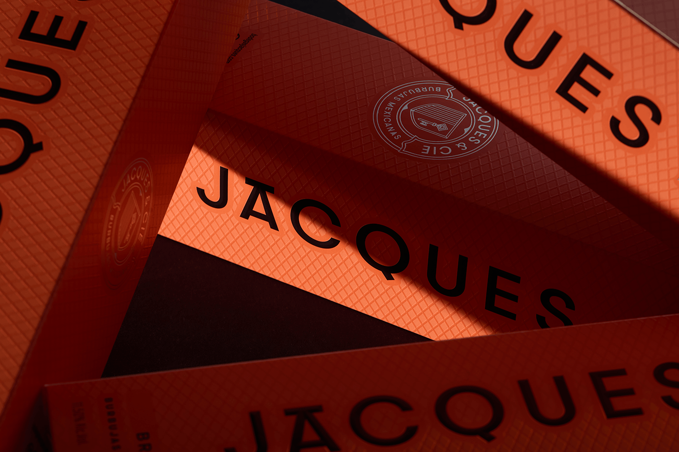
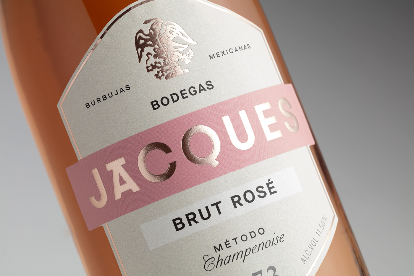
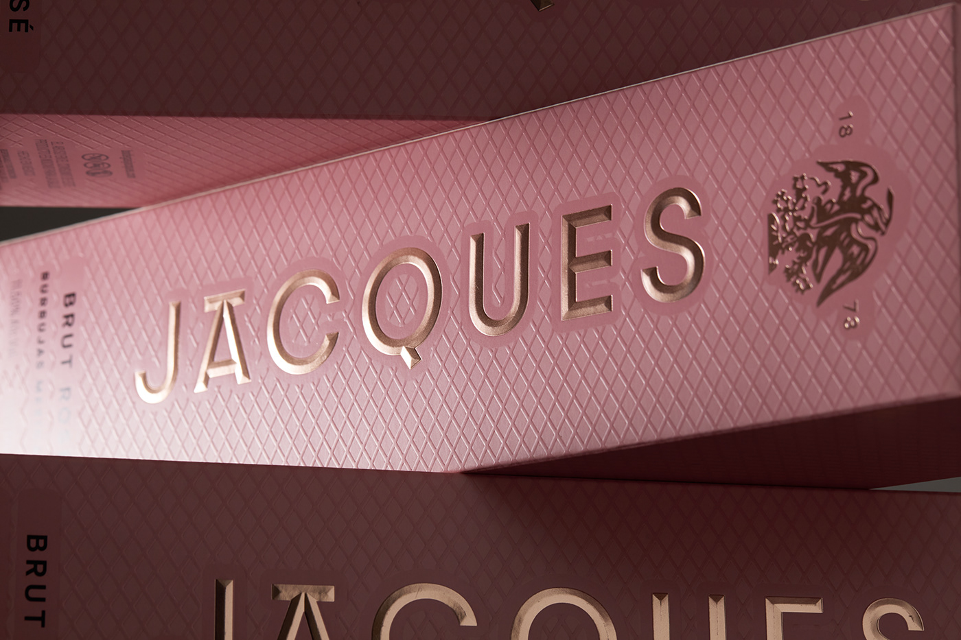
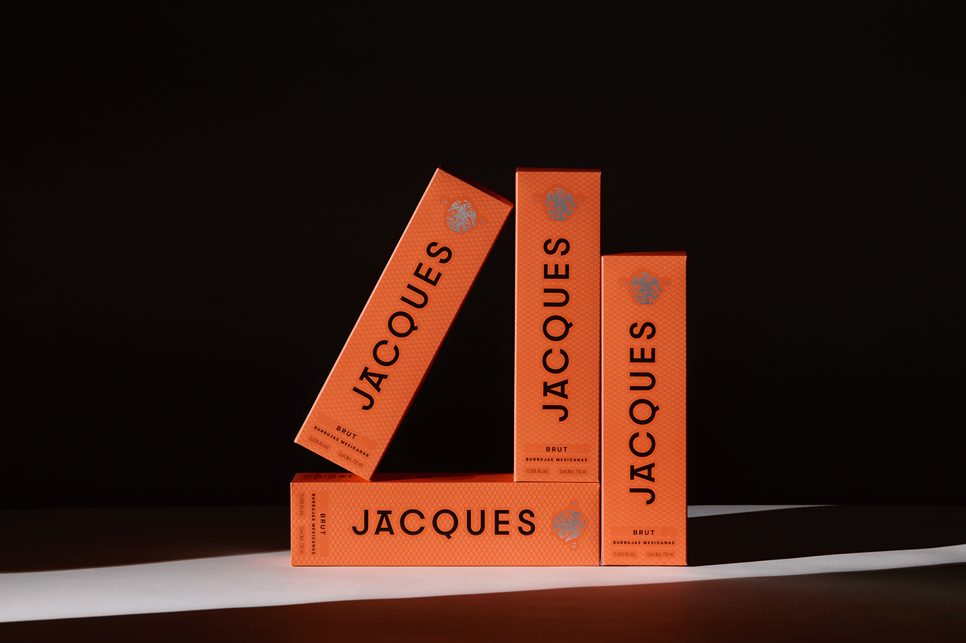
Embracing minimalism, our focus was on enhancing brand recognition throughout the rebranding process. Streamlining the brand to its essence, we made the strategic decision to simplify the name, recognizing that "Jacques" was easier to remember.
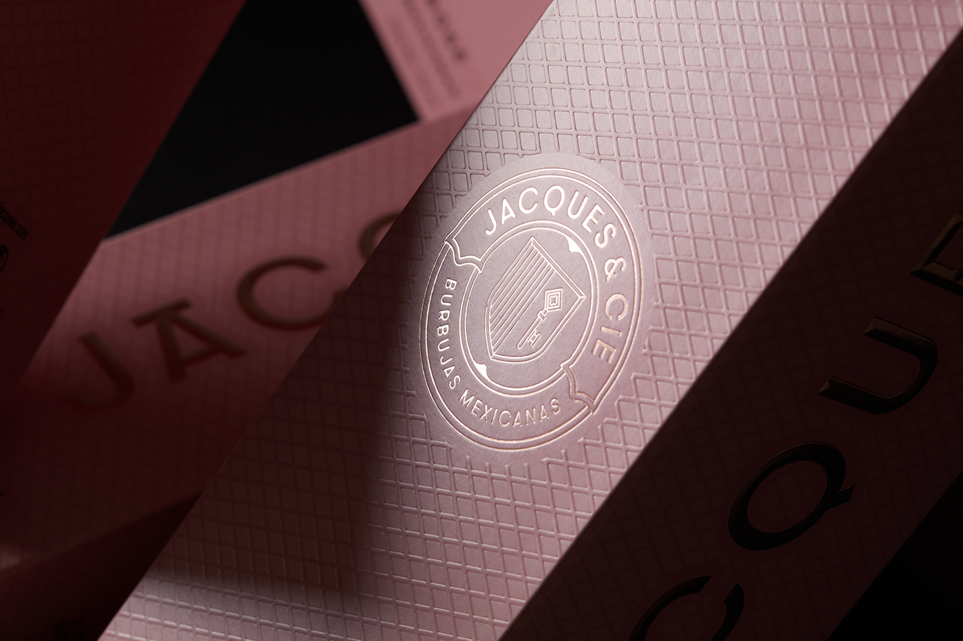
Our strategy was deeply anchored in honoring heritage and tradition while injecting a contemporary flair. With a clear objective in mind, to reshape perceptions of Mexico and to encapsulate its modern essence, we embarked on a meticulous redesign journey.
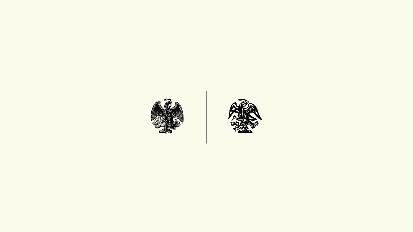
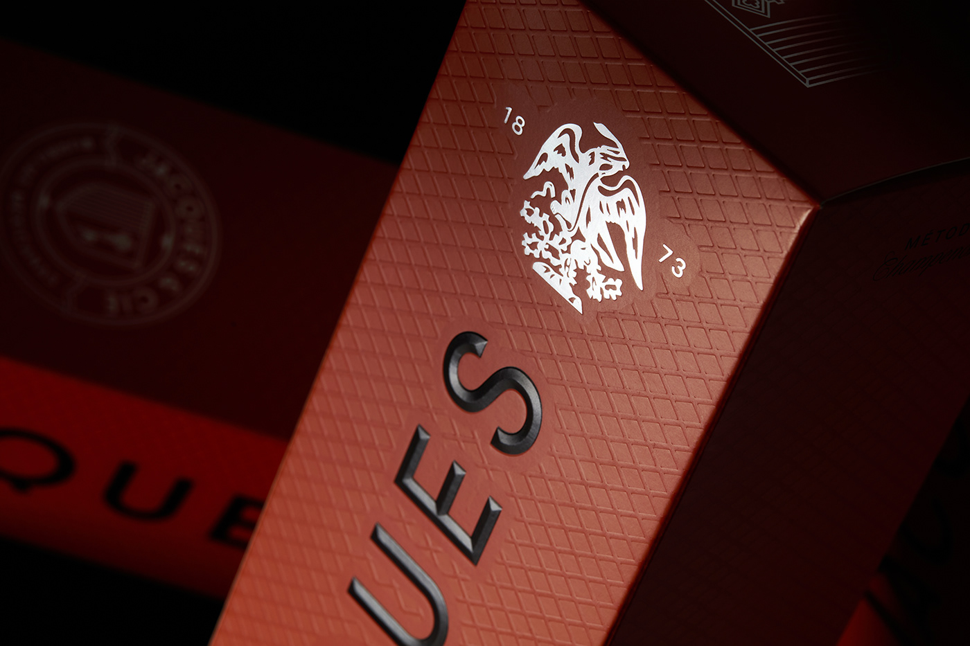
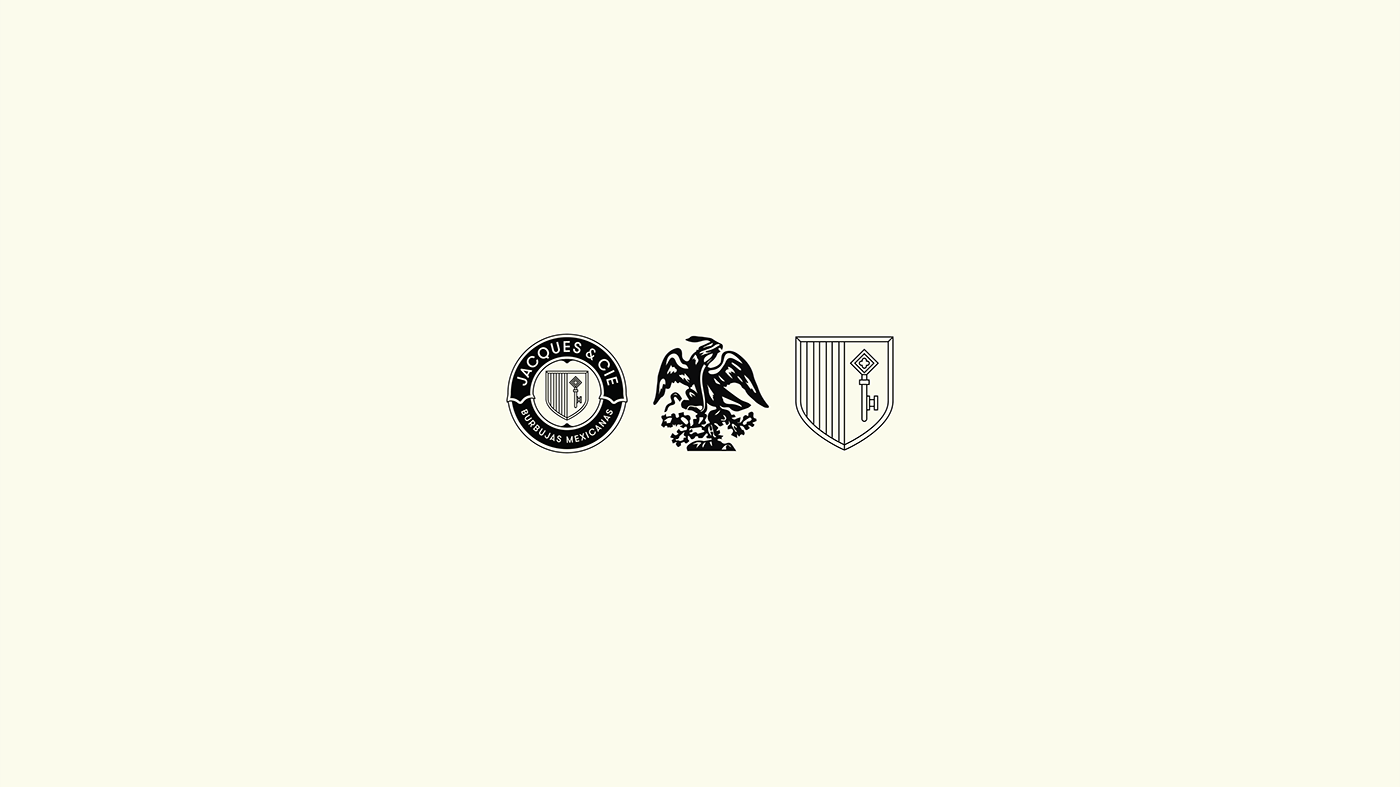
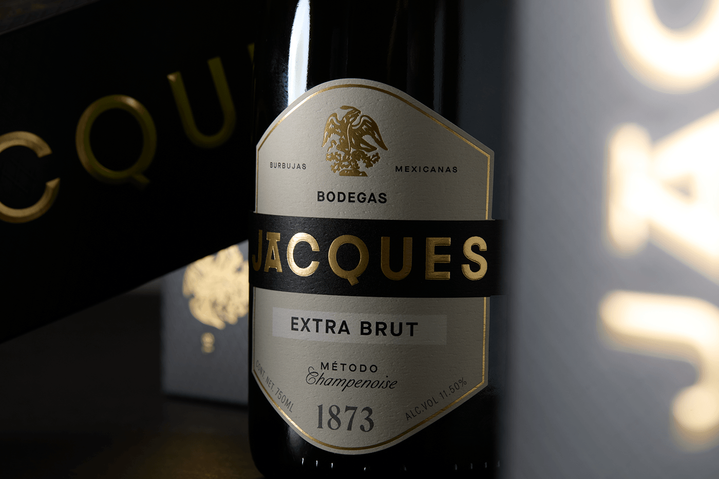
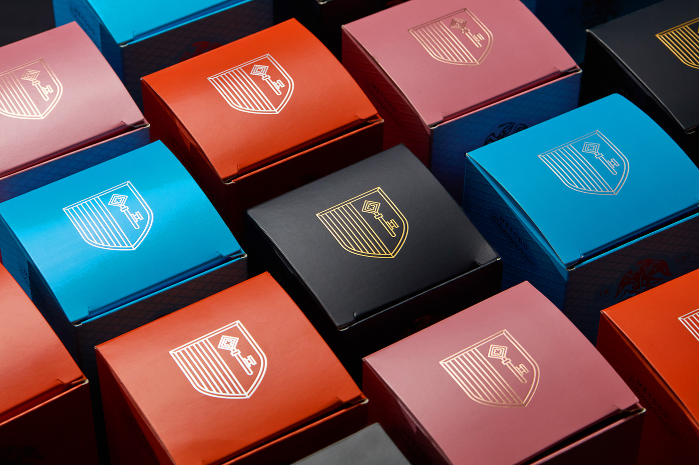
This included a thoughtful reinterpretation of the iconic eagle, opting for a more adaptable illustration, and the integration of three compplementary symbols. One of these symbols serves as a tribute to Barcelonette, France the family homeland preceding their migration to Mexico in the 19th century and of course a modern and minimal typeface with a vibrant color palette that speaks loudly of Mexican culture.
Cheers.