
SOBRE O PROJETO | PT
O objetivo deste projeto é criar uma identidade visual para a João Macelani, um profissional focado na área da saúde que presta serviços de treinamentos personalizados, liberação miofascial e consultoria online para garantir qualidade de vida às pessoas.
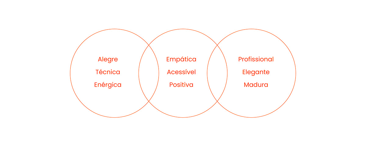
Através da identidade visual queremos transmitir a essência da marca de forma dinâmica, técnica e responsável. A marca tem um objetivo principal: ser vista como uma marca que tem comprometimento e que prioriza proporcionar uma vida saudável para todos através do seu atendimento especializado.
ABOUT THE PROJECT | EN
The objective of this project is to create a visual identity for João Macelani, a professional focused on the healthcare field who provides personalized training services, myofascial release, and online consulting to ensure quality of life for individuals.
Through the visual identity, we aim to convey the essence of the brand in a dynamic, technical, and responsible manner. The brand has a primary objective: to be seen as a brand that is committed and prioritizes providing a healthy life for everyone through its specialized services.
CONCEITO DO LOGOTIPO | PT
O conceito adotado no projeto foi a simbologia do próprio corpo em movimento, afinal, é o instrumento primordial do exercício físico, onde quando praticamos nos encontramos sempre em movimento.
Pensando nisso desenvolvemos o símbolo a partir da inicial J de “João”, a ideia foi dar personalidade e fugir de símbolos genéricos de academia e que trouxesse mais o lado da saúde e que também fosse moderno, elegante e profissional.
A ideia do símbolo inclinado tem como objetivo representar a figura de um corpo ativo movimento. Suas curvas arredondadas tornam o símbolo mais dinâmico, deixando-o mais amigável e convidativo.
LOGOTYPE CONCEPT | EN
The concept adopted in the project was the symbolism of the body itself in motion, after all, it is the primary instrument of physical exercise, where we are always in motion when we practice.
With this in mind, we developed the symbol from the initial "J" of "João". The idea was to give personality and avoid generic gym symbols, focusing more on the health aspect while also being modern, elegant, and professional.
The inclined symbol aims to represent the figure of an active, moving body. Its rounded curves make the symbol more dynamic, making it friendlier and more inviting.


SOBRE AS CORES | PT
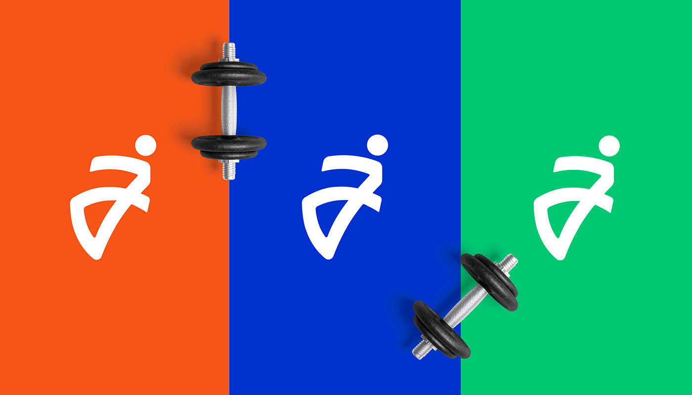
O principal objetivo na escolha da paleta de cores foi trazer em tons vibrantes para transmitir toda energia, alegria, dinamismo e flexibilidade presentes na marca.
Giants orange: foi escolhida como a cor principal da marca por ser uma cor calorosa e amigável que simboliza energia, paixão e determinação, além de transmitir um senso de movimento.
Persian Blue: optamos por utilizar esta cor para trazer o lado mais técnico da marca, além de ser uma cor associada à área da saúde também transmite energia, sensação de inovação e conhecimento.
Jade: it represents health and well-being, being vibrant, it ends up being a highly energetic color. It is also associated with vitality, creativity, and flexibility.
ABOUT THE COLORS | EN
The main objective in choosing the color palette was to bring vibrant tones to convey all the energy, joy, dynamism, and flexibility present in the brand.
Giants orange: was chosen as the main color of the brand for being a warm and friendly color that symbolizes energy, passion, and determination, as well as conveying a sense of movement.
Persian Blue: We chose to use this color to bring out the more technical side of the brand, as well as it being a color associated with the healthcare field, it also conveys energy, a sense of innovation, and knowledge.
Jade: Conveys health and well-being; being vibrant, it ends up being a highly energetic and vibrant color. Its energy is associated with vitality, creativity, and also flexibility.

Through the visual identity, we aim to convey the essence of the brand in a dynamic, technical, and responsible manner. The brand has a primary objective: to be seen as a brand that is committed and prioritizes providing a healthy life for everyone through its specialized services.

Through the visual identity, we aim to convey the essence of the brand in a dynamic, technical, and responsible manner. The brand has a primary objective: to be seen as a brand that is committed and prioritizes providing a healthy life for everyone through its specialized services.


SERVIÇOS / SERVICES
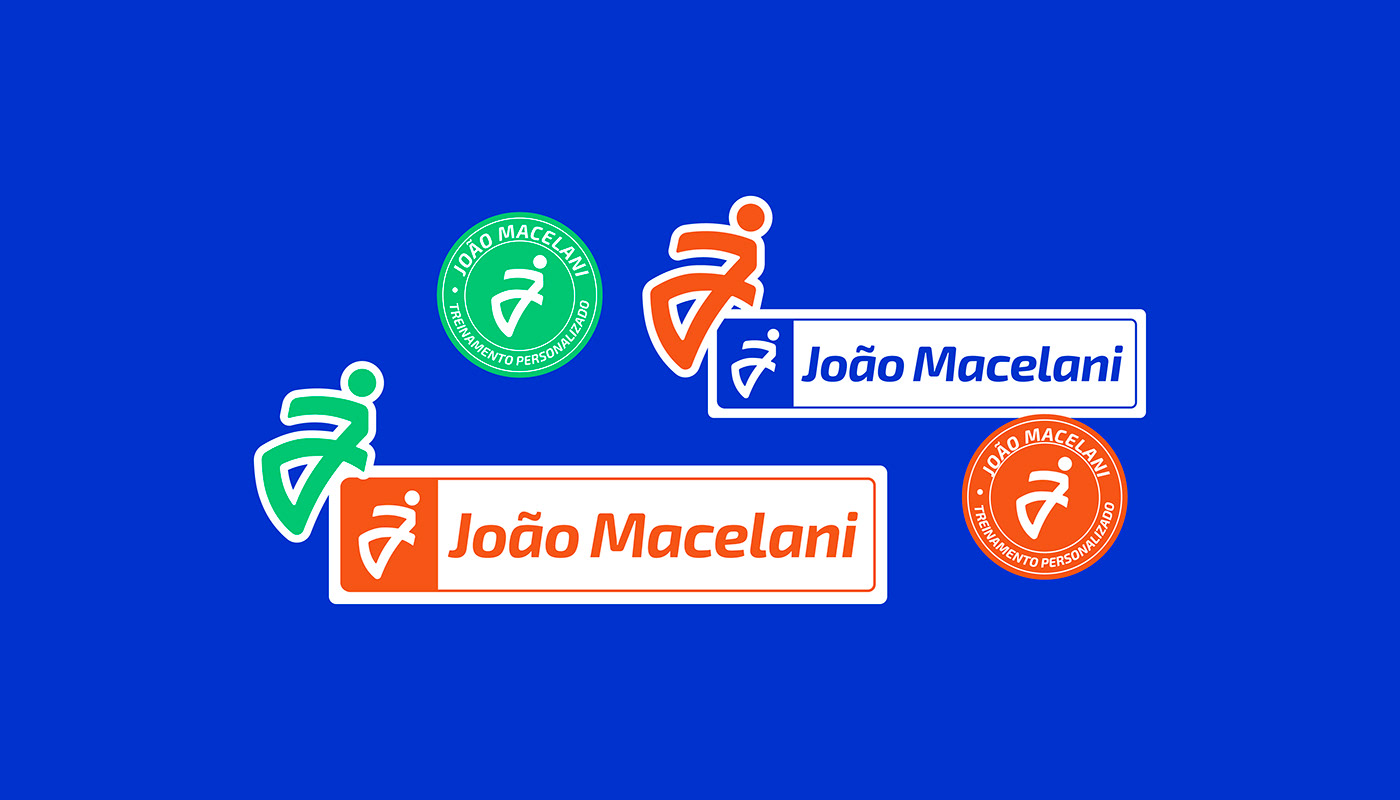
Logotipo / Logotype
Identidade Visual / Visual Identity
Estratégia de Marca / Brand Strategy
Contato / Contact:


