我发现市面上太多羽毛球协会会徽标识缺乏专属性与识别度,
通俗一点来说就是不同的羽毛球协会相互换个名字就可使用。
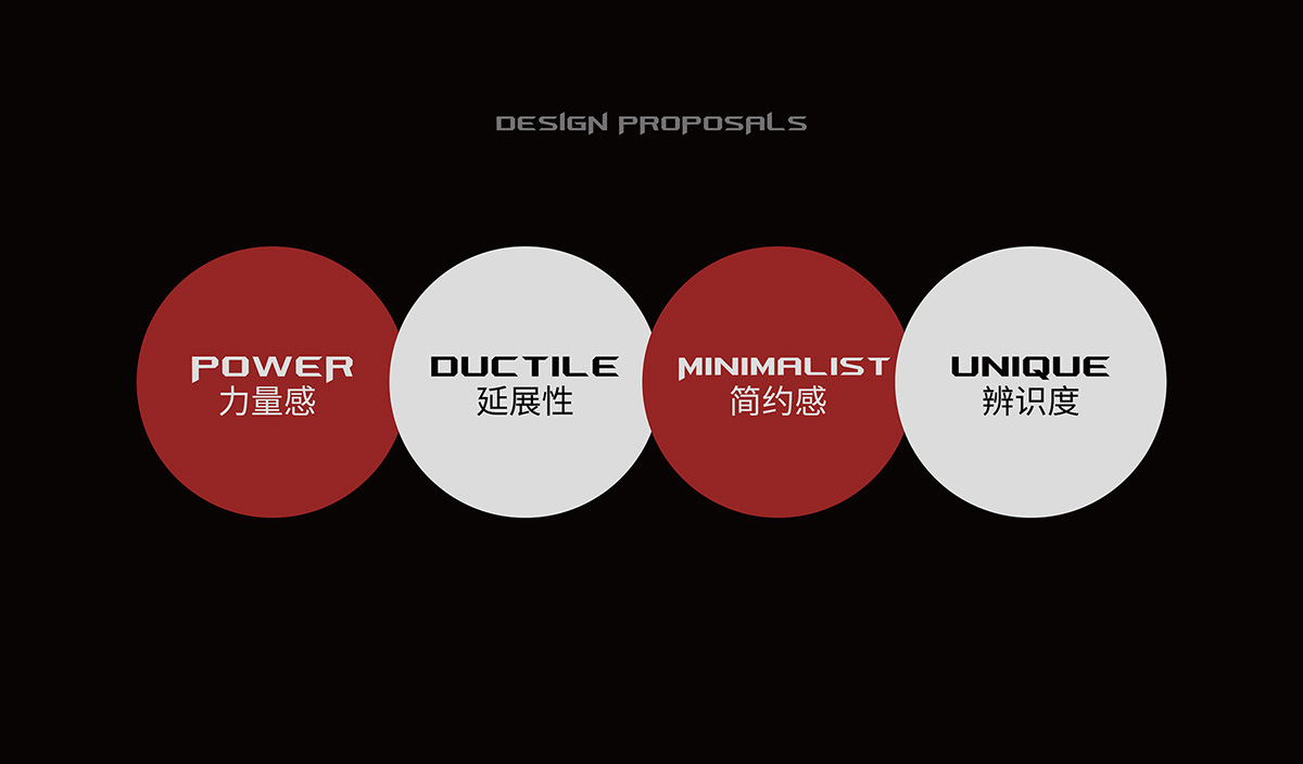
设计形式风格上比较保守,缺少延展性,不太符合现代简约大方的审美与缺少羽毛球运动的力量感。
I found that there are too many badminton association emblems on the market that lack exclusivity and recognition.
In layman's terms, different badminton associations can use the same logo for each other.
The design form is relatively conservative in style, lacking malleability, not quite in line with the modern simple and generous aesthetics and lacking the sense of power of badminton.
In layman's terms, different badminton associations can use the same logo for each other.
The design form is relatively conservative in style, lacking malleability, not quite in line with the modern simple and generous aesthetics and lacking the sense of power of badminton.

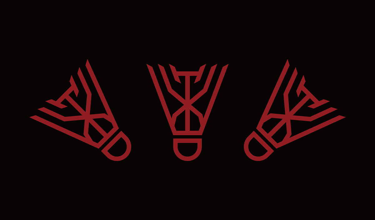
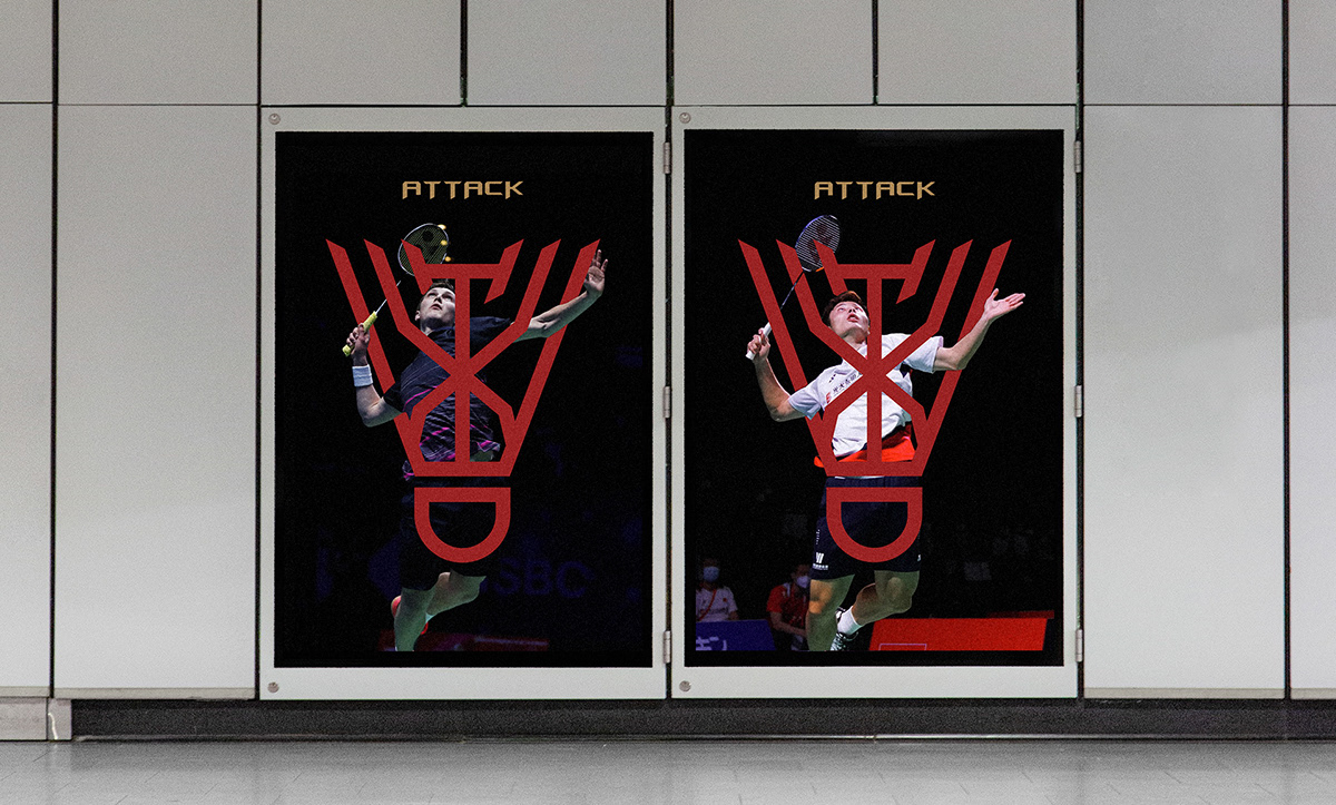
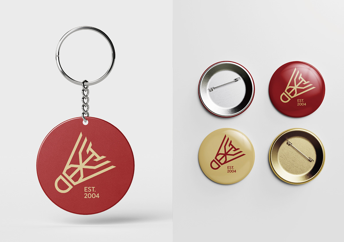
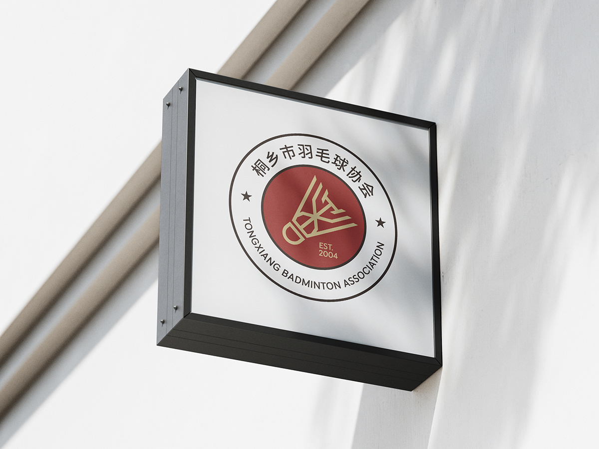
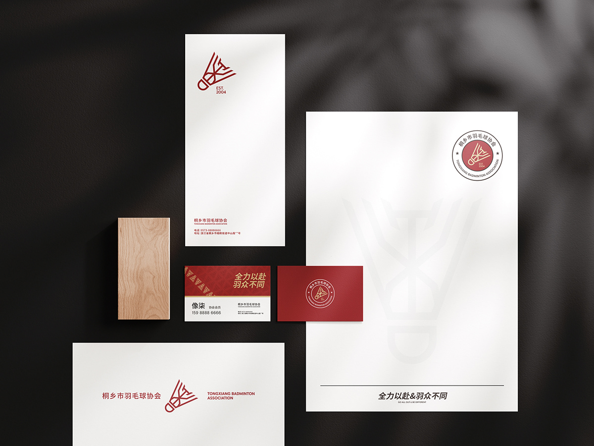
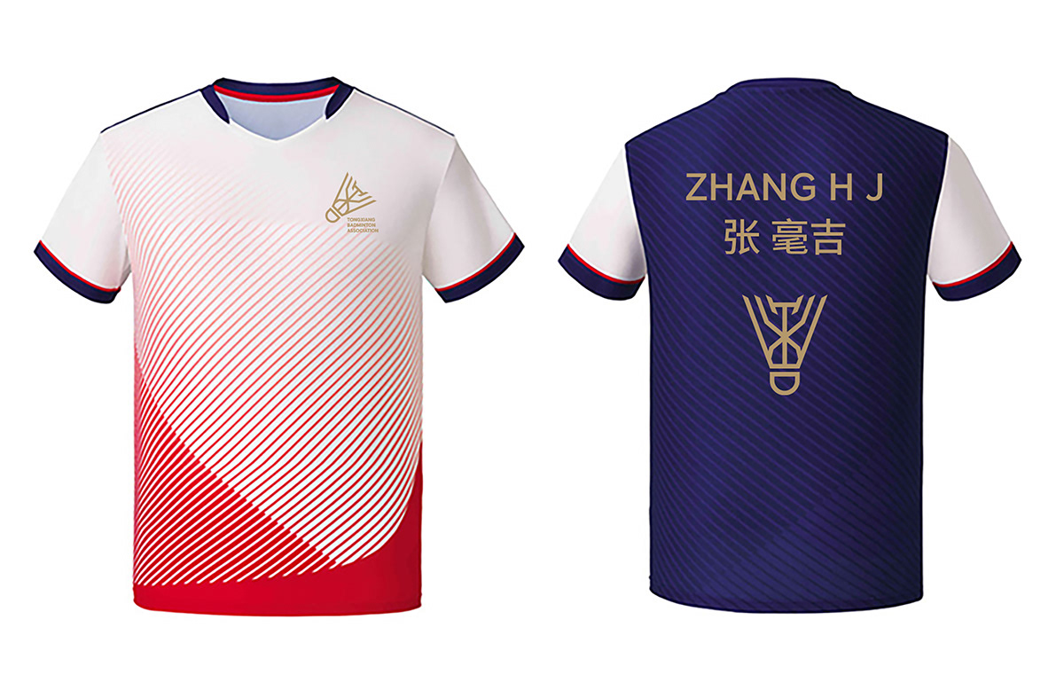
LOGO把桐乡的拼音“T”“X”巧妙融合进羽毛球当中,整体外观看起来简约大气,坚固感,富有冲击力,代表着年轻活力与激情,亦像燃烧着的火炬,散发着无限的可能,象征着桐乡羽毛球的蓬勃发展与再创辉煌的信心。边缘的斜角设计更具有现代化与力量感,整体具有相当好的延展性,也更具有识别度与记忆感。
Tongxiang's pinyin "T" and "X" are cleverly integrated into the badminton, the overall appearance looks simple and atmospheric, solid, impactful, representing young vitality and passion, but also like a burning torch, exuding infinite possibilities, symbolizing the vigorous development of Tongxiang badminton and the confidence to create brilliance. The beveled design of the edge is more modern and powerful, and the overall malleability is quite good, and it is also more recognizable and memorable.