Flaked is a chain of croissanteries that embraces the beauty of messiness.
The name itself, "Flaked," draws inspiration from delicate imperfections we often shy away from—like the crumbs on our shirt when eating a croissant However, in the culinary universe of Flaked, these imperfections are the very essence of quality and delight, representing a journey to transform an "inherent flaw" into a symbol of pleasure.

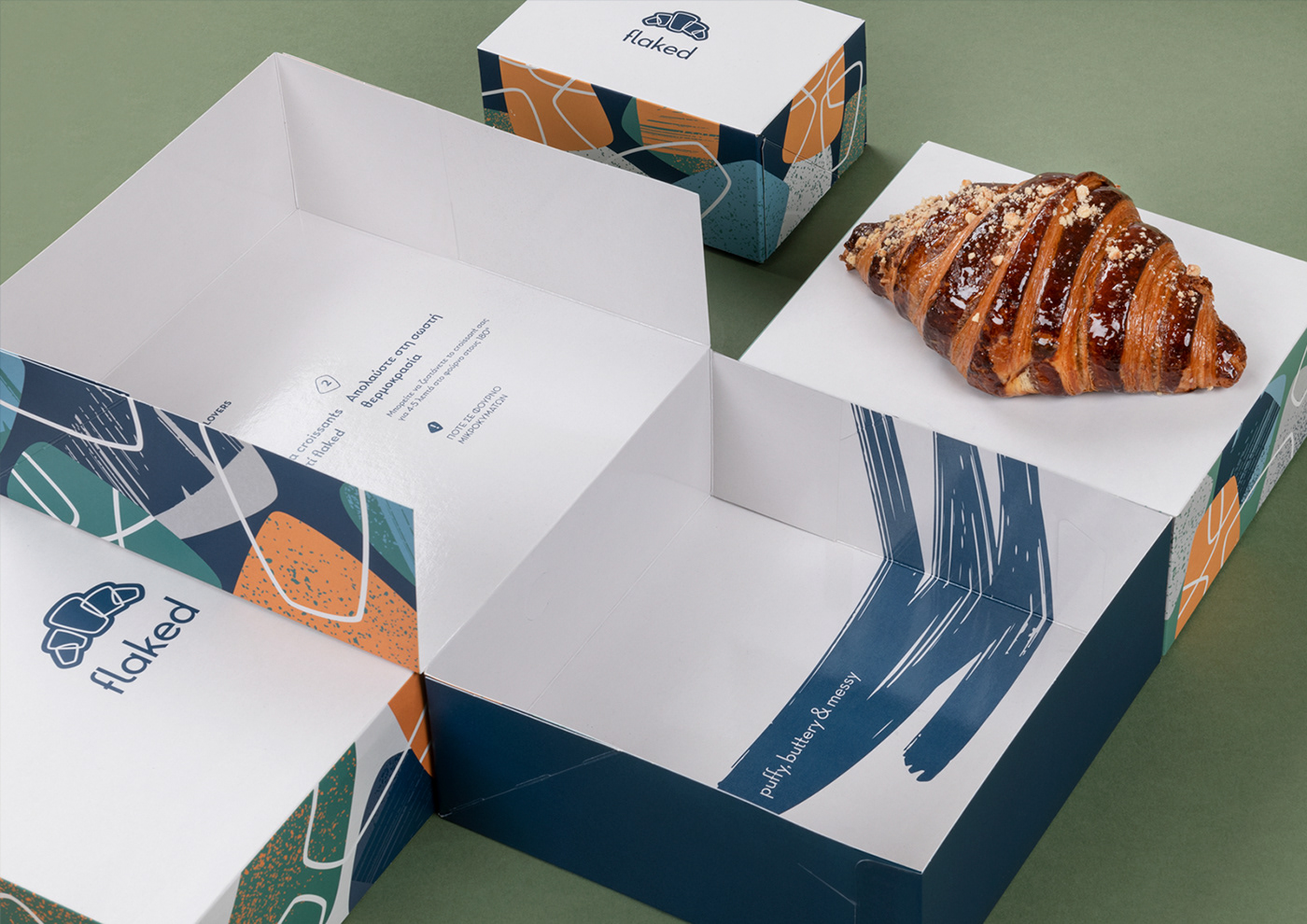
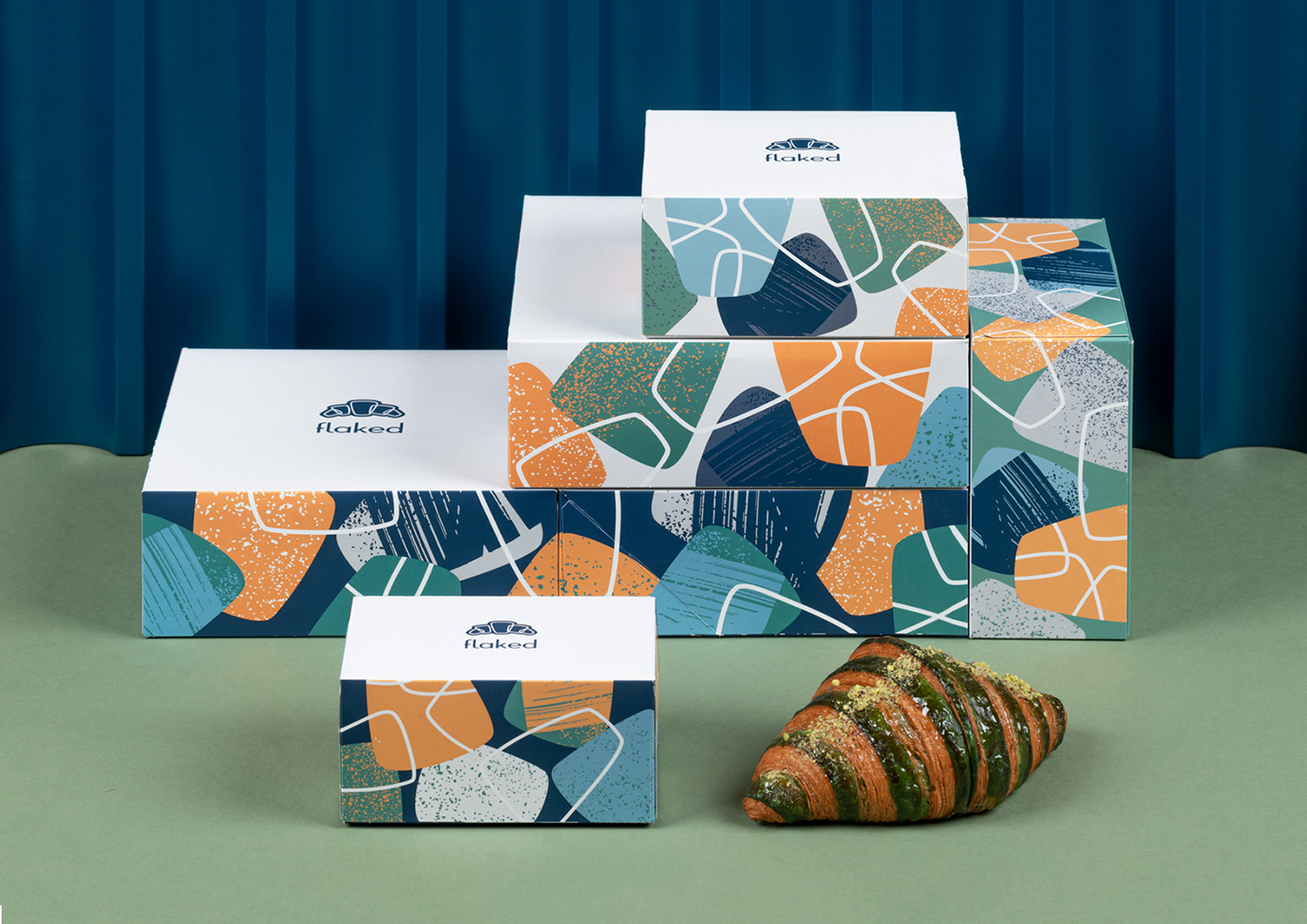
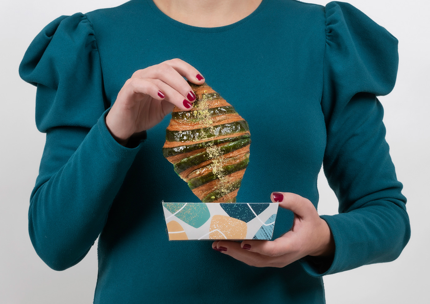
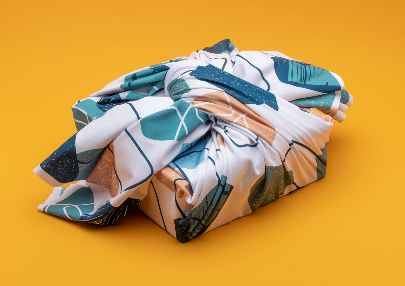
This sign of quality served as the inspiration behind the brand's identity, resulting in an explosive and extroverted visual language filled with vibrant, colorful flakes. A vocabulary that illustrates the mess simultaneously symbolizes the rich burst of flavors, perfectly encapsulated by our strap line: "puffy, buttery & messy."

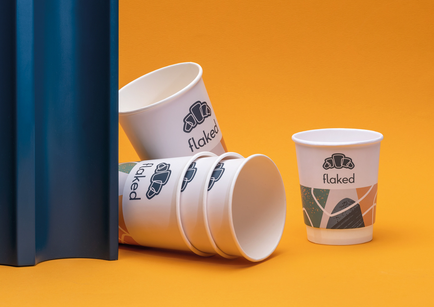
The logo, as a starting point, uses this concentrated essence of the language, forming a symbol where the flakes come together to shape a puffy croissant.
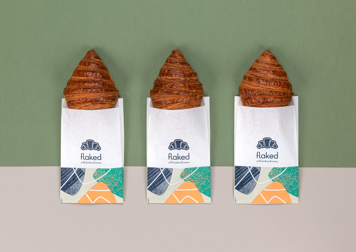

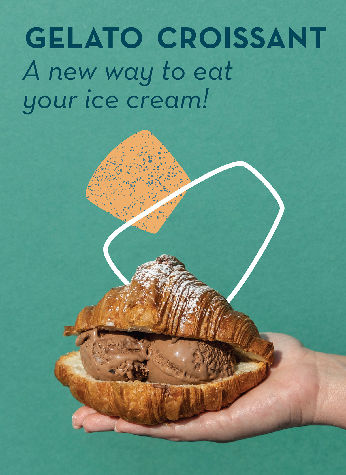
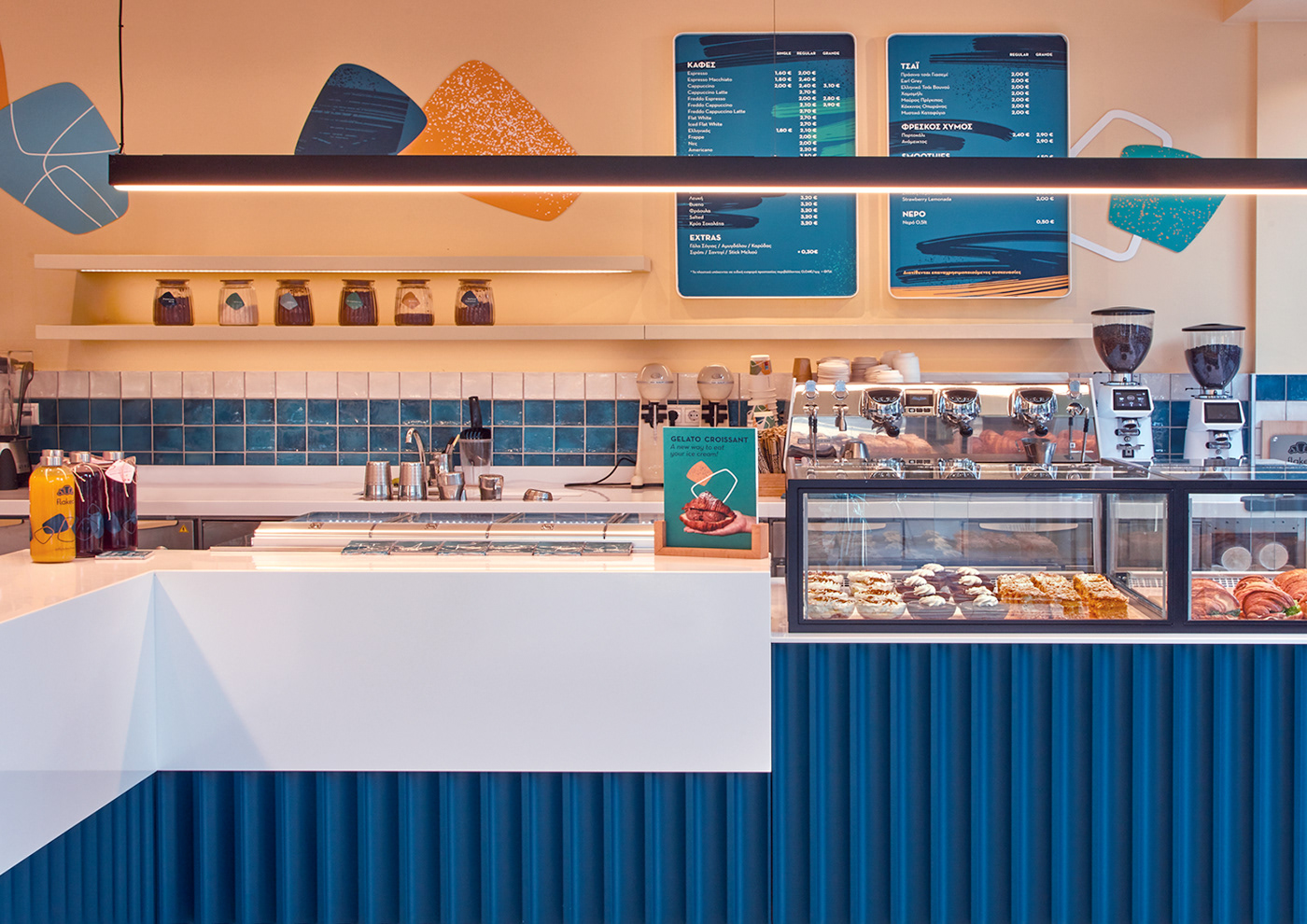
From interior design to signage and print applications, these playful flakes serve as guiding elements, creating a cohesive and visually enticing experience.


Brand Naming / Copywriting: Giorgos Garefalakis
Photography: Spiros Anastassatos & Ioanna Roufopoulou
Photography: Spiros Anastassatos & Ioanna Roufopoulou
