Fusion in Black: A Marriage of Textures
Imagine a label blending the sturdy weight of heavy stock with the tactile caress of cotton texture and smooth paper. It’s more than a visual spectacle; it’s a dance beneath your fingertips, an invitation to explore the nuanced interplay of materials.
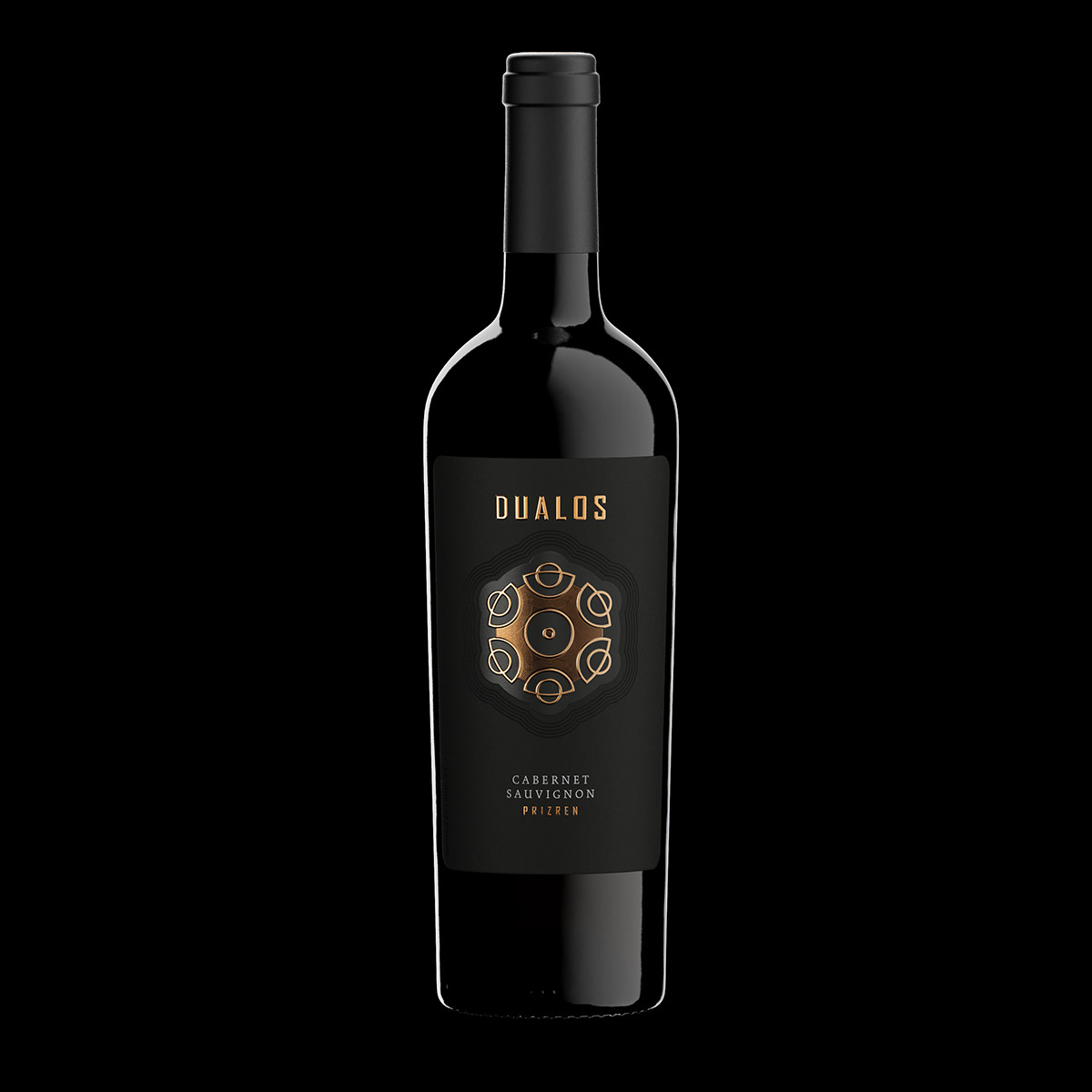
A Modern Muse: The Winery’s Logo as the Protagonist
The label orbits around Kantina Dualos’ contemporary emblem. In the quiet depths of black, the logo assumes the spotlight, a silent protagonist whispering sophistication and mystery. With modest yet potent flair, the logo, along with the revered DUALOS brand, crowns the label. No grand announcements, just a subtle declaration of identity, echoing with the elegance of strong, precise embossing.

Geometry of Mystery: The Mandala-Inspired Logo
Delve into the enigma of the logo, a swirling dance of circles reminiscent of a mandala’s mystique. An unsaid story unfolds, an abstract canvas inviting each observer to interpret its geometric embrace uniquely.
Copper Symphony: Foils with Microembossing Intricacies
Two copper foils gracefully embellish the label, their shimmering presence adding depth with delicate microembossing. It’s a subtle symphony of metallics, weaving finesse into the bold black canvas.
Classic Bottle, Timeless Elegance: Italian Tapered Artistry
The wine rests in a classic tapered Italian bottle, a nod to timeless elegance. More than a vessel, it’s a homage to tradition, allowing the label to harmonize seamlessly with the wine it cradles.
Bold Yet Gentle: A Masculine Minimalism
The label emanates a bold, masculine aura, tempered by a gentle touch. It’s a paradoxical dance – a bold presence that murmurs sophistication and a minimalist design that resonates volumes through restraint.

Understated Class: The Limited Edition Legacy
The label, minimalist yet opulent, stands as a beacon of understated class. Crafted with precision, it’s not a boast of grandeur but a quiet nod to exclusivity, a member of the limited edition lineage, brought to life by the skilled hands at Dagaprint.com.
As the architect, I welcome you to discover the implicit symphony within the label—a blend of ink and texture, geometry, and elegance. Our black fused wine label isn’t merely a design; it’s a canvas inviting each sip to venture into the understated sophistication defining Kantina Dualos. Here’s to the quiet artistry of celebration! Cheers!