I've had the privilege of living on Cape Cod for over twenty-five years, and during that time, in addition to working for various clients throughout the US, I've also done a fair amount of work for some wonderful individuals, businesses and organizations in the Cape Cod local area. This selection shows some of the logos I've designed in establishing their branding.

When the Barnstable Association for Recreational Shellfishing (BARS) was getting started in 2001 my friend Stan Negus asked if I would help them out with their logo. After it was finished, BARS presented me with a shellfishing rake and bucket. That was the beginning of my recreational shellfishing career. I've been a member of BARS since then. I designed their website and manage their social media accounts.
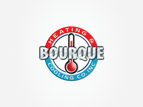
Bourque Heating & Cooling Co., Inc. installs and services all makes of residential and commercial air conditioning and warm air heating, as well as commercial refrigeration for their HVAC clients. Bob Bourque wanted to utilize a thermometer in the design. The red and blue circular bands act as a target to focus the reader's attention. I also designed another version using flat colors for easier application to trucks and clothing.

Calorique is actually over the bridge in Wareham, MA. They manufacture radiant heat products, hence, the letter C sun symbol. The lower case q in Calorique has been lettered to give the type a unique look.
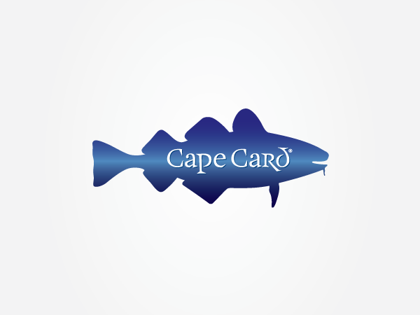
Cape Card® started in 2007 with "The Christmas Cod," and is now the Hallmark of Cods. More "cods" at CapeCard.net.

When I was looking at the interior of the Cape Cod Synagogue, I really liked the design on the door behind which the torah's are kept. I tried to incorporate that in my logo design. When it was finished I realized that, the CCS lettering in the monogram also forms the Hebrew letter shin which is found on every mezuzah, and stands for Shadai, the Almighty God.

CapeNet was the developer and operator of the high-speed fiber-optic OpenCape Network in southeastern Massachusetts, Cape Cod and the Islands. The logo works on three levels: the symbol can be read as a letter C, a wave, and a fiber optic network. The symbol's design was inspired by the framework of the chambered nautilus. CapeNet was bought by OpenCape in 2017.

The Chatham Clothing Bar is located in the historic Epicure Building on Main Street in Chatham. When I first met the owner, Sandra Wycoff, the new store was still under construction, but the original floor and tin pressed tin ceiling were going to be retained. I took the colors of the logo from the floor tiles. The lighthouse silhouette is based on a historic photo of the Harding's Beach Lighthouse.

The Cotuit Kettleers are part of the Cape Cod Baseball League, the premier amateur baseball league in the nation since 1885. It is comprised of many of the top college baseball players, and some go on to professional basball careers. The Kettleers play in idyllic Lowell Park in Cotuit, MA. I had created a Cotuit Kettleers Baseball Cod that was used on T-shirts, prints and postcods, but felt that the team needed a better logo. They agreed after they saw what I had designed for the Kettleers.

Executive Databank was an early internet executive search company based on Cape Cod. The logotype was created using URW Bodoni Ibm.
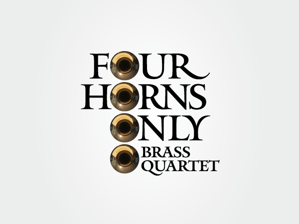
Four Horns Only was a brass quartet that I played tuba in for almost a year. The group dissolved for various reasons, but I had fun creating this logo.

Jack Cotton is synonomous with luxury real estate on Cape Cod and worldwide through his books, website, social media, and speaking engagements. After designing Jack's branding, I also applied a version of the logo to the door knocker on the cover I designed for his book, Selling Luxury Homes.

Jr.Tech’s mission is to engage students in grades 4-12 in Science, Technology, Engineering and Math (STEM) education through workshops and summits. I've been involved with Jr.Tech since its inception. I designed and taught its first course, Photoshop Skillz (now called "Photoshop It!), and designed Jr.Tech's logo, website and branding. I was also board director chair for a few years.

Girls STEM Summits expose young women in grades 8-12 who love Science, Technology, Engineering, and Math (STEM) to emerging careers in STEM fields. In addition to the logo I also wrote the GSS tagline.

This is a personal logo for my daughter, Kat. It utilizes modified characters from Metro, the classic sans serif typeface designed by William Addison Dwiggins. In addition to being a lawyer, Kat is also an artist.
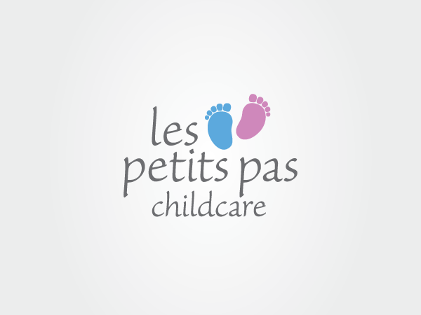
Les petits pas childcare is owned by our good friend, Magali Chbarbi, who believes that children must be nurtured, encouraged, and loved in a safe, stimulating, and fun environment. She has created a magical place in East Falmouth, MA.

The Luke Vincent Powers Foundation was created to keep Luke's memory alive by providing opportunities for disadvantaged children everywhere...in his name.

Marvelous Mavens LLC is a web-based hospitality marketing company with three websites: CapeCodLodgings.com, CapeCodHotelsandMotels.com, and Capecodrestaurants.com.

In 2009, I was approached by the library director of the Marstons Mills Public Library asking if I would be interested in designing a "Library Cod" to be used as a sign for the library. The project intrigued me, and I ended up doing two versions of the sign, one to fit in an existing frame in front of the library, and another 6 x 5 ft. sign on the side of the library. The bottom of the sign contained the MMPL logo shown above with the universal library symbol used in place of the letter L. Later, when the library asked me to adapt the sign as the library's logo, I suggested that they just use the logo above instead of the full color illustrated sign.

MashpeeTV is the home of Community, Educational and Government access television for the Mashpee Community. I was involved in the naming process before designing the logo, and when the name Mashpee TV was suggested, I liked it immediately.

The OpenCape network is an open access network, meaning other service providers can utilize the network to launch various services in the area, including residential or voice services. The capacity of the network and data center is a unique opportunity for other service providers to offer additional services to local governments, business, and residents of Southeastern Massachusetts. These services will enable our local governments, businesses, and schools to compete and be fast. Wicked fast.
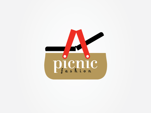
picnic fashion was a wonderful shop on Main Street in Chatham, MA. If you are ever in the neighborhood, there is a selection of unique, vintage, and handcrafted items perfect for gifts or for you. I am not a big shopper, but I love this store, and can always find something unique there. In addition to picnic fashion's logo we did all the branding, signage, icons, tagline ("for you and your picnic"), catalogs, and promotional items. Picnic Fashion relocated to West Palm Beach, FL several years ago, but still uses all this logo.

Prince Cove Marina is where we keep our boat in the summer. It's a beautiful, well protected cove off the Marstons Mills River. The logo was initially designed for a burgee, but I've applied it to a number of products that can be seen in my shop on zazzle.com.

Rogers & Marney is based in Osterville, MA and has been building homes of superior quality since 1968. This elegant typographic solution that utilizes the beautiful Mantinia typeface, designed by Matthew Carter, has served them well in all applications.

The Woods Hole, Martha's Vineyard and Nantucket Steamship Authority, referred to colloquially as The Steamship Authority or simply the SSA, is the statutory regulatory body for all ferry operations to and from the islands from the Massachusetts mainland, as well as being an operator of ferry service from the mainland Cape Cod to the islands of Martha's Vineyard and Nantucket, and the only ferry operator to carry automobiles to the island.
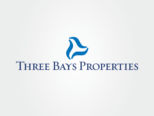
Three Bays Properties was set up my daughter and son-in-law to manage their charming property in Cotuit. Three Bays is comprised of Cotuit Bay, North Bay, and West Bay—surrounded by Cotuit, Marstons Mills, and Osterville, MA.
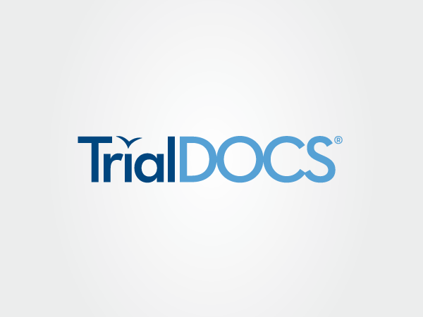
TrialDOCS® software was originally developed by William Baker for his Cape Cod Clinical Research, Inc. (CCCRI) clients. It is now a separate entity. TrialDOCS® gives individuals the ability to manage their company's documentation online securely. The seagull shape was carried over from the i in Inc. used on the CCCRi logo.


