Saturday, January 27th ART 230 "INTRODUCTION TO TYPOGRAPHY", Brigham Young University's Idaho Campus Curricula.
Assignment: WEEKS ONE-THREE, Typographic Glyph Compositions and Respective Project Submission.
Instructor's Name: Professor Simone Bradford.
Student's Name: Marla Antonella Gómez Carrillo.
PROJECT BRIEF OVERVIEW AND ANALYSIS
"INTRODUCTORY PORTION":
Good evening, Dearest Brethren and collegiate peers, alike. My most earnest hope is that you may all find yourselves to be within the most meditative of welfares and the most peremptively excelling of hardihoods. First and foremost, I wanted to take the opportunity to thank each and every single one of you as my fellow classmates and peers, as I have learned tremendously from each of you, from your immense comprehension of the field of typography, dedication to the craft and love of your artistry.
Your grandiosity of spirit and genuine willingness to assist others and to work collaboratively is incredibly inspirational and it has been what has helped me to continue to stay motivated throughout the progression of the current academic year. I would also like to thank my Professor immensely as her unwavering support and belief in my potential have been completely instrumental in my success in this project.
The notion of "Typographic Glyph Compositions", can be broadly yet succintly defined as particular arrangements or compositional as well as allographic layaouts comprised of individualized characters pertaining to either various typographic font families or "super families"; employing imperative principles utilized in the field of graphic design. Furthermore, a standardized glyph composition arhcetype can be comprised of characters or symbols that can be organized within a particular hierarchical structure. The process of glyph composition creation can play a fundamental role in typographic design and visual communication, serving as the fundamental building blocks of written language and visual communication. Moreover, the arrangement and styling of glyphs within a particular composition can come to influence the values of readability and legibility, visual hierarchy and weight, balance, asymmetrical and symmetrical balance as well as organization, in particular with respect to the quality of how effectively the authorial intent is conveyed.
The typographic glyphs themselves are the most fundamental mathematical and visual units of typographic design, thus representing individual characters, symbological motifs and punctuation marks within a typeface. As this project only required for us utilize letters and numbers, the visual experimentation with punctuation marks may perhaps be more applicable to other glyph compositions that are completely dissimilar in nature.
Throughout the first intial stages of the conception of this project, which is originally entitled "Typography Project 01, Glyph Compositions", is comprised of two specific compositions created with Neue Haas Grotesque Bold and the seriffed font "Stempel Garamond Roman." We were addditionally directed to follow the specificatiosn found within the project brief in module two of our class, as we were encouraged to utilize monochromatic color schemes and backgrounds to assist our compositions in flourishing. Furthermore, we were then required to elaborate 24 thumbnail sketches and prospective micro visualizations of the finalized product, wherein 12 of these respective sketches would be elaborated in the Sans-Serif Neue Haas Grotesuqe Bold and the 12 others would be depicted or represented in the seriffed Stempel Garamond Roman, utilizing alphanuemric glyphs (therefore only letters and numbers) meticulously illusrtated in a solid white or black. The process of visual and intellectual discernment of the specific attributes which differentiate seriffed and sans-serif typographic font archetypes is a labor of utmost imporatance within the realm of typographic design studies and multilongitudinal practices. This particular distinction is fundamental for a myriad of reasons. First, Serif and Sans-Serif fonts, exhibit their own specific particularities, visual charactersitics that convey differing artistic and technical nuances as such a process of discernment is essential to the informed selection of typographic superfamilies, families and geneological ties. The element of aesthetic alignment has the potential to significantly enhance the overall visual appeal and cohesivity of a given typographic composition.
Secondly, the respective serif and sans-serif fonts are fundamental in establishing typographic hierarchy, tonal, stylistic and visual preferences of a given typographic composition. Whereas serif and sans-serif allographic compositions are fundamental to cementing the utilization of diverse principles of graphic deisgn, serif fonts in particular are traditionally associated with formality and tradition, oftentimes serving as the foundational elemenst in body or text headings whilst sans-serif fonts, epitomizing modernity and minimalism may assume roles for headings or emphasis.
The mastery of being able to distinguish between serif and sans-serif fonts can further facillitate the creation of clear and effective typographic structures, and thus guiding viewers' vsiual navigation through compositions. Furthermore, the comprehension of the distinct readibility and legibility attributes inherent in serif and sans-serif fonts is tremendously imperative as serif and sans-serif font extensions are known to enhance readability in print contexts by aiding the smoothened flow of text. This understanding has the potential to empower desires to judiciously select fonts optimized for the specific media and viewing conditions, thus ensuring optimal communicational efficacy.
Visual Hierarchy: The axiomatical component of visual hierarchy primarily refers to the organization of visual elemens to convey a specific degree of emphasis to each particular element of design.
Negative/White Space: Negative space, can be conceptualized as the empty space between and surrounding additional visual elements within a particular design frame, providing breathing room and momentum to a particular ocmposition and enhancing visual clarity and legibility by reducing clutter, furthermore allowing particular elements to stand out.
Positive/Black Space: In graphic design, postive space can refer to the specific areas of a given composition which are in essence occupied by the main subject or visual elements that have been integrated into the canvas. The notion of positive space, furthermore commands attention and serves as the distinguishing focal point of the composition, drawing the prospective spectator's attention. It is additionally defined by the presence of visual shapes, forms, textual or allographic motifs and additional elements that capture the veiwer's gaze and conveys the primary message or meaning of the design.
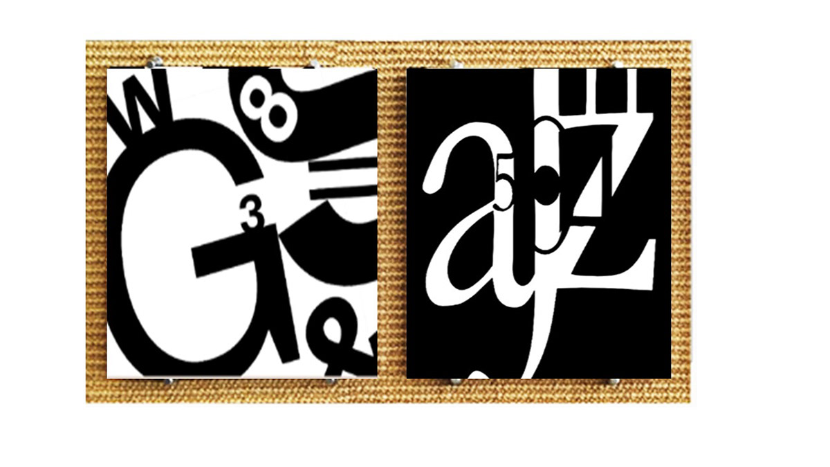
"Sans-Serif Composition, NEUE HAAS GROTESK, Project Discussion and Compositional Analysis."
Each of the respective typographic formats that exist, furthermore offer the prospective designer unique opportunities for creative expressivity and visual communication, furthermore facillitating the implementation of handcraftmanship and manual typographic visualization techniques. Furthermore, by understanding the characteristic and potential applications of each respective format, designers can make informed choices to effectively convey their intended messages and engage with their target audience. For the purpose of this specific project, I have chosen to utilize various alphanumeric visual elements to effectively transmit an sense of organic symbiosis between the variety of visual elements that have been integrated into this particular composition. I have learned that crafting a deeply intellectually cohesive composition requires mantaining a sense of consistency and cohesion across all design elements with the inclusion of typography, iconographic element integrattion, color and layout can prove to be a particularly imperative challenge, as ensuring that each respective component contributes harmoniously to the narrative that is being depicted whilst additionally avoiding visual cluster as much as possible. This can prove to be a significant challenge in sans-serif compositions. The balancing of complexity and simplicity is a notion that one within the position of a designer must carefully contemplate, considering the density of visual information whilst additionally aiming to ensure that the composition remians intellectually engaging without overpowering the visual capacity of the audience. Coversely, one of the many beneficial elements of creating sans-serif typeface compositions, was that each specific sans-serif typeface archetype, which in this particular case would be that of "Neue Haas Grotesque"; offer such versatility across characterization formats, weights and modes of implementation. I wanted to additionally utilize different typographic elements, such as a "bowl", "ascender"; "descender", "ligatures" and "stems" to transmit a semblance of fluidity and movement within the composition, experimenting with the dynamic nature of visual weights to transport the spectator into the composition in of itself, almsot as to make them feel as though they themselves are additionally complicit in the success of the movement and literacy value of the piece in of itself. I was also able to find that sans-serif typefaces such as Neue Haas Grotesk posess a timeless quality that transcends social conventions and stylistic trends, making them a highly reliable choice for design projects whcih require longevity and endurance.
"Seriffed Composition, STEMPEL GARAMOND ROMAN, Project Discussion and Compositional Analysis."
Learning how to best navigate different visual elements and graphic design principles is of paramount importance in creating highly engaging seriffed compositions for various reasons. As such, serif compositions benefit from the careful manipulation of visual elements to create aesthetically complex and kinesthetically appealing designs. By mastering design principles such as color theory, composition and typography can ultimately enhance the visual appeal of serifed compositions, making them muchmore engaging and highly captivating to viewers. I wanted to implement various experiments with visual weight and balance to demonstrate different microcosms of visual emphasis and focus, giving it a much more neoclassical and dynamic character.
"Stempel Garamond Roman Finalized Serif Composition."

"Stempel Garamond Roman Finalized Serif Composition."

"Finalized Composition Iterations with the Inclusion of Individualized as well as Joint or Collaborative Mockup Formats Respectively."
"Stempel Garamond Roman Finalized Composition and Neue Haas Grotesk Format."