


Eng:
Brand identity
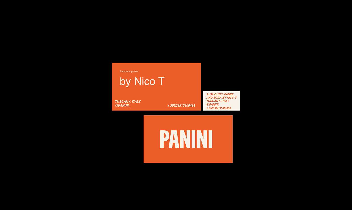
Well, Panini is a chain of cafes in Tuscany that specializes in signature paninis created by Nico T. Even as a child, Nico's grandmother would pack him a quick sandwich for school and call it Nini. This is how the PaNini brand was born. Nico collected grandmother’s best recipes and improved them, became a chef and created a chain of fast food cafes in Tuscany. The main font for the logo is playful, bright, and eye-catching. Nico selects the best ingredients for his paninis.
The key value is that the ingredients in the panini can be changed according to the client's wishes.
Also, at the request of customers, the cafe prepares a signature soda with lemon and ginger and orange with pepper. Nico's motto is "We do not sell ready-made and fast food, we sell time and mood." and "If life gives you lemons make the soda" :)
Rebranding
Client's task: conceptual, modern style. Brutal and attracting the attention of young people, while maintaining the influence of the industry. As a result, we came to a signature style, behind which you see exactly the brutal, ambitious young man that Niko is. The new input was that the cooking speed of the panini is an important criterion. “We don't want to steal the client's time,” says Niko. There are also plans to fully develop the cafe chain; pasta, also prepared according to homemade classic recipes, will appear on the menu. This is something like a new generation restaurant. There are no clichés here. Everything here is as the heart dictates. It is no coincidence that the color orange was chosen for the logo - the color of a warm heart. Black is the color of strength and brutality. And the milky color of freshness, which speaks of the quality of the ingredients.
Ru:
Panini — это сеть кафе в Тоскане, которая специализируется на фирменных панини, созданных Нико Т. Еще в детстве бабушка Нико упаковывала ему быстрый сэндвич в школу и называла его Нини. Так родился бренд PaNini. Нико собрал лучшие бабушкины рецепты и усовершенствовал их, стал шеф-поваром и создал сеть кафе быстрого питания в Тоскане. Основной шрифт логотипа — игривый, яркий и привлекающий внимание. Нико выбирает лучшие ингредиенты для своих панини. Ключевая ценность в том, что ингредиенты панини можно менять по желанию клиента. Также по желанию клиентов кафе готовит фирменную газировку с лимоном и имбирем и апельсином с перцем. Девиз Нико: «Мы не продаем готовое и фастфуд, мы продаем время и настроение». и «Если жизнь дает тебе лимоны, приготовь газировку» :)
Ребрендинг
Задача от клиента: концептуальный, современный стиль. Брутальный и привлекающий внимание молодежи, при этом сохраняющий влияние индустрии на все население. В итоге мы пришли к такому фирменному стиль, за которым видишь именно брутального, амбициозного молодого человека, которым является Нико. Из новых вводных данных было то, что скорость приготовления панини является важным критерием. "Мы не хотим красть время клиента" - говорит Нико. Также планируется полноценное развитие сети кафе, в меню появится паста, приготовленная по домашним классическим рецептам. Это что-то вроде ресторана нового поколения. Здесь нет клише. Здесь все как велит сердце. Неслучайно выбран оранжевый цвет для логотипа - цвет горячего сердца. Черный как цвет силы и брутальности. И молочный цвет свежести, что говорит о качестве ингредиентов.


Thanks for watching!
Спасибо за просмотр!
For contact me please:
Email: polina_design@inbox.ru
Instagram: polina_design17
Telegram: https://t.me/polina170296


