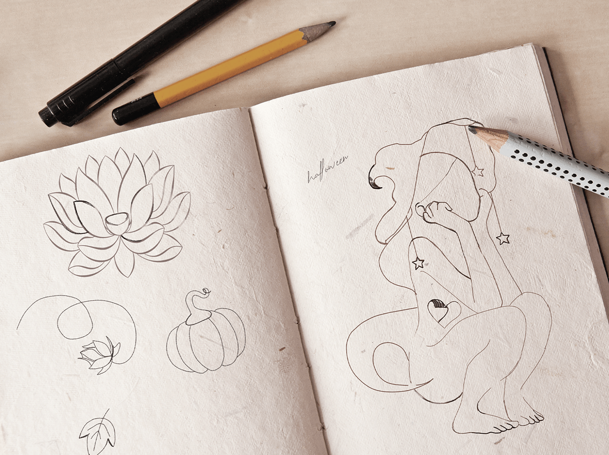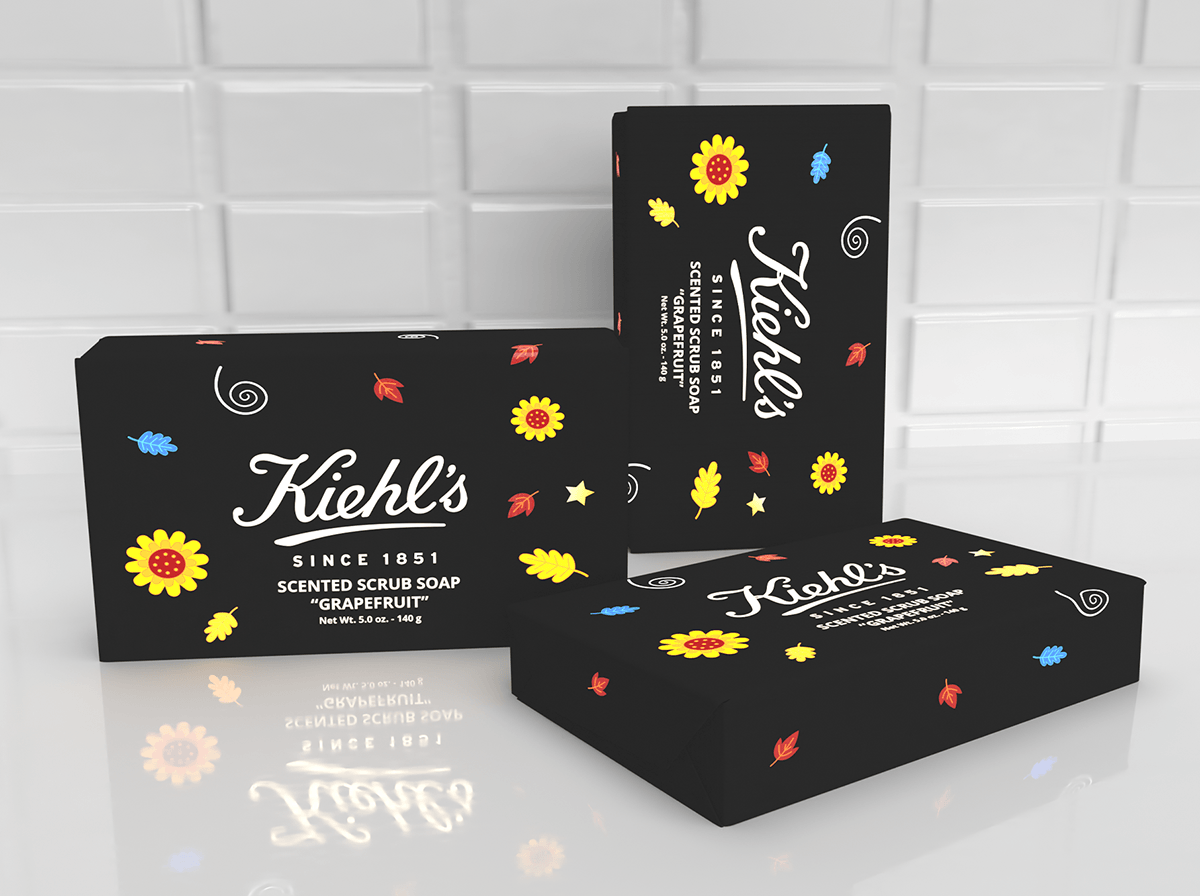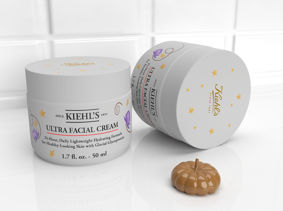
The starting point for this project was a couple of paper sketches of natural elements that go well with the rainy season and also that enforce the aspect of Kiehl's healthy ingredients. From these elements, I've picked the Japanese chrysanthemum as one of the main elements which is one of the most endeared autumn flowers that represents royalty, longevity, and rejuvenation.
The main focus befalls on the little flower-fairy, a magical creature that illustrates the esoteric aspect of Halloween but also purity, elegance and fragility, values that are very well represented by Kiehl's products. The carved heart was initially meant as a reference to one of my favorite lyrics from Anthem by Leonard Cohen: "There is a crack, a crack in everything, That's how the light gets in...". This also can lead to the tradition of carving pumpkins and as the jack-o'-lanterns pour light, we can also pour our light in everything we do and onto others.
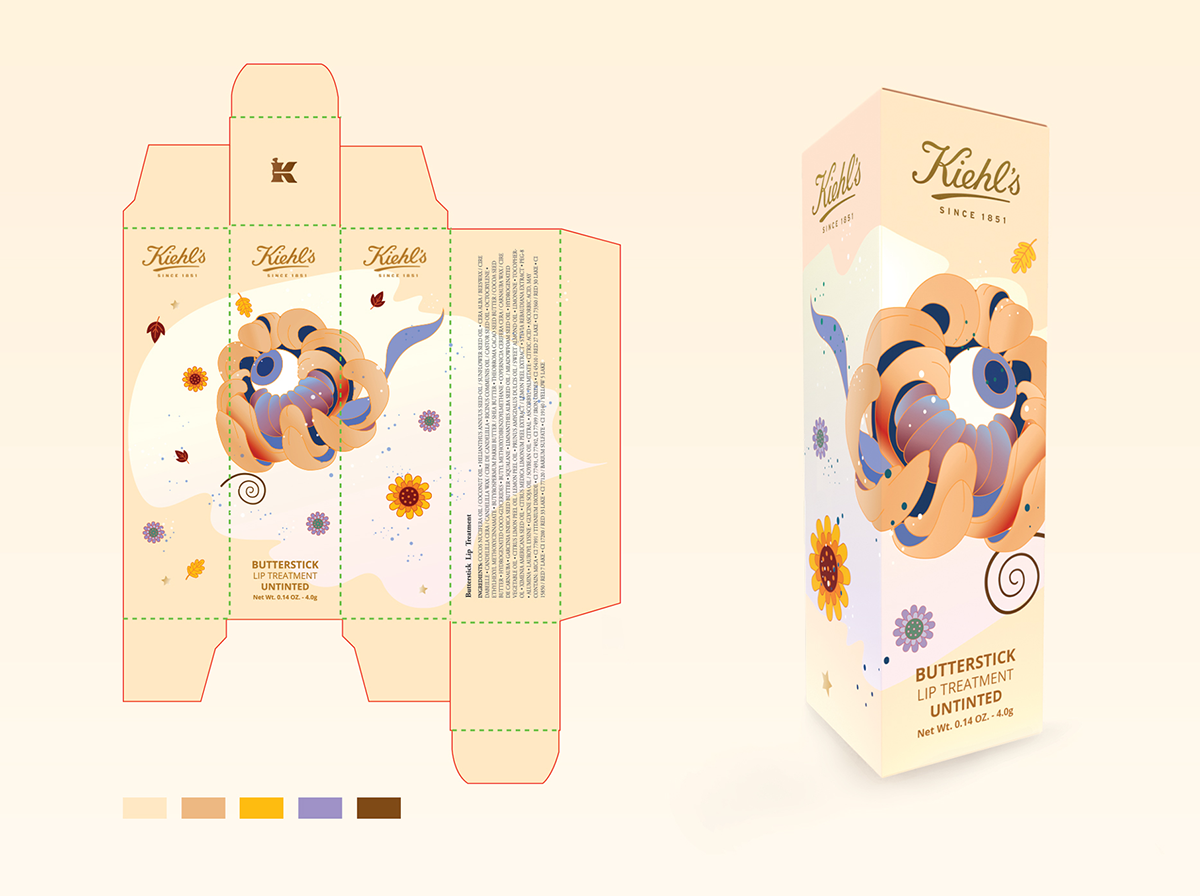
Through some thought, I settled upon the witch hat as an accessory for the fairy. This decision was not entirely random but had its roots in herbology, i.e., witchcraft. It depicts wisdom, magic and liberty. The theme of "light" can also be found on the second Japanese chrysanthemum that has in the epicenter an eye. The eye can represent clairvoyance, omniscience, intelligence and truth.


