

The Art and Mastery Behind Millet Badam Blast Packaging.


Project Overview:
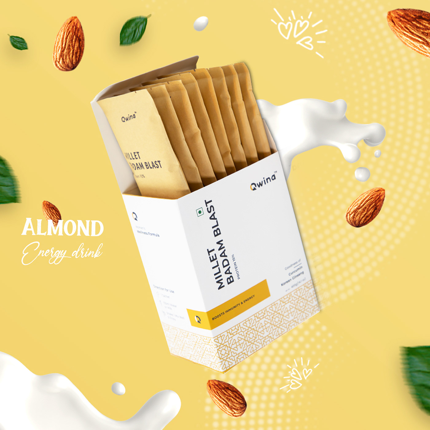
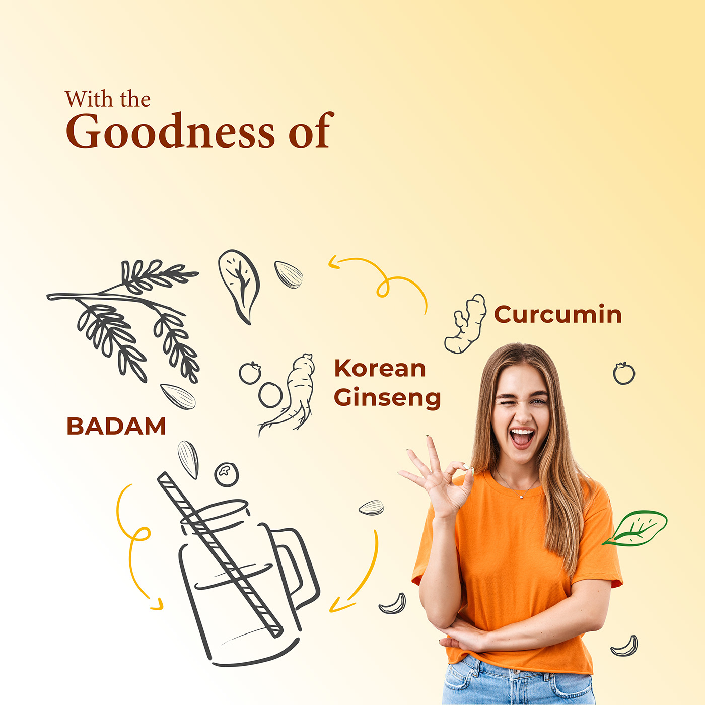
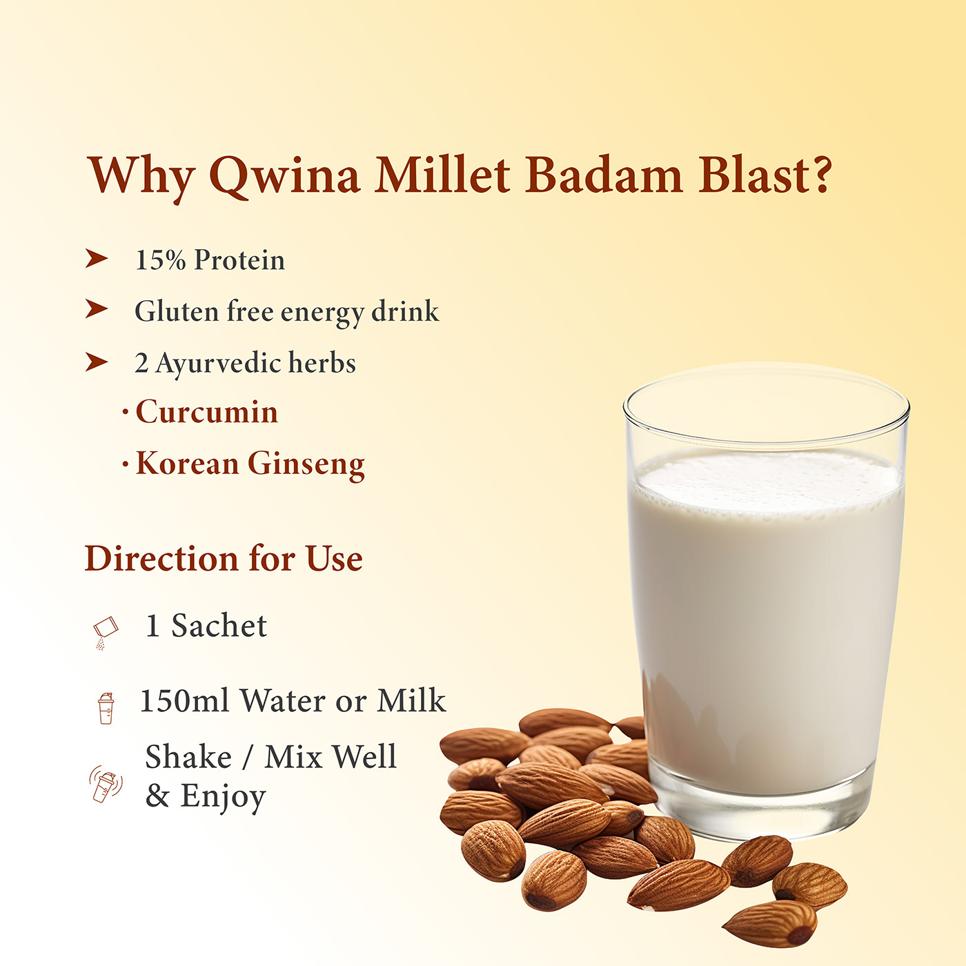
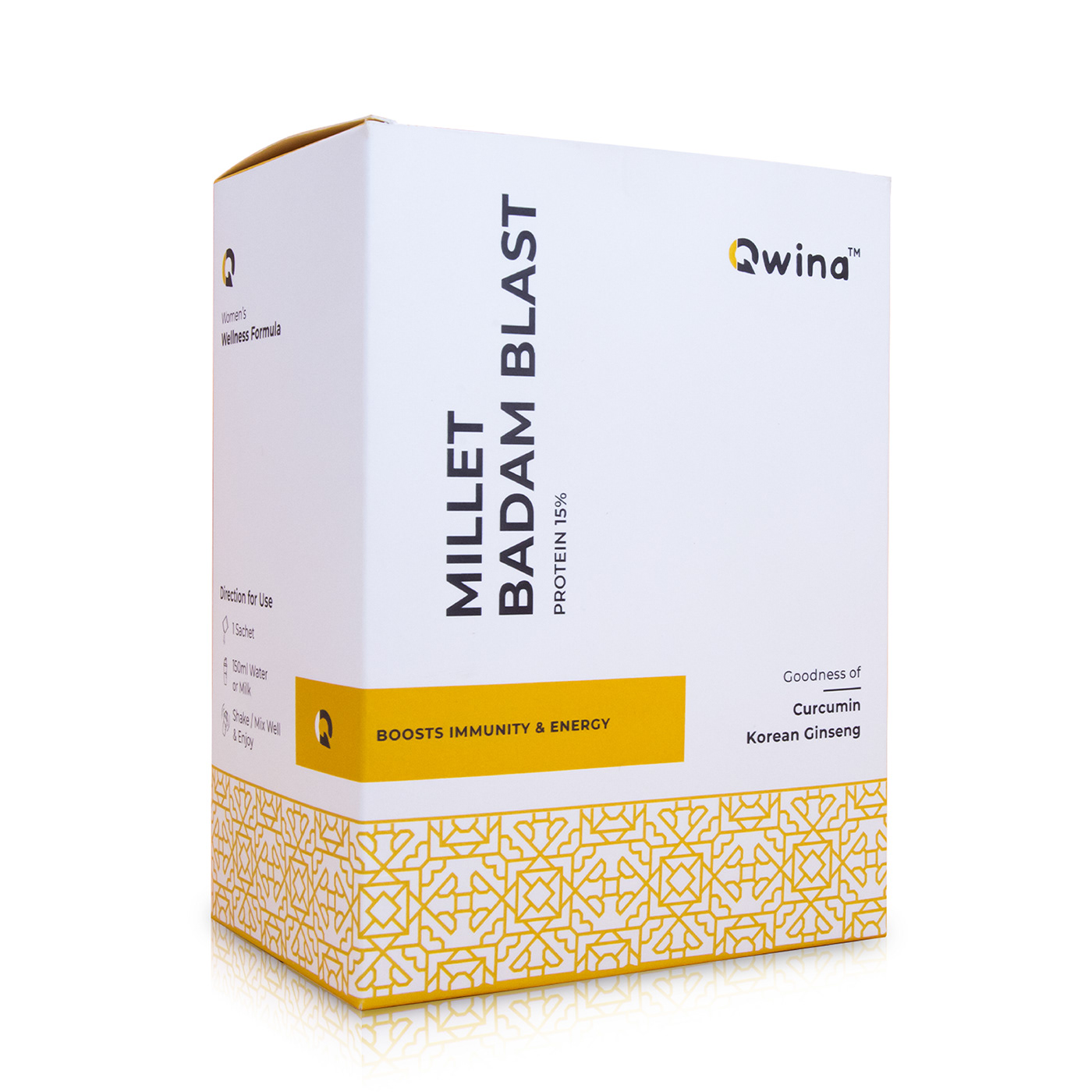
Introduction: Millet Badam Blast presents an innovative Ayurvedic drink integrating nutrition with herbal extracts. In my role as the packaging designer, the primary goal was to craft a visually captivating design that not only appealed to consumers but also conveyed essential information. The minimalist packaging effortlessly communicates the inclusion of key Ayurvedic herbs, providing consumers with insight into the product's fundamental attributes.
Design Approach: The packaging design adopts a blend of simplicity and clarity, seamlessly fusing modern aesthetics with Korean patterns. Through a thoughtful combination of color schemes, typography the design prominently features Ayurvedic herbs on the front panel, ensuring quick and easy recognition of the drink's core ingredients.
Consumer Engagement: Functioning as an educational tool, the design strives to enhance consumer comprehension of the drink's nutritional and Ayurvedic significance. By bridging the gap between contemporary nutritional science and traditional herbal wisdom, the packaging invites consumers to embark on a journey towards holistic well-being.
Conclusion: The Millet Badam Blast packaging design serves as a testament to the successful integration of modern design elements with Korean patterns. Through a minimalist and informative approach, it effectively communicates the essence of the drink, encouraging consumers to embrace its holistic benefits.
This project exemplifies the seamless harmony achieved between design, nutrition, and Ayurveda. The packaging transcends its role as a mere aesthetic vessel, transforming into an interactive gateway into the realms of wellness and nourishment.
Thank you


