


Brand and identity of the Ministry of Health of the Republic of Lithuania
Symbol search: an analysis of analogues showed that the cross is patented by the Red Cross and therefore not usable, although many medical institutions use interpretations of the cross. Other medical symbols used since antiquity have controversial meanings, such as the snake, the drop of blood, the knife. In the past, medicine was associated with alchemy and myths, and it is only in the last 100 years that medical science has progressed thanks to modern research. The SAM Design Committee therefore decided not to use popular medical symbols but to try to create a new, distinctive and original mark.
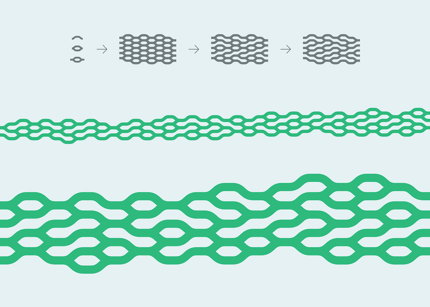
Many of the world's brands are constructed by combining regular geometric shapes. In order to be original, we have created a version based on biomorphic motifs, made up of lines instead of basic geometric shapes (circle, square, triangle). The lines echo the motifs of nature and the structure of the human body, they move organically and do not have strict vertical and horizontal positions in space. As in nature, it can be asymmetrical and changeable.
Politics - the formation of opinion, the reconciliation of different interests, the tilting, the movement, the listening to or the imposition of opinions, the control. Associated with impermanence, movement, change, flux, steady action.
Muscle structure - nerve, tendon, muscle. Symbol of strength, movement, health. Healthcare revolves around the human being, his body, anatomy and psychology.
Nervous system - about control of the body, nerve signals, transmission of brain decisions to muscles to perform. Close relationship with muscles and brain. The brain symbol is unoriginal, widely and straightforwardly used, so we have not sent it.
X and Y chromosomes - small pieces of DNA that determine the sex of a human being, separated by different poles, but at the same time similar in some parameters. Small particles in a large system.
The result is a biomorphic graphic symbolising political decisions, information flow and neural networks, which can be transformed into an ornament and developed in all directions.
The colours have been carefully selected. Green and blue have been chosen to create a calming and confident mood in the medical theme. Red and orange are only for accents or to convey danger messages, for moderate use.
Green in combination with blue is a low-contrast colour, side by side in the colour wheel. But we have managed to find a combination in which blue is seen on green and green on blue. These colours can be used both for the background and for graphics.
Green in combination with blue is a low-contrast colour, side by side in the colour wheel. But we have managed to find a combination in which blue is seen on green and green on blue. These colours can be used both for the background and for graphics.


Client: The Ministry of Health of the Republic of Lithuania
Agency: Moira Visuals - Behance Instagram Facebook
Agency: Moira Visuals - Behance Instagram Facebook
Creative Director: dr. Marius Bartkus
Analysis and research: Dr. Sigitas Gužauskas
Junior Designer: Polina Evdokimovich
Date: 2024 01 22
Analysis and research: Dr. Sigitas Gužauskas
Junior Designer: Polina Evdokimovich
Date: 2024 01 22


