


International Typographic Style Show
student work
This project was a semester long branding project; branding a fictitious show of the International Typographic Style of posters, starring the work of Josef Mueller-Brockman and Armin Hoffman.
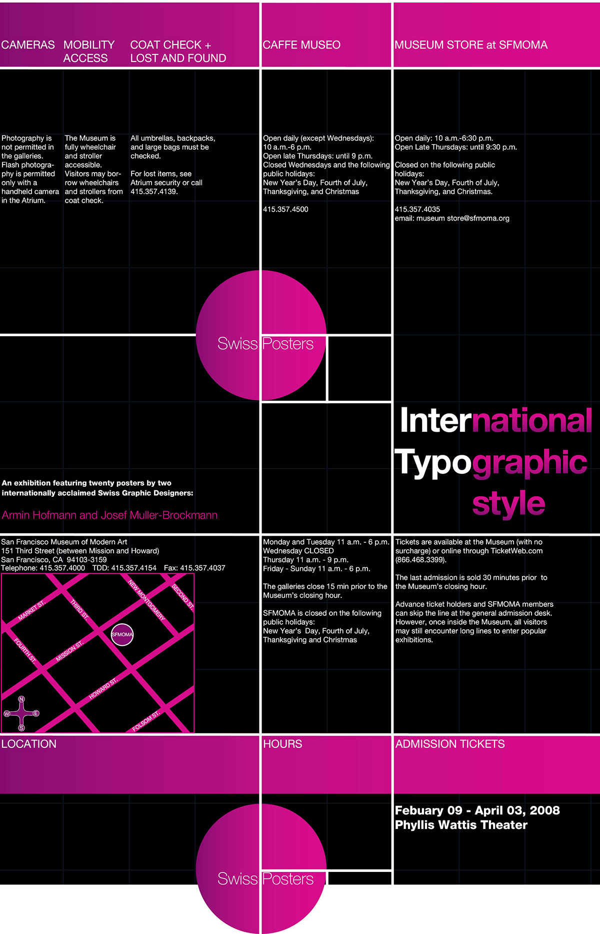
Using a visible grid along with the fibonacci sequence, was the cornerstone of the overall concepts. You can see representation of this swirl in the book cover, poster and in the "birds-eye-view" of the 3-D street signage.
The bright pink circle was taken from research done on Swiss Posters, and stepped away from the much more common color themes for ITS of black, white , red and various muted shades.
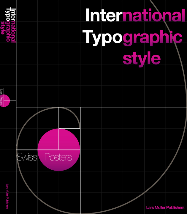
Above: Book Cover
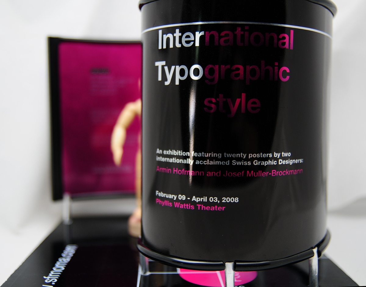
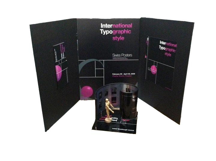
Above: Brochure Exterior
The pink circle you see at the bottom of the photo above, would be a die-cut. When the tri-fold brochure is folded correctly, the lower portion of this circle slips into a slit that is cut into the UPPER circle that you see; thus, continuing the flow of the design when closed.

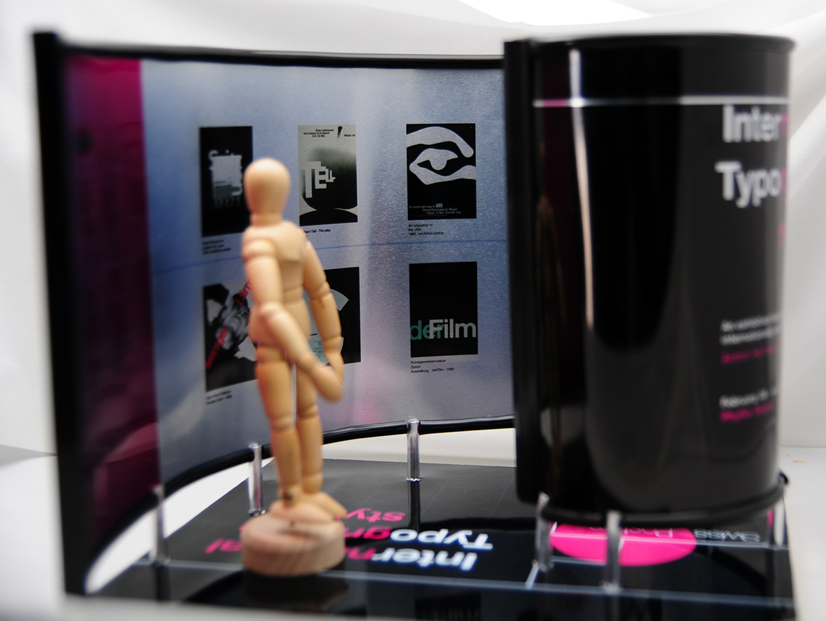
Above: Brochure Interior
Below, is the scaled version of 3D signage for the show. The main surface is aluminum allowing the non-painted spaces to reveal the texture of the finished aluminum. The birds eye view of this piece reveals the fibonacci swirl.


15 x 20 Poster
Brochure, Poster, Book Cover3D Signage