


On the left you can see Brussels' original logo. Sadly, the "BXL" only represents the French speaking part of Brussels' inhabitants, which I wanted to change. Finding the right lettermark was very hard, because I needed to incorporate the French "Bruxelles" and Flemish "Brussel".
Initially, I tried to combine the sum of the letters of both names in a rectangle, creating a composition reminiscent of Art Nouveau. Afterward, I experimented more with typography.
I chose the final logo, because it seemed most basic, scalable and innovative. The French and Flemish name dynamically meet in the lower right corner.


The city of Brussels is multicultural and bilingual. It is were Art Nouveau was invented. It is home to the European Parliament. These attributes were especially important to me when designing the city's new visual identity during a course at uni.
The dark green surfaces of old streetlights and signs, the beige facades of buildings and golden ornaments, that can be found everywhere inspired this colour palette.


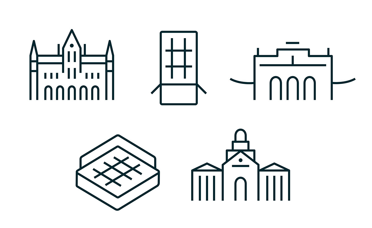
My favourite icons:)) And below are some posters I designed using the logo as a kind of frame, sticking to the colour system and Neue Haas Grotesk typeface.


Hope you liked it
xx


