

Summary
I developed a concept project for a heritage construction contractor, transforming its branding to provide an eye catching representation that honours its 150 year legacy.
Bakers of Danbury are the oldest construction company still active in my home county of Essex. Specialising in Restoration, Conservation and New Builds, they have managed many projects involving the regions historic buildings, church's and ancient monuments since their inception in 1878.


Challenge
Their current branding was basic, consisting of a simplistic text-based logo applied to a few things such as vehicles, uniform and site signage. It barely scratched the surface of demonstrating the company's experience and historical significance within the region. To propel the brand into the 21st Century, an overhaul was necessary.
I wanted to create a full fledged brand identity that not only exuded the depth of Bakers of Danbury's expertise but also captivated the attention of prospective clients and allow them to be effectively recognised amongst competitors.


Solution
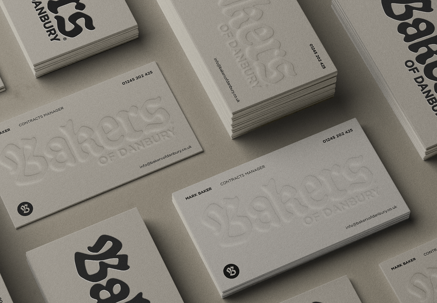
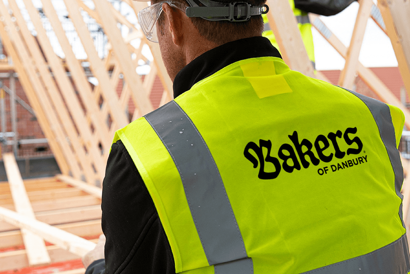
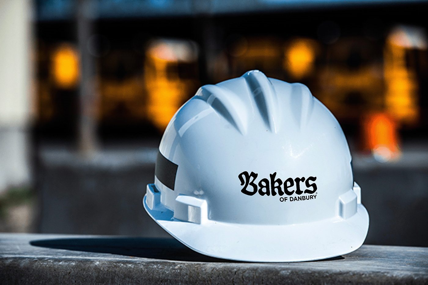
I produced a comprehensive brand identity guidelines booklet, with artwork applied across all industry specific touchpoints. From uniforms and PPE to stationery, site drawings, business cards, site hoarding banners, social media and web icons, every aspect has been thoughtfully considered.
The logo has been fashioned using Blackletter/ Old English lettering, paying homage to Bakers of Danbury's rich heritage. Building upon the foundation of their existing branding, the colours of black and gold have been accentuated by an off white/ cream colour reminiscent of aged paper or vintage photographs. While the Blackletter of the logo exudes a historical charm, modern typography has been incorporated to deliver messaging that is bold and easily readable, ensuring effective communication across all mediums.
Additionally, a separate badge logo was developed to commemorate their 150th birthday. This contains the image of a mill which represents the founders humble beginnings as a Millwright, and serves as a reminder of the companies origins.


Conclusion
This project leverages Bakers of Danbury's story by providing a visual representation of their history, affirming its position as the leading contractor for Essex's architectural heritage. By weaving together traditional and contemporary elements, the revitalised branding stands as a testament to their legacy and presents them as a first choice for clients for years to come.
I will be sending this project to Bakers of Danbury as a gift to celebrate their 150th anniversary in 2028. Hopefully they will receive it well, and give their feedback, when they do I will post it on my Instagram for you guys to see.
_______


