BRIEF
Design Bridge set the task to ‘redesign a famous brand’. Take the TomTom brand and reposition it. Shift it’s perception towards a solution that would be; simple yet bold, warm, engaging, enduring and memorable. The Satellite navigation systems TomTom produce are powerful tools that open up a world of possibilities for their consumers. Re-establish trust in the brand as the best product on the market.
CONCEPT
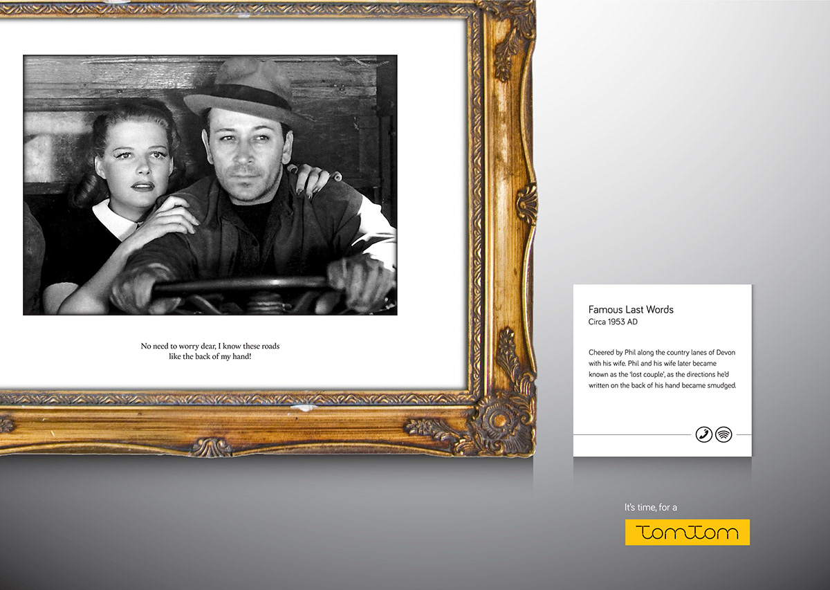
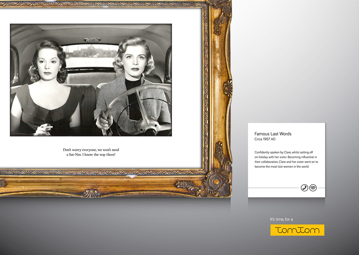
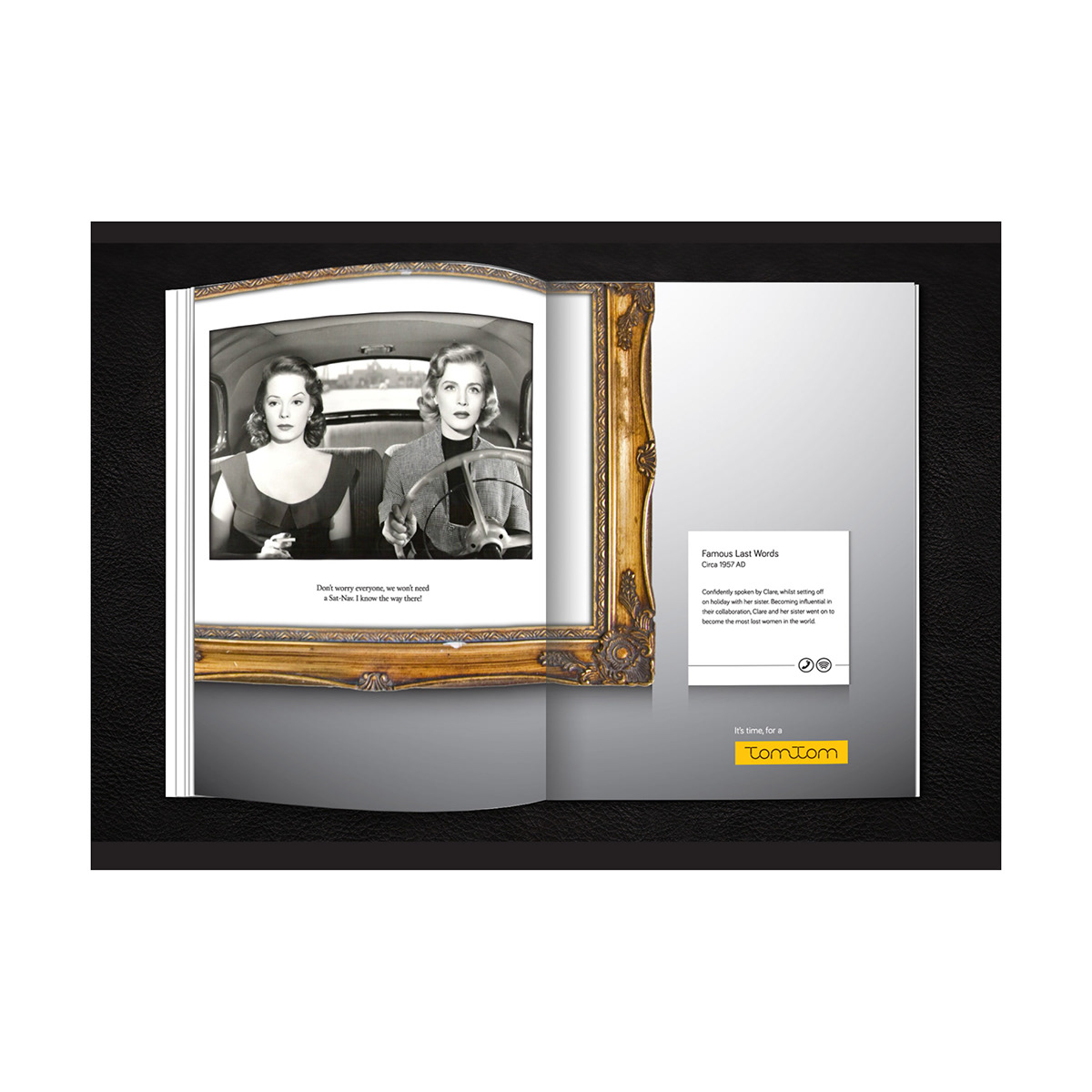
The final concept was based on the idea of trust. People who use TomTom put a lot of trust into the brand and the product itself. I wanted to reposition the brand in a way that would speak to the consumer and remind them of the journey over the destination; that making mistakes is what makes a car trip. TomTom is there for the journey.
We’ve all been in that situation where Dad won’t ask for directions because he’s too stubborn or Nan gets lost on her own street because she simply can’t remember! The copy led application, ‘famous last words’ represents these common situations through quotes that people say before setting off on a journey. The broken up logotype hints to how journeys on the road are not always smooth and straightforward, but unexpected and exciting.


