

Typography Ruler for Typography II.
January 24, 2024
A typography ruler is used to measure type on printed materials. It commonly measures points, picas, and inches, though additional units of measurement can be included. By measuring printed works a designer can access the type size and the spacing as well as understand the design system that was used.
Bringing design to something that has such a practical use and has a long defined standard is interesting to me. I enjoy editing and getting to the purity of an idea or concept.
For this reason, I wanted to used a different letter than the standard E. I attempted to use the words Type Ruler, but that honestly was just confusing. I tried small words in place of the single letter, but it was too much for such a small space. I enjoy the font Josfin Sans, but rarely find applications to use it, in part due to the Ws. I chose the 'S' because it was slightly stylized and was guaranteed to direct the eye to take in the design of the ruler.

Since I had eliminated the E, I decided to add straight lines on the top and bottom of the S to help guid the user when determining the type size.
The 'Type Ruler' at the top of the ruler was easy to balance, but it needed something to make it special. I thought the stem of the lowercase r could function like a ruler. I added a lot of small notches, only to find out they were barely visible during our critique.
I also found out that the card stock I planned on using did not work well with my printer.
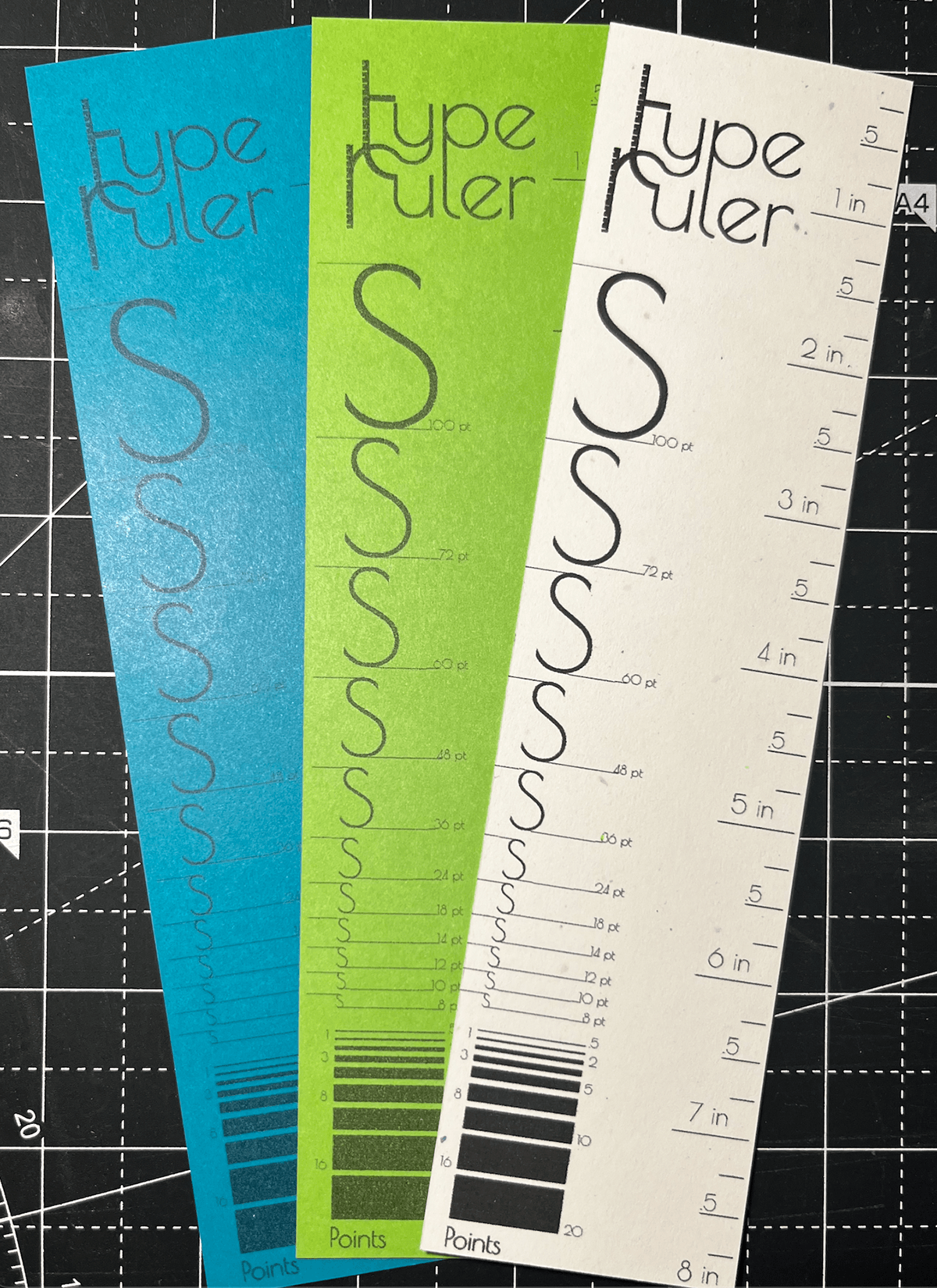
Fortunately, I was able to make some adjustments and have a successful print.


