ESA
European Space Agency ● 2024
_
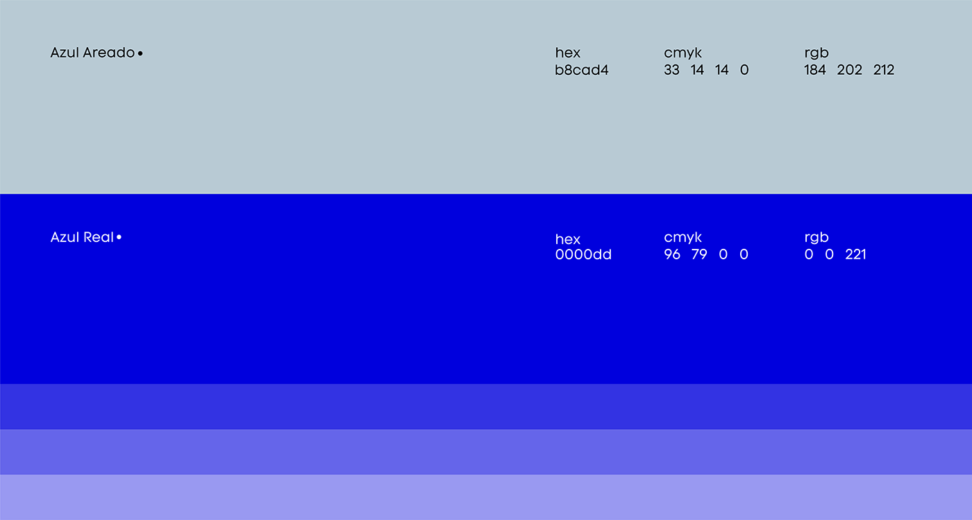
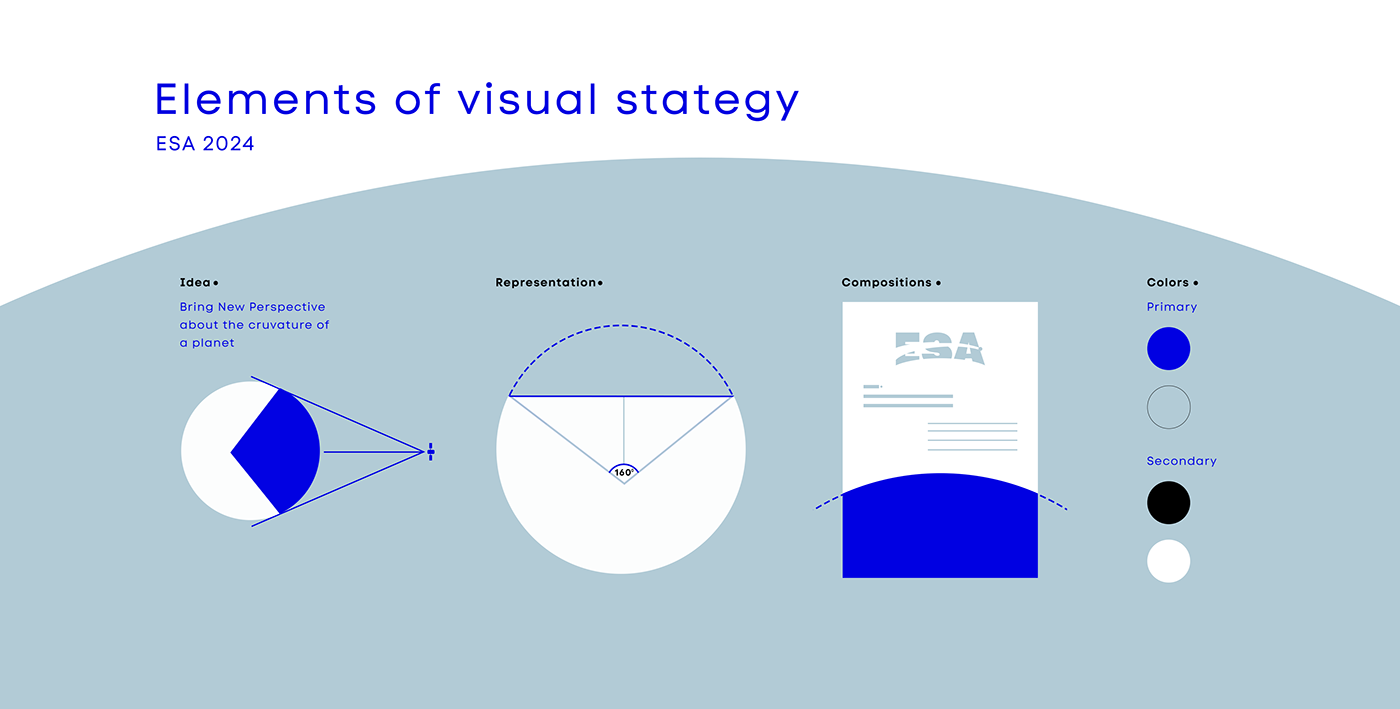
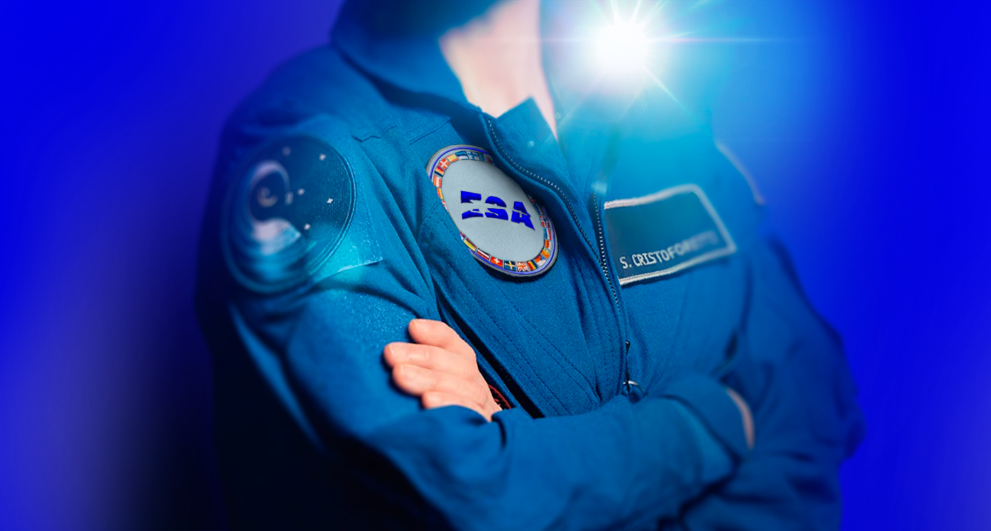
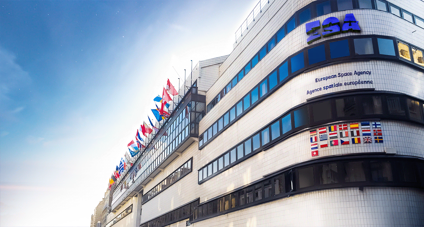
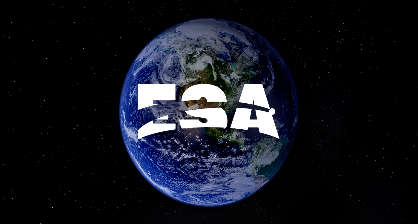
In a fictional scenario, I took the lead in reformulating ESA's visual identity. During this creative process, I introduced two distinct shades of blue to represent the vastness of the space. Furthermore, I harmoniously integrated the curvature of the Earth into the design, emphasizing the deep connection between humanity and the cosmos, while the presence of a comet evokes the never-ending search for new discoveries.
This visual revitalization reflects ESA's ongoing commitment to expanding the horizons of human knowledge about the cosmos, while inspiring future generations of scientists and space explorers to explore the mysteries of the universe.