"To book" is a bookshop featuring American books for children and teenagers to learn English. The branding is based on a visual familiar to everyone learning the English language: the image of a game from a language learning app. The essence of the game is to insert missing words into sentences. In this case, to insert a word equals to book (to reserve) space.
The naming idea plays on words: we encourage to book a book in our store.
The naming idea plays on words: we encourage to book a book in our store.


The store's target audience is parents and teenagers, so the branding needs to be friendly, yet not overly child-oriented.
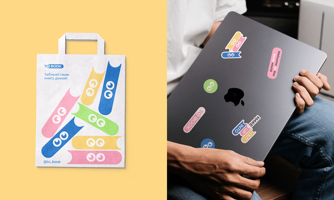
The books fill gaps in English language learning, hence the "book" part of the logo is shaped like a book. For the children's content, "eyes" are incorporated into the book to create a character. These "eyes" correspond with the letters "oo" in the logo. The pupils can look in different directions, allowing the characters to glance at each other.
The books fill gaps in English language learning, hence the "book" part of the logo is shaped like a book. For the children's content, "eyes" are incorporated into the book to create a character. These "eyes" correspond with the letters "oo" in the logo. The pupils can look in different directions, allowing the characters to glance at each other.