ELEVATING PLACES
Developing projects that contribute to a higher quality of life. Today, tomorrow, and forever. Following that framework, MOQO created a renewed visual identity for Acasa.
The strategic preliminary phase revealed the sincere passion of the young team for the creation of thriving neighborhoods. Through quality architecture, thoughtful programming and regard for nature, Acasa elevates locations in Flemish cities to a higher level. Hence, the tagline 'elevating places'.
The project developer can be described as progressive, dynamic and independent-minded. With these characteristics, we set out to design a brand with the necessary punch. A graphic echo effect, reflecting the lasting impact of Acasa projects on the environment, introduces a playful touch in both online and offline carriers.
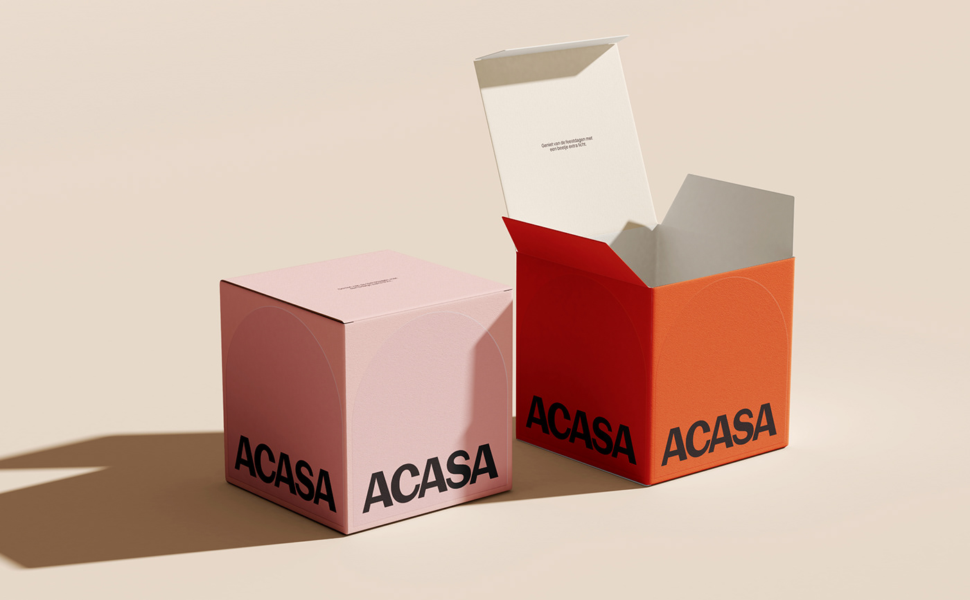
The logo also evolved to represent what Acasa stands for after twenty years. In the bold uppercase font, you can find the company's strong expertise, while subtle asymmetry allows for a healthy dose of humor. With a broad palette of fresh colours, the client is all set to bring their corporate and project communication to life.


