


[PT-BR]
Sobre
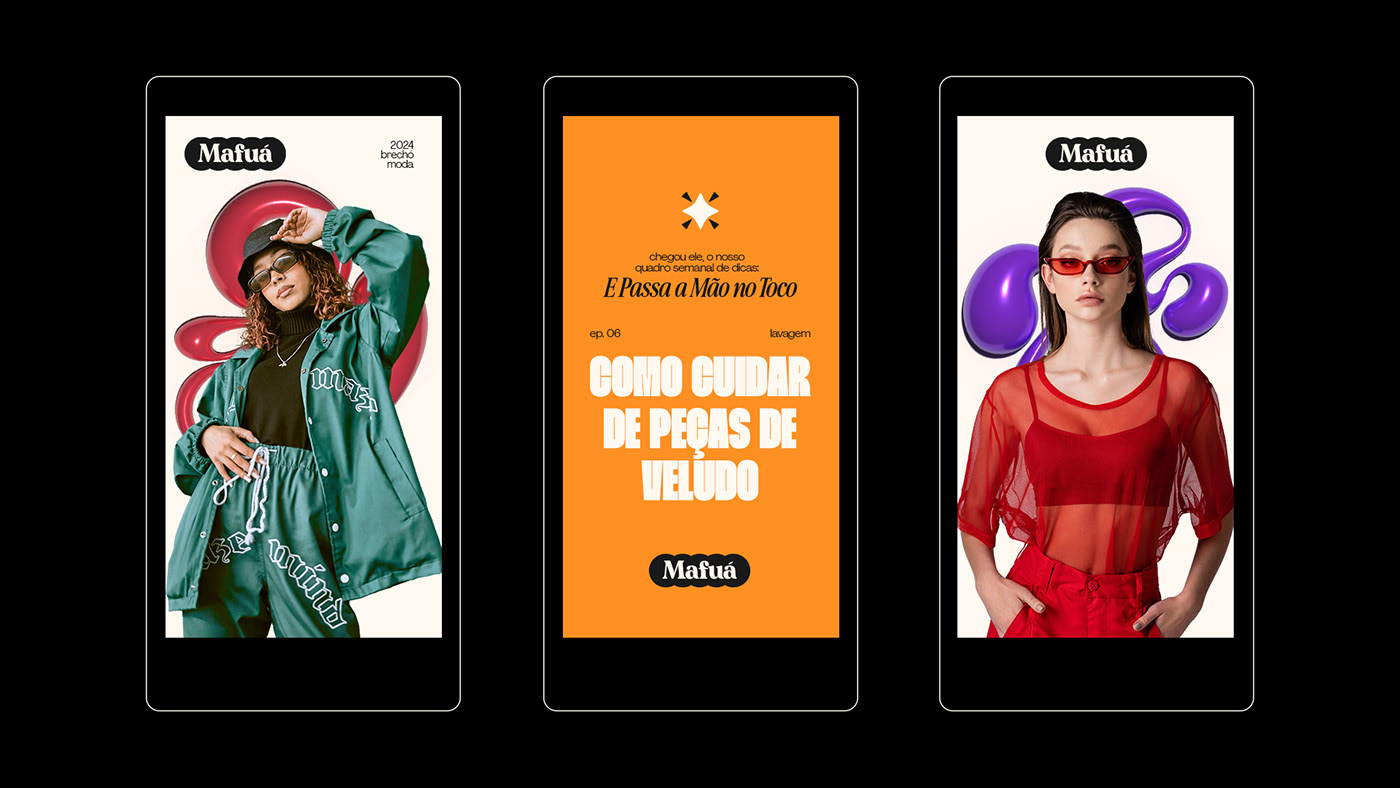
Mafuá é um brechó e loja de desapego com uma pegada groove. A marca quer através da popularidade e valorização da cultura brasileira, ganhar o amor do público.
Além disso, a marca também deseja criar coleções exclusivas de roupas para valorizar as origens e história do Brasil.
[EN]
About
Mafuá is a thrift store and detachment shop with a groove vibe. The brand aims to win the love of the audience through the popularity and appreciation of Brazilian culture.
Additionally, the brand also wishes to create exclusive clothing collections to celebrate the origins and history of Brazil.

[PT-BR]
Desafio
Criar o universo visual de uma marca que pretende se comunicar com um país tão grande quanto o Brasil é realmente um desafio complexo que demanda muita pesquisa. Esse desafio se torna ainda maior quando a marca também deseja ter um visual que remeta ao movimento flower power e ao groove dos anos 70.
Encontrar o equilíbrio entre o contemporâneo que um público jovem busca e o vintage que a marca almeja também foi outro ponto que exigiu muita atenção enquanto desenvolvíamos o projeto.
[EN]
Challenge
Designing the visual vibe for a brand trying to connect with a massive country like Brazil is no joke – it's a tricky task that needs a ton of research. It gets even crazier when the brand wants to channel the flower power and groovy vibes from the 70s.
Balancing what the young crowd digs (that modern vibe) with what the brand dreams of (some groovy flair) was another big deal that had us really focused during the whole project.
[PT-BR]
Solução
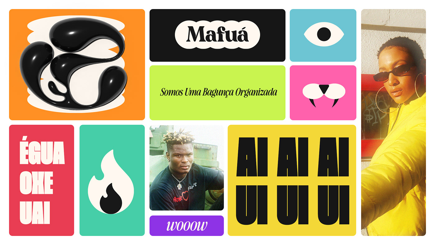
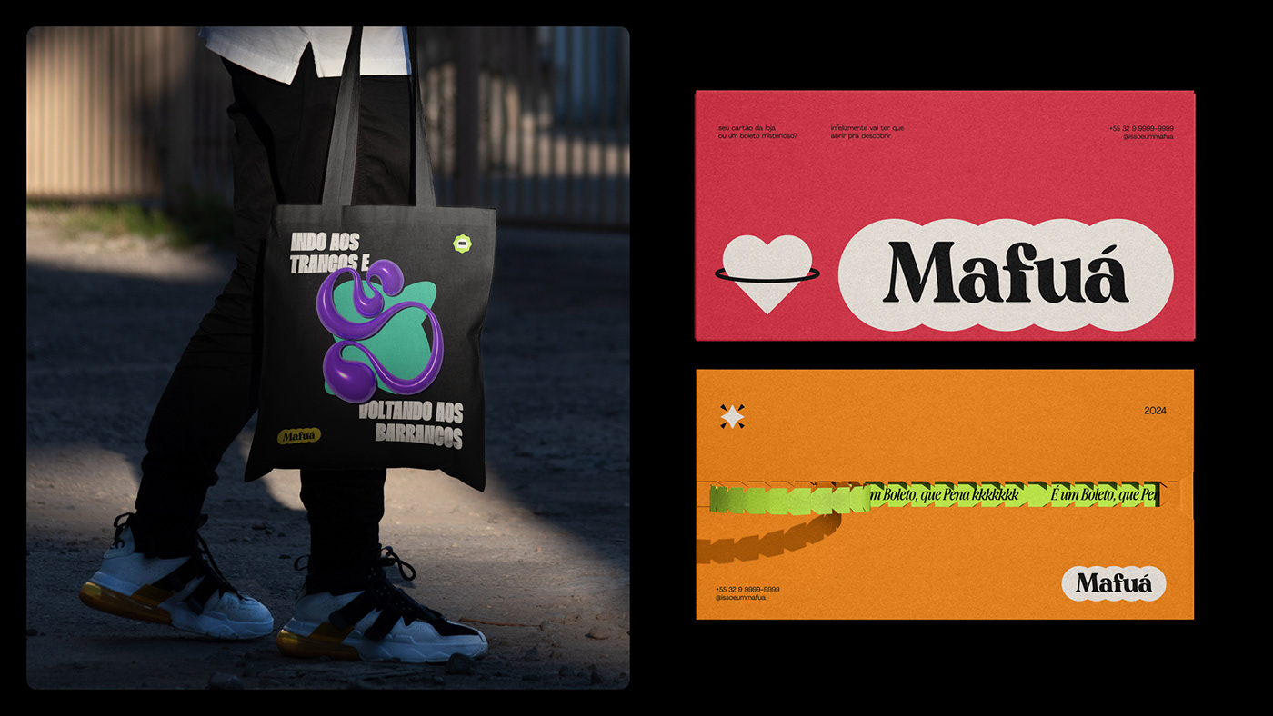
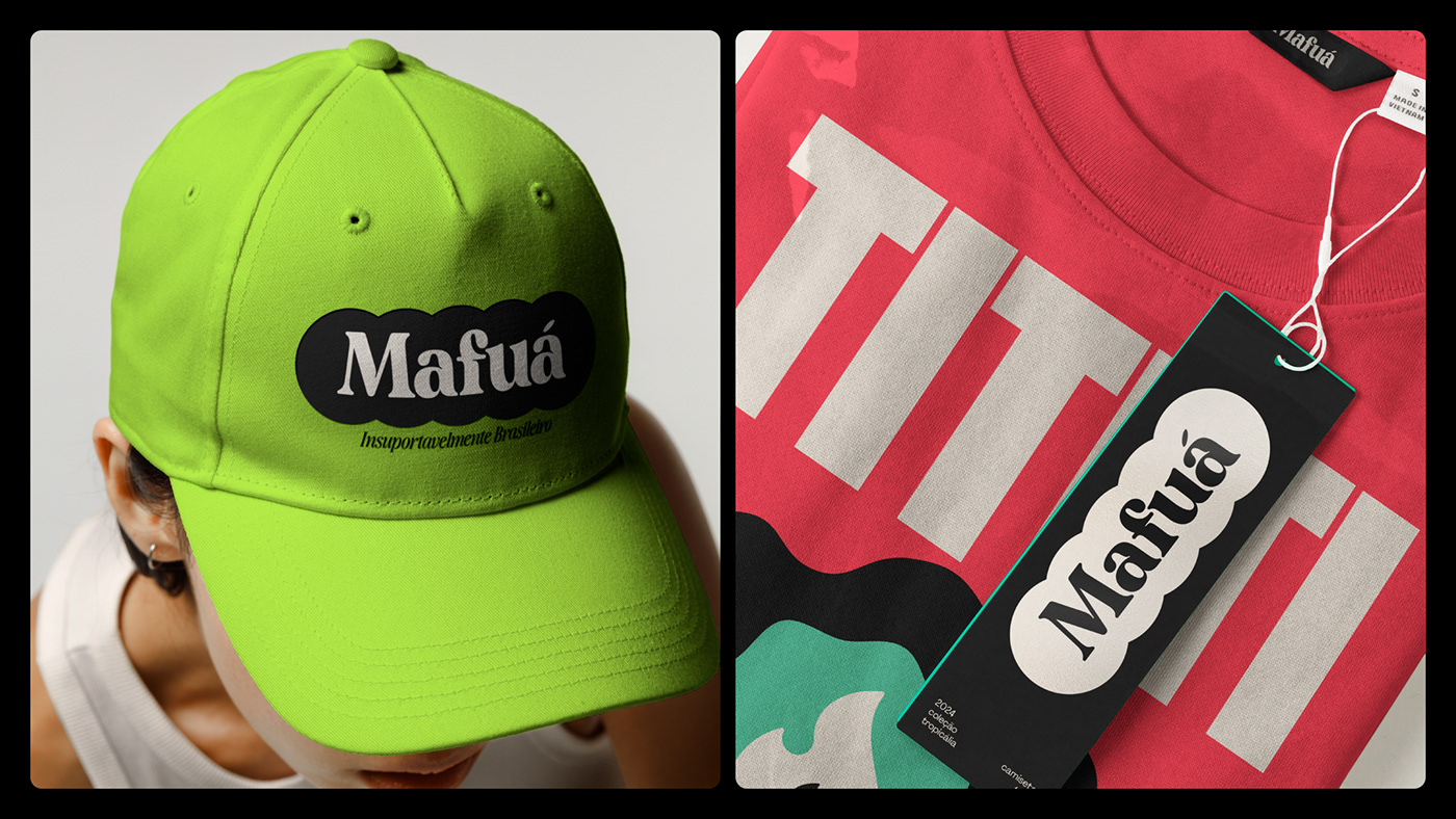
Nossa primeira decisão foi em torno de como trabalhar a brasilidade da marca de forma descontraída e divertida. O Brasil é um país rico em vocabulário e em cultura, muito por conta de ter o português como língua nativa, mas também devido a toda a regionalidade que um país do seu tamanho possui. Portanto, a Mafuá tem uma linguagem inspirada em expressões e palavras brasileiras. O próprio naming já reflete um pouco desse nosso tempero tupiniquim. O resultado é uma marca com uma linguagem cativante, leve e arrebatadora.
Precisávamos alcançar um ponto em que existisse uma leve conexão com a estética Groovy, mas sem que ela roubasse a cena e parecesse ser uma marca vintage demais. Dessa forma, criamos elementos 3D brilhantes e metálicos derivados de uma tipografia que possui diversas curvas. Combinando esses elementos com formas arredondadas mais planas e 8 ícones que refletem valores da marca, conseguimos criar exatamente a sensação que a marca precisava transmitir - moderna, jovial e "cool".
[EN]
Decisions
Our first decision revolved around how to convey the Brazilian essence of the brand in a relaxed and fun manner. Brazil is a country rich in vocabulary and culture, both due to having Portuguese as its native language and the diverse regional influences stemming from its vast size. Therefore, Mafuá adopts a language inspired by Brazilian expressions and words. The very naming reflects a bit of this Brazilian flair. The result is a brand with a captivating, light, and compelling language.
We aimed to strike a balance where there is a subtle connection with the Groovy aesthetic without it overshadowing the brand and appearing overly vintage. To achieve this, we created shiny and metallic 3D elements derived from a typography with various curves. By combining these elements with flatter, rounded shapes and 8 icons reflecting the brand's values, we were able to precisely evoke the sensation the brand needed to convey – modern, youthful, and cool.

[PT-BR]
Identidade Visual
Após a fase de desafios, pesquisa e resolução, a criação e materialização da marca acontece e é aqui que todas as decisões anteriores ganham forma e visual.
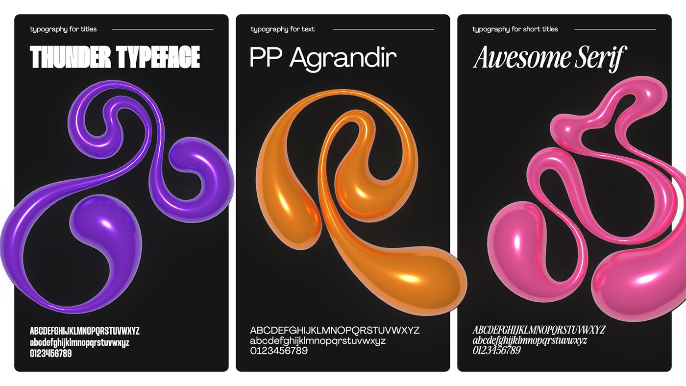
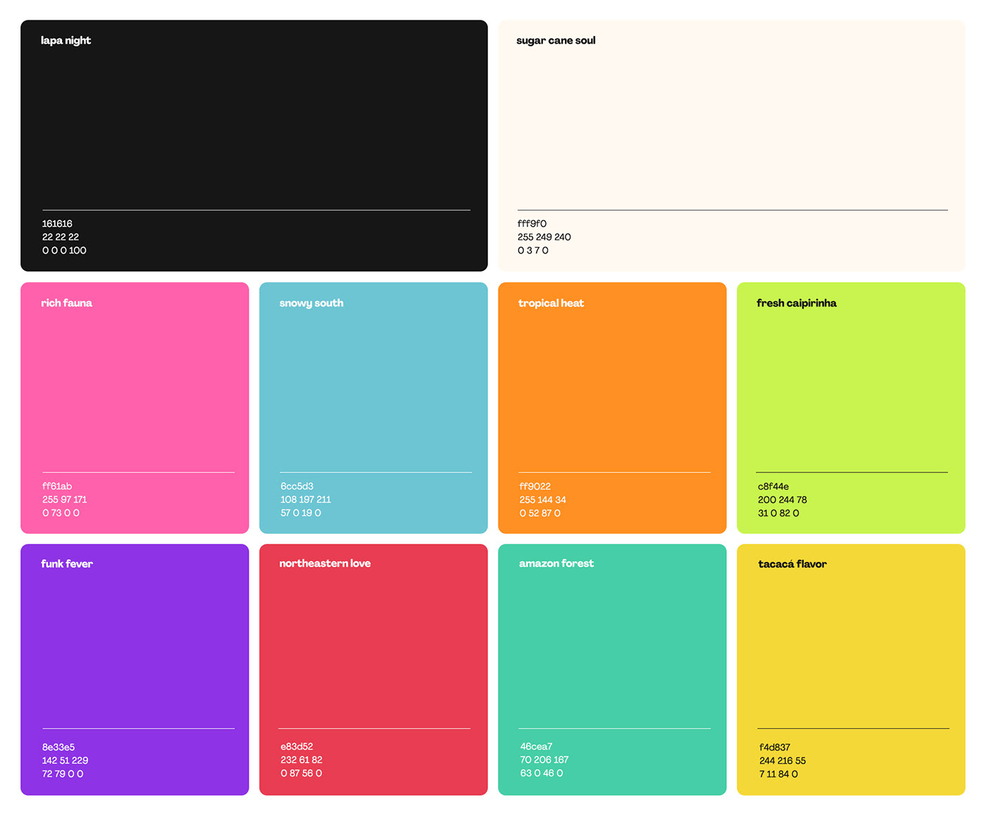
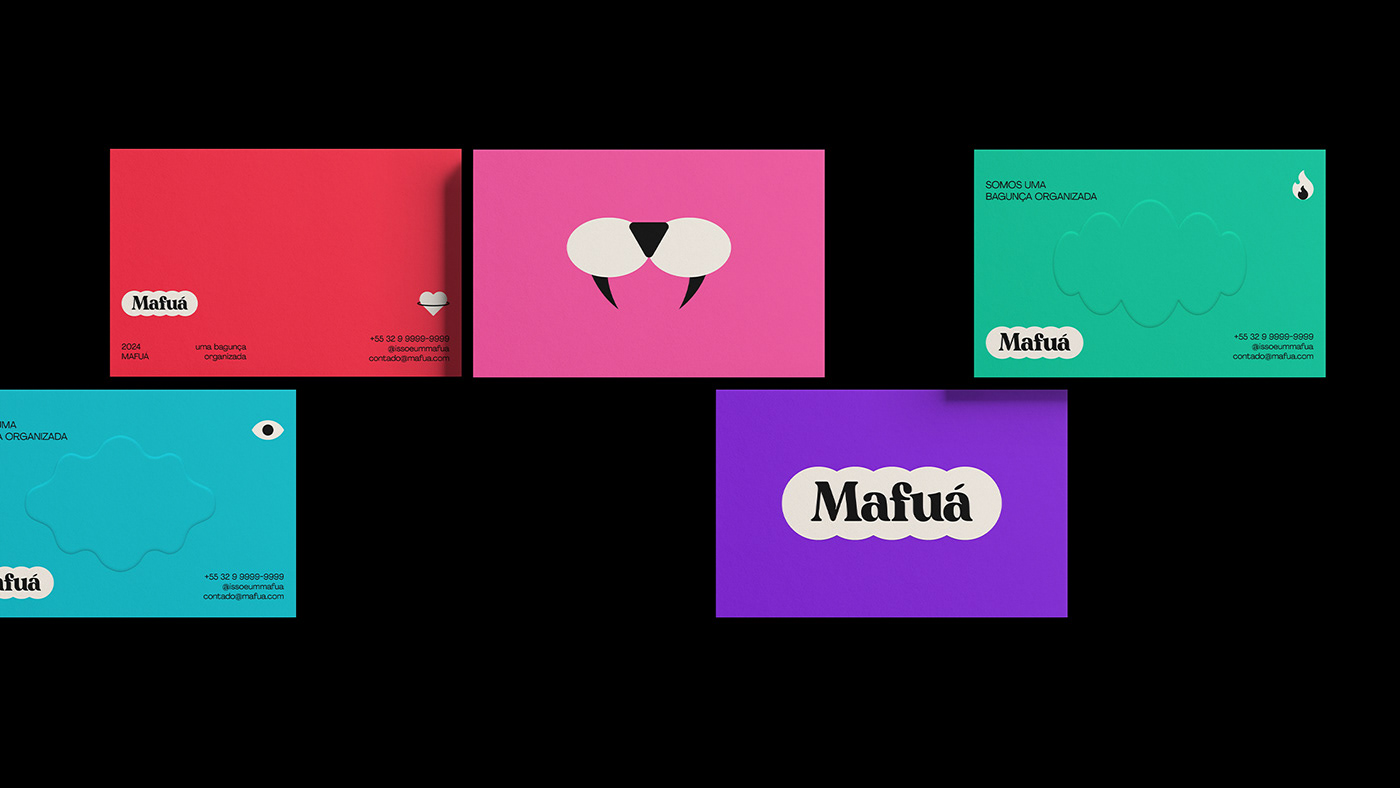
A intenção é que a pluralidade do Brasil seja, na medida do possível, refletida em toda a identidade visual da Mafuá. Dez cores compõe a paleta de cores da empresa, juntamente com 3 tipos de tipografias bem distintas entre si. O objetivo aqui é mostrar versatilidade, diversão e leveza.
Já a assinatura visual possui uma tipografia descontraída, ela vem acompanhada de 5 círculos que representam os pilares da Mafuá - Brasilidade, Pluralidade, Diversão, Jovialidade e Exploração. O resultado é a formação de um isologo para a marca.
[EN]
Visual Identity
After the phase of challenges, research, and resolution, the creation and materialization of the brand take place, and it is here that all previous decisions take shape visually.
The intention is for the diversity of Brazil to be reflected throughout Mafuá's visual identity. Ten colors make up the company's color palette, along with three distinct typography styles. The goal here is to showcase versatility, fun, and lightness.
As for the visual signature, it features a relaxed typography accompanied by five circles representing Mafuá's pillars - Brazilianness, Plurality, Fun, Youthfulness, and Exploration. The result is the formation of an isologo for the brand.


Thanks for watching!
E-mail: studiokondesign@gmail.com
Criação: Kon Studio | Direção de Arte: Matheus Vignoli | Ano: 2024


