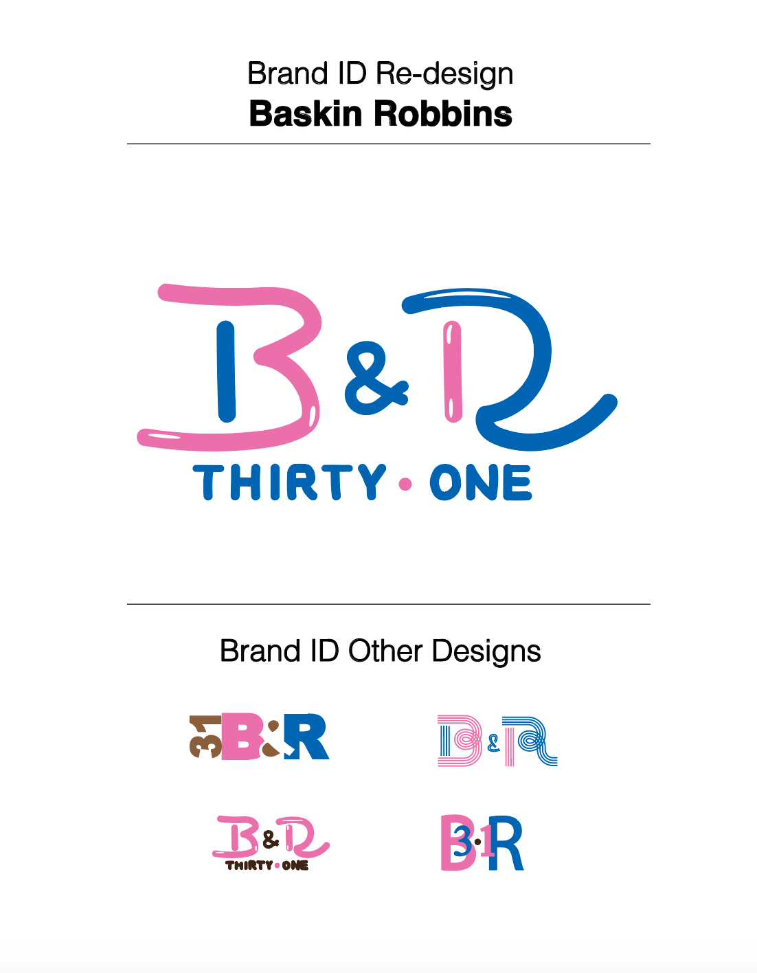
This was a fun rebranding project of the Baskin Robbins logo. I adhered to the same colour scheme and the 31-flavored theme, as this is an integral part of the recognizable Baskin Robbins logo. I chose this famous ice cream company for my rebranding project because it evokes happy memories of summers as a young child. I can still taste the sweetness of the ever-popular gold medal ribbon flavour.
Process:

